- Published on
What You Need To Create A Grid/List Toggle With Tailwind CSS
- The description of Grid/List Toggle ui component
- Why use Tailwind CSS to create a Grid/List Toggle ui component?
- The preview of Grid/List Toggle ui component
- The source code of Grid/List Toggle ui component
- How to create a Grid/List Toggle with Tailwind CSS?
- Conclusion
Tailwind CSS is a utility-first CSS framework that allows developers to quickly and easily create custom user interfaces. With Tailwind, you can create complex designs without having to write custom CSS from scratch. It provides a set of pre-defined classes that can be used to style HTML elements.
The description of Grid/List Toggle ui component
A Grid/List Toggle is a user interface component that allows the user to switch between grid and list views. This component is commonly used in e-commerce websites to display products. When the user clicks on the grid view, the products are displayed in a grid format, and when the user clicks on the list view, the products are displayed in a list format.
Why use Tailwind CSS to create a Grid/List Toggle ui component?
Tailwind CSS provides a set of pre-defined classes that can be used to create a Grid/List Toggle ui component. With Tailwind, you can easily create custom styles for the component without having to write custom CSS from scratch. This saves time and makes the development process more efficient.
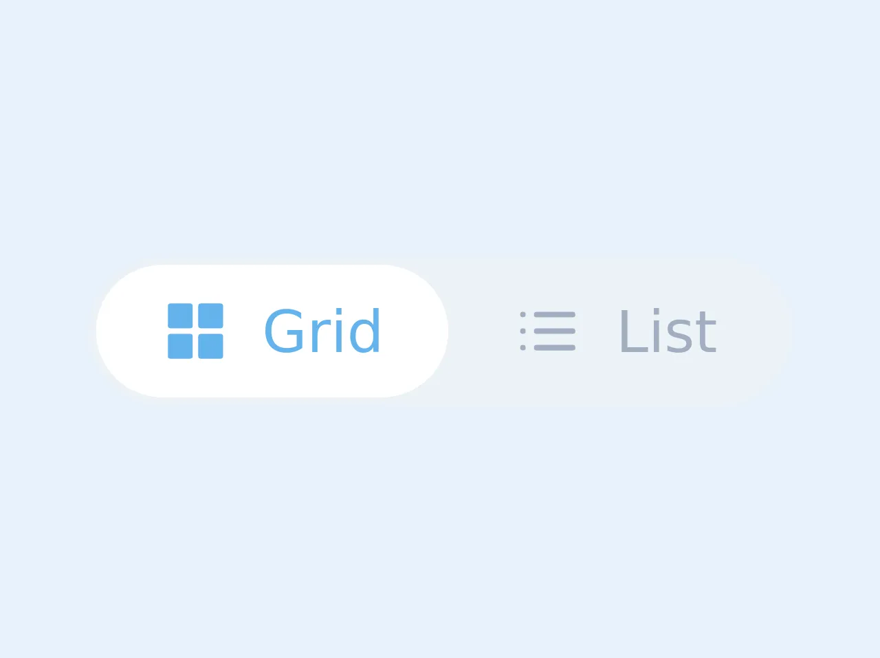
The preview of Grid/List Toggle ui component
To create a Grid/List Toggle ui component, we will use Tailwind CSS. The component will have two buttons, one for grid view and one for list view. When the user clicks on the grid view button, the products will be displayed in a grid format, and when the user clicks on the list view button, the products will be displayed in a list format.
Free download of the Grid/List Toggle's source code
The source code of Grid/List Toggle ui component
To create the Grid/List Toggle ui component, we will use HTML and Tailwind CSS. The HTML code will contain two buttons, one for grid view and one for list view. The Tailwind CSS classes will be used to style the buttons and the product display.
<div class="bg-gray-200 text-sm text-gray-500 leading-none border-2 border-gray-200 rounded-full inline-flex">
    <button class="inline-flex items-center transition-colors duration-300 ease-in focus:outline-none hover:text-blue-400 focus:text-blue-400 rounded-l-full px-4 py-2 active" id="grid">
      <svg xmlns="http://www.w3.org/2000/svg" width="24" height="24" viewBox="0 0 24 24" fill="none" stroke="currentColor" stroke-width="2" stroke-linecap="round" stroke-linejoin="round" class="fill-current w-4 h-4 mr-2"><rect x="3" y="3" width="7" height="7"></rect><rect x="14" y="3" width="7" height="7"></rect><rect x="14" y="14" width="7" height="7"></rect><rect x="3" y="14" width="7" height="7"></rect></svg>
      <span>Grid</span>
    </button>
    <button class="inline-flex items-center transition-colors duration-300 ease-in focus:outline-none hover:text-blue-400 focus:text-blue-400 rounded-r-full px-4 py-2" id="list">
      <svg xmlns="http://www.w3.org/2000/svg" width="24" height="24" viewBox="0 0 24 24" fill="none" stroke="currentColor" stroke-width="2" stroke-linecap="round" stroke-linejoin="round" class="fill-current w-4 h-4 mr-2"><line x1="8" y1="6" x2="21" y2="6"></line><line x1="8" y1="12" x2="21" y2="12"></line><line x1="8" y1="18" x2="21" y2="18"></line><line x1="3" y1="6" x2="3.01" y2="6"></line><line x1="3" y1="12" x2="3.01" y2="12"></line><line x1="3" y1="18" x2="3.01" y2="18"></line></svg>
      <span>List</span>
    </button>
  </div>


<style>
  /*@apply bg-white text-blue-400 rounded-full;*/
  .active {background: white; border-radius: 9999px; color: #63b3ed;}
</style>
How to create a Grid/List Toggle with Tailwind CSS?
To create a Grid/List Toggle with Tailwind CSS, follow these steps:
- Create a container for the products.
- Create two buttons for grid view and list view.
- Add Tailwind CSS classes to the buttons to style them.
- Add JavaScript code to toggle between grid and list view.
Here is the HTML code for the Grid/List Toggle ui component:
<div class="container mx-auto">
  <div class="flex justify-end mb-4">
    <button class="bg-gray-300 hover:bg-gray-400 text-gray-800 font-bold py-2 px-4 rounded-l" id="grid-view">Grid View</button>
    <button class="bg-gray-300 hover:bg-gray-400 text-gray-800 font-bold py-2 px-4 rounded-r" id="list-view">List View</button>
  </div>
  <div class="grid grid-cols-4 gap-4" id="product-grid">
    <!-- Product display in grid format -->
  </div>
  <div class="flex flex-col" id="product-list">
    <!-- Product display in list format -->
  </div>
</div>
In this code, we have created a container for the products and two buttons for grid view and list view. We have also added Tailwind CSS classes to the buttons to style them.
To toggle between grid and list view, we will use JavaScript. Here is the JavaScript code:
const gridView = document.getElementById('grid-view');
const listView = document.getElementById('list-view');
const productGrid = document.getElementById('product-grid');
const productList = document.getElementById('product-list');

gridView.addEventListener('click', () => {
  productGrid.classList.remove('hidden');
  productList.classList.add('hidden');
});

listView.addEventListener('click', () => {
  productGrid.classList.add('hidden');
  productList.classList.remove('hidden');
});
In this code, we have created variables for the buttons and the product display. We have also added event listeners to the buttons to toggle between grid and list view.
Conclusion
In conclusion, Tailwind CSS is a powerful tool for creating custom user interfaces. With its pre-defined classes, developers can easily create complex designs without having to write custom CSS from scratch. The Grid/List Toggle ui component is a useful component for e-commerce websites, and with Tailwind CSS, it can be created quickly and efficiently. By following the steps outlined in this article, you can create a Grid/List Toggle ui component with Tailwind CSS.