- Published on
How To Make A Grid Template Rows With Tailwind CSS From Scratch
- What is Tailwind CSS?
- The description of Grid template rows ui component
- Why use Tailwind CSS to create a Grid template rows ui component?
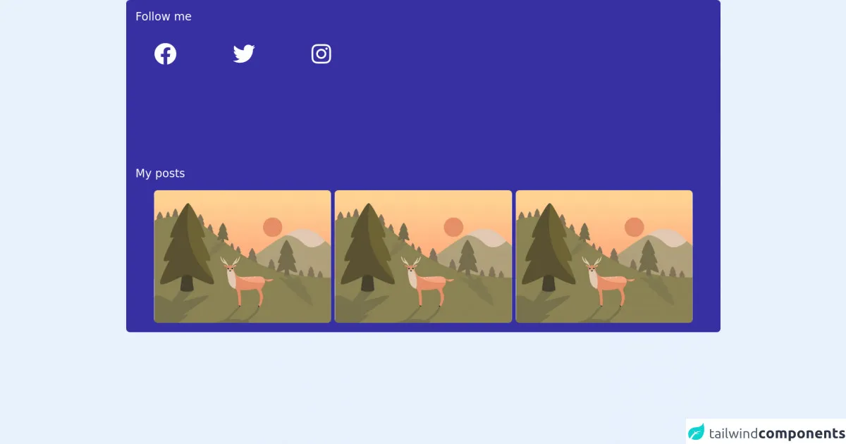
- The preview of Grid template rows ui component.
- The source code of Grid template rows ui component.
- How to create a Grid template rows with Tailwind CSS?
- Conclusion
What is Tailwind CSS?
Tailwind CSS is a utility-first CSS framework that allows developers to quickly and easily build custom user interfaces. It provides a set of pre-defined classes that can be used to style HTML elements without having to write any CSS from scratch.
The description of Grid template rows ui component
Grid template rows is a UI component that allows developers to create a grid layout with rows that have a fixed height. This is useful for creating a consistent and organized layout for content such as images or text.
Why use Tailwind CSS to create a Grid template rows ui component?
Tailwind CSS provides a set of pre-defined classes that can be used to create grid layouts quickly and easily. This saves developers time and effort compared to writing CSS from scratch. Additionally, Tailwind CSS is highly customizable, allowing developers to create unique and personalized UI designs.
The preview of Grid template rows ui component.
To create a grid template rows UI component with Tailwind CSS, we will use a combination of the grid and h- classes. The grid class is used to create a grid container, while the h- classes are used to set the height of each row.
Free download of the Grid template rows's source code
The source code of Grid template rows ui component.
The source code for the Grid template rows UI component is shown below. We use the grid class to create a grid container with three rows. Each row has a height of h-24, which sets the height to 6rem.
<link rel="stylesheet" href="https://cdnjs.cloudflare.com/ajax/libs/font-awesome/5.15.4/css/all.min.css">

<!-- This is an example component divided with grid template rows and fontawesome icons -->
<!-- More info: https://tailwindcss.com/docs/grid-template-rows   -->
<div class="bg-indigo-800 dark:bg-light_secondary rounded-lg py-5 px-5">
	<div class="grid grid-rows-2 gap-5">
		<div class="row-span-1">
			<h1 class="text-1xl md:text-2xl text-white mb-5">Follow me</h1>
			<div class="grid grid-cols-3 gap-2 px-10">
				<div class="flex justify-between items-center mt-5">
					<!-- Facebook -->
					<a class="cursor-pointer items-center" href="#" target="_blank">
						<div
							class="text-white hover:text-blue-600 rounded-full hover:scale-105 transform transition-all duration-500">
							<i class="fab fa-facebook text-5xl"></i>
						</div>
					</a>
					<!-- Facebook -->
					<!-- Twitter -->
					<a class="cursor-pointer items-center" href="#" target="_blank">
						<div
							class="text-white hover:text-blue-400 rounded-full hover:scale-105 transform transition-all duration-500">
							<i class="fab fa-twitter text-5xl"></i>
						</div>
					</a>
					<!-- Twitter -->
					<!-- Instagram -->
					<a class="cursor-pointer items-center" href="#" target="_blank">
						<div
							class="text-white hover:text-pink-600 rounded-full hover:scale-105 transform transition-all duration-500">
							<i class="fab fa-instagram text-5xl"></i>
						</div>
					</a>
					<!-- Instagram -->
				</div>
			</div>
		</div>
		<div class="row-span-2">
			<h1 class="text-1xl md:text-2xl text-white mb-5">My posts</h1>
			<div class="grid grid-cols-3 px-10 gap-2">
				<div class="flex justify-center items-center">
					<a class="cursor-pointer" href="#">
						<div class="hover:scale-105 transform transition-all duration-500">
							<img class="h-30 rounded-lg"
								src="https://cdn.pixabay.com/photo/2020/07/21/16/24/landscape-5426755_960_720.jpg" alt="image" />
						</div>
					</a>
				</div>
			</div>
		</div>
	</div>
</div>
How to create a Grid template rows with Tailwind CSS?
To create a Grid template rows UI component with Tailwind CSS, follow the steps below:
- Create a new HTML file and add the following code to create a grid container:
<div class="grid grid-cols-3 gap-4">
  <div class="bg-gray-100"></div>
  <div class="bg-gray-200"></div>
  <div class="bg-gray-300"></div>
</div>
- Add the
h-classes to set the height of each row. For example, to set the height of each row to 6rem, add theh-24class:
<div class="grid grid-cols-3 gap-4">
  <div class="bg-gray-100 h-24"></div>
  <div class="bg-gray-200 h-24"></div>
  <div class="bg-gray-300 h-24"></div>
</div>
- Customize the grid layout as needed using the pre-defined Tailwind CSS classes.
Conclusion
In this article, we have discussed how to create a Grid template rows UI component with Tailwind CSS. By using a combination of pre-defined classes, developers can quickly and easily create custom grid layouts with fixed row heights. Tailwind CSS is a powerful and flexible CSS framework that can help developers create beautiful and responsive user interfaces with minimal effort.