- Published on
6 Easy Ways To Build A Group List With Tailwind CSS
- What is Tailwind CSS?
- The description of Group list ui component
- Why use Tailwind CSS to create a Group list ui component?
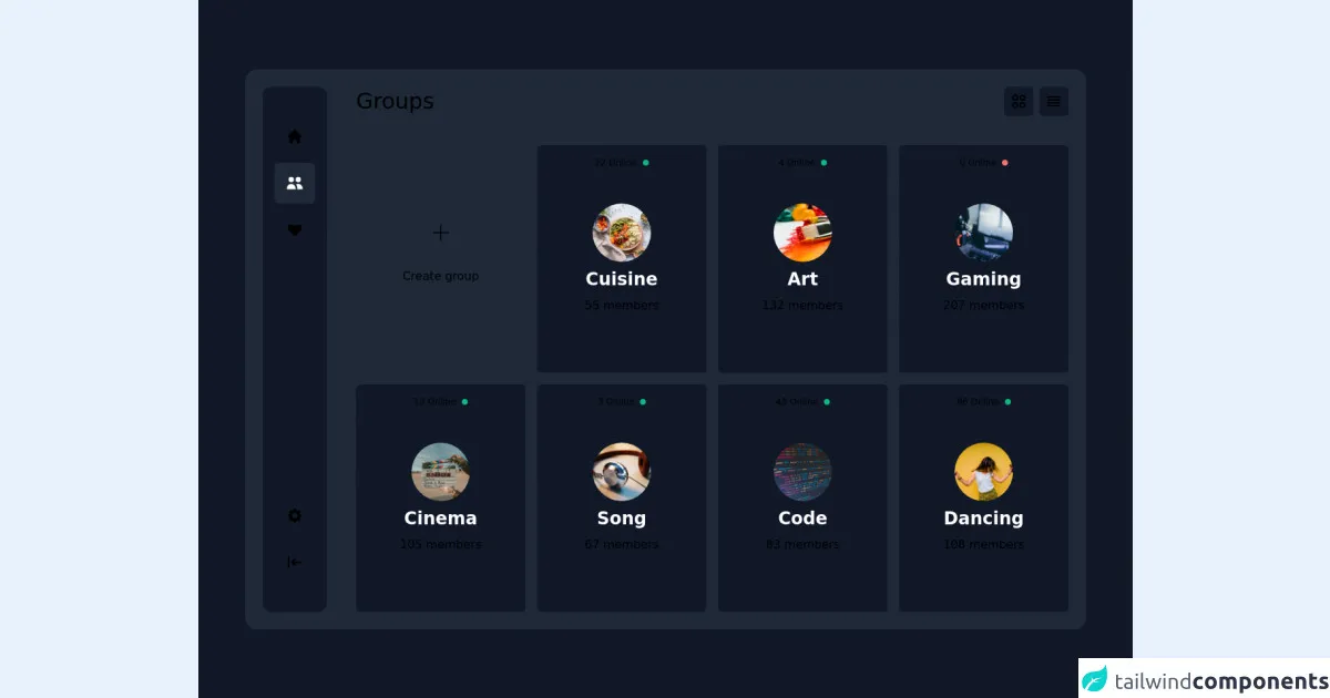
- The preview of Group list ui component
- The source code of Group list ui component
- How to create a Group list with Tailwind CSS?
- 1. Set up the HTML structure
- 2. Add images to the list items
- 3. Add text to the list items
- 4. Customize the styles
- Conclusion
As a FrontEnd technology blogger, it is important to stay up to date with the latest trends and tools in the industry. One of the most popular tools in recent years has been Tailwind CSS. Tailwind CSS is a utility-first CSS framework that makes it easy to create responsive and customizable user interfaces. In this article, we will explore how to use Tailwind CSS to create a Group list ui component.
What is Tailwind CSS?
Tailwind CSS is a utility-first CSS framework that provides a set of pre-defined CSS classes that can be used to style HTML elements. It is designed to make it easy to create responsive and customizable user interfaces without having to write custom CSS code. Tailwind CSS is used by many popular websites and applications, including GitHub, Shopify, and Discord.
The description of Group list ui component
A Group list ui component is a list of items that are grouped together based on a common attribute. For example, a list of products can be grouped by category or price range. Group lists are commonly used in e-commerce websites and applications to help users navigate through a large number of items.
Why use Tailwind CSS to create a Group list ui component?
Tailwind CSS provides a set of pre-defined CSS classes that can be used to create a Group list ui component quickly and easily. These classes can be customized to match the design of your website or application, making it easy to create a unique and professional-looking Group list.
The preview of Group list ui component
To create a Group list ui component with Tailwind CSS, we will use a combination of HTML and CSS classes. The HTML code for a basic Group list might look like this:
Free download of the Group list's source code
The source code of Group list ui component
To create a Group list ui component with Tailwind CSS, we will use a combination of HTML and CSS classes. The CSS code for a basic Group list might look like this:
<div class="bg-gray-900 min-h-screen flex items-center justify-center">
  <div class="bg-gray-800 flex-1 flex flex-col space-y-5 lg:space-y-0 lg:flex-row lg:space-x-10 max-w-6xl sm:p-6 sm:my-2 sm:mx-4 sm:rounded-2xl">
    <!-- Navigation -->
    <div class="bg-gray-900 px-2 lg:px-4 py-2 lg:py-10 sm:rounded-xl flex lg:flex-col justify-between">
      <nav class="flex items-center flex-row space-x-2 lg:space-x-0 lg:flex-col lg:space-y-2">
        <a class="text-white/50 p-4 inline-flex justify-center rounded-md hover:bg-gray-800 hover:text-white smooth-hover" href="#">
          <svg xmlns="http://www.w3.org/2000/svg" class="h-5 w-5 sm:h-6 sm:w-6" viewBox="0 0 20 20" fill="currentColor">
            <path d="M10.707 2.293a1 1 0 00-1.414 0l-7 7a1 1 0 001.414 1.414L4 10.414V17a1 1 0 001 1h2a1 1 0 001-1v-2a1 1 0 011-1h2a1 1 0 011 1v2a1 1 0 001 1h2a1 1 0 001-1v-6.586l.293.293a1 1 0 001.414-1.414l-7-7z" />
          </svg>
        </a>
        <!-- Active: bg-gray-800 text-white, Not active: text-white/50 -->
        <a class="bg-gray-800 text-white p-4 inline-flex justify-center rounded-md" href="#">
          <svg xmlns="http://www.w3.org/2000/svg" class="h-5 w-5 sm:h-6 sm:w-6" viewBox="0 0 20 20" fill="currentColor">
            <path d="M9 6a3 3 0 11-6 0 3 3 0 016 0zM17 6a3 3 0 11-6 0 3 3 0 016 0zM12.93 17c.046-.327.07-.66.07-1a6.97 6.97 0 00-1.5-4.33A5 5 0 0119 16v1h-6.07zM6 11a5 5 0 015 5v1H1v-1a5 5 0 015-5z" />
          </svg>
        </a>
        <a class="text-white/50 p-4 inline-flex justify-center rounded-md hover:bg-gray-800 hover:text-white smooth-hover" href="#">
          <svg xmlns="http://www.w3.org/2000/svg" class="h-5 w-5 sm:h-6 sm:w-6" viewBox="0 0 20 20" fill="currentColor">
            <path fill-rule="evenodd" d="M3.172 5.172a4 4 0 015.656 0L10 6.343l1.172-1.171a4 4 0 115.656 5.656L10 17.657l-6.828-6.829a4 4 0 010-5.656z" clip-rule="evenodd" />
          </svg>
        </a>
      </nav>
      <div class="flex items-center flex-row space-x-2 lg:space-x-0 lg:flex-col lg:space-y-2">
        <a class="text-white/50 p-4 inline-flex justify-center rounded-md hover:bg-gray-800 hover:text-white smooth-hover" href="#">
          <svg xmlns="http://www.w3.org/2000/svg" class="h-5 w-5 sm:h-6 sm:w-6" viewBox="0 0 20 20" fill="currentColor">
            <path fill-rule="evenodd" d="M11.49 3.17c-.38-1.56-2.6-1.56-2.98 0a1.532 1.532 0 01-2.286.948c-1.372-.836-2.942.734-2.106 2.106.54.886.061 2.042-.947 2.287-1.561.379-1.561 2.6 0 2.978a1.532 1.532 0 01.947 2.287c-.836 1.372.734 2.942 2.106 2.106a1.532 1.532 0 012.287.947c.379 1.561 2.6 1.561 2.978 0a1.533 1.533 0 012.287-.947c1.372.836 2.942-.734 2.106-2.106a1.533 1.533 0 01.947-2.287c1.561-.379 1.561-2.6 0-2.978a1.532 1.532 0 01-.947-2.287c.836-1.372-.734-2.942-2.106-2.106a1.532 1.532 0 01-2.287-.947zM10 13a3 3 0 100-6 3 3 0 000 6z" clip-rule="evenodd" />
          </svg>
        </a>
        <a class="text-white/50 p-4 inline-flex justify-center rounded-md hover:bg-gray-800 hover:text-white smooth-hover" href="#">
          <svg xmlns="http://www.w3.org/2000/svg" class="h-5 w-5 sm:h-6 sm:w-6" viewBox="0 0 20 20" fill="currentColor">
            <path fill-rule="evenodd" d="M3 3a1 1 0 011 1v12a1 1 0 11-2 0V4a1 1 0 011-1zm7.707 3.293a1 1 0 010 1.414L9.414 9H17a1 1 0 110 2H9.414l1.293 1.293a1 1 0 01-1.414 1.414l-3-3a1 1 0 010-1.414l3-3a1 1 0 011.414 0z" clip-rule="evenodd" />
          </svg>
        </a>
      </div>
    </div>
    <!-- Content -->
    <div class="flex-1 px-2 sm:px-0">
      <div class="flex justify-between items-center">
        <h3 class="text-3xl font-extralight text-white/50">Groups</h3>
        <div class="inline-flex items-center space-x-2">
          <a class="bg-gray-900 text-white/50 p-2 rounded-md hover:text-white smooth-hover" href="#">
            <svg xmlns="http://www.w3.org/2000/svg" class="h-6 w-6" fill="none" viewBox="0 0 24 24" stroke="currentColor">
              <path stroke-linecap="round" stroke-linejoin="round" stroke-width="2" d="M4 6a2 2 0 012-2h2a2 2 0 012 2v2a2 2 0 01-2 2H6a2 2 0 01-2-2V6zM14 6a2 2 0 012-2h2a2 2 0 012 2v2a2 2 0 01-2 2h-2a2 2 0 01-2-2V6zM4 16a2 2 0 012-2h2a2 2 0 012 2v2a2 2 0 01-2 2H6a2 2 0 01-2-2v-2zM14 16a2 2 0 012-2h2a2 2 0 012 2v2a2 2 0 01-2 2h-2a2 2 0 01-2-2v-2z" />
            </svg>
          </a>
          <a class="bg-gray-900 text-white/50 p-2 rounded-md hover:text-white smooth-hover" href="#">
            <svg xmlns="http://www.w3.org/2000/svg" class="h-6 w-6" fill="none" viewBox="0 0 24 24" stroke="currentColor">
              <path stroke-linecap="round" stroke-linejoin="round" stroke-width="2" d="M4 6h16M4 10h16M4 14h16M4 18h16" />
            </svg>
          </a>
        </div>
      </div>
      <div class="mb-10 sm:mb-0 mt-10 grid gap-4 grid-cols-1 sm:grid-cols-2 md:grid-cols-3 lg:grid-cols-4">
        <div class="group bg-gray-900/30 py-20 px-4 flex flex-col space-y-2 items-center cursor-pointer rounded-md hover:bg-gray-900/40 hover:smooth-hover">
          <a class="bg-gray-900/70 text-white/50 group-hover:text-white group-hover:smooth-hover flex w-20 h-20 rounded-full items-center justify-center" href="#">
            <svg xmlns="http://www.w3.org/2000/svg" class="h-10 w-10" fill="none" viewBox="0 0 24 24" stroke="currentColor">
              <path stroke-linecap="round" stroke-linejoin="round" stroke-width="1" d="M12 6v6m0 0v6m0-6h6m-6 0H6" />
            </svg>
          </a>
          <a class="text-white/50 group-hover:text-white group-hover:smooth-hover text-center" href="#">Create group</a>
        </div>
        <div class="relative group bg-gray-900 py-10 sm:py-20 px-4 flex flex-col space-y-2 items-center cursor-pointer rounded-md hover:bg-gray-900/80 hover:smooth-hover">
          <img class="w-20 h-20 object-cover object-center rounded-full" src="https://images.unsplash.com/photo-1547592180-85f173990554?ixid=MnwxMjA3fDB8MHxwaG90by1wYWdlfHx8fGVufDB8fHx8&ixlib=rb-1.2.1&auto=format&fit=crop&w=1170&q=80" alt="cuisine" />
          <h4 class="text-white text-2xl font-bold capitalize text-center">Cuisine</h4>
          <p class="text-white/50">55 members</p>
          <p class="absolute top-2 text-white/20 inline-flex items-center text-xs">22 Online <span class="ml-2 w-2 h-2 block bg-green-500 rounded-full group-hover:animate-pulse"></span></p>
        </div>
        <div class="relative group bg-gray-900 py-10 sm:py-20 px-4 flex flex-col space-y-2 items-center cursor-pointer rounded-md hover:bg-gray-900/80 hover:smooth-hover">
          <img class="w-20 h-20 object-cover object-center rounded-full" src="https://images.unsplash.com/photo-1513364776144-60967b0f800f?ixid=MnwxMjA3fDB8MHxwaG90by1wYWdlfHx8fGVufDB8fHx8&ixlib=rb-1.2.1&auto=format&fit=crop&w=1171&q=80" alt="art" />
          <h4 class="text-white text-2xl font-bold capitalize text-center">Art</h4>
          <p class="text-white/50">132 members</p>
          <p class="absolute top-2 text-white/20 inline-flex items-center text-xs">4 Online <span class="ml-2 w-2 h-2 block bg-green-500 rounded-full group-hover:animate-pulse"></span></p>
        </div>
        <div class="relative group bg-gray-900 py-10 sm:py-20 px-4 flex flex-col space-y-2 items-center cursor-pointer rounded-md hover:bg-gray-900/80 hover:smooth-hover">
          <img class="w-20 h-20 object-cover object-center rounded-full" src="https://images.unsplash.com/photo-1560419015-7c427e8ae5ba?ixlib=rb-1.2.1&ixid=MnwxMjA3fDB8MHxwaG90by1wYWdlfHx8fGVufDB8fHx8&auto=format&fit=crop&w=1170&q=80" alt="gaming" />
          <h4 class="text-white text-2xl font-bold capitalize text-center">Gaming</h4>
          <p class="text-white/50">207 members</p>
          <p class="absolute top-2 text-white/20 inline-flex items-center text-xs">0 Online <span class="ml-2 w-2 h-2 block bg-red-400 rounded-full group-hover:animate-pulse"></span></p>
        </div>
        <div class="relative group bg-gray-900 py-10 sm:py-20 px-4 flex flex-col space-y-2 items-center cursor-pointer rounded-md hover:bg-gray-900/80 hover:smooth-hover">
          <img class="w-20 h-20 object-cover object-center rounded-full" src="https://images.unsplash.com/photo-1485846234645-a62644f84728?ixlib=rb-1.2.1&ixid=MnwxMjA3fDB8MHxwaG90by1wYWdlfHx8fGVufDB8fHx8&auto=format&fit=crop&w=1159&q=80" alt="cinema" />
          <h4 class="text-white text-2xl font-bold capitalize text-center">cinema</h4>
          <p class="text-white/50">105 members</p>
          <p class="absolute top-2 text-white/20 inline-flex items-center text-xs">12 Online <span class="ml-2 w-2 h-2 block bg-green-500 rounded-full group-hover:animate-pulse"></span></p>
        </div>
        <div class="relative group bg-gray-900 py-10 sm:py-20 px-4 flex flex-col space-y-2 items-center cursor-pointer rounded-md hover:bg-gray-900/80 hover:smooth-hover">
          <img class="w-20 h-20 object-cover object-center rounded-full" src="https://images.unsplash.com/photo-1484704849700-f032a568e944?ixid=MnwxMjA3fDB8MHxwaG90by1wYWdlfHx8fGVufDB8fHx8&ixlib=rb-1.2.1&auto=format&fit=crop&w=1170&q=80" alt="song" />
          <h4 class="text-white text-2xl font-bold capitalize text-center">Song</h4>
          <p class="text-white/50">67 members</p>
          <p class="absolute top-2 text-white/20 inline-flex items-center text-xs">3 Online <span class="ml-2 w-2 h-2 block bg-green-500 rounded-full group-hover:animate-pulse"></span></p>
        </div>
        <div class="relative group bg-gray-900 py-10 sm:py-20 px-4 flex flex-col space-y-2 items-center cursor-pointer rounded-md hover:bg-gray-900/80 hover:smooth-hover">
          <img class="w-20 h-20 object-cover object-center rounded-full" src="https://images.unsplash.com/photo-1542831371-29b0f74f9713?ixid=MnwxMjA3fDB8MHxwaG90by1wYWdlfHx8fGVufDB8fHx8&ixlib=rb-1.2.1&auto=format&fit=crop&w=1170&q=80" alt="code" />
          <h4 class="text-white text-2xl font-bold capitalize text-center">Code</h4>
          <p class="text-white/50">83 members</p>
          <p class="absolute top-2 text-white/20 inline-flex items-center text-xs">43 Online <span class="ml-2 w-2 h-2 block bg-green-500 rounded-full group-hover:animate-pulse"></span></p>
        </div>
        <div class="relative group bg-gray-900 py-10 sm:py-20 px-4 flex flex-col space-y-2 items-center cursor-pointer rounded-md hover:bg-gray-900/80 hover:smooth-hover">
          <img class="w-20 h-20 object-cover object-center rounded-full" src="https://images.unsplash.com/photo-1533147670608-2a2f9775d3a4?ixid=MnwxMjA3fDB8MHxwaG90by1wYWdlfHx8fGVufDB8fHx8&ixlib=rb-1.2.1&auto=format&fit=crop&w=1170&q=80" alt="dancing" />
          <h4 class="text-white text-2xl font-bold capitalize text-center">Dancing</h4>
          <p class="text-white/50">108 members</p>
          <p class="absolute top-2 text-white/20 inline-flex items-center text-xs">86 Online <span class="ml-2 w-2 h-2 block bg-green-500 rounded-full group-hover:animate-pulse"></span></p>
        </div>
      </div>
    </div>
  </div>
</div>
How to create a Group list with Tailwind CSS?
Now that we have seen the HTML and CSS code for a basic Group list, let's explore how to create a more advanced Group list with Tailwind CSS.
1. Set up the HTML structure
The first step is to set up the HTML structure for the Group list. We will use an unordered list (<ul>) to contain the list items (<li>). Each list item will contain a container (<div>) that will hold the content of the item.
<ul class="divide-y divide-gray-200">
  <li class="py-4">
    <div>
      <!-- Item content goes here -->
    </div>
  </li>
  <li class="py-4">
    <div>
      <!-- Item content goes here -->
    </div>
  </li>
  <!-- More list items -->
</ul>
2. Add images to the list items
If your Group list includes images, you can use the <img> tag to add them to the list items. You can use the h-8 and w-8 classes to set the height and width of the images.
<ul class="divide-y divide-gray-200">
  <li class="py-4">
    <div class="flex space-x-3">
      <img class="h-8 w-8 rounded-full" src="{{__placeholder1__}}" alt="">
      <div>
        <!-- Item content goes here -->
      </div>
    </div>
  </li>
  <li class="py-4">
    <div class="flex space-x-3">
      <img class="h-8 w-8 rounded-full" src="{{__placeholder1__}}" alt="">
      <div>
        <!-- Item content goes here -->
      </div>
    </div>
  </li>
  <!-- More list items -->
</ul>
3. Add text to the list items
To add text to the list items, you can use the <h3> and <p> tags. You can use the text-sm and font-medium classes to set the font size and weight of the text.
<ul class="divide-y divide-gray-200">
  <li class="py-4">
    <div class="flex space-x-3">
      <img class="h-8 w-8 rounded-full" src="{{__placeholder1__}}" alt="">
      <div class="flex-1 space-y-1">
        <div class="flex items-center justify-between">
          <h3 class="text-sm font-medium">{{__placeholder1__}}</h3>
          <p class="text-sm text-gray-500">{{__placeholder1__}}</p>
        </div>
        <p class="text-sm text-gray-500">{{__placeholder1__}}</p>
      </div>
    </div>
  </li>
  <!-- More list items -->
</ul>
4. Customize the styles
Finally, you can customize the styles of the Group list by using Tailwind CSS classes. You can use the divide-y and divide-gray-200 classes to add a divider between the list items. You can use the py-4 class to add padding to the top and bottom of each list item. You can use the flex and space-x-3 classes to create a horizontal space between the image and the text. You can use the rounded-full class to make the images round.
<ul class="divide-y divide-gray-200">
  <li class="py-4">
    <div class="flex space-x-3">
      <img class="h-8 w-8 rounded-full" src="{{__placeholder1__}}" alt="">
      <div class="flex-1 space-y-1">
        <div class="flex items-center justify-between">
          <h3 class="text-sm font-medium">{{__placeholder1__}}</h3>
          <p class="text-sm text-gray-500">{{__placeholder1__}}</p>
        </div>
        <p class="text-sm text-gray-500">{{__placeholder1__}}</p>
      </div>
    </div>
  </li>
  <li class="py-4">
    <div class="flex space-x-3">
      <img class="h-8 w-8 rounded-full" src="{{__placeholder1__}}" alt="">
      <div class="flex-1 space-y-1">
        <div class="flex items-center justify-between">
          <h3 class="text-sm font-medium">{{__placeholder1__}}</h3>
          <p class="text-sm text-gray-500">{{__placeholder1__}}</p>
        </div>
        <p class="text-sm text-gray-500">{{__placeholder1__}}</p>
      </div>
    </div>
  </li>
  <!-- More list items -->
</ul>
Conclusion
In this article, we have explored how to use Tailwind CSS to create a Group list ui component. We have seen how Tailwind CSS provides a set of pre-defined CSS classes that can be used to create responsive and customizable user interfaces quickly and easily. By following the steps outlined in this article, you can create a professional-looking Group list for your website or application in no time.