- Published on
Learn How To Make A Google Styled Account Menu With Tailwind CSS Like an Expert
- What is Tailwind CSS?
- The description of Google Styled Account Menu ui component
- Why use Tailwind CSS to create a Google Styled Account Menu ui component?
- The preview of Google Styled Account Menu ui component
- The source code of Google Styled Account Menu ui component
- How to create a Google Styled Account Menu with Tailwind CSS?
- Conclusion
As a FrontEnd technology blogger, it is important to keep up with the latest trends and techniques in web development. One of the most popular CSS frameworks today is Tailwind CSS. In this article, we will learn how to create a Google Styled Account Menu ui component with Tailwind CSS.
What is Tailwind CSS?
Tailwind CSS is a utility-first CSS framework that provides a set of pre-defined classes to help you build custom designs quickly. It is different from other CSS frameworks because it does not have pre-designed components or templates. Instead, it provides a set of low-level utility classes that can be combined to create custom designs.
The description of Google Styled Account Menu ui component
The Google Styled Account Menu is a ui component that is commonly used on websites and web applications. It is a dropdown menu that displays a user's account information and allows them to sign out or manage their account settings.
Why use Tailwind CSS to create a Google Styled Account Menu ui component?
Tailwind CSS is a great choice for creating a Google Styled Account Menu ui component because it provides a set of utility classes that can be used to style the menu quickly and easily. Additionally, it is a lightweight framework that does not add unnecessary bloat to your code.
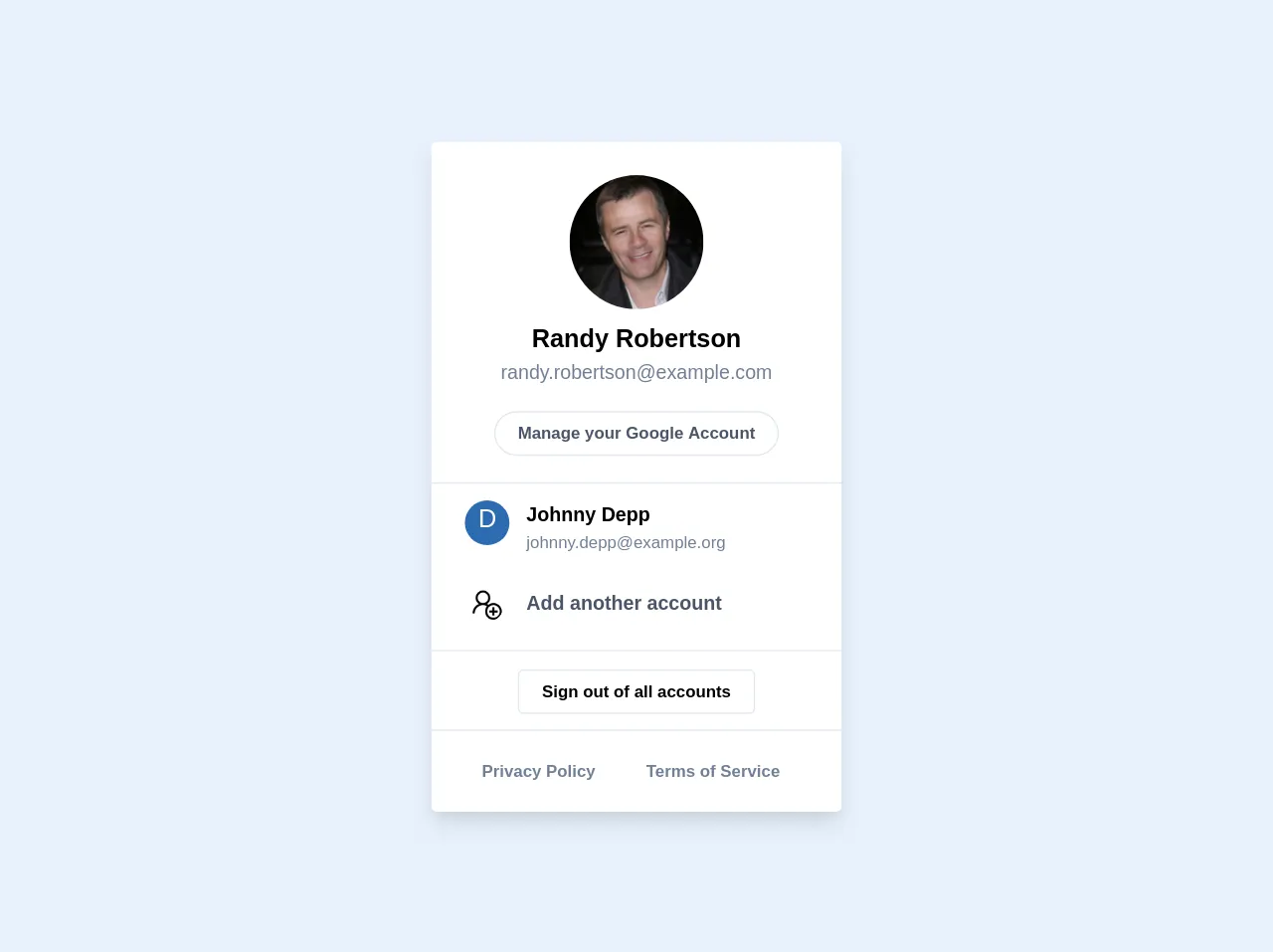
The preview of Google Styled Account Menu ui component
To create a Google Styled Account Menu ui component with Tailwind CSS, we will use a combination of utility classes to style the menu. The menu will have a dark background with white text and will display the user's name and profile picture.
Free download of the Google Styled Account Menu's source code
The source code of Google Styled Account Menu ui component
To create the Google Styled Account Menu ui component, we will use HTML and Tailwind CSS. The HTML will contain a dropdown menu with the user's name and profile picture, and the Tailwind CSS will be used to style the menu.
<div>

  <div class="bg-white sm:max-w-full max-w-md rounded overflow-hidden shadow-lg">
    <div class="text-center p-6  border-b">
      <img class="h-24 w-24 rounded-full mx-auto" src="https://randomuser.me/api/portraits/men/24.jpg" alt="Randy Robertson" />
      <p class="pt-2 text-lg font-semibold">
        Randy Robertson
      </p>
      <p class="text-sm text-gray-600">
        [email protected]
      </p>
      <div class="mt-5">
        <a href="#" class="border rounded-full py-2 px-4 text-xs font-semibold text-gray-700">Manage your Google Account</a>
      </div>
    </div>
    <div class="border-b">
      <!-- First list item -->
      <a href="#" class="px-6 py-3 hover:bg-gray-200 flex">
        <div class="w-8 h-8 bg-blue-700 rounded-full text-center align-middle text-white text-lg content-center">D</div>
        <div class="pl-3">
          <p class="text-sm font-semibold">
            Johnny Depp
          </p>
          <p class="text-xs text-gray-600">
            [email protected]
          </p>
        </div>
      </a>
      <!-- Second list item -->
      <a href="#" class="px-6 py-3 hover:bg-gray-200 flex">
        <div class="w-8 h-8 rounded-full text-center align-middle text-lg">
          <img class="w-6 h-6 rounded-full mx-auto" src="https://img.icons8.com/windows/50/000000/add-user-male.png">
        </div>
        <div class="pl-3">
          <p class="text-sm font-semibold text-gray-700">
            Add another account
          </p>
        </div>
      </a>
    </div>
    <div class="border-b">
      <!-- First list item -->
      <div class="px-6 py-4 text-center">
        <a href="#" class="border rounded py-2 px-4 text-xs font-semibold text-gray-70">
          Sign out of all accounts
        </a>
      </div>
    </div>

    <div class="px-6 py-4">
      <span class="inline-block rounded-full px-3 py-1 text-xs font-semibold text-gray-600 mr-2">Privacy Policy</span>
      <span class="inline-block rounded-full px-3 py-1 text-xs font-semibold text-gray-600 mr-2">Terms of Service</span>
    </div>
  </div>
</div>
How to create a Google Styled Account Menu with Tailwind CSS?
To create a Google Styled Account Menu with Tailwind CSS, follow these steps:
- Create a new HTML file and add the following code:
<div class="relative inline-block">
  <button class="text-white font-semibold py-2 px-4 rounded inline-flex items-center">
    <img class="h-8 w-8 rounded-full object-cover" src="https://source.unsplash.com/50x50/?portrait" alt="">
    <span class="ml-2 mr-1">{{username}}</span>
    <svg class="fill-current h-4 w-4" xmlns="http://www.w3.org/2000/svg" viewBox="0 0 20 20"><path d="M10 12a2 2 0 100-4 2 2 0 000 4z"/><path fill-rule="evenodd" d="M10 0a10 10 0 100 20 10 10 0 000-20zm0 18a8 8 0 110-16 8 8 0 010 16zm-1.5-7.5a1 1 0 011-1h3a1 1 0 110 2h-3a1 1 0 01-1-1zm0-3a1 1 0 011-1h3a1 1 0 110 2h-3a1 1 0 01-1-1zm0 6a1 1 0 011-1h1a1 1 0 110 2h-1a1 1 0 01-1-1z" clip-rule="evenodd"/></svg>
  </button>
  <div class="absolute right-0 mt-2 w-48 bg-white rounded-md shadow-lg z-10">
    <a href="#" class="block px-4 py-2 text-sm text-gray-700 hover:bg-gray-100">Account settings</a>
    <a href="#" class="block px-4 py-2 text-sm text-gray-700 hover:bg-gray-100">Support</a>
    <a href="#" class="block px-4 py-2 text-sm text-gray-700 hover:bg-gray-100">Sign out</a>
  </div>
</div>
Replace the
{{username}}placeholder with the user's name.Save the HTML file and open it in your web browser. You should see the Google Styled Account Menu ui component.
Conclusion
In this article, we learned how to create a Google Styled Account Menu ui component with Tailwind CSS. We saw how Tailwind CSS provides a set of utility classes that can be used to style the menu quickly and easily. We also saw how to use HTML and Tailwind CSS to create the menu. By following these steps, you can create your own Google Styled Account Menu ui component and customize it to fit your needs.