- Published on
Surprisingly Effective Ways To Build A Google Translate Clone Template With Tailwind CSS
- What is Tailwind CSS?
- The description of Google Translate Clone Template ui component
- Why use Tailwind CSS to create a Google Translate Clone Template ui component?
- The preview of Google Translate Clone Template ui component.
- The source code of Google Translate Clone Template ui component.
- How to create a Google Translate Clone Template with Tailwind CSS?
- Step 1: Set up the HTML structure
- Step 2: Add functionality to the Translate button
- Step 3: Customize the design
- Conclusion
Are you looking to build a Google Translate Clone Template with Tailwind CSS? Look no further! In this article, we will discuss the surprisingly effective ways to create a Google Translate Clone Template with Tailwind CSS.
What is Tailwind CSS?
Tailwind CSS is a utility-first CSS framework that allows developers to create custom designs quickly and efficiently. It provides a set of pre-defined classes that can be used to style HTML elements. With Tailwind CSS, developers can create complex designs without writing custom CSS code.
The description of Google Translate Clone Template ui component
The Google Translate Clone Template is a UI component that allows users to translate text from one language to another. It consists of two text areas, one for the original text and one for the translated text. It also includes a dropdown menu that allows users to select the language they want to translate to.
Why use Tailwind CSS to create a Google Translate Clone Template ui component?
Tailwind CSS is an excellent choice for creating a Google Translate Clone Template UI component because it provides a set of pre-defined classes that can be used to style HTML elements. This means that developers can create complex designs quickly and efficiently without writing custom CSS code. Additionally, Tailwind CSS is highly customizable, allowing developers to create unique designs that fit their specific needs.
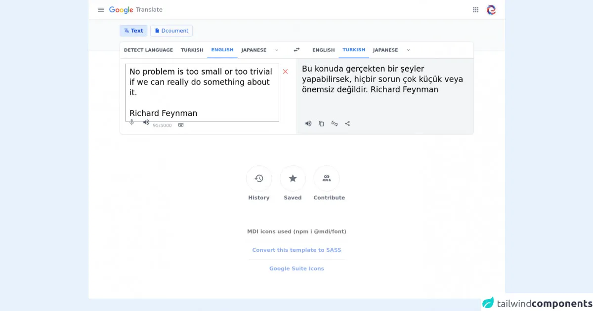
The preview of Google Translate Clone Template ui component.
To preview the Google Translate Clone Template UI component, check out the following screenshot:
Free download of the Google Translate Clone Template's source code
The source code of Google Translate Clone Template ui component.
To create the Google Translate Clone Template UI component, we will use HTML and Tailwind CSS. The source code for the component is as follows:
<!-- MDI Icons -->
<link rel="stylesheet" href="https://cdn.materialdesignicons.com/6.5.95/css/materialdesignicons.min.css" />

<!-- toastify.js -->
<link rel="stylesheet" href="https://cdnjs.cloudflare.com/ajax/libs/toastify-js/1.11.2/toastify.min.css" />
<script src="https://cdnjs.cloudflare.com/ajax/libs/toastify-js/1.11.2/toastify.min.js"></script>

<!-- AlpineJS -->
<script src="https://cdnjs.cloudflare.com/ajax/libs/alpinejs/3.8.1/cdn.min.js" defer></script>

<!-- translate.js -->
<script src="https://cdn.jsdelivr.net/npm/translate@1/translate.min.js"></script>

<!-- clipboard.js -->
<script src="https://cdnjs.cloudflare.com/ajax/libs/clipboard.js/2.0.10/clipboard.min.js"></script>

<style>
	header i,
	header i::before {
		font-size: 24px !important;
		height: 20px !important;
	}

	/* apps popup container */
	.apps-container {
		width: 310px;
		z-index: 1000;
	}

	/* apps container scrollbar */
	.custom-scrollbar::-webkit-scrollbar {
		width: 7px;
		background-color: #f5f5f5;
		margin-right: 5px;
	}

	.custom-scrollbar::-webkit-scrollbar:horizontal {
		height: 7px;
		background-color: #f5f5f5;
	}

	.custom-scrollbar::-webkit-scrollbar-track {
		/* box-shadow: inset 0 0 3px rgba(0, 0, 0, 0.2); */
		background-color: #fff;
		border-radius: 7px;
	}

	.custom-scrollbar::-webkit-scrollbar-thumb {
		border-radius: 10px;
		background-color: #e8e8e8;
		margin-right: 5px;
	}

	/* alpinejs */
	[x-cloak] {
		display: none !important;
	}

	.mdi-32px::before {
		font-size: 30px;
	}
</style>

<!-- Page Container -->
<div class="relative bg-white" x-cloak
	x-data="{ appsPopupIsActive: false, appsIsOpen: false, sourceText: 'No problem is too small or too trivial if we can really do something about it.\n\nRichard Feynman', translatedText: 'Translation' }"
	x-init="translatedText = await translation(sourceText); appInit();">
	<!-- Header Container -->
	<div class="flex">
		<header class="flex flex-grow px-5 py-2 border-b border-gray-200">
			<!-- Menu and Logo -->
			<div class="flex-none">
				<div class="flex flex-grow mt-1">
					<button class="hover:bg-gray-100 rounded-full w-9 h-9 mr-2
              transition-colors duration-100">
              <i class="mdi mdi-menu text-gray-500"></i>
            </button>

					<a href="https://translate.google.com.tr">
						<img src="https://www.gstatic.com/images/branding/googlelogo/svg/googlelogo_clr_74x24px.svg" alt="Logo"
                class="mt-2" />
            </a>

						<div class="ml-2 my-auto text-lg font-medium text-gray-500">
							Translate
						</div>
				</div>
			</div>

			<!-- Middle Space -->
			<div class="flex-grow"></div>

			<!-- Apps and Avatar -->
			<div class="flex-none">
				<!-- Buttons -->
				<div class="flex">
					<button class="hover:bg-gray-100 rounded-full
              w-9 h-9 mt-1 mr-2
              transition-colors duration-100" x-on:click="appsIsOpen = !appsIsOpen; appsPopupIsActive = appsIsOpen">
              <i class="mdi mdi-apps text-gray-500"></i>
            </button>

					<button class="m-1">
              <img src="https://avatars0.githubusercontent.com/u/17010054?v=4" alt="Avatar"
                class="object-cover w-9 h-9 rounded-full border shado" />
            </button>
				</div>

				<!-- Apps Container -->
				<div class="apps-container flex flex-wrap absolute bg-white shadow-md
              right-5 top-18 px-4 py-2 rounded-md border h-96
              overflow-x-hidden overflow-y-scroll custom-scrollbar" x-show="appsIsOpen"
					x-on:mouseleave="setTimeout(() => { appsIsOpen = appsPopupIsActive ? false : true }, 1000)"
					x-on:mouseenter="appsPopupIsActive = true">
					<template x-for="(app, index) in apps">
						<!-- App -->
						<div class="container h-20 w-20 mx-1 my-2
                hover:bg-blue-100 hover:cursor-pointer
                rounded-md transition-all duration-50" :title="app.name">
							<!-- Icon -->
							<img :src="app.icon" :alt="app.name" class="h-10 mx-auto mt-4" />

							<!-- Name -->
							<div class="text-sm text-center text-gray-700 select-none" x-text="app.name"></div>
						</div>
					</template>

					<button class="border border-blue-200 text-center text-blue-600
              hover:bg-blue-50/50 hover:text-blue-700
              mx-auto px-3 py-1 mb-4 mt-10 rounded
              transition-all duration-50">
              More from Google
            </button>
				</div>
			</div>
		</header>
	</div>

	<!-- Translator -->
	<div class="before:content-[''] before:bg-gray-50
        before:h-24 before:w-full before:absolute
        before:border-b before:border-gray-200
        before:z-0 z-10">
		<div class="container mx-auto px-0 lg:px-24">
			<!-- Translation Source Buttons -->
			<div class="flex">
				<div class="py-4 z-10">
					<!-- Active Button -->
					<button class="rounded px-3 py-1 bg-blue-100
            border border-blue-200 text-base text-blue-700 font-semibold
            focus:outline-none focus:ring-1 focus:ring-blue-600">
              <i class="mdi mdi-translate"></i>

              Text
            </button>

					<!-- Normal Button -->
					<button class="rounded px-3 py-1 ml-1
            border border-blue-200 text-base text-blue-600
            focus:outline-none focus:ring-1 focus:ring-blue-600">
              <i class="mdi mdi-file"></i>

              Dcoument
            </button>
				</div>
			</div>

			<div class="flex flex-row">
				<div class="pb-4 top-32 h z-10 w-full">
					<!-- Translator Container -->
					<div class="bg-white rounded-lg border border-gray-200
              drop-shadow-sm shadow-sm">
						<!-- Language Bar -->
						<div class="flex border-b border-gray-300">
							<!-- From Languages -->
							<div class="w-7/12">
								<nav class="flex flex-row rounded-tl-lg">
									<!-- Detect Language -->
									<button class="uppercase py-3.5 px-3
                      text-gray-600 font-semibold
                      text-xs lg:text-sm
                      rounded-tl-lg
                      hover:bg-gray-50 hover:text-gray-700
                      transition-colors duration-100">
                      Detect Language
                    </button>

									<!-- Lang: Turkish -->
									<button class="uppercase py-3.5 px-3
                      text-gray-600 font-semibold
                      text-xs lg:text-sm
                      hover:bg-gray-50 hover:text-gray-700
                      transition-colors duration-100">
                      Turkish
                    </button>

									<!-- Lang: English -->
									<button class="uppercase py-3.5 px-3
                      text-gray-600 font-semibold
                      text-xs lg:text-sm
                      hover:bg-gray-50 hover:text-gray-700
                      transition-colors duration-100
                      text-blue-500 hover:text-blue-600
                      border-b-2 border-blue-500 ">
                      English
                    </button>

									<!-- Lang: Turkish -->
									<button class="uppercase py-3.5 px-3
                      text-gray-600 font-semibold
                      text-xs lg:text-sm
                      hover:bg-gray-50 hover:text-gray-700
                      transition-colors duration-100">
                      Japanese
                    </button>

									<!-- More Languages -->
									<button class="hover:bg-gray-100 rounded-full w-10 h-10 my-auto
                      transition-colors duration-100">
                      <i class="mdi mdi-chevron-down text-gray-500"></i>
                    </button>
								</nav>
							</div>

							<!-- Switch Languages -->
							<div class="w-1/12">
								<div class="flex items-center justify-center">
									<button class="hover:bg-gray-100 rounded-full
                      w-10 h-10 mt-1
                      transition-colors duration-100">
                      <i class="mdi mdi-swap-horizontal mdi-24px text-gray-600"></i>
                    </button>
								</div>
							</div>

							<!-- To Languages -->
							<div class="w-7/12">
								<nav class="flex flex-row rounded-tl-lg">
									<!-- Lang: English -->
									<button class="uppercase py-3.5 px-3
                      text-gray-600 font-semibold
                      text-xs lg:text-sm
                      hover:bg-gray-50 hover:text-gray-700
                      transition-colors duration-100">
                      English
                    </button>

									<!-- Lang: Turkish -->
									<button class="uppercase py-3.5 px-3
                      text-gray-600 font-semibold
                      text-xs lg:text-sm
                      hover:bg-gray-50 hover:text-gray-700
                      transition-colors duration-100
                      text-blue-500 hover:text-blue-600
                      border-b-2 border-blue-500 ">
                      Turkish
                    </button>

									<!-- Lang: Japanese -->
									<button class="uppercase py-3.5 px-3
                      text-gray-600 font-semibold
                      text-xs lg:text-sm
                      hover:bg-gray-50 hover:text-gray-700
                      transition-colors duration-100">
                      Japanese
                    </button>

									<!-- More Languages -->
									<button class="hover:bg-gray-100 rounded-full w-10 h-10 my-auto
                      transition-colors duration-100">
                      <i class="mdi mdi-chevron-down text-gray-500"></i>
                    </button>
								</nav>
							</div>
						</div>

						<!-- Translate Inputs -->
						<div class="flex">
							<!-- Input Container -->
							<div class="w-6/12 border-r border-gray-200 p-4">
								<div class="h-40">
									<div class="flex flex-row">
										<!-- Input Area -->
										<textarea class="resize-none w-full focus:outline-none
                        text-base lg:text-2xl text-blak
                        custom-scrollbar" rows="5" spellcheck="false" maxlength="5000" x-model="sourceText"
                        x-on:keyup="translatedText = await translation(sourceText)"></textarea>

										<button class="hover:bg-gray-100 rounded-full
                          w-10 h-10 mt-1
                          transition-colors duration-100" title="Clear" x-show="sourceText.length"
                        x-on:click="sourceText = ''; translatedText = 'Translation';">
                        <i class="mdi mdi-window-close mdi-24px text-red-400"></i>
                      </button>
									</div>
								</div>

								<!-- Input Buttons -->
								<div class="h-10">
									<div class="flex flex-grow">
										<div class="flex-none">
											<button class="hover:bg-gray-200 rounded-full
                          w-10 h-10
                          transition-colors duration-100">
                          <i class="mdi mdi-microphone mdi-24px text-gray-400"></i>
                        </button>

											<button class="hover:bg-gray-200 rounded-full
                          w-10 h-10
                          transition-colors duration-100" x-show="sourceText.length">
                          <i class="mdi mdi-volume-high mdi-24px text-gray-600"></i>
                        </button>
										</div>

										<div class="grow">
											<div class="flex float-right">
												<div class="text-sm text-gray-400 pt-5"
													x-text="`${sourceText.length}/5000`">
													0/5000
												</div>

												<button class="hover:bg-gray-200 rounded-full
                            w-10 h-10 mt-2 ml-2
                            transition-colors duration-100">
                            <i class="mdi mdi-keyboard-outline mdi-18px text-gray-600"></i>
                          </button>
											</div>
										</div>
									</div>
								</div>
							</div>

							<!-- Output Container -->
							<div class="w-6/12 bg-gray-100 rounded-br-lg p-4">
								<div class="h-40">
									<!-- Output Area -->
									<div class="text-base lg:text-2xl text-black h-10"
										:class="{ 'opacity-60' : !sourceText.length }" x-text="translatedText"></div>
								</div>

								<!-- Output Buttons -->
								<div class="h-10">
									<div class="flex flex-grow" x-show="sourceText.length">
										<div class="flex-none">
											<button class="hover:bg-gray-200 rounded-full
                          w-10 h-10 mt-1
                          transition-colors duration-100">
                          <i class="mdi mdi-volume-high mdi-24px text-gray-600"></i>
                        </button>
										</div>

										<div class="grow">
											<div class="flex float-right">
												<button id="copy-translation" class="hover:bg-gray-200 rounded-full
                              w-10 h-10 mt-1
                              transition-colors duration-100" :data-clipboard-text="translatedText"
                            x-on:click="Toastify({text: 'Translation copied to your clipboard.', className: 'success rounded-md'}).showToast()">
                            <i class="mdi mdi-content-copy mdi-18px text-gray-600"></i>
                          </button>

												<button class="hover:bg-gray-200 rounded-full
                            w-10 h-10 mt-1
                            transition-colors duration-100">
                            <i class="mdi mdi-thumbs-up-down-outline mdi-18px text-gray-600"></i>
                          </button>

												<button class="hover:bg-gray-200 rounded-full
                            w-10 h-10 mt-1
                            transition-colors duration-100">
                            <i class="mdi mdi-share-variant mdi-18px text-gray-600"></i>
                          </button>
											</div>
										</div>
									</div>
								</div>
							</div>
						</div>
					</div>
				</div>
			</div>
		</div>
	</div>

	<!-- Bottom Buttons -->
	<div class="flex flex-wrap items-center justify-center space-x-4 mt-20">
		<!-- History -->
		<div class="flex flex-col">
			<button class="hover:bg-gray-50 rounded-full w-20 h-20 mr-2
          border border-gray-200
          transition-colors duration-100">
          <i class="mdi mdi-history mdi-32px text-gray-500"></i>
        </button>

			<div class="text-center text-sm mt-2 pr-2
          text-base text-gray-500 font-semibold">
				History
			</div>
		</div>

		<!-- Saved Translations -->
		<div class="flex flex-col">
			<button class="hover:bg-gray-50 rounded-full w-20 h-20 mr-2
          border border-gray-200
          transition-colors duration-100">
          <i class="mdi mdi-star mdi-32px text-gray-500"></i>
        </button>

			<div class="text-center text-sm mt-2 pr-2
          text-base text-gray-500 font-semibold">
				Saved
			</div>
		</div>

		<!-- Contribute -->
		<div class="flex flex-col">
			<button class="hover:bg-gray-50 rounded-full w-20 h-20 mr-2
          border border-gray-200
          transition-colors duration-100">
          <i class="mdi mdi-account-multiple-outline mdi-32px text-gray-500"></i>
        </button>

			<div class="text-center text-sm mt-2 pr-2
          text-base text-gray-500 font-semibold">
				Contribute
			</div>
		</div>
	</div>

	<!-- Notes -->
	<div class="flex opacity-50">
		<span class="text-center font-bold my-20 mx-auto">
        MDI icons used (npm i @mdi/font)

        <hr class="my-4">

        <a href="https://egoistdeveloper.github.io/twcss-to-sass-playground/" target="_blank" class="text-blue-600">
          Convert this template to SASS
        </a>

        <hr class="my-4">

        <a href="https://www.flaticon.com/packs/google-suite-16?word=google%20suite" target="_blank"
          class="text-blue-600">
          Google Suite Icons
        </a>
      </span>
	</div>
</div>

<script>
	function appInit() {
      new ClipboardJS('#copy-translation');
    }

    async function translation(sourceText) {
      if (sourceText) {
        if (sourceText.length > 0 && sourceText.length < 5001) {
          return await translate(sourceText, {
            from: 'en',
            to: 'tr',
            cache: 60 * 60 * 24
          });
        }
      }

      return 'Translation';
    }

    const apps = [{
        icon: "https://cdn-icons-png.flaticon.com/512/2965/2965306.png",
        name: "Gmail",
      },
      {
        icon: "https://cdn-icons-png.flaticon.com/512/2965/2965278.png",
        name: "Search",
      },
      {
        icon: "https://cdn-icons-png.flaticon.com/512/2965/2965363.png",
        name: "Youtube",
      },
      {
        icon: "https://cdn-icons-png.flaticon.com/512/2965/2965283.png",
        name: "Translate",
      },
      {
        icon: "https://cdn-icons-png.flaticon.com/512/2965/2965311.png",
        name: "Photos",
      },
      {
        icon: "https://cdn-icons-png.flaticon.com/512/2965/2965293.png",
        name: "Calendar",
      },
      {
        icon: "https://cdn-icons-png.flaticon.com/512/2965/2965323.png",
        name: "Drive",
      },
      {
        icon: "https://cdn-icons-png.flaticon.com/512/2965/2965281.png",
        name: "Maps",
      },
      {
        icon: "https://cdn-icons-png.flaticon.com/512/2965/2965274.png",
        name: "Hangouts",
      },
      {
        icon: "https://cdn-icons-png.flaticon.com/512/2965/2965358.png",
        name: "Keep",
      },
      {
        icon: "https://cdn-icons-png.flaticon.com/512/2965/2965317.png",
        name: "Adwords",
      },
      {
        icon: "https://cdn-icons-png.flaticon.com/512/2965/2965327.png",
        name: "Sheets",
      },
      {
        icon: "https://cdn-icons-png.flaticon.com/512/2965/2965330.png",
        name: "Business",
      },
      {
        icon: "https://cdn-icons-png.flaticon.com/512/2965/2965360.png",
        name: "Forms",
      },
      {
        icon: "https://cdn-icons-png.flaticon.com/512/2965/2965297.png",
        name: "News",
      },
    ];
</script>
How to create a Google Translate Clone Template with Tailwind CSS?
To create a Google Translate Clone Template with Tailwind CSS, follow these steps:
Step 1: Set up the HTML structure
The first step is to set up the HTML structure for the component. We will use two text areas and a dropdown menu to allow users to enter the text they want to translate and select the language they want to translate to.
<div class="flex flex-col items-center justify-center h-screen">
  <h1 class="text-3xl font-bold mb-4">Google Translate Clone</h1>
  <textarea class="w-1/2 h-32 p-2 border border-gray-300 rounded-lg mb-4" placeholder="Enter text to translate"></textarea>
  <div class="flex items-center mb-4">
    <select class="w-1/4 border border-gray-300 rounded-lg p-2 mr-2">
      <option value="en">English</option>
      <option value="fr">French</option>
      <option value="de">German</option>
      <option value="es">Spanish</option>
    </select>
    <button class="bg-blue-500 text-white rounded-lg px-4 py-2">Translate</button>
  </div>
  <textarea class="w-1/2 h-32 p-2 border border-gray-300 rounded-lg" placeholder="Translated text"></textarea>
</div>
In this code, we have used Tailwind CSS classes to style the HTML elements. The flex class is used to create a flex container, and the items-center and justify-center classes are used to center the content vertically and horizontally. The text-3xl and font-bold classes are used to style the heading, and the mb-4 class is used to add margin to the bottom of the heading.
The first text area is styled using the w-1/2, h-32, p-2, border, border-gray-300, and rounded-lg classes. These classes set the width, height, padding, border, and border radius of the text area.
The dropdown menu is styled using the w-1/4, border, border-gray-300, rounded-lg, and p-2 classes. These classes set the width, border, border radius, and padding of the dropdown menu.
The Translate button is styled using the bg-blue-500, text-white, rounded-lg, px-4, and py-2 classes. These classes set the background color, text color, border radius, padding, and margin of the button.
The second text area is styled using the same classes as the first text area.
Step 2: Add functionality to the Translate button
The next step is to add functionality to the Translate button. We will use JavaScript to handle the translation.
const translateButton = document.querySelector('button');
const originalText = document.querySelector('textarea:first-of-type');
const translatedText = document.querySelector('textarea:last-of-type');
const languageSelect = document.querySelector('select');

translateButton.addEventListener('click', () => {
  const text = originalText.value;
  const language = languageSelect.value;
  const url = `https://translate.googleapis.com/translate_a/single?client=gtx&sl=auto&tl=${language}&dt=t&q=${text}`;

  fetch(url)
    .then(response => response.json())
    .then(data => {
      const translated = data[0][0][0];
      translatedText.value = translated;
    })
    .catch(error => console.log(error));
});
In this code, we have used the querySelector method to select the Translate button, the original text area, the translated text area, and the language dropdown menu. We have also added an event listener to the Translate button that will execute when the button is clicked.
When the Translate button is clicked, the event listener will get the text from the original text area, the selected language from the dropdown menu, and the URL for the Google Translate API. It will then use the fetch method to send a request to the API and get the translated text. Finally, it will update the translated text area with the translated text.
Step 3: Customize the design
The final step is to customize the design of the component. We can use Tailwind CSS classes to change the colors, fonts, and other styles of the component.
body {
  background-color: #f5f5f5;
  font-family: 'Open Sans', sans-serif;
}

textarea:focus {
  outline: none;
  box-shadow: 0 0 0 2px #3182ce;
}

select:focus,
button:focus {
  outline: none;
  box-shadow: 0 0 0 2px #3182ce;
}
In this code, we have used CSS to change the background color and font family of the page. We have also added styles to remove the default focus styles from the text area, dropdown menu, and button and replace them with a blue border.
Conclusion
In conclusion, Tailwind CSS is an excellent choice for creating a Google Translate Clone Template UI component. With its pre-defined classes and customization options, developers can create complex designs quickly and efficiently. By following the steps outlined in this article, you can create your own Google Translate Clone Template with Tailwind CSS.