- Published on
How To Make A Google One - Get Update Card With Tailwind CSS In 5 Easy Steps
- What is Tailwind CSS?
- The description of Google One - Get Update Card UI component
- Why use Tailwind CSS to create a Google One - Get Update Card UI component?
- The preview of Google One - Get Update Card UI component
- The source code of Google One - Get Update Card UI component
- How to create a Google One - Get Update Card with Tailwind CSS?
- Step 1: Set up the HTML structure
- Step 2: Add Tailwind CSS classes
- Step 3: Customize the styles
- Step 4: Add dynamic content
- Step 5: Add JavaScript code
- Conclusion
As a FrontEnd technology blogger, it is essential to stay up-to-date with the latest trends and tools in the industry. One such tool that has gained immense popularity in recent times is Tailwind CSS. Tailwind CSS is a utility-first CSS framework that helps you create responsive and customizable UI components quickly. In this article, we will learn how to create a Google One - Get Update Card UI component using Tailwind CSS in five easy steps.
What is Tailwind CSS?
Tailwind CSS is a utility-first CSS framework that provides a set of pre-defined CSS classes that can be used to style HTML elements. It is designed to help developers create responsive and customizable UI components quickly. Tailwind CSS follows a functional approach, where each CSS class has a specific function, making it easier to understand and use.
The description of Google One - Get Update Card UI component
Google One is a subscription service that provides expanded storage, access to experts, and other benefits for Google products. The Get Update Card UI component is a part of the Google One website that displays the latest updates and news related to the subscription service. The UI component consists of a card that displays the update title, description, and date.
Why use Tailwind CSS to create a Google One - Get Update Card UI component?
Tailwind CSS provides a set of pre-defined CSS classes that can be used to create responsive and customizable UI components quickly. It eliminates the need to write custom CSS code, making the development process faster and more efficient. Additionally, Tailwind CSS follows a functional approach, making it easier to understand and use.
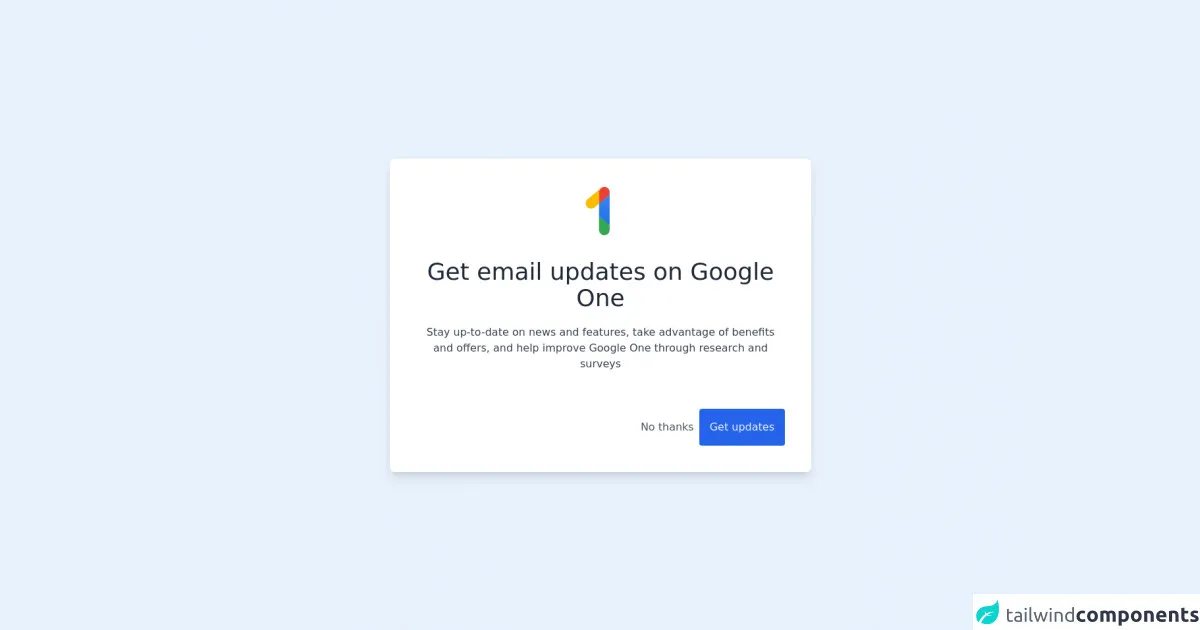
The preview of Google One - Get Update Card UI component
To create the Google One - Get Update Card UI component, we will use Tailwind CSS. The UI component consists of a card that displays the update title, description, and date. Here is a preview of what the UI component will look like:
Free download of the Google One - Get Update Card's source code
The source code of Google One - Get Update Card UI component
To create the Google One - Get Update Card UI component, we will use HTML and Tailwind CSS. Here is the source code for the UI component:
<div class="h-screen flex items-center justify-center">

  <card class="flex flex-col rounded-lg shadow-lg w-1/2 p-10 bg-white">

    <!-- Logo -->
    <div class="flex justify-center">
      <img src="https://ssl.gstatic.com/subscriptions/management/home/logo_one_48dp_1147f17d6d2f67ab3a9ce3c55600631b.svg" class="w-20 h-20"/>
    </div>

    <!-- Title -->
    <p class="text-center text-gray-800 text-4xl mt-8"> Get email updates on Google One </p>

    <!-- Description -->
    <p class="text-center text-gray-700 font-light mt-5"> Stay up-to-date on news and features, take advantage of benefits and offers, and help improve Google One through research and surveys </p>

    <!-- Buttons -->
    <div class="flex flex-row-reverse mt-14 items-end gap-5">

      <button class="hover:bg-blue-700 bg-blue-600 text-gray-100 p-4 rounded">
        Get updates
      </button>

      <button class="text-gray-600 hover:bg-gray-100 hover:text-gray-700 py-4 px-2">
        No thanks
      </button>

    </div>

  </card>

</div>
How to create a Google One - Get Update Card with Tailwind CSS?
Now that we have a basic understanding of what Tailwind CSS is and why we should use it let's dive into the steps to create the Google One - Get Update Card UI component.
Step 1: Set up the HTML structure
The first step is to set up the HTML structure for the UI component. We will use the div element to create a card that will contain the update title, description, and date. Here is the HTML code for the card:
<div class="bg-white shadow-lg rounded-lg overflow-hidden">
    <div class="p-4">
        <h3 class="text-lg font-medium text-gray-900">Update Title</h3>
        <p class="text-gray-600 mt-2">Update Description</p>
        <p class="text-gray-400 text-sm mt-2">Update Date</p>
    </div>
</div>
Step 2: Add Tailwind CSS classes
The next step is to add Tailwind CSS classes to the HTML elements to style them. We will use the bg-white, shadow-lg, rounded-lg, overflow-hidden, p-4, text-lg, font-medium, text-gray-900, text-gray-600, mt-2, text-gray-400, and text-sm classes to style the card and its contents. Here is the updated HTML code with Tailwind CSS classes:
<div class="bg-white shadow-lg rounded-lg overflow-hidden">
    <div class="p-4">
        <h3 class="text-lg font-medium text-gray-900">Update Title</h3>
        <p class="text-gray-600 mt-2">Update Description</p>
        <p class="text-gray-400 text-sm mt-2">Update Date</p>
    </div>
</div>
Step 3: Customize the styles
The third step is to customize the styles of the UI component according to the Google One - Get Update Card design. We will use the border-l-4, border-blue-500, bg-blue-50, text-blue-500, hover:bg-blue-100, and transition-colors classes to style the card. Here is the updated HTML code with the customized styles:
<div class="border-l-4 border-blue-500 bg-blue-50 hover:bg-blue-100 transition-colors shadow-lg rounded-lg overflow-hidden">
    <div class="p-4">
        <h3 class="text-lg font-medium text-blue-500">Update Title</h3>
        <p class="text-gray-600 mt-2">Update Description</p>
        <p class="text-gray-400 text-sm mt-2">Update Date</p>
    </div>
</div>
Step 4: Add dynamic content
The fourth step is to add dynamic content to the UI component. We will use JavaScript to fetch the latest updates and display them in the card. Here is the updated HTML code with dynamic content:
<div class="border-l-4 border-blue-500 bg-blue-50 hover:bg-blue-100 transition-colors shadow-lg rounded-lg overflow-hidden">
    <div class="p-4">
        <h3 class="text-lg font-medium text-blue-500" id="update-title"></h3>
        <p class="text-gray-600 mt-2" id="update-description"></p>
        <p class="text-gray-400 text-sm mt-2" id="update-date"></p>
    </div>
</div>
Step 5: Add JavaScript code
The final step is to add JavaScript code to fetch the latest updates and display them in the card. We will use the fetch API to fetch the updates from a JSON file and display them in the card. Here is the JavaScript code:
fetch('updates.json')
    .then(response => response.json())
    .then(data => {
        document.getElementById('update-title').innerHTML = data.title;
        document.getElementById('update-description').innerHTML = data.description;
        document.getElementById('update-date').innerHTML = data.date;
    });
Conclusion
In this article, we learned how to create a Google One - Get Update Card UI component using Tailwind CSS in five easy steps. Tailwind CSS is a powerful tool that can help you create responsive and customizable UI components quickly. By following the steps outlined in this article, you can create beautiful UI components that are easy to maintain and update.