- Published on
Learn How To Create A Google Login Page With Tailwind CSS from the Pros
- What is Tailwind CSS?
- The description of Google Login Page UI component
- Why use Tailwind CSS to create a Google Login Page UI component?
- The preview of Google Login Page UI component
- The source code of Google Login Page UI component
- How to create a Google Login Page with Tailwind CSS?
- Step 1: Set up your HTML
- Step 2: Add Tailwind CSS to your project
- Step 3: Add Tailwind CSS classes to your HTML
- Step 4: Customize your styles
- Conclusion
Are you looking to create a Google Login Page UI component for your website or application? Look no further than Tailwind CSS! In this article, we'll walk you through the process of creating a Google Login Page UI component using Tailwind CSS.
What is Tailwind CSS?
Tailwind CSS is a utility-first CSS framework that allows developers to quickly and easily create custom user interfaces. It provides a set of pre-defined CSS classes that can be used to style HTML elements. With Tailwind CSS, developers can create responsive and mobile-first designs without having to write custom CSS code.
The description of Google Login Page UI component
The Google Login Page UI component is a common feature on many websites and applications. It allows users to sign in to a website or application using their Google account. The Google Login Page UI component typically includes a form with fields for the user's email address and password, as well as buttons to submit the form or sign in with a different account.
Why use Tailwind CSS to create a Google Login Page UI component?
Tailwind CSS makes it easy to create custom user interfaces without having to write custom CSS code. It provides a set of pre-defined CSS classes that can be used to style HTML elements. This can save developers a lot of time and effort, as they don't have to spend hours writing and debugging custom CSS code.
Tailwind CSS also provides a responsive design system that allows developers to create mobile-first designs that look great on any device. This is important for the Google Login Page UI component, as many users will be accessing it from mobile devices.
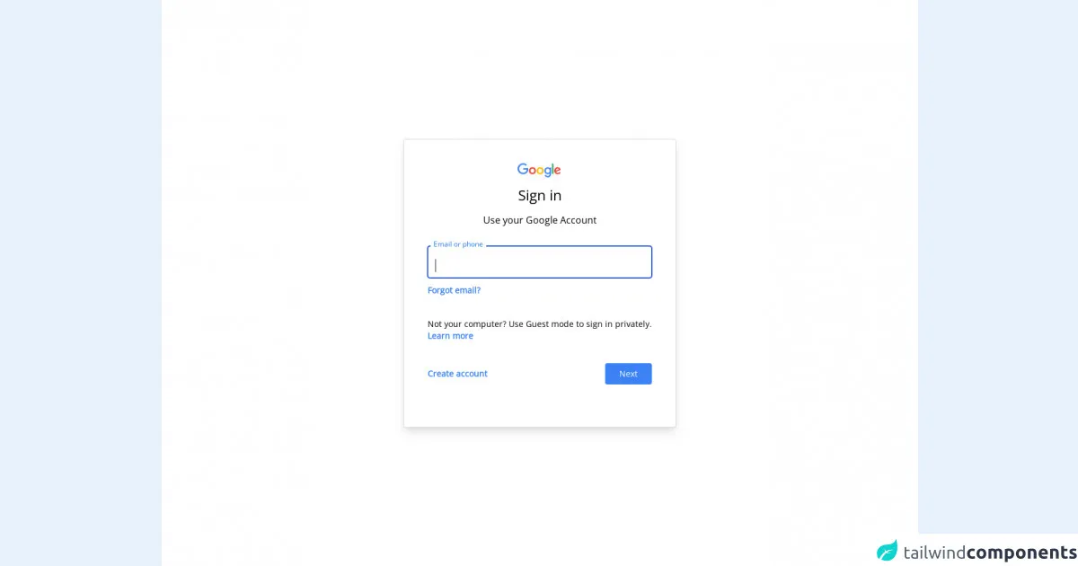
The preview of Google Login Page UI component
To give you an idea of what the Google Login Page UI component looks like, here's a preview:
Free download of the Google Login Page's source code
The source code of Google Login Page UI component
Here's the source code for the Google Login Page UI component:
<!DOCTYPE html>
<html lang="en" class="border-l">
<head>
    <meta charset="UTF-8">
    <link href="https://unpkg.com/tailwindcss@^2/dist/tailwind.min.css" rel="stylesheet">
    <link href="https://fonts.googleapis.com/css2?family=Open+Sans&display=swap" rel="stylesheet">
    <title>Login</title>
    <style>
        * {
            margin:0;
            padding:0;
            font-family: 'Open Sans', sans-serif;
        }
        .input {
            transition: border 0.2s ease-in-out;
            min-width: 280px
        }
        .input:focus+.label,
        .input:active+.label,
        .input.filled+.label {
            font-size: .75rem;
            transition: all 0.2s ease-out;
            top: -0.9rem;
            background-color: #fff;
            color: #1a73e8;
            padding: 0 5px 0 5px;
            margin: 0 5px 0 5px;
        }
        .label {
            transition: all 0.2s ease-out;
            top: 0.4rem;
            left: 0;
        }
    </style>
</head>
<body>
<div class="md:h-screen bg-white relative flex flex-col justify-center items-center">
    <div class="md:border md:border-gray-300 bg-white md:shadow-lg shadow-none rounded p-10" >
        <div class="flex flex-col items-center space-y-3">
            <svg viewBox="0 0 75 24" width="75" height="24" xmlns="http://www.w3.org/2000/svg" aria-hidden="true" class="l5Lhkf"><g id="qaEJec"><path fill="#ea4335" d="M67.954 16.303c-1.33 0-2.278-.608-2.886-1.804l7.967-3.3-.27-.68c-.495-1.33-2.008-3.79-5.102-3.79-3.068 0-5.622 2.41-5.622 5.96 0 3.34 2.53 5.96 5.92 5.96 2.73 0 4.31-1.67 4.97-2.64l-2.03-1.35c-.673.98-1.6 1.64-2.93 1.64zm-.203-7.27c1.04 0 1.92.52 2.21 1.264l-5.32 2.21c-.06-2.3 1.79-3.474 3.12-3.474z"></path></g><g id="YGlOvc"><path fill="#34a853" d="M58.193.67h2.564v17.44h-2.564z"></path></g><g id="BWfIk"><path fill="#4285f4" d="M54.152 8.066h-.088c-.588-.697-1.716-1.33-3.136-1.33-2.98 0-5.71 2.614-5.71 5.98 0 3.338 2.73 5.933 5.71 5.933 1.42 0 2.548-.64 3.136-1.36h.088v.86c0 2.28-1.217 3.5-3.183 3.5-1.61 0-2.6-1.15-3-2.12l-2.28.94c.65 1.58 2.39 3.52 5.28 3.52 3.06 0 5.66-1.807 5.66-6.206V7.21h-2.48v.858zm-3.006 8.237c-1.804 0-3.318-1.513-3.318-3.588 0-2.1 1.514-3.635 3.318-3.635 1.784 0 3.183 1.534 3.183 3.635 0 2.075-1.4 3.588-3.19 3.588z"></path></g><g id="e6m3fd"><path fill="#fbbc05" d="M38.17 6.735c-3.28 0-5.953 2.506-5.953 5.96 0 3.432 2.673 5.96 5.954 5.96 3.29 0 5.96-2.528 5.96-5.96 0-3.46-2.67-5.96-5.95-5.96zm0 9.568c-1.798 0-3.348-1.487-3.348-3.61 0-2.14 1.55-3.608 3.35-3.608s3.348 1.467 3.348 3.61c0 2.116-1.55 3.608-3.35 3.608z"></path></g><g id="vbkDmc"><path fill="#ea4335" d="M25.17 6.71c-3.28 0-5.954 2.505-5.954 5.958 0 3.433 2.673 5.96 5.954 5.96 3.282 0 5.955-2.527 5.955-5.96 0-3.453-2.673-5.96-5.955-5.96zm0 9.567c-1.8 0-3.35-1.487-3.35-3.61 0-2.14 1.55-3.608 3.35-3.608s3.35 1.46 3.35 3.6c0 2.12-1.55 3.61-3.35 3.61z"></path></g><g id="idEJde"><path fill="#4285f4" d="M14.11 14.182c.722-.723 1.205-1.78 1.387-3.334H9.423V8.373h8.518c.09.452.16 1.07.16 1.664 0 1.903-.52 4.26-2.19 5.934-1.63 1.7-3.71 2.61-6.48 2.61-5.12 0-9.42-4.17-9.42-9.29C0 4.17 4.31 0 9.43 0c2.83 0 4.843 1.108 6.362 2.56L14 4.347c-1.087-1.02-2.56-1.81-4.577-1.81-3.74 0-6.662 3.01-6.662 6.75s2.93 6.75 6.67 6.75c2.43 0 3.81-.972 4.69-1.856z"></path></g></svg>
            <span class="text-2xl font-semi-bold leading-normal" >Sign in</span>
            <p class="leading-normal">Use your Google Account</p>
        </div>
        <form class="my-8">
            <div class="relative mb-2">
                <input id="email" class="w-full rounded px-3 border border-gray-300 pt-5 pb-2 focus:border-blue-700 focus:ring-1 focus:ring-blue-700 focus:outline-none input active:outline-none" type="text" autofocus>
                <label for="email" class="label absolute mt-2 ml-3 leading-tighter text-gray-600 text-base cursor-text">Email or phone</label>
            </div>
            <div class="space-y-9">
                <div>
                    <a class="text-sm font-bold text-blue-500" href="#">Forgot email?</a>
                </div>
                <div class="text-sm">
                    <p>Not your computer? Use Guest mode to sign in privately.</p>
                    <a class="font-bold text-blue-500" href="#">Learn more</a>
                </div>
                <div class="text-sm flex justify-between items-center">
                    <a class="font-bold text-blue-500 py-2 px-2 rounded -ml-2 hover:bg-blue-50 hover:text-blue-700" href="#">Create account</a>
                    <button class="py-2 px-6 rounded text-white btn bg-blue-500 hover:bg-blue-600">Next</button>
                </div>
            </div>
        </form>
    </div>
</div>
</body>
</html>
How to create a Google Login Page with Tailwind CSS?
Now that you know why Tailwind CSS is a great choice for creating a Google Login Page UI component, let's walk through the steps to create one.
Step 1: Set up your HTML
The first step is to set up your HTML. You'll need to create a form with fields for the user's email address and password, as well as buttons to submit the form or sign in with a different account. Here's an example:
<form>
  <label for="email">Email</label>
  <input type="email" id="email" name="email" required>

  <label for="password">Password</label>
  <input type="password" id="password" name="password" required>

  <button type="submit">Sign in</button>
  <button>Sign in with a different account</button>
</form>
Step 2: Add Tailwind CSS to your project
The next step is to add Tailwind CSS to your project. You can do this by including the Tailwind CSS stylesheet in your HTML file:
<link rel="stylesheet" href="https://cdn.jsdelivr.net/npm/[email protected]/dist/tailwind.min.css">
Step 3: Add Tailwind CSS classes to your HTML
Now that you've set up your HTML and added Tailwind CSS to your project, it's time to start adding Tailwind CSS classes to your HTML. You can use Tailwind CSS classes to style your HTML elements. Here's an example:
<form class="max-w-md mx-auto">
  <label for="email" class="block font-medium text-sm text-gray-700">Email</label>
  <input type="email" id="email" name="email" required class="mt-1 block w-full rounded-md border-gray-300 shadow-sm focus:border-indigo-500 focus:ring focus:ring-indigo-500 focus:ring-opacity-50">

  <label for="password" class="block mt-4 font-medium text-sm text-gray-700">Password</label>
  <input type="password" id="password" name="password" required class="mt-1 block w-full rounded-md border-gray-300 shadow-sm focus:border-indigo-500 focus:ring focus:ring-indigo-500 focus:ring-opacity-50">

  <button type="submit" class="mt-4 w-full inline-flex items-center justify-center px-4 py-2 border border-transparent rounded-md shadow-sm text-base font-medium text-white bg-indigo-600 hover:bg-indigo-700 focus:outline-none focus:ring-2 focus:ring-offset-2 focus:ring-indigo-500">Sign in</button>
  <button class="mt-4 w-full inline-flex items-center justify-center px-4 py-2 border border-gray-300 rounded-md shadow-sm text-base font-medium text-gray-700 bg-white hover:bg-gray-50 focus:outline-none focus:ring-2 focus:ring-offset-2 focus:ring-indigo-500">Sign in with a different account</button>
</form>
In this example, we've added Tailwind CSS classes to style the form, labels, inputs, and buttons.
Step 4: Customize your styles
The final step is to customize your styles. You can do this by adding your own custom CSS code or by modifying the existing Tailwind CSS classes. Here's an example:
<form class="max-w-md mx-auto">
  <label for="email" class="block font-medium text-sm text-gray-700">Email</label>
  <input type="email" id="email" name="email" required class="mt-1 block w-full rounded-md border-gray-300 shadow-sm focus:border-indigo-500 focus:ring focus:ring-indigo-500 focus:ring-opacity-50">

  <label for="password" class="block mt-4 font-medium text-sm text-gray-700">Password</label>
  <input type="password" id="password" name="password" required class="mt-1 block w-full rounded-md border-gray-300 shadow-sm focus:border-indigo-500 focus:ring focus:ring-indigo-500 focus:ring-opacity-50">

  <button type="submit" class="mt-4 w-full inline-flex items-center justify-center px-4 py-2 border border-transparent rounded-md shadow-sm text-base font-medium text-white bg-indigo-600 hover:bg-indigo-700 focus:outline-none focus:ring-2 focus:ring-offset-2 focus:ring-indigo-500">Sign in</button>
  <button class="mt-4 w-full inline-flex items-center justify-center px-4 py-2 border border-gray-300 rounded-md shadow-sm text-base font-medium text-gray-700 bg-white hover:bg-gray-50 focus:outline-none focus:ring-2 focus:ring-offset-2 focus:ring-indigo-500">Sign in with a different account</button>
</form>

<style>
  /* Custom styles */
  .form label {
    color: #333;
  }

  .form input[type="email"],
  .form input[type="password"] {
    padding: 10px;
    font-size: 16px;
  }

  .form button {
    margin-top: 20px;
    padding: 10px;
    font-size: 16px;
    font-weight: bold;
    border-radius: 5px;
  }

  .form button[type="submit"] {
    background-color: #007bff;
    color: #fff;
  }

  .form button[type="submit"]:hover {
    background-color: #0062cc;
  }

  .form button[type="button"] {
    background-color: #f1f1f1;
    color: #333;
  }

  .form button[type="button"]:hover {
    background-color: #ddd;
  }
</style>
In this example, we've added custom styles to change the color of the labels, increase the font size of the inputs, and add a border radius to the buttons.
Conclusion
In this article, we've shown you how to create a Google Login Page UI component using Tailwind CSS. We've explained what Tailwind CSS is, why it's a great choice for creating user interfaces, and how to use it to create a Google Login Page UI component. We hope you found this article helpful and that you're now ready to start creating your own custom user interfaces with Tailwind CSS!