- Published on
Imagine You Make A Google One - Pricing With Tailwind CSS Like An Expert. Follow These 6 Steps To Get There
- What is Tailwind CSS?
- The description of Google One - Pricing ui component
- Why use Tailwind CSS to create a Google One - Pricing ui component?
- The preview of Google One - Pricing ui component.
- The source code of Google One - Pricing ui component.
- How to create a Google One - Pricing with Tailwind CSS?
- Step 1: Set up your project
- Step 2: Create the HTML structure
- Step 3: Style the HTML elements
- Step 4: Customize the styles
- Step 5: Add responsiveness
- Step 6: Add interactivity
- Conclusion
As a FrontEnd technology blogger, you may have heard of Tailwind CSS, a utility-first CSS framework that helps you create responsive and customizable designs with ease. In this article, we will walk you through the process of creating a Google One - Pricing UI component using Tailwind CSS.
What is Tailwind CSS?
Tailwind CSS is a utility-first CSS framework that provides you with pre-defined classes to style your HTML elements. It allows you to create custom designs by combining these classes, without having to write any CSS code. Tailwind CSS is highly customizable, and you can configure it to suit your specific needs.
The description of Google One - Pricing ui component
Google One is a subscription service offered by Google that provides expanded cloud storage and other benefits. The pricing page for Google One displays the different subscription plans available, along with their features and pricing. The UI component we will be creating is a replica of the Google One pricing page.
Why use Tailwind CSS to create a Google One - Pricing ui component?
Tailwind CSS is an excellent choice for creating UI components because it provides you with pre-defined classes that you can use to style your elements. This makes it easy to create custom designs without having to write any CSS code. Additionally, Tailwind CSS is highly customizable, which means you can tweak it to match your specific needs.
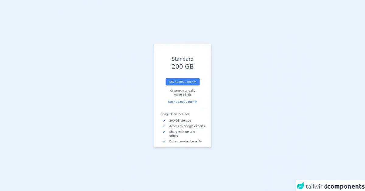
The preview of Google One - Pricing ui component.
To give you an idea of what we will be creating, here is a preview of the Google One pricing page UI component:
Free download of the Google One - Pricing's source code
The source code of Google One - Pricing ui component.
Here is the source code for the Google One pricing page UI component:
<div class="h-screen flex items-center justify-center">

  <card class="w-72 rounded-lg border shadow-md flex flex-col p-5 bg-white">

    <!-- Top Section -->
    <div class="flex flex-col items-center">

      <!-- Quota Name and Details -->
      <p class="mt-10 text-2xl font-light text-gray-700"> Standard </p>
      <p class="mt-1 text-3xl font-light text-gray-700"> 200 GB </p>

      <!-- Button -->
      <button class="mt-10 rounded py-2 px-4 bg-blue-500 text-white hover:bg-blue-700 hover:text-gray-50 text-sm">
        IDR 43,000 / month
      </button>

      <!-- Additional Offer -->
      <p class="mt-4 text-gray-700 text-sm font-light"> Or prepay anually </p>
      <p class="text-gray-800 text-sm font-light"> (save 17%): </p>
      <p class="mt-4 text-sm text-blue-600"> IDR 430,000 / month </p>

      <!-- Line -->
      <div class="h-0.5 bg-gray-200 w-full my-5"> </div>

    </div>

    <!-- Bottom Section -->
    <div class="flex flex-col px-3">

      <p class="text-gray-700 text-sm font-light"> Google One includes </p>

      <div class="grid grid-cols-5 mt-3 gap-y-2">

        <!-- Details 1 -->
        <div class="pl-2">
          <svg xmlns="http://www.w3.org/2000/svg" class="h-5 w-5" fill="none" viewBox="0 0 24 24" stroke="#2563eb" stroke-width="2">
            <path stroke-linecap="round" stroke-linejoin="round" d="M5 13l4 4L19 7" />
          </svg>
        </div>
        <div class="col-span-4 text-sm font-light text-gray-700">
          200 GB storage
        </div>

        <!-- Details 2 -->
        <div class="pl-2">
          <svg xmlns="http://www.w3.org/2000/svg" class="h-5 w-5" fill="none" viewBox="0 0 24 24" stroke="#2563eb" stroke-width="2">
            <path stroke-linecap="round" stroke-linejoin="round" d="M5 13l4 4L19 7" />
          </svg>
        </div>
        <div class="col-span-4 text-sm font-light text-gray-700">
          Access to Google experts
        </div>

        <!-- Details 3 -->
        <div class="pl-2">
          <svg xmlns="http://www.w3.org/2000/svg" class="h-5 w-5" fill="none" viewBox="0 0 24 24" stroke="#2563eb" stroke-width="2">
            <path stroke-linecap="round" stroke-linejoin="round" d="M5 13l4 4L19 7" />
          </svg>
        </div>
        <div class="col-span-4 text-sm font-light text-gray-700">
          Share with up to 5 others
        </div>

       <!-- Details 4 -->
       <div class="pl-2">
          <svg xmlns="http://www.w3.org/2000/svg" class="h-5 w-5" fill="none" viewBox="0 0 24 24" stroke="#2563eb" stroke-width="2">
            <path stroke-linecap="round" stroke-linejoin="round" d="M5 13l4 4L19 7" />
          </svg>
        </div>
        <div class="col-span-4 text-sm font-light text-gray-700">
          Extra member benefits
        </div>

      </div>

    </div>

  </card>

</div>
How to create a Google One - Pricing with Tailwind CSS?
Now that we have covered the basics, let's dive into the steps required to create the Google One pricing page UI component with Tailwind CSS.
Step 1: Set up your project
To get started, you need to set up your project. Create a new HTML file and link to the Tailwind CSS stylesheet. You can either download the CSS file or link to it using a CDN.
Step 2: Create the HTML structure
Next, create the HTML structure for the Google One pricing page. You can use the following code as a starting point:
<div class="container mx-auto">
  <div class="flex flex-wrap -mx-4">
    <div class="w-full md:w-1/2 lg:w-1/3 px-4">
      <div class="bg-white rounded-lg shadow-lg p-6">
        <h2 class="text-2xl font-bold mb-4">Plan Name</h2>
        <p class="text-gray-600 mb-4">Plan Description</p>
        <div class="flex items-center mb-4">
          <span class="text-3xl font-bold">$9.99</span>
          <span class="text-gray-600 ml-2">/month</span>
        </div>
        <ul class="text-gray-600 mb-4">
          <li>Feature 1</li>
          <li>Feature 2</li>
          <li>Feature 3</li>
        </ul>
        <button class="bg-blue-500 text-white py-2 px-4 rounded-lg hover:bg-blue-600">Choose Plan</button>
      </div>
    </div>
  </div>
</div>
This code creates a container with three columns, each containing a pricing plan. The plan includes a plan name, description, price, features, and a button to choose the plan.
Step 3: Style the HTML elements
Now that we have the HTML structure in place, we can start styling the HTML elements using Tailwind CSS classes. Here is the CSS code required to style the elements:
.container {
  max-width: 1200px;
}

.bg-white {
  background-color: #fff;
}

.rounded-lg {
  border-radius: 0.5rem;
}

.shadow-lg {
  box-shadow: 0 10px 15px -3px rgba(0, 0, 0, 0.1), 0 4px 6px -2px rgba(0, 0, 0, 0.05);
}

.text-2xl {
  font-size: 1.5rem;
  line-height: 2rem;
}

.font-bold {
  font-weight: 700;
}

.text-gray-600 {
  color: #718096;
}

.text-3xl {
  font-size: 2rem;
  line-height: 2.5rem;
}

.ml-2 {
  margin-left: 0.5rem;
}

.text-white {
  color: #fff;
}

.py-2 {
  padding-top: 0.5rem;
  padding-bottom: 0.5rem;
}

.px-4 {
  padding-left: 1rem;
  padding-right: 1rem;
}

.bg-blue-500 {
  background-color: #4299e1;
}

.hover\:bg-blue-600:hover {
  background-color: #3182ce;
}
This code defines the styles for the different HTML elements, such as the container, background color, font size, font weight, and padding.
Step 4: Customize the styles
Tailwind CSS is highly customizable, which means you can tweak the styles to match your specific needs. For example, you can change the font family, font size, and colors. Here is an example of how you can customize the styles:
@tailwind base;
@tailwind components;
@tailwind utilities;

.container {
  font-family: 'Open Sans', sans-serif;
}

.bg-white {
  background-color: #f7fafc;
}

.text-gray-600 {
  color: #4a5568;
}

.bg-blue-500 {
  background-color: #1a202c;
}

.hover\:bg-blue-600:hover {
  background-color: #2d3748;
}
This code adds a custom font family, changes the background color, text color, and button color.
Step 5: Add responsiveness
Tailwind CSS makes it easy to create responsive designs. You can use the pre-defined classes to adjust the layout for different screen sizes. Here is an example of how you can make the pricing plans responsive:
<div class="container mx-auto">
  <div class="flex flex-wrap -mx-4">
    <div class="w-full md:w-1/2 lg:w-1/3 px-4 mb-8">
      <div class="bg-white rounded-lg shadow-lg p-6">
        <h2 class="text-2xl font-bold mb-4">Plan Name</h2>
        <p class="text-gray-600 mb-4">Plan Description</p>
        <div class="flex items-center mb-4">
          <span class="text-3xl font-bold">$9.99</span>
          <span class="text-gray-600 ml-2">/month</span>
        </div>
        <ul class="text-gray-600 mb-4">
          <li>Feature 1</li>
          <li>Feature 2</li>
          <li>Feature 3</li>
        </ul>
        <button class="bg-blue-500 text-white py-2 px-4 rounded-lg hover:bg-blue-600">Choose Plan</button>
      </div>
    </div>
  </div>
</div>
This code adds the md:w-1/2 and lg:w-1/3 classes to adjust the column width for medium and large screens, respectively.
Step 6: Add interactivity
Finally, you can add interactivity to the pricing plans using JavaScript. For example, you can add a click event to the button to display a modal with more details about the plan.
Conclusion
In this article, we have walked you through the process of creating a Google One pricing page UI component using Tailwind CSS. We covered the basics of Tailwind CSS, why it is an excellent choice for creating UI components, and the steps required to create the pricing page. We also showed you how to customize the styles, make the design responsive, and add interactivity. With these skills, you can create custom UI components with ease.