- Published on
The Ninja Guide To How To Build A Frequently Asked Question - FAQ With Tailwind CSS Better
- What is Tailwind CSS?
- The description of Frequently Asked Question - FAQ ui component
- Why use Tailwind CSS to create a Frequently Asked Question - FAQ ui component?
- The preview of Frequently Asked Question - FAQ ui component.
- The source code of Frequently Asked Question - FAQ ui component.
- How to create a Frequently Asked Question - FAQ with Tailwind CSS?
- Step 1: Create the HTML structure
- Step 2: Style the HTML elements with Tailwind CSS
- Step 3: Add JavaScript to toggle the answer sections
- Conclusion
What is Tailwind CSS?
Tailwind CSS is a utility-first CSS framework that allows you to create custom designs without writing any CSS. It provides a set of pre-defined classes that you can use to style your HTML elements. With Tailwind CSS, you can create responsive and mobile-first designs quickly and easily.
The description of Frequently Asked Question - FAQ ui component
A Frequently Asked Question (FAQ) is a list of common questions and answers that are often asked by users. The FAQ is a useful UI component that can help users find answers to their questions quickly and easily. The FAQ component is usually displayed in a list format, with each question and answer displayed in a collapsible section.
Why use Tailwind CSS to create a Frequently Asked Question - FAQ ui component?
Tailwind CSS is an excellent choice for creating a Frequently Asked Question (FAQ) UI component. With Tailwind CSS, you can easily style the various elements of the FAQ component, including the question and answer sections, the list items, and the collapsible sections. Tailwind CSS also provides a wide range of utility classes that can be used to create custom designs quickly and easily.
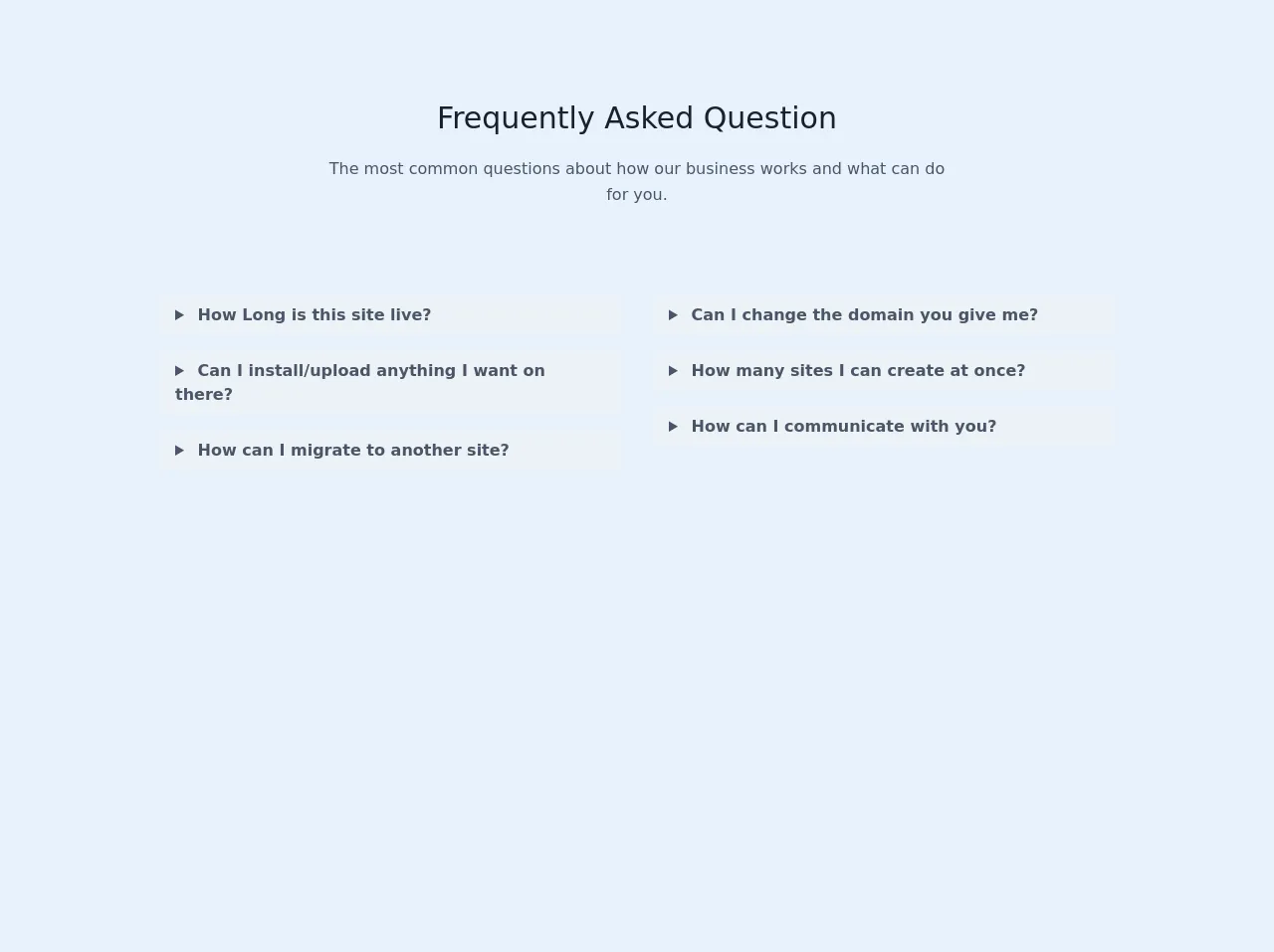
The preview of Frequently Asked Question - FAQ ui component.
To create a Frequently Asked Question (FAQ) UI component with Tailwind CSS, we will use a list format to display the questions and answers. Each question and answer will be displayed in a collapsible section that can be expanded or collapsed by the user.
Free download of the Frequently Asked Question - FAQ's source code
The source code of Frequently Asked Question - FAQ ui component.
To create a Frequently Asked Question (FAQ) UI component with Tailwind CSS, we will use HTML and CSS. The HTML will define the structure of the FAQ component, while the CSS will be used to style the various elements of the component.
<div>
      <section class="text-gray-700">
        <div class="container px-5 py-24 mx-auto">
          <div class="text-center mb-20">
            <h1 class="sm:text-3xl text-2xl font-medium text-center title-font text-gray-900 mb-4">
              Frequently Asked Question
            </h1>
            <p class="text-base leading-relaxed xl:w-2/4 lg:w-3/4 mx-auto">
              The most common questions about how our business works and what
              can do for you.
            </p>
          </div>
          <div class="flex flex-wrap lg:w-4/5 sm:mx-auto sm:mb-2 -mx-2">
            <div class="w-full lg:w-1/2 px-4 py-2">
              <details class="mb-4">
                <summary class="font-semibold  bg-gray-200 rounded-md py-2 px-4">
                  How Long is this site live?
                </summary>

                <span>
                  Laboris qui labore cillum culpa in sunt quis sint veniam.
                  Dolore ex aute deserunt esse ipsum elit aliqua. Aute quis
                  minim velit nostrud pariatur culpa magna in aute.
                </span>
              </details>
              <details class="mb-4">
                <summary class="font-semibold bg-gray-200 rounded-md py-2 px-4">
                  Can I install/upload anything I want on there?
                </summary>

                <span>
                  Laboris qui labore cillum culpa in sunt quis sint veniam.
                  Dolore ex aute deserunt esse ipsum elit aliqua. Aute quis
                  minim velit nostrud pariatur culpa magna in aute.
                </span>
              </details>
              <details class="mb-4">
                <summary class="font-semibold  bg-gray-200 rounded-md py-2 px-4">
                  How can I migrate to another site?
                </summary>

                <span>
                  Laboris qui labore cillum culpa in sunt quis sint veniam.
                  Dolore ex aute deserunt esse ipsum elit aliqua. Aute quis
                  minim velit nostrud pariatur culpa magna in aute.
                </span>
              </details>
            </div>
            <div class="w-full lg:w-1/2 px-4 py-2">
              <details class="mb-4">
                <summary class="font-semibold  bg-gray-200 rounded-md py-2 px-4">
                  Can I change the domain you give me?
                </summary>

                <span class="px-4 py-2">
                  Laboris qui labore cillum culpa in sunt quis sint veniam.
                  Dolore ex aute deserunt esse ipsum elit aliqua. Aute quis
                  minim velit nostrud pariatur culpa magna in aute.
                </span>
              </details>
              <details class="mb-4">
                <summary class="font-semibold  bg-gray-200 rounded-md py-2 px-4">
                  How many sites I can create at once?
                </summary>

                <span class="px-4 py-2">
                  Laboris qui labore cillum culpa in sunt quis sint veniam.
                  Dolore ex aute deserunt esse ipsum elit aliqua. Aute quis
                  minim velit nostrud pariatur culpa magna in aute.
                </span>
              </details>
              <details class="mb-4">
                <summary class="font-semibold  bg-gray-200 rounded-md py-2 px-4">
                  How can I communicate with you?
                </summary>

                <span class="px-4 py-2">
                  Laboris qui labore cillum culpa in sunt quis sint veniam.
                  Dolore ex aute deserunt esse ipsum elit aliqua. Aute quis
                  minim velit nostrud pariatur culpa magna in aute.
                </span>
              </details>
            </div>
          </div>
        </div>
      </section>
    </div>
How to create a Frequently Asked Question - FAQ with Tailwind CSS?
To create a Frequently Asked Question (FAQ) UI component with Tailwind CSS, follow these steps:
Step 1: Create the HTML structure
The first step is to create the HTML structure for the FAQ component. We will use a list format to display the questions and answers. Each question and answer will be displayed in a collapsible section that can be expanded or collapsed by the user.
<div class="faq">
  <ul>
    <li>
      <button class="question">Question 1</button>
      <div class="answer">Answer 1</div>
    </li>
    <li>
      <button class="question">Question 2</button>
      <div class="answer">Answer 2</div>
    </li>
    <li>
      <button class="question">Question 3</button>
      <div class="answer">Answer 3</div>
    </li>
  </ul>
</div>
Step 2: Style the HTML elements with Tailwind CSS
The next step is to style the HTML elements with Tailwind CSS. We will use a combination of pre-defined classes and custom classes to style the various elements of the FAQ component.
/* Style the FAQ component */
.faq {
  max-width: 600px;
  margin: 0 auto;
}

/* Style the list items */
.faq li {
  border-bottom: 1px solid #e2e8f0;
}

/* Style the question button */
.faq .question {
  display: flex;
  justify-content: space-between;
  align-items: center;
  width: 100%;
  padding: 1rem;
  font-weight: 600;
  text-align: left;
  background-color: #f7fafc;
  border: none;
  outline: none;
  cursor: pointer;
}

/* Style the answer section */
.faq .answer {
  padding: 1rem;
  text-align: left;
  background-color: #fff;
  border: none;
  outline: none;
  max-height: 0;
  overflow: hidden;
  transition: max-height 0.2s ease-out;
}

/* Style the answer section when it is open */
.faq .answer.active {
  max-height: 1000px;
  transition: max-height 0.2s ease-in;
}
Step 3: Add JavaScript to toggle the answer sections
The final step is to add JavaScript to toggle the answer sections when the user clicks on a question button. We will use the classList property to add or remove the active class from the answer section.
const questions = document.querySelectorAll('.faq .question');

questions.forEach((question) => {
  question.addEventListener('click', () => {
    const answer = question.nextElementSibling;

    question.classList.toggle('active');
    answer.classList.toggle('active');
  });
});
Conclusion
In conclusion, Tailwind CSS is an excellent choice for creating a Frequently Asked Question (FAQ) UI component. With Tailwind CSS, you can easily style the various elements of the FAQ component, including the question and answer sections, the list items, and the collapsible sections. By following the steps outlined in this guide, you can create a custom and responsive FAQ component quickly and easily.