- Published on
Here Are 6 Ways To Create A Free Tailwind CSS Wishlists Component With Tailwind CSS
- What is Tailwind CSS?
- The description of Free Tailwind CSS Wishlists Component ui component
- Why use Tailwind CSS to create a Free Tailwind CSS Wishlists Component ui component?
- The preview of Free Tailwind CSS Wishlists Component ui component.
- The source code of Free Tailwind CSS Wishlists Component ui component.
- How to create a Free Tailwind CSS Wishlists Component with Tailwind CSS?
- Step 1: Set up your development environment
- Step 2: Create the HTML structure
- Step 3: Add Tailwind CSS classes
- Step 4: Add interactivity with JavaScript
- Step 5: Customize the design
- Conclusion
As a FrontEnd technology blogger, I am excited to share with you how to create a free Tailwind CSS Wishlists Component with Tailwind CSS. In this article, I will provide you with a step-by-step guide on how to create this component with Tailwind CSS.
What is Tailwind CSS?
Tailwind CSS is a utility-first CSS framework that provides a set of pre-defined CSS classes to create custom designs with ease. It is a popular choice among developers because it allows them to create complex designs quickly and efficiently.
The description of Free Tailwind CSS Wishlists Component ui component
The Free Tailwind CSS Wishlists Component is a UI component that allows users to create a list of items they wish to purchase or save for later. It is a common feature found on many e-commerce websites.
Why use Tailwind CSS to create a Free Tailwind CSS Wishlists Component ui component?
Tailwind CSS provides a set of pre-defined CSS classes that can be used to create custom designs quickly and efficiently. This makes it an ideal choice for creating the Free Tailwind CSS Wishlists Component UI component. Additionally, Tailwind CSS is easy to learn and use, making it accessible to developers of all skill levels.
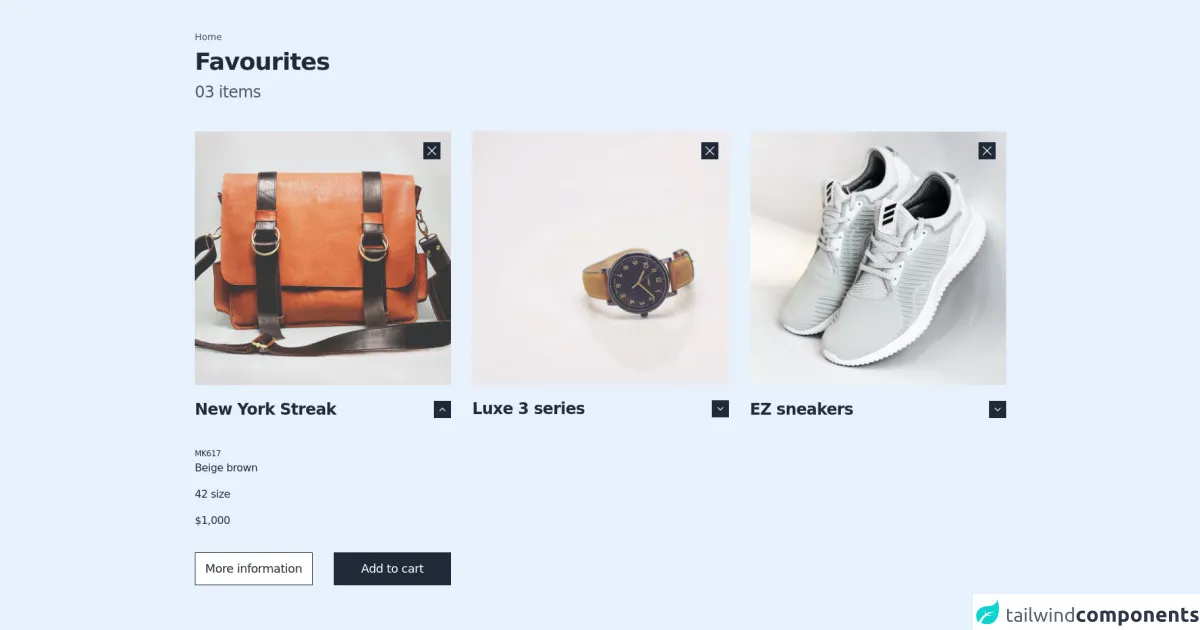
The preview of Free Tailwind CSS Wishlists Component ui component.
The Free Tailwind CSS Wishlists Component UI component is a simple and elegant design that can be easily customized to fit your needs.
Free download of the Free Tailwind CSS Wishlists Component's source code
The source code of Free Tailwind CSS Wishlists Component ui component.
To create the Free Tailwind CSS Wishlists Component UI component, you will need to use HTML and CSS. The HTML code will define the structure of the component, while the CSS code will define the styling.
<div class="mx-auto container px-4 md:px-6 2xl:px-0 py-12 flex justify-center items-center">
  <!-- - more free and premium Tailwind CSS components at https://tailwinduikit.com/ - -->
  <div class="flex flex-col jusitfy-start items-start">
    <div>
      <p class="text-sm leading-4 text-gray-600 dark:text-white">Home</p>
    </div>
    <div class="mt-3">
      <h1 class="text-3xl lg:text-4xl tracking-tight font-semibold leading-8 lg:leading-9 text-gray-800 dark:text-white dark:text-white">Favourites</h1>
    </div>
    <div class="mt-4">
      <p class="text-2xl tracking-tight leading-6 text-gray-600 dark:text-white">03 items</p>
    </div>
    <div class="mt-10 lg:mt-12 grid grid-cols-1 lg:grid-cols-3 gap-x-8 gap-y-10 lg:gap-y-0">
      <div class="flex flex-col">
        <div class="relative">
          <img class="hidden lg:block" src="https://i.ibb.co/SsmkhPq/Rectangle-23.png" alt="bag" />
          <img class="hidden sm:block lg:hidden" src="https://i.ibb.co/ZH9FmZL/Rectangle-23-1.png" alt="bag" />
          <img class="sm:hidden" src="https://i.ibb.co/cyN26yn/Rectangle-23.png" alt="bag" />
          <button aria-label="close" class="top-4 right-4 focus:outline-none focus:ring-2 focus:ring-offset-2 focus:ring-gray-800 absolute p-1.5 bg-gray-800 dark:bg-white dark:text-gray-800 text-white hover:text-gray-400">
            <svg class="fil-current" width="14" height="14" viewBox="0 0 14 14" fill="none" xmlns="http://www.w3.org/2000/svg">
              <path d="M13 1L1 13" stroke="currentColor" stroke-width="1.25" stroke-linecap="round" stroke-linejoin="round" />
              <path d="M1 1L13 13" stroke="currentColor" stroke-width="1.25" stroke-linecap="round" stroke-linejoin="round" />
            </svg>
          </button>
        </div>
        <div class="mt-6 flex justify-between items-center">
          <div class="flex justify-center items-center">
            <p class="tracking-tight text-2xl font-semibold leading-6 text-gray-800 dark:text-white">New York Streak</p>
          </div>
          <div class="flex justify-center items-center">
            <button aria-label="show menu" onclick="handleClick1(true)" class="focus:outline-none focus:ring-2 focus:ring-offset-2 focus:ring-gray-800 py-2.5 px-2 bg-gray-800 dark:bg-white dark:text-gray-800 text-white hover:text-gray-400 hover:bg-gray-200">
              <svg id="chevronUp1" class="fill-stroke" width="10" height="6" viewBox="0 0 10 6" fill="none" xmlns="http://www.w3.org/2000/svg">
                <path d="M9 5L5 1L1 5" stroke="currentColor" stroke-width="1.25" stroke-linecap="round" stroke-linejoin="round" />
              </svg>
              <svg id="chevronDown1" class="hidden fill-stroke" width="10" height="6" viewBox="0 0 10 6" fill="none" xmlns="http://www.w3.org/2000/svg">
                <path d="M1 1L5 5L9 1" stroke="currentColor" stroke-width="1.25" stroke-linecap="round" stroke-linejoin="round" />
              </svg>
            </button>
          </div>
        </div>
        <div id="menu1" class="flex flex-col jusitfy-start items-start mt-12">
          <div>
            <p class="tracking-tight text-xs leading-3 text-gray-800 dark:text-white">MK617</p>
          </div>
          <div class="mt-2">
            <p class="tracking-tight text-base font-medium leading-4 text-gray-800 dark:text-white">Beige brown</p>
          </div>
          <div class="mt-6">
            <p class="tracking-tight text-base font-medium leading-4 text-gray-800 dark:text-white">42 size</p>
          </div>
          <div class="mt-6">
            <p class="tracking-tight text-base font-medium leading-4 text-gray-800 dark:text-white">$1,000</p>
          </div>
          <div class="flex jusitfy-between flex-col lg:flex-row items-center mt-10 w-full space-y-4 lg:space-y-0 lg:space-x-4 xl:space-x-8">
            <div class="w-full">
              <button class="focus:outline-none focus:ring-gray-800 focus:ring-offset-2 focus:ring-2 text-gray-800 dark:text-white text-white w-full tracking-tight py-4 text-lg leading-4 hover:bg-gray-300 hover:text-gray-800 dark:text-white dark:bg-transparent dark:border-white dark:hover:bg-gray-800 bg-white border border-gray-800 dark:hover:text-white">More information</button>
            </div>
            <div class="w-full">
              <button class="focus:outline-none focus:ring-gray-800 focus:ring-offset-2 focus:ring-2 text-white w-full tracking-tight py-4 text-lg leading-4 hover:bg-black bg-gray-800 border border-gray-800 dark:hover:bg-gray-700 dark:hover:text-white">Add to cart</button>
            </div>
          </div>
        </div>
      </div>

      <div class="flex flex-col">
        <div class="relative">
          <img class="hidden lg:block" src="https://i.ibb.co/WVySXBL/Rectangle-24.png" alt="watch" />
          <img class="hidden sm:block lg:hidden" src="https://i.ibb.co/9sqGrR6/Rectangle-24-1.png" alt="watch" />
          <img class="sm:hidden" src="https://i.ibb.co/wCGrdFt/Rectangle-24.png" alt="watch" />
          <button aria-label="close" class="top-4 right-4 focus:outline-none focus:ring-2 focus:ring-offset-2 focus:ring-gray-800 dark:bg-white dark:text-gray-800 absolute p-1.5 bg-gray-800 text-white hover:text-gray-400">
            <svg class="fil-current" width="14" height="14" viewBox="0 0 14 14" fill="none" xmlns="http://www.w3.org/2000/svg">
              <path d="M13 1L1 13" stroke="currentColor" stroke-width="1.25" stroke-linecap="round" stroke-linejoin="round" />
              <path d="M1 1L13 13" stroke="currentColor" stroke-width="1.25" stroke-linecap="round" stroke-linejoin="round" />
            </svg>
          </button>
        </div>
        <div class="mt-6 flex justify-between items-center">
          <div class="flex justify-center items-center">
            <p class="tracking-tight text-2xl font-semibold leading-6 text-gray-800 dark:text-white">Luxe 3 series</p>
          </div>
          <div class="flex justify-center items-center">
            <button aria-label="show menu" onclick="handleClick2(true)" class="focus:outline-none focus:ring-2 focus:ring-offset-2 focus:ring-gray-800 py-2.5 px-2 bg-gray-800 dark:bg-white dark:text-gray-800 text-white hover:text-gray-400 hover:bg-gray-200">
              <svg id="chevronUp2" class="hidden fill-stroke" width="10" height="6" viewBox="0 0 10 6" fill="none" xmlns="http://www.w3.org/2000/svg">
                <path d="M9 5L5 1L1 5" stroke="currentColor" stroke-width="1.25" stroke-linecap="round" stroke-linejoin="round" />
              </svg>
              <svg id="chevronDown2" class="fill-stroke" width="10" height="6" viewBox="0 0 10 6" fill="none" xmlns="http://www.w3.org/2000/svg">
                <path d="M1 1L5 5L9 1" stroke="currentColor" stroke-width="1.25" stroke-linecap="round" stroke-linejoin="round" />
              </svg>
            </button>
          </div>
        </div>
        <div id="menu2" class="hidden flex flex-col jusitfy-start items-start mt-12">
          <div>
            <p class="tracking-tight text-xs leading-3 text-gray-800 dark:text-white">MK617</p>
          </div>
          <div class="mt-2">
            <p class="tracking-tight text-base font-medium leading-4 text-gray-800 dark:text-white">Beige brown</p>
          </div>
          <div class="mt-6">
            <p class="tracking-tight text-base font-medium leading-4 text-gray-800 dark:text-white">42 size</p>
          </div>
          <div class="mt-6">
            <p class="tracking-tight text-base font-medium leading-4 text-gray-800 dark:text-white">$1,000</p>
          </div>
          <div class="flex jusitfy-between flex-col lg:flex-row items-center mt-10 w-full space-y-4 lg:space-y-0 lg:space-x-4 xl:space-x-8">
            <div class="w-full">
              <button class="focus:outline-none focus:ring-gray-800 focus:ring-offset-2 focus:ring-2 text-gray-800 dark:text-white text-white w-full tracking-tight py-4 text-lg leading-4 hover:bg-gray-300 hover:text-gray-800 dark:text-white bg-white border border-gray-800 dark:border-white dark:text-white dark:bg-transparent dark:hover:bg-gray-800 dark:hover:text-white">More information</button>
            </div>
            <div class="w-full">
              <button class="focus:outline-none focus:ring-gray-800 focus:ring-offset-2 focus:ring-2 text-white w-full tracking-tight py-4 text-lg leading-4 hover:bg-black bg-gray-800 border border-gray-800 dark:bg-white dark:text-gray-900 dark:hover:bg-gray-700 dark:hover:text-white">Add to cart</button>
            </div>
          </div>
        </div>
      </div>

      <div class="flex flex-col">
        <div class="relative">
          <img class="hidden lg:block" src="https://i.ibb.co/JqD4MwR/Rectangle-5.png" alt="shoes" />
          <img class="hidden sm:block lg:hidden" src="https://i.ibb.co/MG7JYJ4/Rectangle-5-1.png" alt="shoes" />
          <img class="sm:hidden" src="https://i.ibb.co/89gMng3/Rectangle-5.png" alt="shoes" />
          <button aria-label="close" class="top-4 right-4 focus:outline-none focus:ring-2 focus:ring-offset-2 dark:bg-white dark:text-gray-800 focus:ring-gray-800 absolute p-1.5 bg-gray-800 text-white hover:text-gray-400">
            <svg class="fil-current" width="14" height="14" viewBox="0 0 14 14" fill="none" xmlns="http://www.w3.org/2000/svg">
              <path d="M13 1L1 13" stroke="currentColor" stroke-width="1.25" stroke-linecap="round" stroke-linejoin="round" />
              <path d="M1 1L13 13" stroke="currentColor" stroke-width="1.25" stroke-linecap="round" stroke-linejoin="round" />
            </svg>
          </button>
        </div>
        <div class="mt-6 flex justify-between items-center">
          <div class="flex justify-center items-center">
            <p class="tracking-tight text-2xl font-semibold leading-6 text-gray-800 dark:text-white">EZ sneakers</p>
          </div>
          <div class="flex justify-center items-center">
            <button aria-label="show menu" onclick="handleClick3(true)" class="focus:outline-none focus:ring-2 focus:ring-offset-2 focus:ring-gray-800 py-2.5 px-2 bg-gray-800 text-white hover:text-gray-400 dark:bg-gray-50 dark:text-gray-900 hover:bg-gray-200">
              <svg id="chevronUp3" class="hidden fill-stroke" width="10" height="6" viewBox="0 0 10 6" fill="none" xmlns="http://www.w3.org/2000/svg">
                <path d="M9 5L5 1L1 5" stroke="currentColor" stroke-width="1.25" stroke-linecap="round" stroke-linejoin="round" />
              </svg>
              <svg id="chevronDown3" class="fill-stroke" width="10" height="6" viewBox="0 0 10 6" fill="none" xmlns="http://www.w3.org/2000/svg">
                <path d="M1 1L5 5L9 1" stroke="currentColor" stroke-width="1.25" stroke-linecap="round" stroke-linejoin="round" />
              </svg>
            </button>
          </div>
        </div>
        <div id="menu3" class="hidden flex flex-col jusitfy-start items-start mt-12">
          <div>
            <p class="tracking-tight text-xs leading-3 text-gray-800 dark:text-white">MK617</p>
          </div>
          <div class="mt-2">
            <p class="tracking-tight text-base font-medium leading-4 text-gray-800 dark:text-white">Beige brown</p>
          </div>
          <div class="mt-6">
            <p class="tracking-tight text-base font-medium leading-4 text-gray-800 dark:text-white">42 size</p>
          </div>
          <div class="mt-6">
            <p class="tracking-tight text-base font-medium leading-4 text-gray-800 dark:text-white">$1,000</p>
          </div>
          <div class="flex jusitfy-between flex-col lg:flex-row items-center mt-10 w-full space-y-4 lg:space-y-0 lg:space-x-4 xl:space-x-8">
            <div class="w-full">
              <button class="focus:outline-none focus:ring-gray-800 focus:ring-offset-2 focus:ring-2 text-gray-800 dark:text-white text-white w-full tracking-tight py-4 text-lg leading-4 hover:bg-gray-300 hover:text-gray-800 dark:text-white bg-white border border-gray-800 dark:bg-transparent dark:text-white dark:border-white dark:hover:bg-gray-800 dark:hover:text-white">More information</button>
            </div>
            <div class="w-full">
              <button class="focus:outline-none focus:ring-gray-800 focus:ring-offset-2 focus:ring-2 text-white w-full tracking-tight py-4 text-lg leading-4 hover:bg-black bg-gray-800 border border-gray-800 dark:bg-white dark:text-gray-900 dark:hover:bg-gray-100 dark:hover:bg-gray-700 dark:hover:text-white">Add to cart</button>
            </div>
          </div>
        </div>
      </div>
    </div>
  </div>
</div>
<script>
// more free and premium Tailwind CSS components at https://tailwinduikit.com/
handleClick1 = (flag) => {
  let icon = document.getElementById("chevronDown1");
  let icon2 = document.getElementById("chevronUp1");
  let menu = document.getElementById("menu1");
  if (flag) {
    menu.classList.toggle("hidden");
    icon.classList.toggle("hidden");
    icon2.classList.toggle("hidden");
  }
};

handleClick2 = (flag) => {
  let icon = document.getElementById("chevronDown2");
  let icon2 = document.getElementById("chevronUp2");
  let menu = document.getElementById("menu2");
  if (flag) {
    menu.classList.toggle("hidden");
    icon.classList.toggle("hidden");
    icon2.classList.toggle("hidden");
  }
};

handleClick3 = (flag) => {
  let icon = document.getElementById("chevronDown3");
  let icon2 = document.getElementById("chevronUp3");
  let menu = document.getElementById("menu3");
  if (flag) {
    menu.classList.toggle("hidden");
    icon.classList.toggle("hidden");
    icon2.classList.toggle("hidden");
  }
};
</script>
How to create a Free Tailwind CSS Wishlists Component with Tailwind CSS?
Now that we have covered the basics, let's dive into how to create the Free Tailwind CSS Wishlists Component with Tailwind CSS.
Step 1: Set up your development environment
Before you can start creating the Free Tailwind CSS Wishlists Component, you will need to set up your development environment. This will involve installing Tailwind CSS and any other dependencies you may need.
Step 2: Create the HTML structure
The first step in creating the Free Tailwind CSS Wishlists Component is to create the HTML structure. This will involve creating a list of items that the user can add or remove from their wishlist.
Step 3: Add Tailwind CSS classes
Once you have created the HTML structure, you can start adding Tailwind CSS classes to style the component. This will involve adding classes to the HTML elements to define the layout, typography, and colors.
Step 4: Add interactivity with JavaScript
To make the Free Tailwind CSS Wishlists Component more interactive, you can add JavaScript to allow users to add or remove items from their wishlist. This will involve adding event listeners to the HTML elements and updating the DOM dynamically.
Step 5: Customize the design
Finally, you can customize the design of the Free Tailwind CSS Wishlists Component to fit your needs. This will involve tweaking the Tailwind CSS classes and adding your own custom CSS to create a unique design.
Conclusion
In conclusion, creating a Free Tailwind CSS Wishlists Component with Tailwind CSS is a simple and straightforward process. By following the steps outlined in this article, you can create a custom wishlist component that is both functional and visually appealing. So why not give it a try and see what you can create with Tailwind CSS?