- Published on
3 Things You Must Know To Create A Free Tailwind CSS Toggle Checkbox Radio Component With Tailwind CSS
- What is Tailwind CSS?
- The description of Free Tailwind CSS Toggle Checkbox Radio Component ui component
- Why use Tailwind CSS to create a Free Tailwind CSS Toggle Checkbox Radio Component ui component?
- The preview of Free Tailwind CSS Toggle Checkbox Radio Component ui component.
- The source code of Free Tailwind CSS Toggle Checkbox Radio Component ui component.
- How to create a Free Tailwind CSS Toggle Checkbox Radio Component with Tailwind CSS?
- Step 1: Install Tailwind CSS
- Step 2: Create HTML markup
- Step 3: Add Tailwind CSS classes
- Step 4: Customize the styles
- Conclusion
What is Tailwind CSS?
Tailwind CSS is a utility-first CSS framework that provides a set of pre-defined classes to help developers quickly build custom user interfaces. It is designed to be highly customizable and easy to use, making it a popular choice for front-end developers.
The description of Free Tailwind CSS Toggle Checkbox Radio Component ui component
A toggle checkbox radio component is a user interface element that allows users to select one or more options from a list. It is commonly used in forms and surveys to collect user input. The free Tailwind CSS toggle checkbox radio component is a pre-built user interface component that you can use in your projects to save time and effort.
Why use Tailwind CSS to create a Free Tailwind CSS Toggle Checkbox Radio Component ui component?
Tailwind CSS provides a set of pre-defined classes that you can use to quickly build custom user interfaces. This means that you don't have to write CSS from scratch, which can save you a lot of time and effort. Additionally, Tailwind CSS is highly customizable, so you can easily modify the styles to match your project's design requirements.
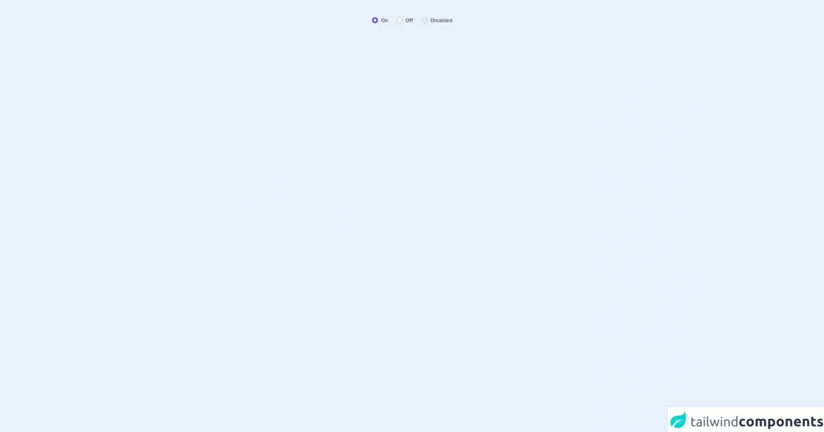
The preview of Free Tailwind CSS Toggle Checkbox Radio Component ui component.
Free download of the Free Tailwind CSS Toggle Checkbox Radio Component's source code
The source code of Free Tailwind CSS Toggle Checkbox Radio Component ui component.
<dh-component>
<!--- more free and premium Tailwind CSS components at https://tailwinduikit.com/ --->

            <div role="radiogroup" class="mx-auto py-12 flex justify-center">
                <!-- Code block starts -->
                <div class="flex items-center">
                    <div class="bg-white dark:bg-gray-100 rounded-full w-4 h-4 flex flex-shrink-0 justify-center items-center relative">
                        <input aria-labelledby="label1" checked type="radio" name="radio" class="checkbox appearance-none focus:opacity-100 focus:ring-2 focus:ring-offset-2 focus:ring-indigo-700 focus:outline-none border rounded-full border-gray-400 absolute cursor-pointer w-full h-full checked:border-none" />
                        <div class="check-icon hidden border-4 border-indigo-700 rounded-full w-full h-full z-1"></div>
                    </div>
                    <label id="label1" class="ml-2 text-sm leading-4 font-normal text-gray-800 dark:text-gray-100">On</label>
                </div>
                <!-- Code block ends -->
                <!-- Code block starts -->
                <div class="flex items-center ml-6">
                    <div class="bg-white dark:bg-gray-100 rounded-full w-4 h-4 flex flex-shrink-0 justify-center items-center relative">
                        <input aria-labelledby="label2" type="radio" name="radio" class="checkbox appearance-none focus:opacity-100 focus:ring-2 focus:ring-offset-2 focus:ring-indigo-700 focus:outline-none border rounded-full border-gray-400 absolute cursor-pointer w-full h-full checked:border-none" />
                        <div class="check-icon hidden border-4 border-indigo-700 rounded-full w-full h-full z-1"></div>
                    </div>
                    <label id="label2" class="ml-2 text-sm leading-4 font-normal text-gray-800 dark:text-gray-100">Off</label>
                </div>
                <!-- Code block ends -->

                <!-- Code block starts -->
                <div class="flex items-center ml-6">
                    <div class="rounded-full w-4 h-4 flex flex-shrink-0 justify-center items-center relative">
                        <input aria-labelledby="disabled" disabled type="radio" name="radio" class="checkbox appearance-none focus:outline-none border rounded-full border-gray-400 absolute cursor-pointer w-full h-full checked:border-none" />
                        <div class="check-icon hidden border-4 border-indigo-700 rounded-full w-full h-full z-1"></div>
                    </div>
                    <p id="disabled" class="ml-2 text-sm leading-4 font-normal text-gray-800 dark:text-gray-100">Disabled</p>
                </div>
                <!-- Code block ends -->
                <style>
                    .checkbox:checked {
                        border: none;
                    }
                    .checkbox:checked + .check-icon {
                        display: flex;
                    }
                </style>
            </div>
        </dh-component>
How to create a Free Tailwind CSS Toggle Checkbox Radio Component with Tailwind CSS?
Step 1: Install Tailwind CSS
To use Tailwind CSS, you need to install it in your project. You can do this by running the following command in your terminal:
npm install tailwindcss
Step 2: Create HTML markup
Next, you need to create the HTML markup for your toggle checkbox radio component. Here's an example:
<div class="flex items-center">
  <input type="checkbox" id="toggle" class="hidden" />
  <label for="toggle" class="flex items-center cursor-pointer">
    <div class="relative">
      <div class="w-10 h-4 bg-gray-400 rounded-full shadow-inner"></div>
      <div class="absolute w-6 h-6 bg-white rounded-full shadow inset-y-0 left-0"></div>
    </div>
    <div class="ml-3 text-gray-700 font-medium">Toggle</div>
  </label>
</div>
In this example, we have a checkbox input element with an ID of "toggle" and a label element that is associated with the checkbox using the "for" attribute. The label element contains two div elements that are used to create the toggle switch.
Step 3: Add Tailwind CSS classes
To style the toggle checkbox radio component, we can use Tailwind CSS classes. Here's an example of how we can modify the styles:
<div class="flex items-center">
  <input type="checkbox" id="toggle" class="hidden" />
  <label for="toggle" class="flex items-center cursor-pointer">
    <div class="relative">
      <div class="w-10 h-4 bg-gray-400 rounded-full shadow-inner"></div>
      <div class="absolute w-6 h-6 bg-white rounded-full shadow inset-y-0 left-0"></div>
    </div>
    <div class="ml-3 text-gray-700 font-medium">Toggle</div>
  </label>
</div>
In this example, we have added Tailwind CSS classes to modify the background color, border radius, and shadow of the toggle switch.
Step 4: Customize the styles
Tailwind CSS provides a set of pre-defined classes that you can use to quickly build custom user interfaces. However, you can also customize the styles by creating your own classes or modifying the existing ones. Here's an example of how we can customize the styles:
<div class="flex items-center">
  <input type="checkbox" id="toggle" class="hidden" />
  <label for="toggle" class="flex items-center cursor-pointer">
    <div class="relative">
      <div class="w-10 h-4 bg-gray-400 rounded-full shadow-inner"></div>
      <div class="absolute w-6 h-6 bg-white rounded-full shadow inset-y-0 left-0 transition"></div>
    </div>
    <div class="ml-3 text-gray-700 font-medium">Toggle</div>
  </label>
</div>
In this example, we have added a "transition" class to the toggle switch to add a smooth transition effect when the switch is toggled.
Conclusion
Creating a free Tailwind CSS toggle checkbox radio component is easy and can save you a lot of time and effort. By using Tailwind CSS, you can quickly build custom user interfaces without having to write CSS from scratch. Additionally, Tailwind CSS is highly customizable, so you can easily modify the styles to match your project's design requirements.