- Published on
The Ultimate Guide To Help You Make A Free Tailwind CSS Tooltip Component With Tailwind CSS
- What is Tailwind CSS?
- The description of Free Tailwind CSS Tooltip Component ui component
- Why use Tailwind CSS to create a Free Tailwind CSS Tooltip Component ui component?
- The preview of Free Tailwind CSS Tooltip Component ui component.
- The source code of Free Tailwind CSS Tooltip Component ui component.
- How to create a Free Tailwind CSS Tooltip Component with Tailwind CSS?
- Conclusion
Are you looking for a way to enhance the user experience of your website or application? One way to do this is by adding tooltips to your UI components. Tooltips provide additional information when users hover over or click on an element, making your interface more interactive and informative. In this article, we will explore how to create a free Tailwind CSS tooltip component that you can use in your projects.
What is Tailwind CSS?
Tailwind CSS is a utility-first CSS framework that provides a set of pre-defined classes to help you style your web pages quickly and easily. With Tailwind CSS, you can create complex layouts and designs without writing custom CSS code. Tailwind CSS is highly customizable, allowing you to create your own classes and styles.
The description of Free Tailwind CSS Tooltip Component ui component
A tooltip is a small pop-up box that appears when a user hovers over or clicks on an element. The Free Tailwind CSS Tooltip Component is a UI component that you can use to create tooltips in your web pages or applications. This component is built using Tailwind CSS classes and can be customized to match your design requirements.
Why use Tailwind CSS to create a Free Tailwind CSS Tooltip Component ui component?
Tailwind CSS provides a set of pre-defined classes that you can use to create UI components quickly and easily. With Tailwind CSS, you don't need to write custom CSS code to style your components. This makes it easy to create consistent designs across your web pages or applications. Additionally, Tailwind CSS is highly customizable, allowing you to create your own classes and styles.
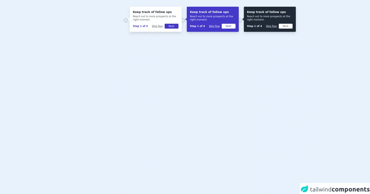
The preview of Free Tailwind CSS Tooltip Component ui component.
Free download of the Free Tailwind CSS Tooltip Component's source code
The source code of Free Tailwind CSS Tooltip Component ui component.
<div class="py-10 h-full w-full">
<!--- more free and premium Tailwind CSS components at https://tailwinduikit.com/ --->

              <div class="container mx-auto px-6 flex flex-col items-start pl-12 md:pl-0 md:items-center">
                  <div class="h-0 md:h-12"></div>
                  <dh-component>
                      <div class="flex-col md:flex-row flex items-center md:justify-center">
                          <!--Code Block for white tooltip starts-->
                          <a tabindex="0" role="link" aria-label="tooltip 1" class="focus:outline-none focus:ring-gray-300 rounded-full focus:ring-offset-2 focus:ring-2 focus:bg-gray-200 relative mt-20 md:mt-0" onmouseover="showTooltip(1)" onfocus="showTooltip(1)" onmouseout="hideTooltip(1)">
                              <div class=" cursor-pointer">
                                  <svg aria-haspopup="true" xmlns="http://www.w3.org/2000/svg" class="icon icon-tabler icon-tabler-info-circle" width="25" height="25" viewBox="0 0 24 24" stroke-width="1.5" stroke="#A0AEC0" fill="none" stroke-linecap="round" stroke-linejoin="round">
                                      <path stroke="none" d="M0 0h24v24H0z" />
                                      <circle cx="12" cy="12" r="9" />
                                      <line x1="12" y1="8" x2="12.01" y2="8" />
                                      <polyline points="11 12 12 12 12 16 13 16" />
                                  </svg>
                              </div>
                              <div id="tooltip1" role="tooltip" class="z-20 -mt-20 w-64 absolute transition duration-150 ease-in-out left-0 ml-8 shadow-lg bg-white p-4 rounded">
                                  <svg class="absolute left-0 -ml-2 bottom-0 top-0 h-full" width="9px" height="16px" viewBox="0 0 9 16" version="1.1" xmlns="http://www.w3.org/2000/svg" xmlns:xlink="http://www.w3.org/1999/xlink">
                                      <g id="Page-1" stroke="none" stroke-width="1" fill="none" fill-rule="evenodd">
                                          <g id="Tooltips-" transform="translate(-874.000000, -1029.000000)" fill="#FFFFFF">
                                              <g id="Group-3-Copy-16" transform="translate(850.000000, 975.000000)">
                                                  <g id="Group-2" transform="translate(24.000000, 0.000000)">
                                                      <polygon id="Triangle" transform="translate(4.500000, 62.000000) rotate(-90.000000) translate(-4.500000, -62.000000) " points="4.5 57.5 12.5 66.5 -3.5 66.5"></polygon>
                                                  </g>
                                              </g>
                                          </g>
                                      </g>
                                  </svg>
                                  <p class="text-sm font-bold text-gray-800 pb-1">Keep track of follow ups</p>
                                  <p class="text-xs leading-4 text-gray-600 pb-3">Reach out to more prospects at the right moment.</p>
                                  <div class="flex justify-between">
                                      <div class="flex items-center">
                                          <span class="text-xs font-bold text-indigo-700">Step 1 of 4</span>
                                      </div>
                                      <div class="flex items-center">
                                          <button class="focus:outline-none  focus:text-gray-400 text-xs text-gray-600 underline mr-2 cursor-pointer">Skip Tour</button>
                                          <button onblur="hideTooltip(1)" class="focus:ring-2 focus:ring-offset-2 focus:ring-indigo-700 focus:bg-indigo-400 focus:outline-none bg-indigo-700 transition duration-150 ease-in-out hover:bg-indigo-600 rounded text-white px-5 py-1 text-xs">Next</button>
                                      </div>
                                  </div>
                              </div>
                          </a>
                          <!--Code Block for white tooltip ends-->

                          <!--Code Block for indigo tooltip starts-->
                          <a  tabindex="0" role="link" aria-label="tooltip 2" class="focus:outline-none focus:ring-gray-300 rounded-full focus:ring-offset-2 focus:ring-2 focus:bg-gray-200 relative my-28 md:my-0 md:mx-64" onmouseover="showTooltip(2)" onfocus="showTooltip(2)" onmouseout="hideTooltip(2)">
                              <div class=" cursor-pointer">
                                  <svg aria-haspopup="true" xmlns="http://www.w3.org/2000/svg" class="icon icon-tabler icon-tabler-info-circle" width="25" height="25" viewBox="0 0 24 24" stroke-width="1.5" stroke="#A0AEC0" fill="none" stroke-linecap="round" stroke-linejoin="round">
                                      <path stroke="none" d="M0 0h24v24H0z" />
                                      <circle cx="12" cy="12" r="9" />
                                      <line x1="12" y1="8" x2="12.01" y2="8" />
                                      <polyline points="11 12 12 12 12 16 13 16" />
                                  </svg>
                              </div>
                              <div id="tooltip2" role="tooltip" class="z-20 -mt-20 w-64 absolute transition duration-150 ease-in-out left-0 ml-8 shadow-lg bg-indigo-700 p-4 rounded">
                                  <svg class="absolute left-0 -ml-2 bottom-0 top-0 h-full" width="9px" height="16px" viewBox="0 0 9 16" version="1.1" xmlns="http://www.w3.org/2000/svg" xmlns:xlink="http://www.w3.org/1999/xlink">
                                      <g id="Page-1" stroke="none" stroke-width="1" fill="none" fill-rule="evenodd">
                                          <g id="Tooltips-" transform="translate(-874.000000, -1029.000000)" fill="#4c51bf">
                                              <g id="Group-3-Copy-16" transform="translate(850.000000, 975.000000)">
                                                  <g id="Group-2" transform="translate(24.000000, 0.000000)">
                                                      <polygon id="Triangle" transform="translate(4.500000, 62.000000) rotate(-90.000000) translate(-4.500000, -62.000000) " points="4.5 57.5 12.5 66.5 -3.5 66.5"></polygon>
                                                  </g>
                                              </g>
                                          </g>
                                      </g>
                                  </svg>
                                  <p class="text-sm font-bold text-white pb-1">Keep track of follow ups</p>
                                  <p class="text-xs leading-4 text-white pb-3">Reach out to more prospects at the right moment.</p>
                                  <div class="flex justify-between">
                                      <div class="flex items-center">
                                          <span class="text-xs font-bold text-white">Step 1 of 4</span>
                                      </div>
                                      <div class="flex items-center">
                                          <button class="focus:outline-none focus:underline focus:text-indigo-200 text-xs text-white underline mr-2 cursor-pointer">Skip Tour</button>
                                          <button onblur="hideTooltip(2)" class="focus:ring-2 focus:ring-offset-2 focus:ring-indigo-700 focus:bg-indigo-400 focus:outline-none focus:text-white bg-white transition duration-150 ease-in-out focus:outline-none hover:bg-gray-200 rounded text-indigo-700 px-5 py-1 text-xs">Next</button>
                                      </div>
                                  </div>
                              </div>
                          </a>
                          <!--Code Block for indigo tooltip ends-->

                          <!--Code Block for gray tooltip starts-->
                          <a tabindex="0" aria-label="tooltip 3" role="link" class="focus:outline-none focus:ring-gray-300 rounded-full focus:ring-offset-2 focus:ring-2 focus:bg-gray-200 relative" onmouseover="showTooltip(3)" onfocus="showTooltip(3)" onmouseout="hideTooltip(3)">
                              <div class=" cursor-pointer">
                                  <svg aria-haspopup="true" xmlns="http://www.w3.org/2000/svg" class="icon icon-tabler icon-tabler-info-circle" width="25" height="25" viewBox="0 0 24 24" stroke-width="1.5" stroke="#A0AEC0" fill="none" stroke-linecap="round" stroke-linejoin="round">
                                      <path stroke="none" d="M0 0h24v24H0z" />
                                      <circle cx="12" cy="12" r="9" />
                                      <line x1="12" y1="8" x2="12.01" y2="8" />
                                      <polyline points="11 12 12 12 12 16 13 16" />
                                  </svg>
                              </div>
                              <div id="tooltip3" role="tooltip" class="z-20 -mt-20 w-64 absolute transition duration-150 ease-in-out left-0 ml-8 shadow-lg bg-gray-800 p-4 rounded">
                                  <svg class="absolute left-0 -ml-2 bottom-0 top-0 h-full" width="9px" height="16px" viewBox="0 0 9 16" version="1.1" xmlns="http://www.w3.org/2000/svg" xmlns:xlink="http://www.w3.org/1999/xlink">
                                      <g id="Page-1" stroke="none" stroke-width="1" fill="none" fill-rule="evenodd">
                                          <g id="Tooltips-" transform="translate(-874.000000, -1029.000000)" fill="#2D3748">
                                              <g id="Group-3-Copy-16" transform="translate(850.000000, 975.000000)">
                                                  <g id="Group-2" transform="translate(24.000000, 0.000000)">
                                                      <polygon id="Triangle" transform="translate(4.500000, 62.000000) rotate(-90.000000) translate(-4.500000, -62.000000) " points="4.5 57.5 12.5 66.5 -3.5 66.5"></polygon>
                                                  </g>
                                              </g>
                                          </g>
                                      </g>
                                  </svg>
                                  <p class="text-sm font-bold text-white pb-1">Keep track of follow ups</p>
                                  <p class="text-xs leading-4 text-white pb-3">Reach out to more prospects at the right moment.</p>
                                  <div class="flex justify-between">
                                      <div class="flex items-center">
                                          <span class="text-xs font-bold text-white">Step 1 of 4</span>
                                      </div>
                                      <div class="flex items-center">
                                          <button class="focus:outline-none focus:underline focus:text-indigo-200 text-xs text-white underline mr-2 cursor-pointer">Skip Tour</button>
                                          <button onblur="hideTooltip(3)" class="focus:ring-2 focus:ring-offset-2 focus:ring-indigo-700 focus:bg-indigo-400 focus:outline-none focus:text-white bg-white transition duration-150 ease-in-out focus:outline-none hover:bg-gray-200 rounded text-gray-600 px-5 py-1 text-xs">Next</button>
                                      </div>
                                  </div>
                              </div>
                          </a>
                          <!--Code Block for gray tooltip ends-->
                      </div>
                  </dh-component>
                  <div class="h-12"></div>
              </div>
          </div>
          <script src="index.js"></script>
          <script>function showTooltip(flag) {
  switch (flag) {
    case 1:
      document.getElementById("tooltip1").classList.remove("hidden");
      break;
    case 2:
      document.getElementById("tooltip2").classList.remove("hidden");
      break;
    case 3:
      document.getElementById("tooltip3").classList.remove("hidden");
      break;
  }
}
function hideTooltip(flag) {
  switch (flag) {
    case 1:
      document.getElementById("tooltip1").classList.add("hidden");
      break;
    case 2:
      document.getElementById("tooltip2").classList.add("hidden");
      break;
    case 3:
      document.getElementById("tooltip3").classList.add("hidden");
      break;
  }
}
</script>
How to create a Free Tailwind CSS Tooltip Component with Tailwind CSS?
To create a Free Tailwind CSS Tooltip Component, follow these steps:
- Create a new HTML file and add the necessary HTML structure for your tooltip component. For example:
<div class="tooltip">
  <span class="tooltip-text">Tooltip text</span>
  <div class="tooltip-box">Tooltip box</div>
</div>
- Add the necessary Tailwind CSS classes to your HTML elements. For example:
<div class="tooltip relative">
  <span class="tooltip-text cursor-pointer">Tooltip text</span>
  <div class="tooltip-box absolute bg-gray-800 text-white p-2 rounded-md opacity-0 transition-opacity duration-300">
    Tooltip box
  </div>
</div>
In this example, we have added the relative class to the tooltip container and the absolute class to the tooltip box. We have also added the bg-gray-800 and text-white classes to style the tooltip box. The opacity-0 class hides the tooltip box by default, and the transition-opacity and duration-300 classes provide a smooth animation when the tooltip box appears.
- Add the necessary JavaScript code to show and hide the tooltip box. For example:
const tooltip = document.querySelector('.tooltip');
const tooltipBox = tooltip.querySelector('.tooltip-box');

tooltip.addEventListener('mouseenter', () => {
  tooltipBox.classList.add('opacity-100');
});

tooltip.addEventListener('mouseleave', () => {
  tooltipBox.classList.remove('opacity-100');
});
In this example, we have added event listeners to the tooltip container to show and hide the tooltip box. When the user hovers over the tooltip container, the opacity-100 class is added to the tooltip box, making it visible. When the user moves the mouse away from the tooltip container, the opacity-100 class is removed, hiding the tooltip box.
- Customize the tooltip component to match your design requirements by adding your own classes and styles.
Conclusion
In this article, we have explored how to create a free Tailwind CSS tooltip component that you can use in your web pages or applications. Tailwind CSS provides a set of pre-defined classes that you can use to create UI components quickly and easily. With a few lines of HTML and JavaScript code, you can create a tooltip component that enhances the user experience of your interface.