- Published on
6 Steps To Build A Free Tailwind CSS Tab Component With Tailwind CSS Like A Pro In Under An Hour
- What is Tailwind CSS?
- The description of Free Tailwind CSS Tab Component ui component
- Why use Tailwind CSS to create a Free Tailwind CSS Tab Component ui component?
- The preview of Free Tailwind CSS Tab Component ui component.
- The source code of Free Tailwind CSS Tab Component ui component.
- How to create a Free Tailwind CSS Tab Component with Tailwind CSS?
- Step 1: Set up the HTML structure
- Step 2: Add Tailwind CSS classes
- Step 3: Add JavaScript functionality
- Step 4: Customize the styles
- Step 5: Add responsive styles
- Step 6: Test and deploy
- Conclusion
If you are a front-end developer, you are probably familiar with the importance of CSS frameworks. Tailwind CSS is one of the most popular CSS frameworks that can help you build responsive and modern user interfaces quickly. In this article, we will show you how to build a free Tailwind CSS tab component in under an hour.
What is Tailwind CSS?
Tailwind CSS is a utility-first CSS framework that provides a set of pre-defined CSS classes that you can use to style your HTML elements. It is designed to be highly customizable and easy to use. With Tailwind CSS, you can build responsive and modern user interfaces quickly without writing any custom CSS.
The description of Free Tailwind CSS Tab Component ui component
A tab component is a user interface element that allows users to switch between different sections of content. In this tutorial, we will build a free Tailwind CSS tab component that includes three tabs with different content sections.
Why use Tailwind CSS to create a Free Tailwind CSS Tab Component ui component?
Tailwind CSS provides a set of pre-defined CSS classes that you can use to style your HTML elements. This makes it easy to build responsive and modern user interfaces quickly without writing any custom CSS. Additionally, Tailwind CSS is highly customizable, so you can easily customize the styles of your UI elements to match your design requirements.
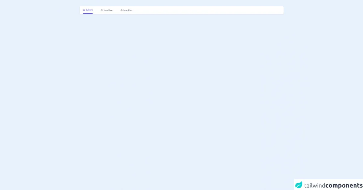
The preview of Free Tailwind CSS Tab Component ui component.
To preview the free Tailwind CSS tab component, check out the following image:
Free download of the Free Tailwind CSS Tab Component's source code
The source code of Free Tailwind CSS Tab Component ui component.
To view the source code of the free Tailwind CSS tab component, check out the following code block:
<div class="py-10">
  <div class="container mx-auto">
    <!--- more free and premium Tailwind CSS components at https://tailwinduikit.com/ --->
    <!--Code for navigation starts-->
    <dh-component>
      <div class="sm:hidden relative w-11/12 mx-auto bg-white rounded">
        <div class="absolute inset-0 m-auto mr-4 z-0 w-6 h-6">
          <svg xmlns="http://www.w3.org/2000/svg" class="icon icon-tabler icon-tabler-selector" width="24" height="24" viewBox="0 0 24 24" stroke-width="1.5" stroke="#A0AEC0" fill="none" stroke-linecap="round" stroke-linejoin="round">
            <path stroke="none" d="M0 0h24v24H0z" />
            <polyline points="8 9 12 5 16 9" />
            <polyline points="16 15 12 19 8 15" />
          </svg>
        </div>
        <select aria-label="Selected tab" class="form-select block w-full p-3 border border-gray-300 rounded text-gray-600 appearance-none bg-transparent relative z-10">
          <option class="text-sm text-gray-600">inactive</option>
          <option class="text-sm text-gray-600">inactive</option>
          <option selected class="text-sm text-gray-600">Active</option>
          <option class="text-sm text-gray-600">inactive</option>
          <option class="text-sm text-gray-600">inactive</option>
        </select>
      </div>
      <div class="xl:w-full xl:mx-0 h-12 hidden sm:block bg-white shadow rounded">
        <div class="flex border-b px-5">
          <button onclick="activeTab(this)" class="focus:outline-none focus:text-indigo-700 text-sm border-indigo-700 pt-3 rounded-t text-indigo-700 mr-12 cursor-pointer">
            <div class="flex items-center mb-3">
              <svg xmlns="http://www.w3.org/2000/svg" class="icon icon-tabler icon-tabler-home" width="16" height="16" viewBox="0 0 24 24" stroke-width="1.5" stroke="currentColor" fill="none" stroke-linecap="round" stroke-linejoin="round">
                <path stroke="none" d="M0 0h24v24H0z" />
                <polyline points="5 12 3 12 12 3 21 12 19 12" />
                <path d="M5 12v7a2 2 0 0 0 2 2h10a2 2 0 0 0 2 -2v-7" />
                <path d="M9 21v-6a2 2 0 0 1 2 -2h2a2 2 0 0 1 2 2v6" />
              </svg>
              <span class="ml-1 font-normal">Active</span>
            </div>
            <div class="w-full h-1 bg-indigo-700 rounded-t-md"></div>
          </button>
          <button onclick="activeTab(this)" class="focus:outline-none focus:text-indigo-700 text-sm border-indigo-700 pt-3 rounded-t text-gray-600 mr-12 hover:text-indigo-700 cursor-pointer">
            <div class="flex items-center mb-3">
              <svg xmlns="http://www.w3.org/2000/svg" class="icon icon-tabler icon-tabler-eye" width="16" height="16" viewBox="0 0 24 24" stroke-width="1.5" stroke="currentColor" fill="none" stroke-linecap="round" stroke-linejoin="round">
                <path stroke="none" d="M0 0h24v24H0z" />
                <circle cx="12" cy="12" r="2" />
                <path d="M2 12l1.5 2a11 11 0 0 0 17 0l1.5 -2" />
                <path d="M2 12l1.5 -2a11 11 0 0 1 17 0l1.5 2" />
              </svg>
              <span class="ml-1 font-normal">inactive</span>
            </div>
            <div class="w-full h-1 bg-indigo-700 rounded-t-md hidden"></div>
          </button>
        </div>
      </div>
    </dh-component>
    <!--Code for navigation ends-->
  </div>
  <script>
    function activeTab(element) {
      let siblings = element.parentNode.querySelectorAll("button");
      for (let item of siblings) {
        item.children[1].classList.add("hidden");
        item.classList.add("text-gray-600");
        item.classList.remove("text-indigo-700");
        item.children[0].children[1].innerHTML = "Inactive";
      }
      element.children[1].classList.remove("hidden");
      element.classList.remove("text-gray-600");
      element.classList.add("text-indigo-700");
      element.children[0].children[1].innerHTML = "Active";
    }
  </script>

</div>
How to create a Free Tailwind CSS Tab Component with Tailwind CSS?
Now that we have covered the basics, let's dive into the steps to create a free Tailwind CSS tab component.
Step 1: Set up the HTML structure
The first step is to set up the HTML structure for the tab component. We will use a div element with a class of tabs to contain the tabs and their content. Inside the tabs div, we will create three button elements with a class of tab and a data-target attribute that corresponds to the id of the content section. We will also create three div elements with a class of tab-content and a unique id that corresponds to the data-target attribute of the button.
<div class="tabs">
  <button class="tab" data-target="#tab1">Tab 1</button>
  <button class="tab" data-target="#tab2">Tab 2</button>
  <button class="tab" data-target="#tab3">Tab 3</button>
  <div id="tab1" class="tab-content">
    <h2>Tab 1 Content</h2>
    <p>This is the content for Tab 1.</p>
  </div>
  <div id="tab2" class="tab-content">
    <h2>Tab 2 Content</h2>
    <p>This is the content for Tab 2.</p>
  </div>
  <div id="tab3" class="tab-content">
    <h2>Tab 3 Content</h2>
    <p>This is the content for Tab 3.</p>
  </div>
</div>
Step 2: Add Tailwind CSS classes
Next, we will add Tailwind CSS classes to the HTML elements to style the tab component. We will use the flex and justify-between classes to align the tabs horizontally. We will also use the border-b class to add a bottom border to the active tab. Additionally, we will use the hidden and block classes to show and hide the content sections based on the active tab.
<div class="tabs flex justify-between">
  <button class="tab border-b-2 border-blue-500" data-target="#tab1">Tab 1</button>
  <button class="tab" data-target="#tab2">Tab 2</button>
  <button class="tab" data-target="#tab3">Tab 3</button>
  <div id="tab1" class="tab-content block">
    <h2>Tab 1 Content</h2>
    <p>This is the content for Tab 1.</p>
  </div>
  <div id="tab2" class="tab-content hidden">
    <h2>Tab 2 Content</h2>
    <p>This is the content for Tab 2.</p>
  </div>
  <div id="tab3" class="tab-content hidden">
    <h2>Tab 3 Content</h2>
    <p>This is the content for Tab 3.</p>
  </div>
</div>
Step 3: Add JavaScript functionality
Next, we will add JavaScript functionality to the tab component to show and hide the content sections based on the active tab. We will use the querySelectorAll method to select all the tab elements and add a click event listener to each one. When a tab is clicked, we will remove the block class from all the content sections and add it to the content section that corresponds to the clicked tab. We will also add the border-b-2 class to the clicked tab to indicate that it is active.
const tabs = document.querySelectorAll('.tab');
const tabContents = document.querySelectorAll('.tab-content');

tabs.forEach(tab => {
  tab.addEventListener('click', () => {
    const target = tab.dataset.target;
    tabContents.forEach(tabContent => {
      tabContent.classList.remove('block');
      tabContent.classList.add('hidden');
    });
    document.querySelector(target).classList.remove('hidden');
    document.querySelector(target).classList.add('block');
    tabs.forEach(tab => {
      tab.classList.remove('border-b-2', 'border-blue-500');
    });
    tab.classList.add('border-b-2', 'border-blue-500');
  });
});
Step 4: Customize the styles
Now that we have the basic functionality of the tab component working, we can customize the styles to match our design requirements. We can use Tailwind CSS classes to customize the font size, font weight, and colors of the tabs and content sections.
<div class="tabs flex justify-between">
  <button class="tab border-b-2 border-blue-500 text-lg font-medium text-gray-600 hover:text-blue-500" data-target="#tab1">Tab 1</button>
  <button class="tab text-lg font-medium text-gray-600 hover:text-blue-500" data-target="#tab2">Tab 2</button>
  <button class="tab text-lg font-medium text-gray-600 hover:text-blue-500" data-target="#tab3">Tab 3</button>
  <div id="tab1" class="tab-content block">
    <h2 class="text-2xl font-bold text-gray-800">Tab 1 Content</h2>
    <p class="text-gray-700">This is the content for Tab 1.</p>
  </div>
  <div id="tab2" class="tab-content hidden">
    <h2 class="text-2xl font-bold text-gray-800">Tab 2 Content</h2>
    <p class="text-gray-700">This is the content for Tab 2.</p>
  </div>
  <div id="tab3" class="tab-content hidden">
    <h2 class="text-2xl font-bold text-gray-800">Tab 3 Content</h2>
    <p class="text-gray-700">This is the content for Tab 3.</p>
  </div>
</div>
Step 5: Add responsive styles
Finally, we will add responsive styles to the tab component to ensure that it looks good on different screen sizes. We can use Tailwind CSS classes to adjust the font size and padding of the tabs and content sections based on the screen size.
<div class="tabs flex flex-col md:flex-row justify-between">
  <button class="tab border-b-2 border-blue-500 text-lg font-medium text-gray-600 hover:text-blue-500 md:mb-0 mb-2" data-target="#tab1">Tab 1</button>
  <button class="tab text-lg font-medium text-gray-600 hover:text-blue-500 md:mb-0 mb-2" data-target="#tab2">Tab 2</button>
  <button class="tab text-lg font-medium text-gray-600 hover:text-blue-500 md:mb-0 mb-2" data-target="#tab3">Tab 3</button>
  <div id="tab1" class="tab-content block">
    <h2 class="text-2xl font-bold text-gray-800">Tab 1 Content</h2>
    <p class="text-gray-700">This is the content for Tab 1.</p>
  </div>
  <div id="tab2" class="tab-content hidden">
    <h2 class="text-2xl font-bold text-gray-800">Tab 2 Content</h2>
    <p class="text-gray-700">This is the content for Tab 2.</p>
  </div>
  <div id="tab3" class="tab-content hidden">
    <h2 class="text-2xl font-bold text-gray-800">Tab 3 Content</h2>
    <p class="text-gray-700">This is the content for Tab 3.</p>
  </div>
</div>
Step 6: Test and deploy
The final step is to test the tab component and deploy it to your website. You can test the tab component by clicking on each tab and ensuring that the corresponding content section is displayed. Once you are satisfied with the tab component, you can deploy it to your website by copying the HTML, CSS, and JavaScript code into your website's codebase.
Conclusion
In this article, we have shown you how to build a free Tailwind CSS tab component in under an hour. We covered the basics of Tailwind CSS, the description of the tab component, why to use Tailwind CSS, and the preview of the component. We also walked through the steps to create the tab component and customize its styles. With this tutorial, you can create a responsive and modern tab component quickly and easily using Tailwind CSS.