- Published on
Ultimate Guide: Make A Free Tailwind CSS Quick Views Component With Tailwind CSS
- What is Tailwind CSS?
- The description of Free Tailwind CSS Quick Views Component UI component
- Why use Tailwind CSS to create a Free Tailwind CSS Quick Views Component UI component?
- The preview of Free Tailwind CSS Quick Views Component UI component
- The source code of Free Tailwind CSS Quick Views Component UI component
- How to create a Free Tailwind CSS Quick Views Component with Tailwind CSS?
- Step 1: Set up your HTML
- Step 2: Add Tailwind CSS
- Step 3: Style your Quick Views Component
- Step 4: Add JavaScript
- Conclusion
What is Tailwind CSS?
Tailwind CSS is a utility-first CSS framework that allows you to rapidly build custom user interfaces. It provides a set of pre-defined classes that you can use to style your HTML elements. This makes it easy to create responsive and mobile-first designs without having to write custom CSS code.
The description of Free Tailwind CSS Quick Views Component UI component
The Free Tailwind CSS Quick Views Component is a UI component that allows you to display quick views of your content. It is a simple and elegant way to provide users with a preview of your content without having to navigate away from the current page.
Why use Tailwind CSS to create a Free Tailwind CSS Quick Views Component UI component?
Tailwind CSS is a great choice for creating the Free Tailwind CSS Quick Views Component UI component because it provides a set of pre-defined classes that you can use to style your HTML elements. This makes it easy to create a consistent and responsive design. Additionally, Tailwind CSS is highly customizable, which means you can easily modify the styles to match your brand.
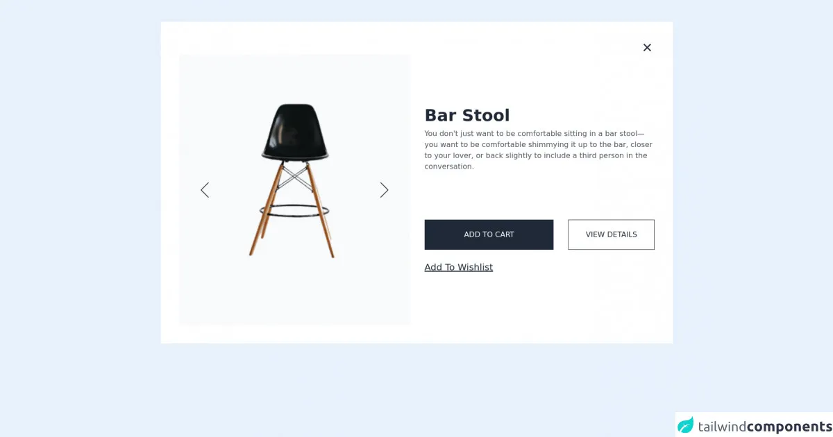
The preview of Free Tailwind CSS Quick Views Component UI component
Free download of the Free Tailwind CSS Quick Views Component's source code
The source code of Free Tailwind CSS Quick Views Component UI component
<div class="2xl:container 2xl:mx-auto md:py-12 lg:px-20 md:px-6 py-9 px-4">
  <!--- more free and premium Tailwind CSS components at https://tailwinduikit.com/ --->
  <div id="viewerButton" class="hidden w-full flex justify-center">
    <button onclick="openView()" class="bg-white text-indigo-600 shadow-md rounded focus:outline-none focus:ring-2 focus:ring-offset-2 focus:ring-indigo-600 py-5 px-10 font-semibold">Open Quick View</button>
  </div>
  <div id="viewerBox" class="lg:p-10 md:p-6 p-4 bg-white dark:bg-gray-900">
    <div class="flex justify-end">
      <button onclick="closeView()" aria-label="Close" class="focus:outline-none focus:ring-2 focus:ring-gray-800">
        <svg class="dark:text-white" width="32" height="32" viewBox="0 0 32 32" fill="currentColor" xmlns="http://www.w3.org/2000/svg">
          <path d="M17.8799 15.9996L23.6133 10.2796C23.8643 10.0285 24.0054 9.688 24.0054 9.33293C24.0054 8.97786 23.8643 8.63733 23.6133 8.38626C23.3622 8.13519 23.0217 7.99414 22.6666 7.99414C22.3115 7.99414 21.971 8.13519 21.7199 8.38626L15.9999 14.1196L10.2799 8.38626C10.0288 8.13519 9.68832 7.99414 9.33325 7.99414C8.97818 7.99414 8.63766 8.13519 8.38659 8.38626C8.13551 8.63733 7.99446 8.97786 7.99446 9.33293C7.99446 9.688 8.13551 10.0285 8.38659 10.2796L14.1199 15.9996L8.38659 21.7196C8.26161 21.8435 8.16242 21.991 8.09473 22.1535C8.02704 22.316 7.99219 22.4902 7.99219 22.6663C7.99219 22.8423 8.02704 23.0166 8.09473 23.179C8.16242 23.3415 8.26161 23.489 8.38659 23.6129C8.51054 23.7379 8.658 23.8371 8.82048 23.9048C8.98296 23.9725 9.15724 24.0073 9.33325 24.0073C9.50927 24.0073 9.68354 23.9725 9.84602 23.9048C10.0085 23.8371 10.156 23.7379 10.2799 23.6129L15.9999 17.8796L21.7199 23.6129C21.8439 23.7379 21.9913 23.8371 22.1538 23.9048C22.3163 23.9725 22.4906 24.0073 22.6666 24.0073C22.8426 24.0073 23.0169 23.9725 23.1794 23.9048C23.3418 23.8371 23.4893 23.7379 23.6133 23.6129C23.7382 23.489 23.8374 23.3415 23.9051 23.179C23.9728 23.0166 24.0077 22.8423 24.0077 22.6663C24.0077 22.4902 23.9728 22.316 23.9051 22.1535C23.8374 21.991 23.7382 21.8435 23.6133 21.7196L17.8799 15.9996Z" fill="#1F2937" />
        </svg>
      </button>
    </div>
    <div class="mt-3 md:mt-4 lg:mt-0 flex flex-col lg:flex-row items-strech justify-center lg:space-x-8">
      <div class="lg:w-1/2 flex justify-between items-strech bg-gray-50  px-2 py-20 md:py-6 md:px-6 lg:py-24">
        <div class="flex items-center">
          <button onclick="goPrev()" aria-label="slide back" class="focus:outline-none focus:ring-2 focus:ring-gray-800 hover:bg-gray-100">
            <svg class="w-10 h-10 lg:w-16 lg:h-16" viewBox="0 0 64 64" fill="none" xmlns="http://www.w3.org/2000/svg">
              <path d="M40 16L24 32L40 48" stroke="#1F2937" stroke-width="1.5" stroke-linecap="round" stroke-linejoin="round" />
            </svg>
          </button>
        </div>
        <div class="slider">
          <div class="slide-ana lg:relative">
            <div class="flex" style="transform: translateX(-100%)">
              <img src="https://i.ibb.co/fMGD6ZC/eugene-chystiakov-3ne-Swyntb-Q8-unsplash-1-removebg-preview-3-1.png" alt="A black chair with wooden legs" class="w-full h-full" />
            </div>
            <div class="flex" style="transform: translateX(0%)">
              <img src="https://i.ibb.co/fMGD6ZC/eugene-chystiakov-3ne-Swyntb-Q8-unsplash-1-removebg-preview-3-1.png" alt="A black chair with wooden legs" class="w-full h-full" />
            </div>
            <div class="flex" style="transform: translateX(100%)">
              <img src="https://i.ibb.co/fMGD6ZC/eugene-chystiakov-3ne-Swyntb-Q8-unsplash-1-removebg-preview-3-1.png" alt="A black chair with wooden legs" class="w-full h-full" />
            </div>
          </div>
        </div>
        <div class="flex items-center">
          <button onclick="goNext()" aria-label="slide forward" class="focus:outline-none focus:ring-2 focus:ring-gray-800 hover:bg-gray-100">
            <svg class="w-10 h-10 lg:w-16 lg:h-16" viewBox="0 0 64 64" fill="none" xmlns="http://www.w3.org/2000/svg">
              <path d="M24 16L40 32L24 48" stroke="#1F2937" stroke-width="1.5" stroke-linecap="round" stroke-linejoin="round" />
            </svg>
          </button>
        </div>
      </div>
      <div class="lg:w-1/2 flex flex-col justify-center mt-7 md:mt-8 lg:mt-0 pb-8 lg:pb-0">
        <h1 class="text-3xl lg:text-4xl font-semibold text-gray-800 dark:text-white">Bar Stool</h1>
        <p class="text-base leading-normal text-gray-600 dark:text-white mt-2">You don't just want to be comfortable sitting in a bar stool—you want to be comfortable shimmying it up to the bar, closer to your lover, or back slightly to include a third person in the conversation.</p>
        <p class="text-3xl font-medium text-gray-600 dark:text-white mt-8 md:mt-10"></p>
        <div class="flex items-center flex-col md:flex-row space-y-4 md:space-y-0 md:space-x-6 lg:space-x-8 mt-8 md:mt-16">
          <button class="w-full md:w-3/5 border border-gray-800 text-base font-medium leading-none text-white uppercase py-6 focus:outline-none focus:ring-2 focus:ring-offset-2 focus:ring-gray-800 bg-gray-800 text-white dark:bg-white dark:text-gray-900 dark:hover:bg-gray-200">Add to Cart</button>
          <button class="w-full md:w-2/5 border border-gray-800 text-base font-medium leading-none text-gray-800 dark:text-white uppercase py-6 bg-transparent focus:outline-none focus:ring-2 focus:ring-offset-2 dark:bg-transparent dark:border-white dark:text-white focus:ring-gray-800 hover:bg-gray-800 hover:text-white dark:hover:bg-gray-800 ">View Details</button>
        </div>
        <div class="mt-6">
          <button class="text-xl underline text-gray-800 dark:text-white dark:hover:text-gray-200 capitalize hover:text-gray-500 focus:outline-none focus:ring-2 focus:ring-offset-2 focus:ring-gray-800">add to wishlist</button>
        </div>
      </div>
    </div>
  </div>
</div>
<style>.slider {
  width: 200px;
  height: 400px;
  position: relative;
  overflow: hidden;
}

.slide-ana {
  height: 360px;
}

.slide-ana > div {
  width: 100%;
  height: 100%;
  position: absolute;
  transition: all 0.7s;
}

@media (min-width: 200px) and (max-width: 639px) {
  .slider {
    height: 300px;
    width: 170px;
  }
}
</style>
<script>// more free and premium Tailwind CSS components at https://tailwinduikit.com/
let slides = document.querySelectorAll(".slide-ana>div");
let slideSayisi = slides.length;
let prev = document.getElementById("prev");
let next = document.getElementById("next");
for (let index = 0; index < slides.length; index++) {
  const element = slides[index];
  element.style.transform = "translateX(" + 100 * index + "%)";
}
let loop = 0 + 1000 * slideSayisi;

function goNext() {
  loop++;
  for (let index = 0; index < slides.length; index++) {
    const element = slides[index];
    element.style.transform =
      "translateX(" + 100 * (index - (loop % slideSayisi)) + "%)";
  }
}

function goPrev() {
  loop--;
  for (let index = 0; index < slides.length; index++) {
    const element = slides[index];
    element.style.transform =
      "translateX(" + 100 * (index - (loop % slideSayisi)) + "%)";
  }
}

function openView() {
  document.getElementById("viewerButton").classList.add("hidden");
  document.getElementById("viewerBox").classList.remove("hidden");
}
function closeView() {
  document.getElementById("viewerBox").classList.add("hidden");
  document.getElementById("viewerButton").classList.remove("hidden");
}
</script>
How to create a Free Tailwind CSS Quick Views Component with Tailwind CSS?
To create a Free Tailwind CSS Quick Views Component with Tailwind CSS, follow these steps:
Step 1: Set up your HTML
First, you need to set up your HTML. Here's an example:
<div class="quick-view">
  <div class="quick-view-header">
    <h2 class="quick-view-title">Title</h2>
    <button class="quick-view-close">Close</button>
  </div>
  <div class="quick-view-body">
    <p>Content goes here</p>
  </div>
</div>
Step 2: Add Tailwind CSS
Next, you need to add Tailwind CSS to your project. You can either download the CSS file from the Tailwind CSS website or use a CDN. Here's an example of how to use the CDN:
<link rel="stylesheet" href="https://cdn.jsdelivr.net/npm/[email protected]/dist/tailwind.min.css">
Step 3: Style your Quick Views Component
Now that you have your HTML and Tailwind CSS set up, you can start styling your Quick Views Component. Here's an example:
.quick-view {
  position: fixed;
  top: 0;
  left: 0;
  width: 100%;
  height: 100%;
  background-color: rgba(0, 0, 0, 0.5);
  display: flex;
  align-items: center;
  justify-content: center;
}

.quick-view-header {
  display: flex;
  align-items: center;
  justify-content: space-between;
  padding: 1rem;
  background-color: #fff;
  border-bottom: 1px solid #ccc;
}

.quick-view-title {
  margin: 0;
}

.quick-view-close {
  background-color: transparent;
  border: none;
  font-size: 1.5rem;
  cursor: pointer;
}

.quick-view-body {
  padding: 1rem;
  background-color: #fff;
}
Step 4: Add JavaScript
Finally, you need to add some JavaScript to your project to show and hide the Quick Views Component. Here's an example:
const quickView = document.querySelector('.quick-view');
const quickViewOpenButtons = document.querySelectorAll('.quick-view-open');
const quickViewCloseButton = document.querySelector('.quick-view-close');

quickViewOpenButtons.forEach(button => {
  button.addEventListener('click', () => {
    quickView.classList.add('active');
  });
});

quickViewCloseButton.addEventListener('click', () => {
  quickView.classList.remove('active');
});
Conclusion
In this article, we've shown you how to create a Free Tailwind CSS Quick Views Component UI component using Tailwind CSS. By following these steps, you can create a simple and elegant way to provide users with a preview of your content without having to navigate away from the current page.