- Published on
Here Are 6 Ways To Make A Free Tailwind CSS Shopping Carts Component With Tailwind CSS
- What is Tailwind CSS?
- The description of Free Tailwind CSS Shopping Carts Component ui component
- Why use Tailwind CSS to create a Free Tailwind CSS Shopping Carts Component ui component?
- The preview of Free Tailwind CSS Shopping Carts Component ui component.
- The source code of Free Tailwind CSS Shopping Carts Component ui component.
- How to create a Free Tailwind CSS Shopping Carts Component with Tailwind CSS?
- 1. Use a pre-built component library
- 2. Use a Tailwind CSS plugin
- 3. Use a Tailwind CSS template
- 4. Build a shopping cart component from scratch
- 5. Use a CSS framework that includes a shopping cart component
- 6. Hire a developer
- Conclusion
What is Tailwind CSS?
Tailwind CSS is a utility-first CSS framework that provides a set of pre-defined CSS classes to help developers quickly build custom user interfaces. It is designed to be highly customizable and easy to use, making it a popular choice for front-end developers.
The description of Free Tailwind CSS Shopping Carts Component ui component
A shopping cart is an essential component of any e-commerce website. It allows users to add products to their cart and proceed to checkout. A free Tailwind CSS shopping cart component is a pre-built user interface component that developers can use to quickly add a shopping cart to their website.
Why use Tailwind CSS to create a Free Tailwind CSS Shopping Carts Component ui component?
Tailwind CSS provides a set of pre-defined CSS classes that make it easy to create custom user interfaces. By using Tailwind CSS, developers can save time and focus on building the functionality of their website instead of spending time on styling.
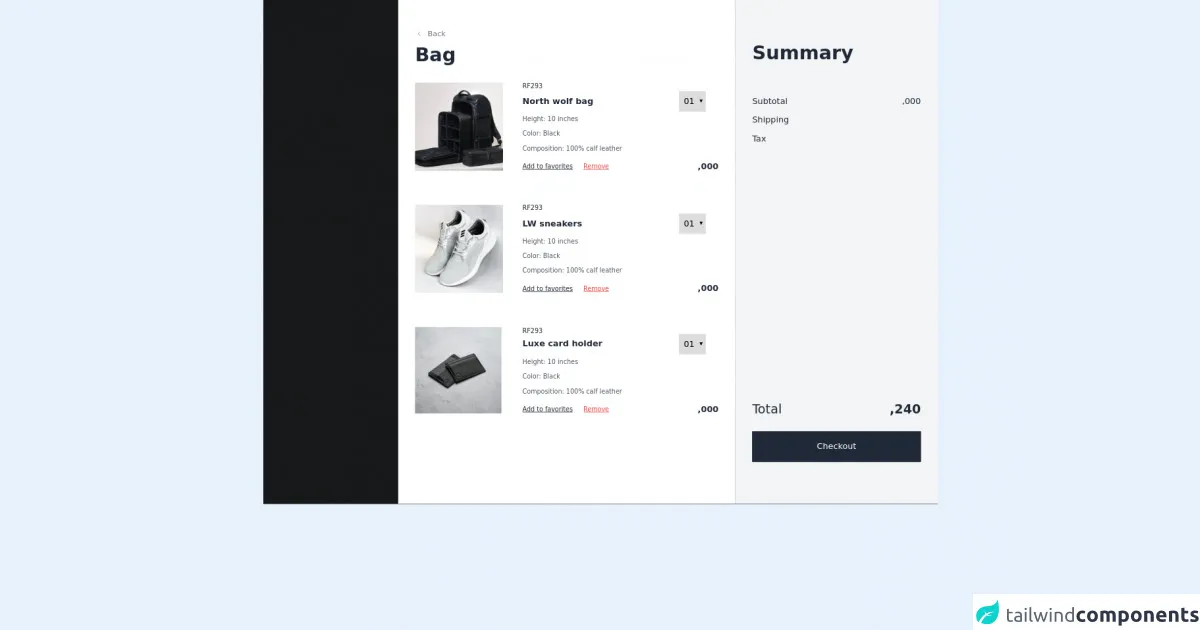
The preview of Free Tailwind CSS Shopping Carts Component ui component.
Free download of the Free Tailwind CSS Shopping Carts Component's source code
The source code of Free Tailwind CSS Shopping Carts Component ui component.
<div class="flex items-center justify-center py-8">
  <!--- more free and premium Tailwind CSS components at https://tailwinduikit.com/ --->
  <button onclick="checkoutHandler(false)" class="py-2 px-10 rounded bg-indigo-600 hover:bg-indigo-700 text-white">Open Modal</button>
</div>
<div class="w-full h-full bg-black dark:bg-gray-900 bg-opacity-90 top-0 overflow-y-auto overflow-x-hidden fixed sticky-0" id="chec-div">
  <!--- more free and premium Tailwind CSS components at https://tailwinduikit.com/ --->
  <div class="w-full absolute z-10 right-0 h-full overflow-x-hidden transform translate-x-0 transition ease-in-out duration-700" id="checkout">
    <div class="flex items-end lg:flex-row flex-col justify-end" id="cart">
      <div class="lg:w-1/2 md:w-8/12 w-full lg:px-8 lg:py-14 md:px-6 px-4 md:py-8 py-4 bg-white dark:bg-gray-800 overflow-y-hidden overflow-x-hidden lg:h-screen h-auto" id="scroll">
        <div class="flex items-center text-gray-500 hover:text-gray-600 dark:text-white cursor-pointer" onclick="checkoutHandler(false)">
          <svg xmlns="http://www.w3.org/2000/svg" class="icon icon-tabler icon-tabler-chevron-left" width="16" height="16" viewBox="0 0 24 24" stroke-width="1.5" stroke="currentColor" fill="none" stroke-linecap="round" stroke-linejoin="round">
            <path stroke="none" d="M0 0h24v24H0z" fill="none" />
            <polyline points="15 6 9 12 15 18" />
          </svg>
          <p class="text-sm pl-2 leading-none dark:hover:text-gray-200">Back</p>
        </div>
        <p class="lg:text-4xl text-3xl font-black leading-10 text-gray-800 dark:text-white pt-3">Bag</p>
        <div class="md:flex items-strech py-8 md:py-10 lg:py-8 border-t border-gray-50">
          <div class="md:w-4/12 2xl:w-1/4 w-full">
            <img src="https://i.ibb.co/SX762kX/Rectangle-36-1.png" alt="Black Leather Bag" class="h-full object-center object-cover md:block hidden" />
            <img src="https://i.ibb.co/g9xsdCM/Rectangle-37.pngg" alt="Black Leather Bag" class="md:hidden w-full h-full object-center object-cover" />
          </div>
          <div class="md:pl-3 md:w-8/12 2xl:w-3/4 flex flex-col justify-center">
            <p class="text-xs leading-3 text-gray-800 dark:text-white md:pt-0 pt-4">RF293</p>
            <div class="flex items-center justify-between w-full pt-1">
              <p class="text-base font-black leading-none text-gray-800 dark:text-white">North wolf bag</p>
              <select aria-label="Select quantity" class="py-2 px-1 border border-gray-200 mr-6 focus:outline-none dark:bg-gray-800 dark:hover:bg-gray-700 dark:text-white">
                <option>01</option>
                <option>02</option>
                <option>03</option>
              </select>
            </div>
            <p class="text-xs leading-3 text-gray-600 dark:text-white pt-2">Height: 10 inches</p>
            <p class="text-xs leading-3 text-gray-600 dark:text-white py-4">Color: Black</p>
            <p class="w-96 text-xs leading-3 text-gray-600 dark:text-white">Composition: 100% calf leather</p>
            <div class="flex items-center justify-between pt-5">
              <div class="flex itemms-center">
                <p class="text-xs leading-3 underline text-gray-800 dark:text-white cursor-pointer">Add to favorites</p>
                <p class="text-xs leading-3 underline text-red-500 pl-5 cursor-pointer">Remove</p>
              </div>
              <p class="text-base font-black leading-none text-gray-800 dark:text-white">,000</p>
            </div>
          </div>
        </div>
        <div class="md:flex items-strech py-8 md:py-10 lg:py-8 border-t border-gray-50">
          <div class="md:w-4/12 2xl:w-1/4 w-full">
            <img src="https://i.ibb.co/c6KyDXN/Rectangle-5-1.png" alt="Gray Sneakers" class="h-full object-center object-cover md:block hidden" />
            <img src="https://i.ibb.co/yVSpYqx/Rectangle-6.png" alt="Gray Sneakers" class="md:hidden w-full h-full object-center object-cover" />
          </div>
          <div class="md:pl-3 md:w-8/12 2xl:w-3/4 flex flex-col justify-center">
            <p class="text-xs leading-3 text-gray-800 dark:text-white md:pt-0 pt-4">RF293</p>
            <div class="flex items-center justify-between w-full pt-1">
              <p class="text-base font-black leading-none text-gray-800 dark:text-white">LW sneakers</p>
              <select aria-label="Select quantity" class="py-2 px-1 border border-gray-200 mr-6 focus:outline-none dark:bg-gray-800 dark:hover:bg-gray-700 dark:text-white">
                <option>01</option>
                <option>02</option>
                <option>03</option>
              </select>
            </div>
            <p class="text-xs leading-3 text-gray-600 dark:text-white pt-2">Height: 10 inches</p>
            <p class="text-xs leading-3 text-gray-600 dark:text-white py-4">Color: Black</p>
            <p class="w-96 text-xs leading-3 text-gray-600 dark:text-white">Composition: 100% calf leather</p>
            <div class="flex items-center justify-between pt-5">
              <div class="flex itemms-center">
                <p class="text-xs leading-3 underline text-gray-800 dark:text-white cursor-pointer">Add to favorites</p>
                <p class="text-xs leading-3 underline text-red-500 pl-5 cursor-pointer">Remove</p>
              </div>
              <p class="text-base font-black leading-none text-gray-800 dark:text-white">,000</p>
            </div>
          </div>
        </div>
        <div class="md:flex items-strech py-8 md:py-10 lg:py-8 border-t border-gray-50">
          <div class="md:w-4/12 2xl:w-1/4 w-full">
            <img src="https://i.ibb.co/6gzWwSq/Rectangle-20-1.png" alt="Black Leather Purse" class="h-full object-center object-cover md:block hidden" />
            <img src="https://i.ibb.co/TTnzMTf/Rectangle-21.png" alt="Black Leather Purse" class="md:hidden w-full h-full object-center object-cover" />
          </div>
          <div class="md:pl-3 md:w-8/12 2xl:w-3/4 flex flex-col justify-center">
            <p class="text-xs leading-3 text-gray-800 dark:text-white md:pt-0 pt-4">RF293</p>
            <div class="flex items-center justify-between w-full">
              <p class="text-base font-black leading-none text-gray-800 dark:text-white">Luxe card holder</p>
              <select aria-label="Select quantity" class="py-2 px-1 border border-gray-200 mr-6 focus:outline-none dark:bg-gray-800 dark:hover:bg-gray-700 dark:text-white">
                <option>01</option>
                <option>02</option>
                <option>03</option>
              </select>
            </div>
            <p class="text-xs leading-3 text-gray-600 dark:text-white pt-2">Height: 10 inches</p>
            <p class="text-xs leading-3 text-gray-600 dark:text-white py-4">Color: Black</p>
            <p class="w-96 text-xs leading-3 text-gray-600 dark:text-white">Composition: 100% calf leather</p>
            <div class="flex items-center justify-between pt-5">
              <div class="flex itemms-center">
                <p class="text-xs leading-3 underline text-gray-800 dark:text-white cursor-pointer">Add to favorites</p>
                <p class="text-xs leading-3 underline text-red-500 pl-5 cursor-pointer">Remove</p>
              </div>
              <p class="text-base font-black leading-none text-gray-800 dark:text-white">,000</p>
            </div>
          </div>
        </div>
      </div>
      <div class="lg:w-96 md:w-8/12 w-full bg-gray-100 dark:bg-gray-900 h-full">
        <div class="flex flex-col lg:h-screen h-auto lg:px-8 md:px-7 px-4 lg:py-20 md:py-10 py-6 justify-between overflow-y-auto">
          <div>
            <p class="lg:text-4xl text-3xl font-black leading-9 text-gray-800 dark:text-white">Summary</p>
            <div class="flex items-center justify-between pt-16">
              <p class="text-base leading-none text-gray-800 dark:text-white">Subtotal</p>
              <p class="text-base leading-none text-gray-800 dark:text-white">,000</p>
            </div>
            <div class="flex items-center justify-between pt-5">
              <p class="text-base leading-none text-gray-800 dark:text-white">Shipping</p>
              <p class="text-base leading-none text-gray-800 dark:text-white"></p>
            </div>
            <div class="flex items-center justify-between pt-5">
              <p class="text-base leading-none text-gray-800 dark:text-white">Tax</p>
              <p class="text-base leading-none text-gray-800 dark:text-white"></p>
            </div>
          </div>
          <div>
            <div class="flex items-center pb-6 justify-between lg:pt-5 pt-20">
              <p class="text-2xl leading-normal text-gray-800 dark:text-white">Total</p>
              <p class="text-2xl font-bold leading-normal text-right text-gray-800 dark:text-white">,240</p>
            </div>
            <button onclick="checkoutHandler1(true)" class="text-base leading-none w-full py-5 bg-gray-800 border-gray-800 border focus:outline-none focus:ring-2 focus:ring-offset-2 focus:ring-gray-800 text-white dark:hover:bg-gray-700">Checkout</button>
          </div>
        </div>
      </div>
    </div>
  </div>
  <style>
    /* width */
    #scroll::-webkit-scrollbar {
      width: 1px;
    }

    /* Track */
    #scroll::-webkit-scrollbar-track {
      background: #f1f1f1;
    }

    /* Handle */
    #scroll::-webkit-scrollbar-thumb {
      background: rgb(133, 132, 132);
    }
  </style>
</div>
<script>
let checkout = document.getElementById("checkout");
let checdiv = document.getElementById("chec-div");
let flag3 = false;
const checkoutHandler = () => {
  if (!flag3) {
    checkout.classList.add("translate-x-full");
    checkout.classList.remove("translate-x-0");
    setTimeout(function () {
      checdiv.classList.add("hidden");
    }, 1000);
    flag3 = true;
  } else {
    setTimeout(function () {
      checkout.classList.remove("translate-x-full");
      checkout.classList.add("translate-x-0");
    }, 1000);
    checdiv.classList.remove("hidden");
    flag3 = false;
  }
};
</script>
How to create a Free Tailwind CSS Shopping Carts Component with Tailwind CSS?
Here are six ways to create a free Tailwind CSS shopping cart component:
1. Use a pre-built component library
There are many pre-built component libraries available that include a shopping cart component. These libraries often include pre-defined CSS classes that can be used with Tailwind CSS.
2. Use a Tailwind CSS plugin
There are several Tailwind CSS plugins available that provide pre-built shopping cart components. These plugins can be easily installed and used with Tailwind CSS.
3. Use a Tailwind CSS template
There are many free Tailwind CSS templates available that include a shopping cart component. These templates can be customized to fit the needs of your website.
4. Build a shopping cart component from scratch
Developers can build a shopping cart component from scratch using Tailwind CSS. This method requires more time and effort but provides complete control over the component's functionality and design.
5. Use a CSS framework that includes a shopping cart component
Some CSS frameworks include a pre-built shopping cart component. These frameworks can be used with Tailwind CSS to quickly add a shopping cart to your website.
6. Hire a developer
If you don't have the time or expertise to build a shopping cart component yourself, you can hire a developer to do it for you. There are many freelance developers and development agencies that specialize in front-end development with Tailwind CSS.
Conclusion
A free Tailwind CSS shopping cart component is a great way to quickly add a shopping cart to your website. By using Tailwind CSS, developers can save time and focus on building the functionality of their website instead of spending time on styling. There are many ways to create a free Tailwind CSS shopping cart component, including using pre-built component libraries, Tailwind CSS plugins, templates, building from scratch, using a CSS framework, or hiring a developer.