- Published on
A Complete Guide To Make A Free Tailwind CSS Blog Component With Tailwind CSS
- What is Tailwind CSS?
- The description of Free Tailwind CSS Blog Component ui component
- Why use Tailwind CSS to create a Free Tailwind CSS Blog Component ui component?
- The preview of Free Tailwind CSS Blog Component ui component.
- The source code of Free Tailwind CSS Blog Component ui component.
- How to create a Free Tailwind CSS Blog Component with Tailwind CSS?
- Step 1: Set up a new project
- Step 2: Create HTML markup
- Step 3: Configure Tailwind CSS
- Step 4: Create CSS styles
- Step 5: Build and run the project
- Conclusion
What is Tailwind CSS?
Tailwind CSS is a utility-first CSS framework that helps developers create responsive and customizable UI components quickly. It provides a set of pre-defined classes that can be used to style HTML elements without writing any custom CSS code.
The description of Free Tailwind CSS Blog Component ui component
A blog component is an essential part of any website that publishes blog posts. The Free Tailwind CSS Blog Component is a UI component that can be used to display blog posts on a website. It is a responsive and customizable component that can be easily integrated into any website.
Why use Tailwind CSS to create a Free Tailwind CSS Blog Component ui component?
Tailwind CSS provides a set of pre-defined classes that can be used to style HTML elements without writing any custom CSS code. This makes it easy to create responsive and customizable UI components quickly. Using Tailwind CSS to create a Free Tailwind CSS Blog Component UI component can save a lot of time and effort.
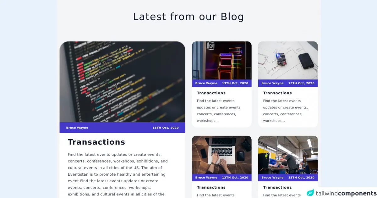
The preview of Free Tailwind CSS Blog Component ui component.
The Free Tailwind CSS Blog Component is a responsive and customizable component that can be easily integrated into any website. It can be used to display blog posts on a website.
Free download of the Free Tailwind CSS Blog Component's source code
The source code of Free Tailwind CSS Blog Component ui component.
The source code of the Free Tailwind CSS Blog Component is available on GitHub. It is a set of HTML and CSS files that can be easily customized to fit the needs of any website.
<div id="blog" class="bg-gray-100 px-4 xl:px-4 py-14">
                    <div class="mx-auto container">
                        <span role="contentinfo">
                        <h1 tabindex="0" class="focus:outline-none text-center text-3xl lg:text-5xl tracking-wider text-gray-900">Latest from our Blog</h1>
                    </span>
                        <div tabindex="0"  aria-label="Group of cards" class="focus:outline-none mt-12 lg:mt-24">
                            <div  class="grid sm:grid-cols-1 md:grid-cols-1 lg:grid-cols-2 xl:grid-cols-2 gap-8">
                                <div tabindex="0" class="focus:outline-none" aria-label="card 1">
                                    <img role="img" aria-label="code editor" tabindex="0" class="focus:outline-none w-full" src="https://cdn.tuk.dev/assets/components/111220/Blg-6/blog(1).png" alt="code editor" />
                                    <div class="py-4 px-8 w-full flex justify-between bg-indigo-700">
                                        <p  tabindex="0" class="focus:outline-none text-sm text-white font-semibold tracking-wide">Bruce Wayne</p>
                                        <p tabindex="0" class="focus:outline-none text-sm text-white font-semibold tracking-wide">13TH Oct, 2020</p>
                                    </div>
                                    <div class="bg-white px-10 py-6 rounded-bl-3xl rounded-br-3xl">
                                        <h1 tabindex="0" class="focus:outline-none text-4xl text-gray-900 font-semibold tracking-wider">Transactions</h1>
                                        <p tabindex="0" class="focus:outline-none text-gray-700 text-base lg:text-lg lg:leading-8 tracking-wide mt-6 w-11/12">Find the latest events updates or create events, concerts, conferences, workshops, exhibitions, and cultural events in all cities of the US. The aim of Eventistan is to promote healthy and entertaining event.Find the latest events updates or create events, concerts, conferences, workshops, exhibitions, and cultural events in all cities of the US. The aim of Eventistan is to promote healthy and entertaining event.</p>
                                        <div class="w-full flex justify-end" >
                                            <button class="focus:outline-none focus:ring-2 ring-offset-2 focus:ring-gray-600 hover:opacity-75 mt-4 justify-end flex items-center cursor-pointer">
                                                <span class=" text-base tracking-wide text-indigo-700">Read more</span>
                                                <svg class="ml-3 lg:ml-6 text-indigo-700" xmlns="http://www.w3.org/2000/svg" width="20" height="18" viewBox="0 0 20 18" fill="none">
                                                    <path d="M11.7998 1L18.9998 8.53662L11.7998 16.0732" stroke="currentColor" stroke-width="2" stroke-linecap="round" stroke-linejoin="round"></path>
                                                    <path d="M1 8.53662H19" stroke="currentColor" stroke-width="2" stroke-linecap="round" stroke-linejoin="round"></path>
                                                </svg>
                                            </button>
                                        </div>
                                        <div class="h-5 w-2"></div>
                                    </div>
                                </div>
                                <div>
                                    <div class="grid sm:grid-cols-1 md:grid-cols-2 lg:grid-cols-2 xl:grid-cols-2 gap-8">
                                        <div tabindex="0" class="focus:outline-none " aria-label="card 2" >
                                            <img tabindex="0" role="img" aria-label="gaming" class="focus:outline-none w-full" src="https://cdn.tuk.dev/assets/components/111220/Blg-6/blog(2).png" alt="games" />
                                            <div class="py-2 px-4 w-full flex justify-between bg-indigo-700">
                                                <p tabindex="0" class="focus:outline-none  text-sm text-white font-semibold tracking-wide">Bruce Wayne</p>
                                                <p tabindex="0" class="focus:outline-none text-sm text-white font-semibold tracking-wide">13TH Oct, 2020</p>
                                            </div>
                                            <div class="bg-white px-3 lg:px-6 py-4 rounded-bl-3xl rounded-br-3xl">
                                                <h1 tabindex="0" class="focus:outline-none text-lg text-gray-900 font-semibold tracking-wider">Transactions</h1>
                                                <p tabindex="0" class="focus:outline-none text-gray-700 text-sm lg:text-base lg:leading-8 pr-4 tracking-wide mt-2">Find the latest events updates or create events, concerts, conferences, workshops...</p>
                                            </div>
                                        </div>
                                        <div  tabindex="0" class="focus:outline-none" aria-label="card 3">
                                            <img tabindex="0" role="img" aria-label="gaming" class="focus:outline-none focus:outline-none w-full" src="https://cdn.tuk.dev/assets/components/111220/Blg-6/blog(3).png" alt="notes" />
                                            <div class="py-2 px-4 w-full flex justify-between bg-indigo-700">
                                                <p tabindex="0" class="focus:outline-none text-sm text-white font-semibold tracking-wide">Bruce Wayne</p>
                                                <p tabindex="0" class="focus:outline-none text-sm text-white font-semibold tracking-wide">13TH Oct, 2020</p>
                                            </div>
                                            <div class="bg-white px-3 lg:px-6 py-4 rounded-bl-3xl rounded-br-3xl">
                                                <h1 tabindex="0" class="focus:outline-none text-lg text-gray-900 font-semibold tracking-wider">Transactions</h1>
                                                <p tabindex="0" class="focus:outline-none text-gray-700 text-sm lg:text-base lg:leading-8 pr-4 tracking-wide mt-2">Find the latest events updates or create events, concerts, conferences, workshops...</p>
                                            </div>
                                        </div>
                                    </div>

                                    <div class="mt-10 grid sm:grid-cols-1 md:grid-cols-2 lg:grid-cols-2 xl:grid-cols-2 gap-8">
                                        <div tabindex="0" class="focus:outline-none " aria-label="card 4">
                                            <img tabindex="0" role="img" aria-label="laptop" class="focus:outline-none w-full" src="https://cdn.tuk.dev/assets/components/111220/Blg-6/blog(4).png" alt="laptop" />
                                            <div class="py-2 px-4 w-full flex justify-between bg-indigo-700">
                                                <p tabindex="0" class="focus:outline-none text-sm text-white font-semibold tracking-wide">Bruce Wayne</p>
                                                <p tabindex="0" class="focus:outline-none text-sm text-white font-semibold tracking-wide">13TH Oct, 2020</p>
                                            </div>
                                            <div class="bg-white px-3 lg:px-6 py-4 rounded-bl-3xl rounded-br-3xl">
                                                <h1 tabindex="0" class="focus:outline-none text-lg text-gray-900 font-semibold tracking-wider">Transactions</h1>
                                                <p tabindex="0" class="focus:outline-none text-gray-700 text-sm lg:text-base lg:leading-8 pr-4 tracking-wide mt-2">Find the latest events updates or create events, concerts, conferences, workshops...</p>
                                            </div>
                                        </div>
                                        <div tabindex="0" class="focus:outline-none" aria-label="card 5">
                                            <img tabindex="0" role="img" aria-label="worker" class="focus:outline-none w-full" src="https://cdn.tuk.dev/assets/components/111220/Blg-6/blog(5).png" alt="worker" />
                                            <div class="py-2 px-4 w-full flex justify-between bg-indigo-700">
                                                <p tabindex="0" class="focus:outline-none text-sm text-white font-semibold tracking-wide">Bruce Wayne</p>
                                                <p tabindex="0" class="focus:outline-none text-sm text-white font-semibold tracking-wide">13TH Oct, 2020</p>
                                            </div>
                                            <div class="bg-white px-3 lg:px-6 py-4 rounded-bl-3xl rounded-br-3xl">
                                                <h1 tabindex="0" class="focus:outline-none  text-lg text-gray-900 font-semibold tracking-wider">Transactions</h1>
                                                <p tabindex="0" class="focus:outline-none  text-gray-700 text-sm lg:text-base lg:leading-8 pr-4 tracking-wide mt-2">Find the latest events updates or create events, concerts, conferences, workshops...</p>
       <!--- more free and premium Tailwind CSS components at https://tailwinduikit.com/ --->                                     </div>
                                        </div>
                                    </div>
                                </div>
                            </div>
                        </div>
                    </div>
                </div>
How to create a Free Tailwind CSS Blog Component with Tailwind CSS?
To create a Free Tailwind CSS Blog Component with Tailwind CSS, follow these steps:
Step 1: Set up a new project
Create a new project folder and initialize it with npm. Install Tailwind CSS and PostCSS using the following commands:
npm init -y
npm install tailwindcss postcss-cli
Step 2: Create HTML markup
Create an HTML file and add the following markup:
<div class="blog-component">
  <div class="blog-post">
    <div class="blog-image">
      <img src="https://via.placeholder.com/150" alt="Blog Post Image">
    </div>
    <div class="blog-content">
      <h2 class="blog-title">Blog Post Title</h2>
      <p class="blog-excerpt">Blog Post Excerpt</p>
      <a href="#" class="blog-read-more">Read More</a>
    </div>
  </div>
</div>
Step 3: Configure Tailwind CSS
Create a new file named tailwind.config.js and add the following configuration:
module.exports = {
  purge: [],
  darkMode: false,
  theme: {
    extend: {},
  },
  variants: {},
  plugins: [],
}
Step 4: Create CSS styles
Create a new file named styles.css and add the following CSS styles:
@tailwind base;
@tailwind components;
@tailwind utilities;

.blog-component {
  display: flex;
  flex-wrap: wrap;
  justify-content: center;
}

.blog-post {
  margin: 1rem;
  max-width: 300px;
  border: 1px solid #ccc;
  border-radius: 0.5rem;
  overflow: hidden;
}

.blog-image img {
  width: 100%;
  height: auto;
}

.blog-content {
  padding: 1rem;
}

.blog-title {
  font-size: 1.5rem;
  margin-bottom: 0.5rem;
}

.blog-excerpt {
  margin-bottom: 1rem;
}

.blog-read-more {
  display: block;
  text-align: center;
  padding: 0.5rem;
  background-color: #000;
  color: #fff;
  border-radius: 0.25rem;
  transition: background-color 0.3s ease;
}

.blog-read-more:hover {
  background-color: #333;
}
Step 5: Build and run the project
Build the project using the following command:
npx postcss styles.css -o dist/styles.css
Create a new HTML file and add the following markup:
<!DOCTYPE html>
<html lang="en">
<head>
  <meta charset="UTF-8">
  <title>Free Tailwind CSS Blog Component</title>
  <link rel="stylesheet" href="dist/styles.css">
</head>
<body>
  <div class="blog-component">
    <div class="blog-post">
      <div class="blog-image">
        <img src="https://via.placeholder.com/150" alt="Blog Post Image">
      </div>
      <div class="blog-content">
        <h2 class="blog-title">Blog Post Title</h2>
        <p class="blog-excerpt">Blog Post Excerpt</p>
        <a href="#" class="blog-read-more">Read More</a>
      </div>
    </div>
  </div>
</body>
</html>
Run the HTML file in a web browser to see the Free Tailwind CSS Blog Component in action.
Conclusion
Tailwind CSS is a powerful CSS framework that can help developers create responsive and customizable UI components quickly. The Free Tailwind CSS Blog Component is a UI component that can be used to display blog posts on a website. By following the steps outlined in this guide, you can create a Free Tailwind CSS Blog Component with Tailwind CSS and integrate it into your website.