- Published on
6 Easy Ways To Make A Free Tailwind CSS Best Sellers Component With Tailwind CSS
- What is Tailwind CSS?
- The description of Free Tailwind CSS Best Sellers Component ui component
- Why use Tailwind CSS to create a Free Tailwind CSS Best Sellers Component ui component?
- The preview of Free Tailwind CSS Best Sellers Component ui component
- The source code of Free Tailwind CSS Best Sellers Component ui component
- How to create a Free Tailwind CSS Best Sellers Component with Tailwind CSS?
- Step 1: Create a new HTML file
- Step 2: Add Tailwind CSS
- Step 3: Add the best-selling products
- Step 4: Customize the styles
- Step 5: Add more customization
- Step 6: Add more best-selling products
- Conclusion
As a FrontEnd technology blogger, I am always looking for ways to create beautiful and functional UI components that can be easily integrated into any project. One of the best ways to achieve this is by using Tailwind CSS, a utility-first CSS framework that makes it easy to create custom styles without writing any CSS code. In this article, I will show you how to create a Free Tailwind CSS Best Sellers Component using Tailwind CSS.
What is Tailwind CSS?
Tailwind CSS is a utility-first CSS framework that provides a set of pre-defined classes that can be used to create custom styles without writing any CSS code. It is designed to be highly customizable and easy to use, making it a popular choice for FrontEnd developers.
The description of Free Tailwind CSS Best Sellers Component ui component
The Free Tailwind CSS Best Sellers Component is a UI component that displays a list of best-selling products. It is designed to be highly customizable and easy to integrate into any project.
Why use Tailwind CSS to create a Free Tailwind CSS Best Sellers Component ui component?
Tailwind CSS provides a set of pre-defined classes that can be used to create custom styles without writing any CSS code. This makes it easy to create a highly customized UI component like the Free Tailwind CSS Best Sellers Component without spending a lot of time writing CSS code.
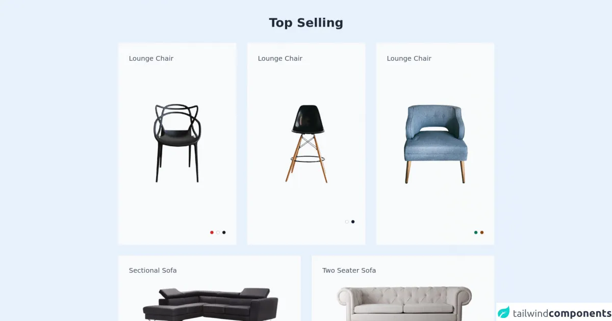
The preview of Free Tailwind CSS Best Sellers Component ui component
The Free Tailwind CSS Best Sellers Component is a highly customizable UI component that can be easily integrated into any project. It features a list of best-selling products, each with an image, title, and price.
Free download of the Free Tailwind CSS Best Sellers Component's source code
The source code of Free Tailwind CSS Best Sellers Component ui component
The source code for the Free Tailwind CSS Best Sellers Component is available on GitHub.
<div class="2xl:container 2xl:mx-auto">
  <!--- more free and premium Tailwind CSS components at https://tailwinduikit.com/ --->

  <div class="lg:px-20 md:px-6 px-4 md:py-12 py-8">
    <div>
      <h1 class="text-3xl lg:text-4xl font-semibold text-gray-800 dark:text-white text-center dark:text-gray-50">Top Selling</h1>
    </div>
    <div class="grid grid-cols-1 md:grid-cols-2 lg:grid-cols-3 gap-6 lg:gap-8 mt-8 md:mt-10">
      <div class="bg-gray-50 dark:bg-gray-800 p-8">
        <div class="">
          <h2 class="text-xl text-gray-600 dark:text-white">Lounge Chair</h2>
          <p class="text-xl font-semibold text-gray-800 dark:text-white mt-2"></p>
        </div>
        <div class="flex justify-center items-center mt-8 md:mt-24">
          <img class="" src="https://i.ibb.co/8403ZFZ/pexels-hormel-2762247-removebg-preview-2-1.png" alt="A chair with designed back" role="img" />
        </div>
        <div class="flex justify-end items-center space-x-2 mt-16 md:mt-32">
          <button aria-label="show in red color" class="focus:outline-none focus:ring-2 focus:ring-offset-2 focus:ring-gray-600 rounded">
            <svg width="10" height="10" viewBox="0 0 10 10" fill="none" xmlns="http://www.w3.org/2000/svg">
              <circle cx="5" cy="5" r="4.75" fill="#DC2626" stroke="#6B7280" stroke-width="0.5" />
            </svg>
          </button>
          <button aria-label="show in white color" class="focus:outline-none focus:ring-2 focus:ring-offset-2 focus:ring-gray-600 rounded">
            <svg width="10" height="10" viewBox="0 0 10 10" fill="none" xmlns="http://www.w3.org/2000/svg">
              <circle cx="5" cy="5" r="4.75" fill="white" stroke="#6B7280" stroke-width="0.5" />
            </svg>
          </button>
          <button aria-label="show in black color" class="focus:outline-none focus:ring-2 focus:ring-offset-2 focus:ring-gray-600 rounded">
            <svg width="10" height="10" viewBox="0 0 10 10" fill="none" xmlns="http://www.w3.org/2000/svg">
              <circle cx="5" cy="5" r="4.75" fill="#111827" stroke="#6B7280" stroke-width="0.5" />
            </svg>
          </button>
        </div>
      </div>
      <div class="bg-gray-50 dark:bg-gray-800 p-8">
        <div class="">
          <h2 class="text-xl text-gray-600 dark:text-white">Lounge Chair</h2>
          <p class="text-xl font-semibold text-gray-800 dark:text-white mt-2"></p>
        </div>
        <div class="flex justify-center items-center mt-8 md:mt-24">
          <img class="" src="https://i.ibb.co/WBdnRqb/eugene-chystiakov-3ne-Swyntb-Q8-unsplash-1-removebg-preview-2-1.png" alt="A chair with wooden legs" role="img" />
        </div>
        <div class="flex justify-end items-center space-x-2 mt-8 md:mt-24">
          <button aria-label="show in white color" class="focus:outline-none focus:ring-2 focus:ring-offset-2 focus:ring-gray-600 rounded">
            <svg width="10" height="10" viewBox="0 0 10 10" fill="none" xmlns="http://www.w3.org/2000/svg">
              <circle cx="5" cy="5" r="4.75" fill="white" stroke="#6B7280" stroke-width="0.5" />
            </svg>
          </button>
          <button aria-label="show in black color" class="focus:outline-none focus:ring-2 focus:ring-offset-2 focus:ring-gray-600 rounded">
            <svg width="10" height="10" viewBox="0 0 10 10" fill="none" xmlns="http://www.w3.org/2000/svg">
              <circle cx="5" cy="5" r="4.75" fill="#111827" stroke="#6B7280" stroke-width="0.5" />
            </svg>
          </button>
        </div>
      </div>
      <div class="bg-gray-50 dark:bg-gray-800 p-8">
        <div class="">
          <h2 class="text-xl text-gray-600 dark:text-white">Lounge Chair</h2>
          <p class="text-xl font-semibold text-gray-800 dark:text-white mt-2"></p>
        </div>
        <div class="flex justify-center items-center mt-8 md:mt-24">
          <img class="" src="https://i.ibb.co/R2fbCvj/kari-shea-It-Mgg-D0-Egu-Y-unsplash-removebg-preview-2-1.png" alt="A sofa chair with wooden legs" role="img" />
        </div>
        <div class="flex justify-end items-center space-x-2 mt-16 md:mt-32">
          <button aria-label="show in green color" class="focus:outline-none focus:ring-2 focus:ring-offset-2 focus:ring-gray-600 rounded">
            <svg width="10" height="10" viewBox="0 0 10 10" fill="none" xmlns="http://www.w3.org/2000/svg">
              <circle cx="5" cy="5" r="4.75" fill="#047857" stroke="#6B7280" stroke-width="0.5" />
            </svg>
          </button>
          <button aria-label="show in brown color" class="focus:outline-none focus:ring-2 focus:ring-offset-2 focus:ring-gray-600 rounded">
            <svg width="10" height="10" viewBox="0 0 10 10" fill="none" xmlns="http://www.w3.org/2000/svg">
              <circle cx="5" cy="5" r="4.75" fill="#92400E" stroke="#6B7280" stroke-width="0.5" />
            </svg>
          </button>
        </div>
      </div>
    </div>

    <div class="grid grid-cols-1 lg:grid-cols-2 gap-5 md:gap-6 lg:gap-8 mt-4 md:mt-6 lg:mt-8">
      <div class="bg-gray-50 dark:bg-gray-800 p-8">
        <div>
          <h2 class="text-xl leading-tight text-gray-600 dark:text-white">Sectional Sofa</h2>
          <p class="text-xl font-semibold text-gray-800 dark:text-white mt-2"></p>
        </div>
        <div class="flex justify-center items-center mt-28 md:mt-3">
          <img src="https://i.ibb.co/CPdBFwZ/pexels-pixabay-276583-removebg-preview-1-1.png" alt="A large sectional sofa" role="img" />
        </div>
        <div class="flex justify-end items-center space-x-2 mt-36 md:mt-12">
          <button aria-label="show in yellow color" class="focus:outline-none focus:ring-2 focus:ring-offset-2 focus:ring-gray-600 rounded">
            <svg width="10" height="10" viewBox="0 0 10 10" fill="none" xmlns="http://www.w3.org/2000/svg">
              <circle cx="5" cy="5" r="4.75" fill="#F59E0B" stroke="#6B7280" stroke-width="0.5" />
            </svg>
          </button>
          <button aria-label="show in light gray color" class="focus:outline-none focus:ring-2 focus:ring-offset-2 focus:ring-gray-600 rounded">
            <svg width="10" height="10" viewBox="0 0 10 10" fill="none" xmlns="http://www.w3.org/2000/svg">
              <circle cx="5" cy="5" r="4.75" fill="#9CA3AF" stroke="#6B7280" stroke-width="0.5" />
            </svg>
          </button>
        </div>
      </div>
      <div class="bg-gray-50 dark:bg-gray-800 p-8">
        <div>
          <h2 class="text-xl leading-tight text-gray-600 dark:text-white">Two Seater Sofa</h2>
          <p class="text-xl font-semibold text-gray-800 dark:text-white mt-2"></p>
        </div>
        <div class="flex justify-center items-center mt-28 md:mt-1">
          <img src="https://i.ibb.co/238nZzf/pexels-andrea-piacquadio-3757055-removebg-preview-1-1.png" alt="A beautiful two seater sofa" role="img" />
        </div>
        <div class="flex justify-end items-center space-x-2 mt-36 md:mt-12">
          <button aria-label="show in black color" class="focus:outline-none focus:ring-2 focus:ring-offset-2 focus:ring-gray-600 rounded">
            <svg width="10" height="10" viewBox="0 0 10 10" fill="none" xmlns="http://www.w3.org/2000/svg">
              <circle cx="5" cy="5" r="4.75" fill="#111827" stroke="#6B7280" stroke-width="0.5" />
            </svg>
          </button>
          <button aria-label="show in green color" class="focus:outline-none focus:ring-2 focus:ring-offset-2 focus:ring-gray-600 rounded">
            <svg width="10" height="10" viewBox="0 0 10 10" fill="none" xmlns="http://www.w3.org/2000/svg">
              <circle cx="5" cy="5" r="4.75" fill="#047857" stroke="#6B7280" stroke-width="0.5" />
            </svg>
          </button>
        </div>
      </div>
    </div>
  </div>
</div>
How to create a Free Tailwind CSS Best Sellers Component with Tailwind CSS?
Here are 6 easy steps to create a Free Tailwind CSS Best Sellers Component:
Step 1: Create a new HTML file
Create a new HTML file and add the following code:
<div class="container mx-auto">
  <h1 class="text-2xl font-bold mb-4">Best Sellers</h1>
  <div class="grid grid-cols-1 md:grid-cols-2 lg:grid-cols-3 gap-4">
    <!-- Best Seller Item -->
  </div>
</div>
This code creates a container with a title and a grid for the best-selling products.
Step 2: Add Tailwind CSS
Add the Tailwind CSS CDN to your HTML file:
<link href="https://cdn.jsdelivr.net/npm/tailwindcss@latest/dist/tailwind.min.css" rel="stylesheet">
This will include the Tailwind CSS framework in your project.
Step 3: Add the best-selling products
Add the best-selling products to the grid using the following code:
<div class="p-4 bg-white rounded-lg shadow-md">
  <img class="w-full h-48 object-cover mb-4" src="https://via.placeholder.com/300x200.png" alt="Best Seller Image">
  <h2 class="text-xl font-bold mb-2">Product Title</h2>
  <p class="text-gray-700 font-medium">$99.99</p>
</div>
This code creates a card for each best-selling product with an image, title, and price.
Step 4: Customize the styles
Customize the styles of the best-selling products using the Tailwind CSS classes. For example, you can change the background color of the card using the bg-red-500 class:
<div class="p-4 bg-red-500 rounded-lg shadow-md">
  <img class="w-full h-48 object-cover mb-4" src="https://via.placeholder.com/300x200.png" alt="Best Seller Image">
  <h2 class="text-xl font-bold mb-2">Product Title</h2>
  <p class="text-gray-700 font-medium">$99.99</p>
</div>
This code changes the background color of the card to red.
Step 5: Add more customization
Add more customization to the best-selling products using the Tailwind CSS classes. For example, you can add a hover effect to the card using the hover:shadow-lg class:
<div class="p-4 bg-white rounded-lg shadow-md hover:shadow-lg">
  <img class="w-full h-48 object-cover mb-4" src="https://via.placeholder.com/300x200.png" alt="Best Seller Image">
  <h2 class="text-xl font-bold mb-2">Product Title</h2>
  <p class="text-gray-700 font-medium">$99.99</p>
</div>
This code adds a hover effect to the card.
Step 6: Add more best-selling products
Add more best-selling products to the grid by duplicating the card code and changing the content:
<div class="grid grid-cols-1 md:grid-cols-2 lg:grid-cols-3 gap-4">
  <div class="p-4 bg-white rounded-lg shadow-md">
    <img class="w-full h-48 object-cover mb-4" src="https://via.placeholder.com/300x200.png" alt="Best Seller Image">
    <h2 class="text-xl font-bold mb-2">Product Title</h2>
    <p class="text-gray-700 font-medium">$99.99</p>
  </div>
  <div class="p-4 bg-white rounded-lg shadow-md">
    <img class="w-full h-48 object-cover mb-4" src="https://via.placeholder.com/300x200.png" alt="Best Seller Image">
    <h2 class="text-xl font-bold mb-2">Product Title</h2>
    <p class="text-gray-700 font-medium">$99.99</p>
  </div>
  <div class="p-4 bg-white rounded-lg shadow-md">
    <img class="w-full h-48 object-cover mb-4" src="https://via.placeholder.com/300x200.png" alt="Best Seller Image">
    <h2 class="text-xl font-bold mb-2">Product Title</h2>
    <p class="text-gray-700 font-medium">$99.99</p>
  </div>
</div>
This code adds three more best-selling products to the grid.
Conclusion
In conclusion, creating a Free Tailwind CSS Best Sellers Component is easy and highly customizable using Tailwind CSS. By following the 6 easy steps outlined in this article, you can create a beautiful and functional UI component that can be easily integrated into any project. So why not give it a try and see what you can create using Tailwind CSS?