- Published on
A Complete Guide To Make A Free Tailwind CSS Blogs Component With Tailwind CSS
- What is Tailwind CSS?
- The description of Free Tailwind CSS Blogs Component ui component
- Why use Tailwind CSS to create a Free Tailwind CSS Blogs Component ui component?
- The preview of Free Tailwind CSS Blogs Component ui component.
- The source code of Free Tailwind CSS Blogs Component ui component.
- How to create a Free Tailwind CSS Blogs Component with Tailwind CSS?
- Step 1: Set up the project
- Step 2: Create the component
- Step 3: Customize the component
- Step 4: Add multiple components
- Conclusion
What is Tailwind CSS?
Tailwind CSS is a utility-first CSS framework that allows developers to create custom designs without writing any CSS code. It provides a set of pre-defined CSS classes that can be used to style HTML elements. This approach helps to speed up the development process and makes it easier to maintain the code.
The description of Free Tailwind CSS Blogs Component ui component
The Free Tailwind CSS Blogs Component is a UI component that can be used to display blog posts on a website. It is designed using Tailwind CSS and includes features such as a header, image, title, and description.
Why use Tailwind CSS to create a Free Tailwind CSS Blogs Component ui component?
Tailwind CSS provides a set of pre-defined CSS classes that can be used to style HTML elements. This approach helps to speed up the development process and makes it easier to maintain the code. Additionally, Tailwind CSS is highly customizable, which means that developers can easily modify the design of the component to fit their needs.
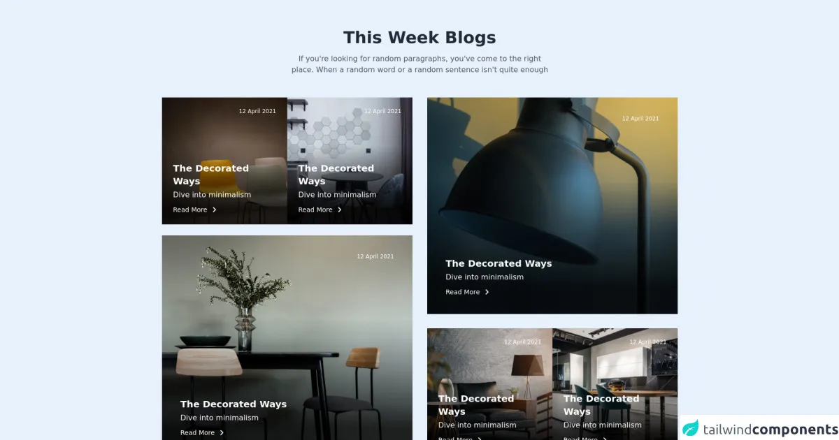
The preview of Free Tailwind CSS Blogs Component ui component.
The Free Tailwind CSS Blogs Component is a visually appealing component that can be used to display blog posts on a website. It includes a header, image, title, and description.
Free download of the Free Tailwind CSS Blogs Component's source code
The source code of Free Tailwind CSS Blogs Component ui component.
The source code for the Free Tailwind CSS Blogs Component is available on GitHub. It is designed using HTML and Tailwind CSS.
<div class="flex justify-center items-center">
  <!--- more free and premium Tailwind CSS components at https://tailwinduikit.com/ --->
  <div class="2xl:mx-auto 2xl:container lg:px-20 lg:py-16 md:py-12 md:px-6 py-9 px-4 w-96 sm:w-auto">
    <div role="main" class="flex flex-col items-center justify-center">
      <h1 class="text-4xl font-semibold leading-9 text-center text-gray-800 dark:text-gray-50">This Week Blogs</h1>
      <p class="text-base leading-normal text-center text-gray-600 dark:text-white mt-4 lg:w-1/2 md:w-10/12 w-11/12">If you're looking for random paragraphs, you've come to the right place. When a random word or a random sentence isn't quite enough</p>
    </div>
    <div class="lg:flex items-stretch md:mt-12 mt-8">
      <div class="lg:w-1/2">
        <div class="sm:flex items-center justify-between xl:gap-x-8 gap-x-6">
          <div class="sm:w-1/2 relative">
            <div>
              <p class="p-6 text-xs font-medium leading-3 text-white absolute top-0 right-0">12 April 2021</p>
              <div class="absolute bottom-0 left-0 p-6">
                <h2 class="text-xl font-semibold 5 text-white">The Decorated Ways</h2>
                <p class="text-base leading-4 text-white mt-2">Dive into minimalism</p>
                <a href="javascript:void(0)" class="focus:outline-none focus:underline flex items-center mt-4 cursor-pointer text-white hover:text-gray-200 hover:underline">
                  <p class="pr-2 text-sm font-medium leading-none">Read More</p>
                  <svg class="fill-stroke" width="16" height="16" viewBox="0 0 16 16" fill="none" xmlns="http://www.w3.org/2000/svg">
                    <path d="M5.75 12.5L10.25 8L5.75 3.5" stroke="currentColor" stroke-width="2" stroke-linecap="round" stroke-linejoin="round" />
                  </svg>
                </a>
              </div>
            </div>
            <img src="https://i.ibb.co/DYxtCJq/img-1.png" class="w-full" alt="chair" />
          </div>
          <div class="sm:w-1/2 sm:mt-0 mt-4 relative">
            <div>
              <p class="p-6 text-xs font-medium leading-3 text-white absolute top-0 right-0">12 April 2021</p>
              <div class="absolute bottom-0 left-0 p-6">
                <h2 class="text-xl font-semibold 5 text-white">The Decorated Ways</h2>
                <p class="text-base leading-4 text-white mt-2">Dive into minimalism</p>
                <a href="javascript:void(0)" class="focus:outline-none focus:underline flex items-center mt-4 cursor-pointer text-white hover:text-gray-200 hover:underline">
                  <p class="pr-2 text-sm font-medium leading-none">Read More</p>
                  <svg class="fill-stroke" width="16" height="16" viewBox="0 0 16 16" fill="none" xmlns="http://www.w3.org/2000/svg">
                    <path d="M5.75 12.5L10.25 8L5.75 3.5" stroke="currentColor" stroke-width="2" stroke-linecap="round" stroke-linejoin="round" />
                  </svg>
                </a>
              </div>
            </div>
            <img src="https://i.ibb.co/3C5HvxC/img-2.png" class="w-full" alt="wall design" />
          </div>
        </div>
        <div class="relative">
          <div>
            <p class="md:p-10 p-6 text-xs font-medium leading-3 text-white absolute top-0 right-0">12 April 2021</p>
            <div class="absolute bottom-0 left-0 md:p-10 p-6">
              <h2 class="text-xl font-semibold 5 text-white">The Decorated Ways</h2>
              <p class="text-base leading-4 text-white mt-2">Dive into minimalism</p>
              <a href="javascript:void(0)" class="focus:outline-none focus:underline flex items-center mt-4 cursor-pointer text-white hover:text-gray-200 hover:underline">
                <p class="pr-2 text-sm font-medium leading-none">Read More</p>
                <svg class="fill-stroke" width="16" height="16" viewBox="0 0 16 16" fill="none" xmlns="http://www.w3.org/2000/svg">
                  <path d="M5.75 12.5L10.25 8L5.75 3.5" stroke="currentColor" stroke-width="2" stroke-linecap="round" stroke-linejoin="round" />
                </svg>
              </a>
            </div>
          </div>
          <img src="https://i.ibb.co/Ms4qyXp/img-3.png" alt="sitting place" class="w-full mt-8 md:mt-6 hidden sm:block" />
          <img class="w-full mt-4 sm:hidden" src="https://i.ibb.co/6XYbN7f/Rectangle-29.png" alt="sitting place" />
        </div>
      </div>
      <div class="lg:w-1/2 xl:ml-8 lg:ml-4 lg:mt-0 md:mt-6 mt-4 lg:flex flex-col justify-between">
        <div class="relative">
          <div>
            <p class="md:p-10 p-6 text-xs font-medium leading-3 text-white absolute top-0 right-0">12 April 2021</p>
            <div class="absolute bottom-0 left-0 md:p-10 p-6">
              <h2 class="text-xl font-semibold 5 text-white">The Decorated Ways</h2>
              <p class="text-base leading-4 text-white mt-2">Dive into minimalism</p>
              <a href="javascript:void(0)" class="focus:outline-none focus:underline flex items-center mt-4 cursor-pointer text-white hover:text-gray-200 hover:underline">
                <p class="pr-2 text-sm font-medium leading-none">Read More</p>
                <svg class="fill-stroke" width="16" height="16" viewBox="0 0 16 16" fill="none" xmlns="http://www.w3.org/2000/svg">
                  <path d="M5.75 12.5L10.25 8L5.75 3.5" stroke="currentColor" stroke-width="2" stroke-linecap="round" stroke-linejoin="round" />
                </svg>
              </a>
            </div>
          </div>
          <img src="https://i.ibb.co/6Wfjf2w/img-4.png" alt="sitting place" class="w-full sm:block hidden" />
          <img class="w-full sm:hidden" src="https://i.ibb.co/dpXStJk/Rectangle-29.png" alt="sitting place" />
        </div>
        <div class="sm:flex items-center justify-between xl:gap-x-8 gap-x-6 md:mt-6 mt-4">
          <div class="relative w-full">
            <div>
              <p class="p-6 text-xs font-medium leading-3 text-white absolute top-0 right-0">12 April 2021</p>
              <div class="absolute bottom-0 left-0 p-6">
                <h2 class="text-xl font-semibold 5 text-white">The Decorated Ways</h2>
                <p class="text-base leading-4 text-white mt-2">Dive into minimalism</p>
                <a href="javascript:void(0)" class="focus:outline-none focus:underline flex items-center mt-4 cursor-pointer text-white hover:text-gray-200 hover:underline">
                  <p class="pr-2 text-sm font-medium leading-none">Read More</p>
                  <svg class="fill-stroke" width="16" height="16" viewBox="0 0 16 16" fill="none" xmlns="http://www.w3.org/2000/svg">
                    <path d="M5.75 12.5L10.25 8L5.75 3.5" stroke="currentColor" stroke-width="2" stroke-linecap="round" stroke-linejoin="round" />
                  </svg>
                </a>
              </div>
            </div>
            <img src="https://i.ibb.co/3yvZBpm/img-5.png" class="w-full" alt="chair" />
          </div>
          <div class="relative w-full sm:mt-0 mt-4">
            <div>
              <p class="p-6 text-xs font-medium leading-3 text-white absolute top-0 right-0">12 April 2021</p>
              <div class="absolute bottom-0 left-0 p-6">
                <h2 class="text-xl font-semibold 5 text-white">The Decorated Ways</h2>
                <p class="text-base leading-4 text-white mt-2">Dive into minimalism</p>
                <a href="javascript:void(0)" class="focus:outline-none focus:underline flex items-center mt-4 cursor-pointer text-white hover:text-gray-200 hover:underline">
                  <p class="pr-2 text-sm font-medium leading-none">Read More</p>
                  <svg class="fill-stroke" width="16" height="16" viewBox="0 0 16 16" fill="none" xmlns="http://www.w3.org/2000/svg">
                    <path d="M5.75 12.5L10.25 8L5.75 3.5" stroke="currentColor" stroke-width="2" stroke-linecap="round" stroke-linejoin="round" />
                  </svg>
                </a>
              </div>
            </div>
            <img src="https://i.ibb.co/gDdnJb5/img-6.png" class="w-full" alt="wall design" />
          </div>
        </div>
      </div>
    </div>
  </div>
</div>
How to create a Free Tailwind CSS Blogs Component with Tailwind CSS?
To create a Free Tailwind CSS Blogs Component with Tailwind CSS, follow the steps below:
Step 1: Set up the project
Create a new HTML file and add the following code:
<!DOCTYPE html>
<html lang="en">
<head>
  <meta charset="UTF-8">
  <meta name="viewport" content="width=device-width, initial-scale=1.0">
  <title>Free Tailwind CSS Blogs Component</title>
  <link rel="stylesheet" href="https://cdn.jsdelivr.net/npm/[email protected]/dist/tailwind.min.css">
</head>
<body>
  <div class="container mx-auto">
    <!-- Add the component code here -->
  </div>
</body>
</html>
This code sets up the basic structure of the HTML file and includes the Tailwind CSS library.
Step 2: Create the component
Add the following code to the HTML file to create the Free Tailwind CSS Blogs Component:
<div class="bg-white rounded-lg overflow-hidden shadow-lg">
  <img class="w-full" src="https://via.placeholder.com/800x400" alt="Blog Post Image">
  <div class="p-6">
    <h2 class="text-xl font-bold text-gray-800 mb-2">Blog Post Title</h2>
    <p class="text-gray-600 leading-relaxed">Lorem ipsum dolor sit amet, consectetur adipiscing elit, sed do eiusmod tempor incididunt ut labore et dolore magna aliqua. Ut enim ad minim veniam, quis nostrud exercitation ullamco laboris nisi ut aliquip ex ea commodo consequat.</p>
  </div>
</div>
This code creates a container with a white background, rounded corners, and a shadow. It also includes an image, title, and description.
Step 3: Customize the component
The Free Tailwind CSS Blogs Component can be customized to fit your needs. For example, you can change the background color, font size, and spacing. Here are some examples:
<!-- Change the background color -->
<div class="bg-blue-500 rounded-lg overflow-hidden shadow-lg">

<!-- Change the font size -->
<h2 class="text-2xl font-bold text-gray-800 mb-2">Blog Post Title</h2>

<!-- Change the spacing -->
<div class="p-8">
Step 4: Add multiple components
You can add multiple instances of the Free Tailwind CSS Blogs Component to create a list of blog posts. Here is an example:
<div class="container mx-auto">
  <div class="grid grid-cols-1 md:grid-cols-2 lg:grid-cols-3 gap-4">
    <div class="bg-white rounded-lg overflow-hidden shadow-lg">
      <!-- Component code -->
    </div>
    <div class="bg-white rounded-lg overflow-hidden shadow-lg">
      <!-- Component code -->
    </div>
    <div class="bg-white rounded-lg overflow-hidden shadow-lg">
      <!-- Component code -->
    </div>
  </div>
</div>
This code creates a grid layout with three columns and adds three instances of the Free Tailwind CSS Blogs Component.
Conclusion
Tailwind CSS is a powerful CSS framework that can be used to create custom designs quickly and easily. The Free Tailwind CSS Blogs Component is a great example of how Tailwind CSS can be used to create visually appealing UI components. By following the steps outlined in this guide, you can create your own Free Tailwind CSS Blogs Component and customize it to fit your needs.