- Published on
6 Steps To Make A Formulario De Registro With Tailwind CSS Like A Pro In Under An Hour
- What is Tailwind CSS?
- The description of Formulario de registro UI component
- Why use Tailwind CSS to create a Formulario de registro UI component?
- The preview of Formulario de registro UI component
- The source code of Formulario de registro UI component
- How to create a Formulario de registro with Tailwind CSS?
- Step 1: Set up your HTML
- Step 2: Add Tailwind CSS to your project
- Step 3: Customize your form with Tailwind CSS classes
- Step 4: Customize your form with your own styles
- Step 5: Test your form
- Step 6: Deploy your form
- Conclusion
Are you looking to create a Formulario de registro UI component for your website or application? Look no further than Tailwind CSS! In this article, we will go over the steps to create a professional-looking Formulario de registro UI component in under an hour using Tailwind CSS.
What is Tailwind CSS?
Tailwind CSS is a utility-first CSS framework that allows developers to rapidly build custom user interfaces. It provides a set of pre-defined classes that can be used to style HTML elements, making it easy to create complex layouts and designs.
The description of Formulario de registro UI component
A Formulario de registro UI component is a form used to collect user information for registration purposes. It typically includes fields for the user's name, email address, password, and other relevant information.
Why use Tailwind CSS to create a Formulario de registro UI component?
Tailwind CSS provides a set of pre-defined classes that can be used to style HTML elements, making it easy to create complex layouts and designs. This saves developers time and effort, allowing them to focus on building the functionality of their application rather than spending hours styling their UI components.
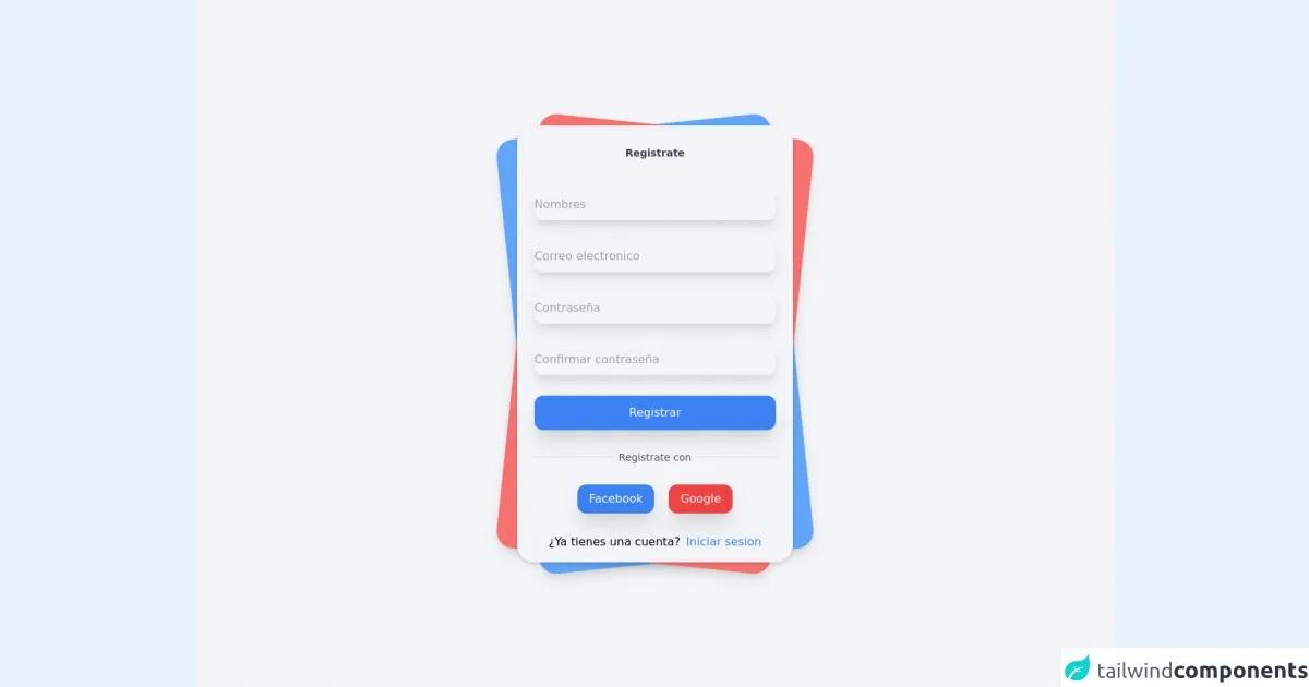
The preview of Formulario de registro UI component
To preview the Formulario de registro UI component we will be creating, please see the image below:
Free download of the Formulario de registro's source code
The source code of Formulario de registro UI component
To view the source code for the Formulario de registro UI component we will be creating, please see the code below:
<div class="font-sans">
    <div class="relative min-h-screen flex flex-col sm:justify-center items-center bg-gray-100 ">
        <div class="relative sm:max-w-sm w-full">
            <div class="card bg-blue-400 shadow-lg  w-full h-full rounded-3xl absolute  transform -rotate-6"></div>
            <div class="card bg-red-400 shadow-lg  w-full h-full rounded-3xl absolute  transform rotate-6"></div>
            <div class="relative w-full rounded-3xl  px-6 py-4 bg-gray-100 shadow-md">
                <label for="" class="block mt-3 text-sm text-gray-700 text-center font-semibold">
                    Registrate
                </label>
                <form method="#" action="#" class="mt-10">

                    <div>
                        <input type="text" placeholder="Nombres" class="mt-1 block w-full border-none bg-gray-100 h-11 rounded-xl shadow-lg hover:bg-blue-100 focus:bg-blue-100 focus:ring-0">
                    </div>

                    <div class="mt-7">
                        <input type="email" placeholder="Correo electronico" class="mt-1 block w-full border-none bg-gray-100 h-11 rounded-xl shadow-lg hover:bg-blue-100 focus:bg-blue-100 focus:ring-0">
                    </div>

                    <div class="mt-7">
                        <input type="password" placeholder="Contraseña" class="mt-1 block w-full border-none bg-gray-100 h-11 rounded-xl shadow-lg hover:bg-blue-100 focus:bg-blue-100 focus:ring-0">
                    </div>

                    <div class="mt-7">
                        <input type="password" placeholder="Confirmar contraseña" class="mt-1 block w-full border-none bg-gray-100 h-11 rounded-xl shadow-lg hover:bg-blue-100 focus:bg-blue-100 focus:ring-0">
                    </div>


                    <div class="mt-7">
                        <button class="bg-blue-500 w-full py-3 rounded-xl text-white shadow-xl hover:shadow-inner focus:outline-none transition duration-500 ease-in-out  transform hover:-translate-x hover:scale-105">
                            Registrar
                        </button>
                    </div>

                    <div class="flex mt-7 items-center text-center">
                        <hr class="border-gray-300 border-1 w-full rounded-md">
                        <label class="block font-medium text-sm text-gray-600 w-full">
                            Registrate con
                        </label>
                        <hr class="border-gray-300 border-1 w-full rounded-md">
                    </div>

                    <div class="flex mt-7 justify-center w-full">
                        <button class="mr-5 bg-blue-500 border-none px-4 py-2 rounded-xl cursor-pointer text-white shadow-xl hover:shadow-inner transition duration-500 ease-in-out  transform hover:-translate-x hover:scale-105">

                            Facebook
                        </button>

                        <button class="bg-red-500 border-none px-4 py-2 rounded-xl cursor-pointer text-white shadow-xl hover:shadow-inner transition duration-500 ease-in-out  transform hover:-translate-x hover:scale-105">

                            Google
                        </button>
                    </div>

                    <div class="mt-7">
                        <div class="flex justify-center items-center">
                            <label class="mr-2" >¿Ya tienes una cuenta?</label>
                            <a href="#" class=" text-blue-500 transition duration-500 ease-in-out  transform hover:-translate-x hover:scale-105">
                                Iniciar sesion
                            </a>
                        </div>
                    </div>
                </form>
            </div>
        </div>
    </div>
</div>
How to create a Formulario de registro with Tailwind CSS?
Now that we have covered the basics, let's dive into the steps to create a Formulario de registro UI component with Tailwind CSS.
Step 1: Set up your HTML
The first step is to set up your HTML. Create a new HTML file and add the following code:
<form class="bg-white shadow-md rounded px-8 pt-6 pb-8 mb-4">
  <div class="mb-4">
    <label class="block text-gray-700 font-bold mb-2" for="username">
      Username
    </label>
    <input
      class="shadow appearance-none border rounded w-full py-2 px-3 text-gray-700 leading-tight focus:outline-none focus:shadow-outline"
      id="username"
      type="text"
      placeholder="Username"
    />
  </div>
  <div class="mb-4">
    <label class="block text-gray-700 font-bold mb-2" for="email">
      Email
    </label>
    <input
      class="shadow appearance-none border rounded w-full py-2 px-3 text-gray-700 leading-tight focus:outline-none focus:shadow-outline"
      id="email"
      type="email"
      placeholder="Email"
    />
  </div>
  <div class="mb-4">
    <label class="block text-gray-700 font-bold mb-2" for="password">
      Password
    </label>
    <input
      class="shadow appearance-none border rounded w-full py-2 px-3 text-gray-700 leading-tight focus:outline-none focus:shadow-outline"
      id="password"
      type="password"
      placeholder="********"
    />
  </div>
  <div class="mb-6">
    <label class="block text-gray-700 font-bold mb-2" for="confirm-password">
      Confirm Password
    </label>
    <input
      class="shadow appearance-none border rounded w-full py-2 px-3 text-gray-700 leading-tight focus:outline-none focus:shadow-outline"
      id="confirm-password"
      type="password"
      placeholder="********"
    />
  </div>
  <div class="flex items-center justify-between">
    <button
      class="bg-blue-500 hover:bg-blue-700 text-white font-bold py-2 px-4 rounded focus:outline-none focus:shadow-outline"
      type="button"
    >
      Register
    </button>
  </div>
</form>
This code sets up a basic form with fields for the user's username, email, password, and confirm password, as well as a register button.
Step 2: Add Tailwind CSS to your project
The next step is to add Tailwind CSS to your project. You can do this by including the Tailwind CSS CDN in your HTML file:
<link href="https://cdn.jsdelivr.net/npm/tailwindcss@latest/dist/tailwind.min.css" rel="stylesheet">
Step 3: Customize your form with Tailwind CSS classes
Now that we have our HTML and Tailwind CSS set up, we can start customizing our form using Tailwind CSS classes. Let's break down the classes we are using in our HTML:
bg-white: sets the background color of the form to whiteshadow-md: adds a shadow to the form to give it depthrounded: rounds the corners of the formpx-8: adds padding to the left and right sides of the formpt-6: adds padding to the top of the formpb-8: adds padding to the bottom of the formmb-4: adds margin to the bottom of each form fieldblock: sets the display property of the label to blocktext-gray-700: sets the text color of the label to grayfont-bold: makes the label text boldleading-tight: sets the line height of the input fields to be tightfocus:outline-none: removes the default outline when the input field is in focusfocus:shadow-outline: adds a shadow to the input field when it is in focusbg-blue-500: sets the background color of the register button to bluehover:bg-blue-700: changes the background color of the register button to a darker shade of blue when hovered overtext-white: sets the text color of the register button to whitefont-bold: makes the register button text boldpy-2: adds padding to the top and bottom of the register buttonpx-4: adds padding to the left and right sides of the register buttonrounded: rounds the corners of the register buttonfocus:outline-none: removes the default outline when the register button is in focusfocus:shadow-outline: adds a shadow to the register button when it is in focus
Step 4: Customize your form with your own styles
Tailwind CSS provides a set of pre-defined classes that can be used to style HTML elements, but you can also customize your form with your own styles. For example, you can change the background color of the form to match your brand colors, or change the font size of the label text to make it more readable.
Step 5: Test your form
Once you have customized your form to your liking, it's time to test it out! Fill out the form and make sure it is submitting the data correctly. If you encounter any issues, go back and double-check your code to make sure everything is set up correctly.
Step 6: Deploy your form
Finally, it's time to deploy your form to your website or application. Simply copy and paste the HTML code into your project and you're good to go!
Conclusion
In this article, we have gone over the steps to create a professional-looking Formulario de registro UI component in under an hour using Tailwind CSS. By following these steps, you can save time and effort while still creating a beautiful and functional form for your users to register with. Happy coding!