- Published on
Best Ways To Create A Fortnite Button With Tailwind CSS
- What is Tailwind CSS?
- The description of Fortnite button ui component
- Why use Tailwind CSS to create a Fortnite button ui component?
- The preview of Fortnite button ui component
- The source code of Fortnite button ui component
- How to create a Fortnite button with Tailwind CSS?
- Conclusion
What is Tailwind CSS?
Tailwind CSS is a utility-first CSS framework that allows developers to easily create responsive and customizable user interfaces. It provides a set of pre-defined classes that can be used to style HTML elements, making it easy to create complex layouts and designs without writing custom CSS.
The description of Fortnite button ui component
The Fortnite button is a UI component that is commonly used in gaming websites and applications. It typically consists of a rectangular button with rounded corners, a gradient background, and a label or icon in the center. The button is often used to trigger actions such as starting a game or joining a group.
Why use Tailwind CSS to create a Fortnite button ui component?
Tailwind CSS is an excellent choice for creating a Fortnite button UI component for several reasons:
- Easy to use: Tailwind CSS provides a set of pre-defined classes that can be used to style HTML elements, making it easy to create complex layouts and designs without writing custom CSS.
- Customizable: Tailwind CSS allows developers to customize the design of UI components by modifying the pre-defined classes or creating new ones.
- Responsive: Tailwind CSS is designed to be responsive, meaning that UI components created with Tailwind CSS will automatically adjust to different screen sizes and devices.
- Fast: Tailwind CSS is optimized for performance, meaning that UI components created with Tailwind CSS will load quickly and efficiently.
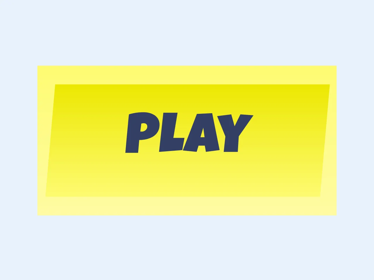
The preview of Fortnite button ui component
To create a Fortnite button UI component with Tailwind CSS, we will use a combination of pre-defined classes to style the button. The resulting button will have a gradient background, rounded corners, and a label in the center.
Free download of the Fortnite button's source code
The source code of Fortnite button ui component
To create a Fortnite button UI component with Tailwind CSS, we will use a combination of pre-defined classes to style the button. The resulting button will have a gradient background, rounded corners, and a label in the center.
<link href="https://fonts.googleapis.com/css2?family=Luckiest+Guy&display=swap" rel="stylesheet">

<style>
.fortnite-btn {
  	background: linear-gradient(#fefb72, #fefca3);
	font-family: 'Luckiest Guy';
}

.fortnite-btn-inner {
  	background: linear-gradient(#ede801, #fefb72);
	transform: skew(-5deg);
	color: #343F65;
}
</style>

<button class="fortnite-btn flex items-center justify-center h-32 w-64">
	<span class="fortnite-btn-inner p-3 pt-5 w-11/12 text-5xl truncate">Play</span>
</button>
How to create a Fortnite button with Tailwind CSS?
To create a Fortnite button with Tailwind CSS, follow these steps:
- Create a new HTML file and add a
buttonelement to it.
<button>Join Game</button>
- Add the
bg-gradient-to-rclass to the button to create a gradient background.
<button class="bg-gradient-to-r from-purple-400 via-pink-500 to-red-500">Join Game</button>
- Add the
rounded-lgclass to the button to create rounded corners.
<button class="bg-gradient-to-r from-purple-400 via-pink-500 to-red-500 rounded-lg">Join Game</button>
- Add the
text-whiteclass to the button to change the text color to white.
<button class="bg-gradient-to-r from-purple-400 via-pink-500 to-red-500 rounded-lg text-white">Join Game</button>
- Add the
p-4class to the button to add padding to the button.
<button class="bg-gradient-to-r from-purple-400 via-pink-500 to-red-500 rounded-lg text-white p-4">Join Game</button>
- Add the
font-boldclass to the button to make the text bold.
<button class="bg-gradient-to-r from-purple-400 via-pink-500 to-red-500 rounded-lg text-white p-4 font-bold">Join Game</button>
- Add the
hover:shadow-lgclass to the button to add a shadow effect when the button is hovered over.
<button class="bg-gradient-to-r from-purple-400 via-pink-500 to-red-500 rounded-lg text-white p-4 font-bold hover:shadow-lg">Join Game</button>
- Add the
focus:outline-noneclass to the button to remove the default outline when the button is clicked.
<button class="bg-gradient-to-r from-purple-400 via-pink-500 to-red-500 rounded-lg text-white p-4 font-bold hover:shadow-lg focus:outline-none">Join Game</button>
And that's it! You have successfully created a Fortnite button UI component with Tailwind CSS.
Conclusion
Tailwind CSS is a powerful and flexible CSS framework that makes it easy to create complex and responsive user interfaces. By using pre-defined classes and customizing them to fit your needs, you can quickly create beautiful and functional UI components like the Fortnite button. With these tips and tricks, you'll be well on your way to creating amazing UIs with Tailwind CSS.