- Published on
How To Create A Tailwind CSS Forms With Tailwind CSS From Scratch
- What is Tailwind CSS?
- The description of Tailwind CSS Forms ui component
- Why use Tailwind CSS to create a Tailwind CSS Forms ui component?
- The preview of Tailwind CSS Forms ui component.
- The source code of Tailwind CSS Forms ui component.
- How to create a Tailwind CSS Forms with Tailwind CSS?
- Step 1: Install Tailwind CSS
- Step 2: Create a new HTML file
- Step 3: Add Tailwind CSS classes to your form fields
- Step 4: Customize your form fields
- Step 5: Add form validation
- Conclusion
What is Tailwind CSS?
Tailwind CSS is a utility-first CSS framework that provides a set of pre-defined CSS classes to help you quickly build custom user interfaces. It allows you to create complex layouts and designs without writing custom CSS code.
The description of Tailwind CSS Forms ui component
Forms are an essential part of any website or application. They allow users to interact with your website by submitting data, signing up for newsletters, or making purchases. Tailwind CSS provides a set of pre-designed form components that you can use to create beautiful and functional forms quickly.
Why use Tailwind CSS to create a Tailwind CSS Forms ui component?
Tailwind CSS is a popular CSS framework that provides a set of pre-designed components that you can use to create beautiful and functional user interfaces quickly. It allows you to create complex layouts and designs without writing custom CSS code. Using Tailwind CSS to create a Tailwind CSS Forms ui component will save you time and effort.
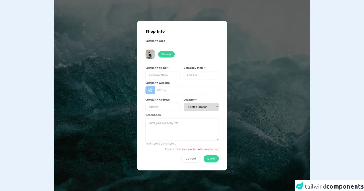
The preview of Tailwind CSS Forms ui component.
Tailwind CSS Forms ui component is a set of pre-designed form components that you can use to create beautiful and functional forms quickly. It includes input fields, text areas, checkboxes, radio buttons, and select boxes.
Free download of the Tailwind CSS Forms's source code
The source code of Tailwind CSS Forms ui component.
The source code of Tailwind CSS Forms ui component is available on the official Tailwind CSS website. You can download it and use it in your projects.
<div class="relative min-h-screen flex items-center justify-center bg-center bg-gray-50 py-12 px-4 sm:px-6 lg:px-8 bg-gray-500 bg-no-repeat bg-cover relative items-center"
style="background-image: url(https://images.unsplash.com/photo-1532423622396-10a3f979251a?ixlib=rb-1.2.1&ixid=MnwxMjA3fDB8MHxwaG90by1wYWdlfHx8fGVufDB8fHx8&auto=format&fit=crop&w=1500&q=80);">
<div class="absolute bg-black opacity-60 inset-0 z-0"></div>
<div class="max-w-md w-full space-y-8 p-10 bg-white rounded-xl shadow-lg z-10">
<div class="grid gap-8 grid-cols-1">
<div class="flex flex-col ">
<div class="flex flex-col sm:flex-row items-center">
<h2 class="font-semibold text-lg mr-auto">Shop Info</h2>
<div class="w-full sm:w-auto sm:ml-auto mt-3 sm:mt-0"></div>
</div>
<div class="mt-5">
<div class="form">
<div class="md:space-y-2 mb-3">
<label class="text-xs font-semibold text-gray-600 py-2">Company Logo<abbr class="hidden" title="required">*</abbr></label>
<div class="flex items-center py-6">
<div class="w-12 h-12 mr-4 flex-none rounded-xl border overflow-hidden">
<img class="w-12 h-12 mr-4 object-cover" src="https://images.unsplash.com/photo-1611867967135-0faab97d1530?ixid=MnwxMjA3fDB8MHxwaG90by1wYWdlfHx8fGVufDB8fHx8&ixlib=rb-1.2.1&auto=format&fit=crop&w=1352&q=80" alt="Avatar Upload">
</div>
<label class="cursor-pointer ">
<span class="focus:outline-none text-white text-sm py-2 px-4 rounded-full bg-green-400 hover:bg-green-500 hover:shadow-lg">Browse</span>
<input type="file" class="hidden" :multiple="multiple" :accept="accept">
</label>
</div>
</div>
<div class="md:flex flex-row md:space-x-4 w-full text-xs">
<div class="mb-3 space-y-2 w-full text-xs">
<label class="font-semibold text-gray-600 py-2">Company Name <abbr title="required">*</abbr></label>
<input placeholder="Company Name" class="appearance-none block w-full bg-grey-lighter text-grey-darker border border-grey-lighter rounded-lg h-10 px-4" required="required" type="text" name="integration[shop_name]" id="integration_shop_name">
<p class="text-red text-xs hidden">Please fill out this field.</p>
</div>
<div class="mb-3 space-y-2 w-full text-xs">
<label class="font-semibold text-gray-600 py-2">Company Mail <abbr title="required">*</abbr></label>
<input placeholder="Email ID" class="appearance-none block w-full bg-grey-lighter text-grey-darker border border-grey-lighter rounded-lg h-10 px-4" required="required" type="text" name="integration[shop_name]" id="integration_shop_name">
<p class="text-red text-xs hidden">Please fill out this field.</p>
</div>
</div>
<div class="mb-3 space-y-2 w-full text-xs">
<label class=" font-semibold text-gray-600 py-2">Company Website</label>
<div class="flex flex-wrap items-stretch w-full mb-4 relative">
<div class="flex">
<span class="flex items-center leading-normal bg-grey-lighter border-1 rounded-r-none border border-r-0 border-blue-300 px-3 whitespace-no-wrap text-grey-dark text-sm w-12 h-10 bg-blue-300 justify-center items-center text-xl rounded-lg text-white">
<svg xmlns="http://www.w3.org/2000/svg" class="h-6 w-6" fill="none" viewBox="0 0 24 24" stroke="currentColor">
<path stroke-linecap="round" stroke-linejoin="round" stroke-width="2" d="M3.055 11H5a2 2 0 012 2v1a2 2 0 002 2 2 2 0 012 2v2.945M8 3.935V5.5A2.5 2.5 0 0010.5 8h.5a2 2 0 012 2 2 2 0 104 0 2 2 0 012-2h1.064M15 20.488V18a2 2 0 012-2h3.064M21 12a9 9 0 11-18 0 9 9 0 0118 0z"></path>
</svg>
</span>
</div>
<input type="text" class="flex-shrink flex-grow flex-auto leading-normal w-px flex-1 border border-l-0 h-10 border-grey-light rounded-lg rounded-l-none px-3 relative focus:border-blue focus:shadow" placeholder="https://">
</div>
</div>
<div class="md:flex md:flex-row md:space-x-4 w-full text-xs">
<div class="w-full flex flex-col mb-3">
<label class="font-semibold text-gray-600 py-2">Company Address</label>
<input placeholder="Address" class="appearance-none block w-full bg-grey-lighter text-grey-darker border border-grey-lighter rounded-lg h-10 px-4" type="text" name="integration[street_address]" id="integration_street_address">
</div>
<div class="w-full flex flex-col mb-3">
<label class="font-semibold text-gray-600 py-2">Location<abbr title="required">*</abbr></label>
<select class="block w-full bg-grey-lighter text-grey-darker border border-grey-lighter rounded-lg h-10 px-4 md:w-full " required="required" name="integration[city_id]" id="integration_city_id">
<option value="">Seleted location</option>
<option value="">Cochin,KL</option>
<option value="">Mumbai,MH</option>
<option value="">Bangalore,KA</option>
</select>
<p class="text-sm text-red-500 hidden mt-3" id="error">Please fill out this field.</p>
</div>
</div>
<div class="flex-auto w-full mb-1 text-xs space-y-2">
<label class="font-semibold text-gray-600 py-2">Description</label>
<textarea required="" name="message" id="" class="w-full min-h-[100px] max-h-[300px] h-28 appearance-none block w-full bg-grey-lighter text-grey-darker border border-grey-lighter rounded-lg py-4 px-4" placeholder="Enter your comapny info" spellcheck="false"></textarea>
<p class="text-xs text-gray-400 text-left my-3">You inserted 0 characters</p>
</div>
<p class="text-xs text-red-500 text-right my-3">Required fields are marked with an
asterisk <abbr title="Required field">*</abbr></p>
<div class="mt-5 text-right md:space-x-3 md:block flex flex-col-reverse">
<button class="mb-2 md:mb-0 bg-white px-5 py-2 text-sm shadow-sm font-medium tracking-wider border text-gray-600 rounded-full hover:shadow-lg hover:bg-gray-100"> Cancel </button>
<button class="mb-2 md:mb-0 bg-green-400 px-5 py-2 text-sm shadow-sm font-medium tracking-wider text-white rounded-full hover:shadow-lg hover:bg-green-500">Save</button>
</div>
</div>
</div>
</div>
</div>
</div>
How to create a Tailwind CSS Forms with Tailwind CSS?
To create a Tailwind CSS Forms with Tailwind CSS, follow these steps:
Step 1: Install Tailwind CSS
Before you can use Tailwind CSS, you need to install it. You can install it using npm or yarn. Open your terminal and run the following command:
npm install tailwindcss
Step 2: Create a new HTML file
Create a new HTML file and add the following code:
<!DOCTYPE html>
<html lang="en">
<head>
  <meta charset="UTF-8">
  <title>Tailwind CSS Forms</title>
  <link rel="stylesheet" href="https://cdn.jsdelivr.net/npm/[email protected]/dist/tailwind.min.css">
</head>
<body>
  <form>
    <!-- Add your form fields here -->
  </form>
</body>
</html>
Step 3: Add Tailwind CSS classes to your form fields
Add Tailwind CSS classes to your form fields to style them. For example, to style an input field, you can use the following code:
<input type="text" class="border border-gray-400 p-2 rounded-md">
This will add a border, padding, and rounded corners to your input field.
Step 4: Customize your form fields
You can customize your form fields by adding your own CSS classes or modifying the existing Tailwind CSS classes. For example, to change the color of your input field, you can add the following CSS code:
.input-field {
  color: red;
}
And then add the input-field class to your input field:
<input type="text" class="border border-gray-400 p-2 rounded-md input-field">
Step 5: Add form validation
You can add form validation using JavaScript or a JavaScript library like jQuery. For example, to validate an email field, you can use the following code:
function validateEmail(email) {
  var re = /\S+@\S+\.\S+/;
  return re.test(email);
}

var email = document.getElementById("email");

email.addEventListener("blur", function() {
  if (!validateEmail(email.value)) {
    email.classList.add("border", "border-red-500");
  } else {
    email.classList.remove("border", "border-red-500");
  }
});
This will add a red border to the email field if the email is invalid.
Conclusion
Tailwind CSS is a powerful CSS framework that allows you to create beautiful and functional user interfaces quickly. Using Tailwind CSS to create a Tailwind CSS Forms ui component will save you time and effort. Follow the steps above to create your own Tailwind CSS Forms ui component.