- Published on
6 Steps To Build A Form Add Posts With Tailwind CSS Like A Pro In Under An Hour
- What is Tailwind CSS?
- The description of Form Add Posts UI component
- Why use Tailwind CSS to create a Form Add Posts UI component?
- The preview of Form Add Posts UI component
- The source code of Form Add Posts UI component
- How to create a Form Add Posts with Tailwind CSS?
- Step 1: Set up your HTML
- Step 2: Add Tailwind CSS to your project
- Step 3: Customize your Tailwind CSS configuration
- Step 4: Build your UI component with Tailwind CSS
- Step 5: Test your UI component
- Step 6: Refine your UI component
- Conclusion
As a FrontEnd technology blogger, I am always looking for ways to make my UI components look amazing while keeping the code clean and easy to maintain. That's why I am excited to share with you today how to build a Form Add Posts UI component with Tailwind CSS.
What is Tailwind CSS?
Tailwind CSS is a utility-first CSS framework that helps you quickly build custom designs without writing any CSS. It provides a set of pre-defined classes that you can use to style your HTML elements. Tailwind CSS is highly customizable and can be used with any JavaScript framework or library.
The description of Form Add Posts UI component
The Form Add Posts UI component is a common UI element that allows users to add new posts to a website or application. It usually includes fields for the post title, content, and any relevant tags or categories.
Why use Tailwind CSS to create a Form Add Posts UI component?
Tailwind CSS makes it easy to create custom UI components without writing any CSS. It provides a set of pre-defined classes that you can use to style your HTML elements. This saves you time and makes your code more maintainable. Tailwind CSS also allows you to easily customize the styles of your UI components to match your brand or design.
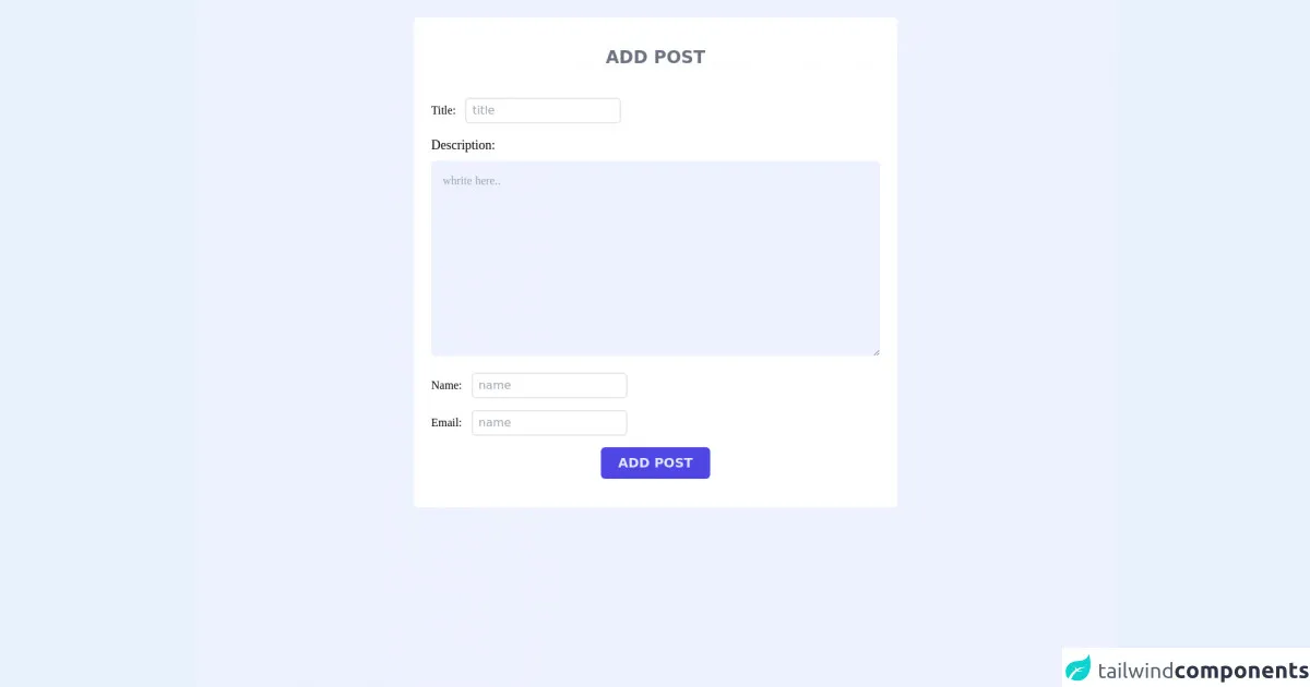
The preview of Form Add Posts UI component
Here is a preview of the Form Add Posts UI component we will be building:
Free download of the Form Add Posts's source code
The source code of Form Add Posts UI component
Here is the source code for the Form Add Posts UI component:
<form>
  <div class="bg-indigo-50 min-h-screen md:px-20 pt-6">
    <div class=" bg-white rounded-md px-6 py-10 max-w-2xl mx-auto">
      <h1 class="text-center text-2xl font-bold text-gray-500 mb-10">ADD POST</h1>
      <div class="space-y-4">
        <div>
          <label for="title" class="text-lx font-serif">Title:</label>
          <input type="text" placeholder="title" id="title" class="ml-2 outline-none py-1 px-2 text-md border-2 rounded-md" />
        </div>
        <div>
          <label for="description" class="block mb-2 text-lg font-serif">Description:</label>
          <textarea id="description" cols="30" rows="10" placeholder="whrite here.." class="w-full font-serif  p-4 text-gray-600 bg-indigo-50 outline-none rounded-md"></textarea>
        </div>
        <div>
          <label for="name" class="text-lx font-serif">Name:</label>
          <input type="text" placeholder="name" id="name" class="ml-2 outline-none py-1 px-2 text-md border-2 rounded-md" />
        </div>
        <div>
          <label for="email" class="text-lx font-serif">Email:</label>
          <input type="text" placeholder="name" id="email" class="ml-2 outline-none py-1 px-2 text-md border-2 rounded-md" />
        </div>
        <button class=" px-6 py-2 mx-auto block rounded-md text-lg font-semibold text-indigo-100 bg-indigo-600  ">ADD POST</button>
      </div>
    </div>
  </div>
</form>
How to create a Form Add Posts with Tailwind CSS?
Now that we have covered the basics of Tailwind CSS and the Form Add Posts UI component, let's dive into how to create it.
Step 1: Set up your HTML
The first step is to set up your HTML. You will need to create a form element with input fields for the post title, content, and any relevant tags or categories. Here is an example:
<form>
  <label for="title">Title</label>
  <input type="text" id="title" name="title" class="border rounded w-full p-2 mb-4">

  <label for="content">Content</label>
  <textarea id="content" name="content" class="border rounded w-full p-2 mb-4"></textarea>

  <label for="tags">Tags</label>
  <input type="text" id="tags" name="tags" class="border rounded w-full p-2 mb-4">

  <button type="submit" class="bg-blue-500 hover:bg-blue-700 text-white font-bold py-2 px-4 rounded">Add Post</button>
</form>
In this example, we have used Tailwind CSS classes to style the form elements. The border, rounded, w-full, p-2, and mb-4 classes are used to style the input fields and the bg-blue-500, hover:bg-blue-700, text-white, font-bold, py-2, px-4, and rounded classes are used to style the submit button.
Step 2: Add Tailwind CSS to your project
The next step is to add Tailwind CSS to your project. You can do this by installing it via npm or by including the CDN in your HTML file. Here is an example of including the CDN:
<head>
  <link href="https://cdn.jsdelivr.net/npm/tailwindcss@latest/dist/tailwind.min.css" rel="stylesheet">
</head>
Step 3: Customize your Tailwind CSS configuration
Tailwind CSS provides a default configuration file that you can customize to match your design or brand. You can do this by creating a tailwind.config.js file in your project directory and modifying the default values. Here is an example:
module.exports = {
  theme: {
    extend: {
      colors: {
        'primary': '#2c5282',
        'secondary': '#718096',
        'danger': '#c53030',
      }
    }
  },
  variants: {},
  plugins: [],
}
In this example, we have customized the colors section of the configuration file to include our primary, secondary, and danger colors.
Step 4: Build your UI component with Tailwind CSS
Now that we have set up our HTML, added Tailwind CSS to our project, and customized our configuration, we can start building our UI component. We can do this by using the pre-defined Tailwind CSS classes to style our HTML elements. Here is an example:
<form>
  <label for="title" class="block text-gray-700 font-bold mb-2">Title</label>
  <input type="text" id="title" name="title" class="border rounded w-full py-2 px-3 mb-4 leading-tight focus:outline-none focus:shadow-outline">

  <label for="content" class="block text-gray-700 font-bold mb-2">Content</label>
  <textarea id="content" name="content" class="border rounded w-full py-2 px-3 mb-4 leading-tight focus:outline-none focus:shadow-outline"></textarea>

  <label for="tags" class="block text-gray-700 font-bold mb-2">Tags</label>
  <input type="text" id="tags" name="tags" class="border rounded w-full py-2 px-3 mb-4 leading-tight focus:outline-none focus:shadow-outline">

  <button type="submit" class="bg-primary hover:bg-blue-700 text-white font-bold py-2 px-4 rounded">Add Post</button>
</form>
In this example, we have used the pre-defined Tailwind CSS classes to style our HTML elements. We have also used the focus:outline-none and focus:shadow-outline classes to remove the default focus styles and add our own custom focus styles.
Step 5: Test your UI component
The next step is to test your UI component to make sure it works as expected. You can do this by filling out the form fields and submitting the form. You should see a new post added to your website or application.
Step 6: Refine your UI component
The final step is to refine your UI component to match your design or brand. You can do this by customizing the pre-defined Tailwind CSS classes or by creating your own custom classes. You can also use the Tailwind CSS documentation to find additional classes or examples.
Conclusion
In this article, we have covered the basics of Tailwind CSS and how to use it to create a Form Add Posts UI component. We have also provided a preview and source code for the UI component and outlined six steps to build it like a pro in under an hour. With Tailwind CSS, you can quickly and easily create custom UI components that look amazing and are easy to maintain.