- Published on
The Ultimate Guide To Help You Build A Form Create With Tailwind CSS

- What is Tailwind CSS?
- The description of Form Create ui component
- Why use Tailwind CSS to create a Form Create ui component?
- The preview of Form Create ui component
- The source code of Form Create ui component
- How to create a Form Create with Tailwind CSS?
- Conclusion
Forms are an essential part of any website or application. They allow users to input data, make selections, and submit information. However, creating a form can be a daunting task, especially when it comes to styling it. This is where Tailwind CSS comes in. In this article, we'll explore how to use Tailwind CSS to create a Form Create ui component.
What is Tailwind CSS?
Tailwind CSS is a utility-first CSS framework that provides a set of pre-defined CSS classes that can be used to style HTML elements. It allows you to create custom designs quickly and easily by using these classes instead of writing CSS from scratch. Tailwind CSS is highly customizable, and you can configure it to suit your specific needs.
The description of Form Create ui component
Form Create is a UI component that allows users to create forms quickly and easily. It provides a set of pre-defined form fields such as text input, radio buttons, checkboxes, and more. Form Create also allows you to customize the form fields and layout to match your design requirements.
Why use Tailwind CSS to create a Form Create ui component?
Tailwind CSS provides a set of pre-defined classes that can be used to style the Form Create ui component quickly and easily. It allows you to create custom designs without the need to write CSS from scratch. Tailwind CSS also provides responsive design classes that allow you to create designs that work well on different screen sizes.
The preview of Form Create ui component
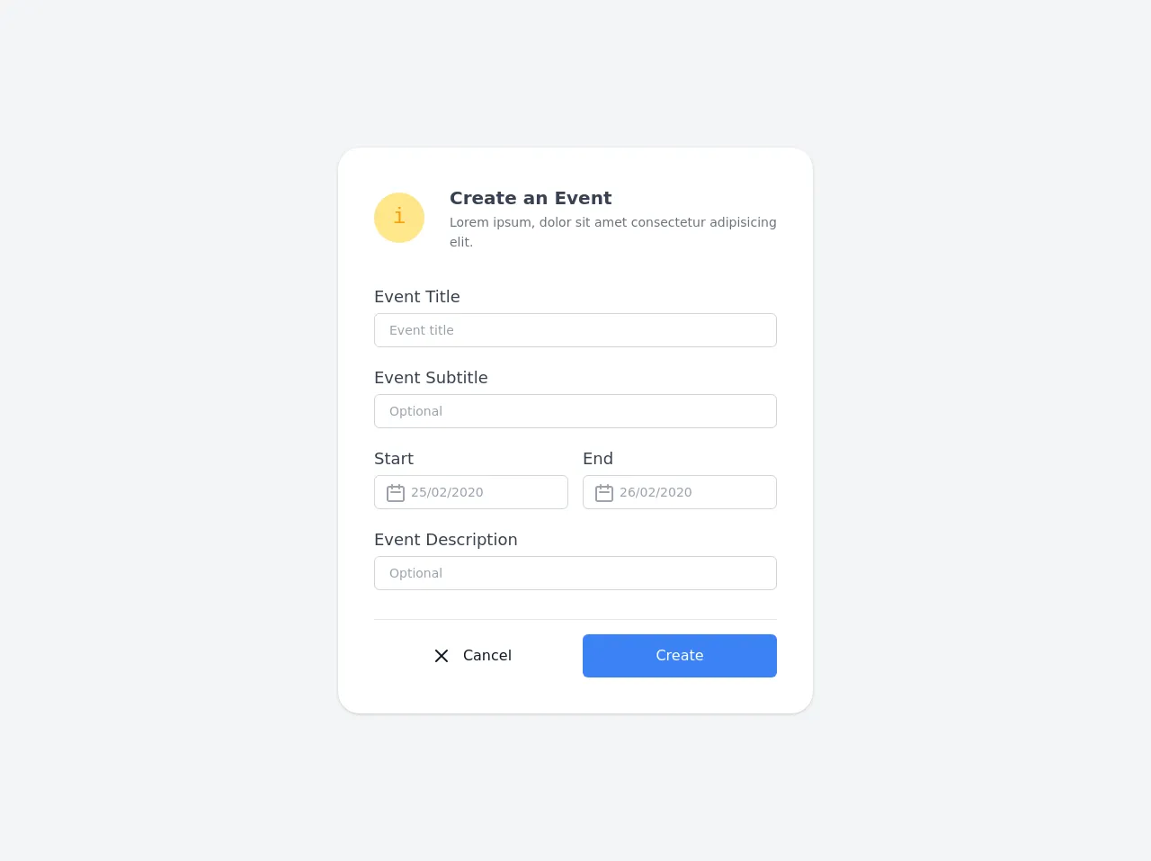
Form Create provides a set of pre-defined form fields that can be customized to match your design requirements. You can use the pre-defined classes provided by Tailwind CSS to style the form fields. Here is a preview of what the Form Create ui component looks like:
Free download of the Form Create's source code
The source code of Form Create ui component
To create the Form Create ui component, you can use the pre-defined classes provided by Tailwind CSS. Here is an example of the HTML and CSS code required to create a simple form using Form Create:
<!--
  UI Design Prototype
  Link : https://dribbble.com/shots/10452538-React-UI-Components
-->
<div class="min-h-screen bg-gray-100 py-6 flex flex-col justify-center sm:py-12">
  <div class="relative py-3 sm:max-w-xl sm:mx-auto">
    <div class="relative px-4 py-10 bg-white mx-8 md:mx-0 shadow rounded-3xl sm:p-10">
      <div class="max-w-md mx-auto">
        <div class="flex items-center space-x-5">
          <div class="h-14 w-14 bg-yellow-200 rounded-full flex flex-shrink-0 justify-center items-center text-yellow-500 text-2xl font-mono">i</div>
          <div class="block pl-2 font-semibold text-xl self-start text-gray-700">
            <h2 class="leading-relaxed">Create an Event</h2>
            <p class="text-sm text-gray-500 font-normal leading-relaxed">Lorem ipsum, dolor sit amet consectetur adipisicing elit.</p>
          </div>
        </div>
        <div class="divide-y divide-gray-200">
          <div class="py-8 text-base leading-6 space-y-4 text-gray-700 sm:text-lg sm:leading-7">
            <div class="flex flex-col">
              <label class="leading-loose">Event Title</label>
              <input type="text" class="px-4 py-2 border focus:ring-gray-500 focus:border-gray-900 w-full sm:text-sm border-gray-300 rounded-md focus:outline-none text-gray-600" placeholder="Event title">
            </div>
            <div class="flex flex-col">
              <label class="leading-loose">Event Subtitle</label>
              <input type="text" class="px-4 py-2 border focus:ring-gray-500 focus:border-gray-900 w-full sm:text-sm border-gray-300 rounded-md focus:outline-none text-gray-600" placeholder="Optional">
            </div>
            <div class="flex items-center space-x-4">
              <div class="flex flex-col">
                <label class="leading-loose">Start</label>
                <div class="relative focus-within:text-gray-600 text-gray-400">
                  <input type="text" class="pr-4 pl-10 py-2 border focus:ring-gray-500 focus:border-gray-900 w-full sm:text-sm border-gray-300 rounded-md focus:outline-none text-gray-600" placeholder="25/02/2020">
                  <div class="absolute left-3 top-2">
                    <svg class="w-6 h-6" fill="none" stroke="currentColor" viewBox="0 0 24 24" xmlns="http://www.w3.org/2000/svg"><path stroke-linecap="round" stroke-linejoin="round" stroke-width="2" d="M8 7V3m8 4V3m-9 8h10M5 21h14a2 2 0 002-2V7a2 2 0 00-2-2H5a2 2 0 00-2 2v12a2 2 0 002 2z"></path></svg>
                  </div>
                </div>
              </div>
              <div class="flex flex-col">
                <label class="leading-loose">End</label>
                <div class="relative focus-within:text-gray-600 text-gray-400">
                  <input type="text" class="pr-4 pl-10 py-2 border focus:ring-gray-500 focus:border-gray-900 w-full sm:text-sm border-gray-300 rounded-md focus:outline-none text-gray-600" placeholder="26/02/2020">
                  <div class="absolute left-3 top-2">
                    <svg class="w-6 h-6" fill="none" stroke="currentColor" viewBox="0 0 24 24" xmlns="http://www.w3.org/2000/svg"><path stroke-linecap="round" stroke-linejoin="round" stroke-width="2" d="M8 7V3m8 4V3m-9 8h10M5 21h14a2 2 0 002-2V7a2 2 0 00-2-2H5a2 2 0 00-2 2v12a2 2 0 002 2z"></path></svg>
                  </div>
                </div>
              </div>
            </div>
            <div class="flex flex-col">
              <label class="leading-loose">Event Description</label>
              <input type="text" class="px-4 py-2 border focus:ring-gray-500 focus:border-gray-900 w-full sm:text-sm border-gray-300 rounded-md focus:outline-none text-gray-600" placeholder="Optional">
            </div>
          </div>
          <div class="pt-4 flex items-center space-x-4">
              <button class="flex justify-center items-center w-full text-gray-900 px-4 py-3 rounded-md focus:outline-none">
                <svg class="w-6 h-6 mr-3" fill="none" stroke="currentColor" viewBox="0 0 24 24" xmlns="http://www.w3.org/2000/svg"><path stroke-linecap="round" stroke-linejoin="round" stroke-width="2" d="M6 18L18 6M6 6l12 12"></path></svg> Cancel
              </button>
              <button class="bg-blue-500 flex justify-center items-center w-full text-white px-4 py-3 rounded-md focus:outline-none">Create</button>
          </div>
        </div>
      </div>
    </div>
  </div>
</div>
How to create a Form Create with Tailwind CSS?
To create a Form Create ui component with Tailwind CSS, you need to follow these steps:
Install Tailwind CSS: You can install Tailwind CSS using npm or yarn. You can also use a CDN to include Tailwind CSS in your project.
Create the HTML markup for the form: You can use the pre-defined form fields provided by Form Create to create the HTML markup for the form.
Style the form using Tailwind CSS: You can use the pre-defined classes provided by Tailwind CSS to style the form. You can also customize the classes to match your design requirements.
Add interactivity to the form: You can use JavaScript to add interactivity to the form, such as form validation and submission.
Conclusion
Creating a form can be a challenging task, especially when it comes to styling it. However, with Tailwind CSS and Form Create, you can create custom forms quickly and easily. Tailwind CSS provides a set of pre-defined classes that can be used to style the form, and Form Create provides a set of pre-defined form fields that can be customized to match your design requirements. With these tools, you can create beautiful and functional forms that enhance the user experience.