- Published on
6 Easy Ways To Make A Footer-1 With Tailwind CSS
- What is Tailwind CSS?
- The description of footer-1 ui component
- Why use Tailwind CSS to create a footer-1 ui component?
- The preview of footer-1 ui component
- The source code of footer-1 ui component
- How to create a footer-1 with Tailwind CSS?
- Step 1: Create the HTML structure
- Step 2: Add the background color
- Step 3: Add the header and text
- Step 4: Add the columns
- Step 5: Add the spacing
- Step 6: Add the styles
- Conclusion
What is Tailwind CSS?
Tailwind CSS is a utility-first CSS framework that allows you to quickly create custom designs without having to write any CSS. It provides a set of pre-defined classes that you can use to style your HTML elements. With Tailwind CSS, you can easily create responsive designs that work on different screen sizes.
The description of footer-1 ui component
A footer is an essential part of any website. It is the last section of a webpage that contains important information such as copyright, contact information, and links to other pages. Footer-1 is a UI component that provides a simple and elegant design for the footer section of your website.
Why use Tailwind CSS to create a footer-1 ui component?
Tailwind CSS provides a set of pre-defined classes that you can use to style your HTML elements. This makes it easy to create a footer-1 UI component without having to write any CSS. Additionally, Tailwind CSS is highly customizable, which means you can easily modify the design of the footer-1 component to match the style of your website.
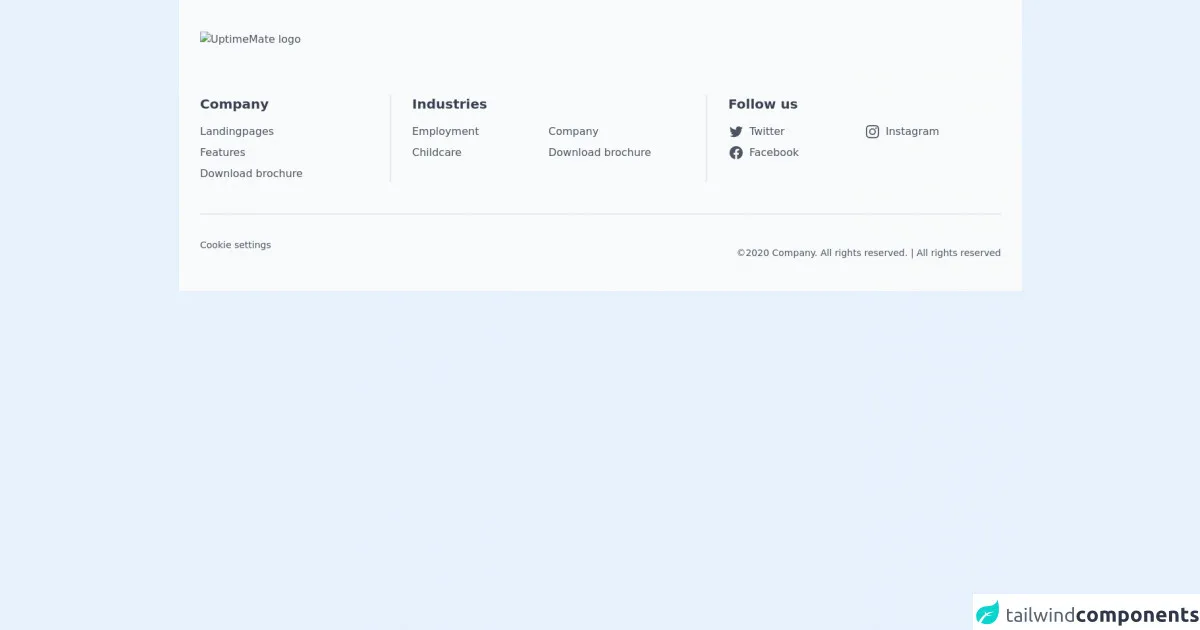
The preview of footer-1 ui component
Free download of the footer-1's source code
The source code of footer-1 ui component
<footer class="bg-gray-50 text-gray-600 px-6 lg:px-8 py-12">
<div class="max-w-screen-xl mx-auto mb-12 lg:mb-16 ">
<img class="h-8" src="/images/pathway-logo.svg" alt="UptimeMate logo">
</div>
<div class="max-w-screen-xl mx-auto ">
<div class="grid grid-cols-8 md:grid-cols-9 lg:grid-cols-8 divide-gray-200 divide-y-2 md:divide-x-2 md:divide-y-0 md:-mx-8">
<div class="col-span-8 md:col-span-3 lg:col-span-2 md:px-8 py-4 md:py-0">
<h5 class="text-xl font-semibold text-gray-700">Company</h5>
<nav class="mt-4">
<ul class="space-y-2">
<li>
<a href="#" class="font-normal text-base hover:text-gray-400">Landingpages</a>
</li>
<li>
<a href="#" class="font-normal text-base hover:text-gray-400">Features</a>
</li>
<li>
<a href="#" class="font-normal text-base hover:text-gray-400">Download brochure</a>
</li>
</ul>
</nav>
</div>
<div class="col-span-8 md:col-span-3 lg:col-span-3 md:px-8 py-4 md:py-0">
<h5 class="text-xl font-semibold text-gray-700">Industries</h5>
<nav class="mt-4">
<ul class="grid lg:grid-cols-2">
<li class="mb-2">
<a href="#" class="font-normal text-base hover:text-gray-400">Employment</a>
</li>
<li class="mb-2">
<a href="#" class="font-normal text-base hover:text-gray-400">Company</a>
</li>
<li class="mb-2">
<a href="#" class="font-normal text-base hover:text-gray-400">Childcare</a>
</li>
<li class="mb-2">
<a href="#" class="font-normal text-base hover:text-gray-400">Download brochure</a>
</li>
</ul>
</nav>
</div>
<div class="col-span-8 md:col-span-3 lg:col-span-3 md:px-8 py-4 md:py-0">
<h5 class="text-xl font-semibold text-gray-700">Follow us</h5>
<nav class="mt-4">
<ul class="grid lg:grid-cols-2">
<li class="mb-2">
<a href="#" class="flex space-x-2 font-normal text-base hover:text-gray-400">
<svg class="h-6 w-6" aria-hidden="true" fill="currentColor" viewBox="0 0 24 24">
<path d="M8.29 20.251c7.547 0 11.675-6.253 11.675-11.675 0-.178 0-.355-.012-.53A8.348 8.348 0 0022 5.92a8.19 8.19 0 01-2.357.646 4.118 4.118 0 001.804-2.27 8.224 8.224 0 01-2.605.996 4.107 4.107 0 00-6.993 3.743 11.65 11.65 0 01-8.457-4.287 4.106 4.106 0 001.27 5.477A4.072 4.072 0 012.8 9.713v.052a4.105 4.105 0 003.292 4.022 4.095 4.095 0 01-1.853.07 4.108 4.108 0 003.834 2.85A8.233 8.233 0 012 18.407a11.616 11.616 0 006.29 1.84" />
</svg>
<span>
Twitter
</span>
</a>
</li>
<li class="mb-2">
<a href="#" class="flex space-x-2 font-normal text-base hover:text-gray-400">
<svg class="h-6 w-6" aria-hidden="true" fill="currentColor" viewBox="0 0 24 24">
<path fill-rule="evenodd" d="M12.315 2c2.43 0 2.784.013 3.808.06 1.064.049 1.791.218 2.427.465a4.902 4.902 0 011.772 1.153 4.902 4.902 0 011.153 1.772c.247.636.416 1.363.465 2.427.048 1.067.06 1.407.06 4.123v.08c0 2.643-.012 2.987-.06 4.043-.049 1.064-.218 1.791-.465 2.427a4.902 4.902 0 01-1.153 1.772 4.902 4.902 0 01-1.772 1.153c-.636.247-1.363.416-2.427.465-1.067.048-1.407.06-4.123.06h-.08c-2.643 0-2.987-.012-4.043-.06-1.064-.049-1.791-.218-2.427-.465a4.902 4.902 0 01-1.772-1.153 4.902 4.902 0 01-1.153-1.772c-.247-.636-.416-1.363-.465-2.427-.047-1.024-.06-1.379-.06-3.808v-.63c0-2.43.013-2.784.06-3.808.049-1.064.218-1.791.465-2.427a4.902 4.902 0 011.153-1.772A4.902 4.902 0 015.45 2.525c.636-.247 1.363-.416 2.427-.465C8.901 2.013 9.256 2 11.685 2h.63zm-.081 1.802h-.468c-2.456 0-2.784.011-3.807.058-.975.045-1.504.207-1.857.344-.467.182-.8.398-1.15.748-.35.35-.566.683-.748 1.15-.137.353-.3.882-.344 1.857-.047 1.023-.058 1.351-.058 3.807v.468c0 2.456.011 2.784.058 3.807.045.975.207 1.504.344 1.857.182.466.399.8.748 1.15.35.35.683.566 1.15.748.353.137.882.3 1.857.344 1.054.048 1.37.058 4.041.058h.08c2.597 0 2.917-.01 3.96-.058.976-.045 1.505-.207 1.858-.344.466-.182.8-.398 1.15-.748.35-.35.566-.683.748-1.15.137-.353.3-.882.344-1.857.048-1.055.058-1.37.058-4.041v-.08c0-2.597-.01-2.917-.058-3.96-.045-.976-.207-1.505-.344-1.858a3.097 3.097 0 00-.748-1.15 3.098 3.098 0 00-1.15-.748c-.353-.137-.882-.3-1.857-.344-1.023-.047-1.351-.058-3.807-.058zM12 6.865a5.135 5.135 0 110 10.27 5.135 5.135 0 010-10.27zm0 1.802a3.333 3.333 0 100 6.666 3.333 3.333 0 000-6.666zm5.338-3.205a1.2 1.2 0 110 2.4 1.2 1.2 0 010-2.4z" clip-rule="evenodd" />
</svg>
<span>
Instagram
</span>
</a>
</li>
<li class="mb-2">
<a href="#" class="flex space-x-2 font-normal text-base hover:text-gray-400">
<svg class="h-6 w-6" aria-hidden="true" fill="currentColor" viewBox="0 0 24 24">
<path fill-rule="evenodd" d="M22 12c0-5.523-4.477-10-10-10S2 6.477 2 12c0 4.991 3.657 9.128 8.438 9.878v-6.987h-2.54V12h2.54V9.797c0-2.506 1.492-3.89 3.777-3.89 1.094 0 2.238.195 2.238.195v2.46h-1.26c-1.243 0-1.63.771-1.63 1.562V12h2.773l-.443 2.89h-2.33v6.988C18.343 21.128 22 16.991 22 12z" clip-rule="evenodd" />
</svg>
<span>
Facebook
</span>
</a>
</li>
</ul>
</nav>
</div>
</div>
</div>
<div class="max-w-screen-xl mx-auto flex flex-col md:flex-row justify-between items-center space-y-4 mt-8 lg:mt-12 border-t-2 border-gray-200 pt-8">
<nav class="flex flex-wrap justify-center space-x-6">
<a href="#" class="font-normal text-sm hover:text-gray-400 mb-2">Cookie settings</a>
</nav>
<p class="text-sm text-center md:text-right">©2020 Company. All rights reserved. | All rights reserved</p>
</div>
</footer>
How to create a footer-1 with Tailwind CSS?
Here are six easy steps to create a footer-1 UI component with Tailwind CSS:
Step 1: Create the HTML structure
The first step is to create the HTML structure for the footer-1 component. Here is an example:
<footer class="bg-gray-800">
  <div class="container mx-auto py-6 px-4">
    <div class="flex flex-wrap justify-between">
      <div class="w-full md:w-1/4 text-center md:text-left">
        <h5 class="uppercase mb-2 font-bold text-white">Footer header 1</h5>
        <p class="text-white-50">Lorem ipsum dolor sit amet, consectetur adipiscing elit.</p>
      </div>
      <div class="w-full md:w-1/4 text-center md:text-left">
        <h5 class="uppercase mb-2 font-bold text-white">Footer header 2</h5>
        <p class="text-white-50">Lorem ipsum dolor sit amet, consectetur adipiscing elit.</p>
      </div>
      <div class="w-full md:w-1/4 text-center md:text-left">
        <h5 class="uppercase mb-2 font-bold text-white">Footer header 3</h5>
        <p class="text-white-50">Lorem ipsum dolor sit amet, consectetur adipiscing elit.</p>
      </div>
      <div class="w-full md:w-1/4 text-center md:text-left">
        <h5 class="uppercase mb-2 font-bold text-white">Footer header 4</h5>
        <p class="text-white-50">Lorem ipsum dolor sit amet, consectetur adipiscing elit.</p>
      </div>
    </div>
  </div>
</footer>
In this example, we have used the container and mx-auto classes to center the content of the footer. We have also used the py-6 and px-4 classes to add padding to the top and bottom and left and right of the footer.
Step 2: Add the background color
To add a background color to the footer, we can use the bg-gray-800 class. This will give the footer a dark gray background color.
Step 3: Add the header and text
To add the header and text to the footer, we can use the text-white and text-white-50 classes. The text-white class will give the header a white color, and the text-white-50 class will give the text a light gray color.
Step 4: Add the columns
To create the columns in the footer, we can use the flex and flex-wrap classes. The flex class will make the elements inside the footer flexible, and the flex-wrap class will allow the elements to wrap to the next line if there is not enough space.
We can also use the w-full and md:w-1/4 classes to make the columns full width on small screens and one-quarter width on medium screens and above.
Step 5: Add the spacing
To add spacing between the columns, we can use the justify-between class. This will evenly distribute the columns and add space between them.
We can also use the mb-2 class to add margin to the bottom of the header.
Step 6: Add the styles
Finally, we can add some additional styles to the footer-1 component to make it look more polished. Here are some styles you can add:
a {
  color: #fff;
  text-decoration: none;
}

a:hover {
  text-decoration: underline;
}
These styles will make the links in the footer white and remove the underline by default. When the user hovers over the link, the underline will appear.
Conclusion
In conclusion, creating a footer-1 UI component with Tailwind CSS is easy and straightforward. With just a few lines of HTML and some pre-defined classes, you can create a simple and elegant footer for your website. Additionally, Tailwind CSS is highly customizable, which means you can easily modify the design of the footer-1 component to match the style of your website.