- Published on
The Ultimate Guide To Help You Create A Fly-out Menu (Vue.js) With Tailwind CSS
- What is Tailwind CSS?
- The Description of Fly-out Menu (Vue.js) UI Component
- Why Use Tailwind CSS to Create a Fly-out Menu (Vue.js) UI Component?
- The Preview of Fly-out Menu (Vue.js) UI Component
- The Source Code of Fly-out Menu (Vue.js) UI Component
- How to Create a Fly-out Menu (Vue.js) with Tailwind CSS?
- Step 1: Set up a new Vue.js project
- Step 2: Install Tailwind CSS
- Step 3: Create a new Vue component
- Step 4: Style the Fly-out Menu using Tailwind CSS
- Step 5: Add Interactivity to the Fly-out Menu
- Conclusion
Fly-out menus are a popular UI component that can be used to create a clean and organized navigation system for your website. In this article, we will guide you through the process of creating a fly-out menu using Vue.js and Tailwind CSS.
What is Tailwind CSS?
Tailwind CSS is a utility-first CSS framework that provides pre-defined classes to style your website. It allows you to create custom designs without writing any CSS code. Tailwind CSS is easy to use and can be integrated with any front-end framework, including Vue.js.
The Description of Fly-out Menu (Vue.js) UI Component
A fly-out menu is a type of navigation menu that appears when the user clicks or hovers over a button or icon. It slides out from the side of the screen and displays a list of options or links. Fly-out menus are a popular choice for mobile-first designs, as they allow for easy navigation on smaller screens.
Why Use Tailwind CSS to Create a Fly-out Menu (Vue.js) UI Component?
Tailwind CSS provides a set of pre-defined classes that can be used to style your fly-out menu. This saves time and effort in writing custom CSS code. Additionally, Tailwind CSS is easy to learn and can be used with any front-end framework, including Vue.js.
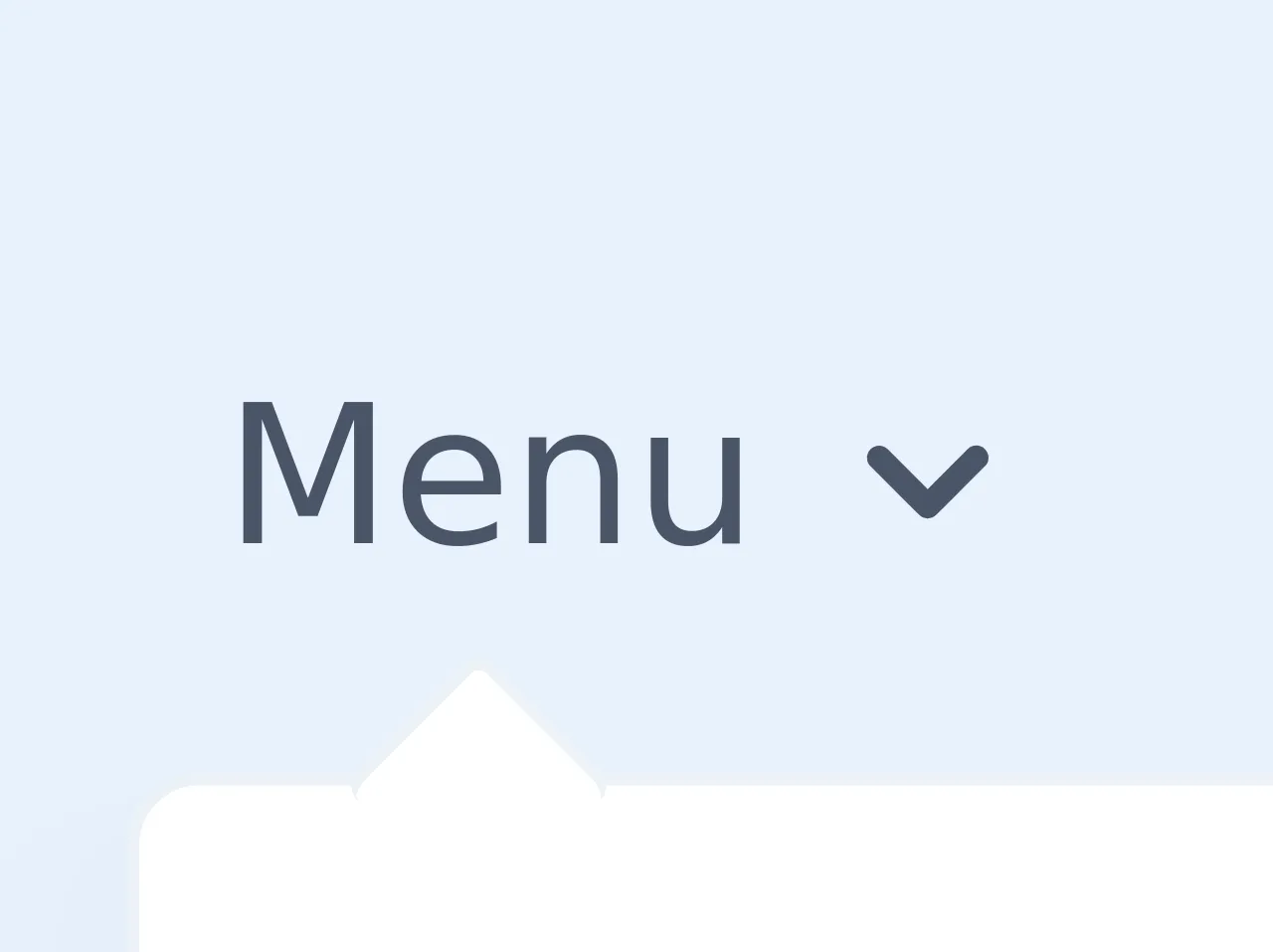
The Preview of Fly-out Menu (Vue.js) UI Component
To create a fly-out menu using Vue.js and Tailwind CSS, we will use the following components:
- A button to trigger the fly-out menu
- A container to hold the fly-out menu items
- A list of menu items
Free download of the Fly-out Menu (Vue.js)'s source code
The Source Code of Fly-out Menu (Vue.js) UI Component
To create a fly-out menu using Vue.js and Tailwind CSS, we will use the following code:
<div id="app" class="antialiased font-sans py-16">
  <!-- This empty div is only for demo purposes and it's used so you can close the menu on a touchscreen device. Normally you'd handle it differently by not using hover states on mobile, but by using real clicks. -->
  <div class="fixed inset-0" @click="isVisible = false"></div>
  <div class="relative inline-block" @mouseover="isVisible = true" @mouseleave="isVisible = false" @keydown.enter="isVisible = !isVisible">
    <button type="button" class="inline-flex items-center justify-between px-2 py-1 font-medium text-gray-700 transition-all duration-500 rounded-md focus:outline-none focus:text-brand-900 sm:focus:shadow-outline">
      <span class="flex-shrink-0">Menu</span>
      <svg fill="currentColor" viewBox="0 0 20 20" class="flex-shrink-0 w-5 h-5 ml-1">
        <path :class="{ 'rotate-180': isVisible }" class="transition duration-300 ease-in-out origin-center transform" fill-rule="evenodd" d="M5.293 7.293a1 1 0 011.414 0L10 10.586l3.293-3.293a1 1 0 111.414 1.414l-4 4a1 1 0 01-1.414 0l-4-4a1 1 0 010-1.414z" clip-rule="evenodd"></path>
      </svg>
    </button>
    <transition enter-active-class="transition duration-300 ease-out transform" enter-class="-translate-y-3 scale-95 opacity-0" enter-to-class="translate-y-0 scale-100 opacity-100" leave-active-class="transition duration-150 ease-in transform" leave-class="translate-y-0 opacity-100" leave-to-class="-translate-y-3 opacity-0">
      <div v-show="isVisible" class="absolute pt-2">
        <div class="relative py-1 bg-white border border-gray-200 rounded-md shadow-xl">
          <div class="absolute top-0 w-4 h-4 origin-center transform rotate-45 translate-x-5 -translate-y-2 bg-white border-t border-l border-gray-200 rounded-sm pointer-events-none"></div>
          <div class="relative">
            <a href="#" class="block w-full px-4 py-2 font-medium text-gray-700 whitespace-no-wrap hover:bg-gray-100 focus:outline-none hover:text-gray-900 focus:text-gray-900 focus:shadow-outline transition duration-300 ease-in-out">Submenu Link #1</a>
            <a href="#" class="block w-full px-4 py-2 font-medium text-gray-700 whitespace-no-wrap hover:bg-gray-100 focus:outline-none hover:text-gray-900 focus:text-gray-900 focus:shadow-outline transition duration-300 ease-in-out">Submenu Link #2</a>
            <a href="#" class="block w-full px-4 py-2 font-medium text-gray-700 whitespace-no-wrap hover:bg-gray-100 focus:outline-none hover:text-gray-900 focus:text-gray-900 focus:shadow-outline transition duration-300 ease-in-out">Submenu Link #3</a>
            <a href="#" class="block w-full px-4 py-2 font-medium text-gray-700 whitespace-no-wrap hover:bg-gray-100 focus:outline-none hover:text-gray-900 focus:text-gray-900 focus:shadow-outline transition duration-300 ease-in-out">Submenu Link #4</a>
          </div>
        </div>
      </div>
    </transition>
  </div>
</div>

<script src="https://cdn.jsdelivr.net/npm/vue"></script>
<script>
  var app = new Vue({
    el: '#app',
    data: {
      isVisible: false
    }
  })
</script>
How to Create a Fly-out Menu (Vue.js) with Tailwind CSS?
Now that we have a basic understanding of what a fly-out menu is and why we should use Tailwind CSS, let's dive into the steps to create a fly-out menu using Vue.js and Tailwind CSS.
Step 1: Set up a new Vue.js project
Before we begin, we need to set up a new Vue.js project. You can use the Vue CLI to create a new project or create one manually.
Step 2: Install Tailwind CSS
Next, we need to install Tailwind CSS. You can install it using npm or yarn.
npm install tailwindcss
Step 3: Create a new Vue component
Now, we need to create a new Vue component for our fly-out menu. You can create a new component using the Vue CLI or create one manually.
<template>
  <div class="relative">
    <button
      @click="isOpen = !isOpen"
      class="px-4 py-2 text-white bg-blue-500 rounded-md hover:bg-blue-600 focus:outline-none focus:ring-2 focus:ring-blue-500 focus:ring-offset-2"
    >
      Menu
    </button>
    <div
      v-if="isOpen"
      class="absolute right-0 z-10 w-48 py-2 mt-2 bg-white rounded-md shadow-xl"
    >
      <a
        href="#"
        class="block px-4 py-2 text-gray-800 hover:bg-gray-100"
      >
        Home
      </a>
      <a
        href="#"
        class="block px-4 py-2 text-gray-800 hover:bg-gray-100"
      >
        About
      </a>
      <a
        href="#"
        class="block px-4 py-2 text-gray-800 hover:bg-gray-100"
      >
        Contact
      </a>
    </div>
  </div>
</template>

<script>
export default {
  data() {
    return {
      isOpen: false,
    };
  },
};
</script>
In the above code, we have created a new Vue component that contains a button and a container for the fly-out menu items. We have also added a list of menu items that will be displayed when the user clicks on the button.
Step 4: Style the Fly-out Menu using Tailwind CSS
Now, we need to style our fly-out menu using Tailwind CSS. We can add Tailwind CSS classes to our Vue component to style it.
/* app.css */
@tailwind base;
@tailwind components;
@tailwind utilities;

/* index.html */
<link rel="stylesheet" href="./app.css">
In the above code, we have added the Tailwind CSS classes to our Vue component. We have also added the Tailwind CSS stylesheet to our HTML file.
Step 5: Add Interactivity to the Fly-out Menu
Finally, we need to add interactivity to our fly-out menu. We can use Vue.js directives to add interactivity.
<template>
  <div class="relative">
    <button
      @click="isOpen = !isOpen"
      class="px-4 py-2 text-white bg-blue-500 rounded-md hover:bg-blue-600 focus:outline-none focus:ring-2 focus:ring-blue-500 focus:ring-offset-2"
    >
      Menu
    </button>
    <div
      v-if="isOpen"
      @click.away="isOpen = false"
      class="absolute right-0 z-10 w-48 py-2 mt-2 bg-white rounded-md shadow-xl"
    >
      <a
        href="#"
        class="block px-4 py-2 text-gray-800 hover:bg-gray-100"
      >
        Home
      </a>
      <a
        href="#"
        class="block px-4 py-2 text-gray-800 hover:bg-gray-100"
      >
        About
      </a>
      <a
        href="#"
        class="block px-4 py-2 text-gray-800 hover:bg-gray-100"
      >
        Contact
      </a>
    </div>
  </div>
</template>

<script>
export default {
  data() {
    return {
      isOpen: false,
    };
  },
};
</script>
In the above code, we have added a click.away directive to close the fly-out menu when the user clicks outside of it.
Conclusion
In this article, we have learned how to create a fly-out menu using Vue.js and Tailwind CSS. We have also discussed the benefits of using Tailwind CSS to style our fly-out menu. With this knowledge, you can create a clean and organized navigation system for your website.