- Published on
Most Effective Ways To Build A Floating Labels With Tailwind CSS
- What is Tailwind CSS?
- The description of Floating labels ui component
- Why use Tailwind CSS to create a Floating labels ui component?
- The preview of Floating labels ui component
- The source code of Floating labels ui component
- How to create a Floating labels with Tailwind CSS?
- Conclusion
What is Tailwind CSS?
Tailwind CSS is a utility-first CSS framework that makes it easy to create complex designs with minimal effort. It provides a set of pre-defined classes that can be used to style HTML elements without having to write custom CSS. Tailwind CSS is highly customizable, which means that you can easily modify the default styles to match your brand or design requirements.
The description of Floating labels ui component
A floating label is a user interface (UI) component that is used to display form labels inside the input fields. The label floats above the input field when the user focuses on the field or enters a value. This UI component is commonly used in modern web applications to improve the user experience and make the forms more interactive.
Why use Tailwind CSS to create a Floating labels ui component?
Tailwind CSS provides a set of pre-defined classes that can be used to create a floating label UI component without having to write custom CSS. This makes it easy to create a consistent and responsive design that works across different screen sizes and devices. Tailwind CSS also provides a wide range of utility classes that can be used to customize the appearance and behavior of the floating label component.
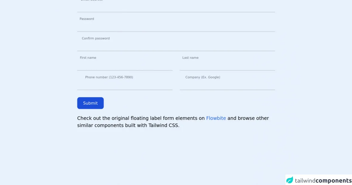
The preview of Floating labels ui component
To create a floating label UI component, we will use the following HTML structure:
<div class="form-group">
  <label for="input" class="label">Email</label>
  <input type="email" id="input" class="input" placeholder="Enter your email address">
</div>
The CSS classes used in this HTML structure are:
form-group: This class is used to group the label and input elements together.label: This class is used to style the label element.input: This class is used to style the input element.
Free download of the Floating labels's source code
The source code of Floating labels ui component
To create a floating label UI component, we will use the following CSS code:
.form-group {
  position: relative;
  margin-bottom: 1.5rem;
}

.label {
  position: absolute;
  top: 0;
  left: 0;
  font-size: 1rem;
  color: #a0aec0;
  transform-origin: 0 0;
  transition: all 0.2s ease-out;
}

.input {
  width: 100%;
  padding: 0.5rem 0;
  font-size: 1rem;
  border: none;
  border-bottom: 2px solid #e2e8f0;
  color: #4a5568;
}

.input:focus {
  outline: none;
  border-bottom-color: #38b2ac;
}

.input:focus + .label,
.input:not(:placeholder-shown) + .label {
  transform: translate3d(0, -1.5rem, 0) scale(0.75);
  color: #38b2ac;
}
The CSS classes used in this code are:
.form-group: This class is used to group the label and input elements together and set the position to relative..label: This class is used to style the label element and set the position to absolute..input: This class is used to style the input element and set the border to none..input:focus: This class is used to style the input element when it is in focus..input:focus + .label: This class is used to style the label element when the input element is in focus..input:not(:placeholder-shown) + .label: This class is used to style the label element when the input element has a value.
<!-- This is an example component -->
<div class="max-w-2xl mx-auto">

	<form>
		<div class="relative z-0 mb-6 w-full group">
			<input type="email" name="floating_email" class="block py-2.5 px-0 w-full text-sm text-gray-900 bg-transparent border-0 border-b-2 border-gray-300 appearance-none dark:text-white dark:border-gray-600 dark:focus:border-blue-500 focus:outline-none focus:ring-0 focus:border-blue-600 peer" placeholder=" " required />
			<label for="floating_email" class="absolute text-sm text-gray-500 dark:text-gray-400 duration-300 transform -translate-y-6 scale-75 top-3 -z-10 origin-[0] peer-focus:left-0 peer-focus:text-blue-600 peer-focus:dark:text-blue-500 peer-placeholder-shown:scale-100 peer-placeholder-shown:translate-y-0 peer-focus:scale-75 peer-focus:-translate-y-6">Email address</label>
		</div>
		<div class="relative z-0 mb-6 w-full group">
			<input type="password" name="floating_password" id="floating_password" class="block py-2.5 px-0 w-full text-sm text-gray-900 bg-transparent border-0 border-b-2 border-gray-300 appearance-none dark:text-white dark:border-gray-600 dark:focus:border-blue-500 focus:outline-none focus:ring-0 focus:border-blue-600 peer" placeholder=" " required />
			<label for="floating_password" class="absolute text-sm text-gray-500 dark:text-gray-400 duration-300 transform -translate-y-6 scale-75 top-3 -z-10 origin-[0] peer-focus:left-0 peer-focus:text-blue-600 peer-focus:dark:text-blue-500 peer-placeholder-shown:scale-100 peer-placeholder-shown:translate-y-0 peer-focus:scale-75 peer-focus:-translate-y-6">Password</label>
		</div>
		<div class="relative z-0 mb-6 w-full group">
			<input type="password" name="repeat_password" id="floating_repeat_password" class="block py-2.5 px-0 w-full text-sm text-gray-900 bg-transparent border-0 border-b-2 border-gray-300 appearance-none dark:text-white dark:border-gray-600 dark:focus:border-blue-500 focus:outline-none focus:ring-0 focus:border-blue-600 peer" placeholder=" " required />
			<label for="floating_repeat_password" class="absolute text-sm text-gray-500 dark:text-gray-400 duration-300 transform -translate-y-6 scale-75 top-3 -z-10 origin-[0] peer-focus:left-0 peer-focus:text-blue-600 peer-focus:dark:text-blue-500 peer-placeholder-shown:scale-100 peer-placeholder-shown:translate-y-0 peer-focus:scale-75 peer-focus:-translate-y-6">Confirm password</label>
		</div>
		<div class="grid xl:grid-cols-2 xl:gap-6">
			<div class="relative z-0 mb-6 w-full group">
				<input type="text" name="floating_first_name" id="floating_first_name" class="block py-2.5 px-0 w-full text-sm text-gray-900 bg-transparent border-0 border-b-2 border-gray-300 appearance-none dark:text-white dark:border-gray-600 dark:focus:border-blue-500 focus:outline-none focus:ring-0 focus:border-blue-600 peer" placeholder=" " required />
				<label for="floating_first_name" class="absolute text-sm text-gray-500 dark:text-gray-400 duration-300 transform -translate-y-6 scale-75 top-3 -z-10 origin-[0] peer-focus:left-0 peer-focus:text-blue-600 peer-focus:dark:text-blue-500 peer-placeholder-shown:scale-100 peer-placeholder-shown:translate-y-0 peer-focus:scale-75 peer-focus:-translate-y-6">First name</label>
			</div>
			<div class="relative z-0 mb-6 w-full group">
				<input type="text" name="floating_last_name" id="floating_last_name" class="block py-2.5 px-0 w-full text-sm text-gray-900 bg-transparent border-0 border-b-2 border-gray-300 appearance-none dark:text-white dark:border-gray-600 dark:focus:border-blue-500 focus:outline-none focus:ring-0 focus:border-blue-600 peer" placeholder=" " required />
				<label for="floating_last_name" class="absolute text-sm text-gray-500 dark:text-gray-400 duration-300 transform -translate-y-6 scale-75 top-3 -z-10 origin-[0] peer-focus:left-0 peer-focus:text-blue-600 peer-focus:dark:text-blue-500 peer-placeholder-shown:scale-100 peer-placeholder-shown:translate-y-0 peer-focus:scale-75 peer-focus:-translate-y-6">Last name</label>
			</div>
		</div>
		<div class="grid xl:grid-cols-2 xl:gap-6">
			<div class="relative z-0 mb-6 w-full group">
				<input type="tel" pattern="[0-9]{3}-[0-9]{3}-[0-9]{4}" name="floating_phone" id="floating_phone" class="block py-2.5 px-0 w-full text-sm text-gray-900 bg-transparent border-0 border-b-2 border-gray-300 appearance-none dark:text-white dark:border-gray-600 dark:focus:border-blue-500 focus:outline-none focus:ring-0 focus:border-blue-600 peer" placeholder=" " required />
				<label for="floating_phone" class="absolute text-sm text-gray-500 dark:text-gray-400 duration-300 transform -translate-y-6 scale-75 top-3 -z-10 origin-[0] peer-focus:left-0 peer-focus:text-blue-600 peer-focus:dark:text-blue-500 peer-placeholder-shown:scale-100 peer-placeholder-shown:translate-y-0 peer-focus:scale-75 peer-focus:-translate-y-6">Phone number (123-456-7890)</label>
			</div>
			<div class="relative z-0 mb-6 w-full group">
				<input type="text" name="floating_company" id="floating_company" class="block py-2.5 px-0 w-full text-sm text-gray-900 bg-transparent border-0 border-b-2 border-gray-300 appearance-none dark:text-white dark:border-gray-600 dark:focus:border-blue-500 focus:outline-none focus:ring-0 focus:border-blue-600 peer" placeholder=" " required />
				<label for="floating_company" class="absolute text-sm text-gray-500 dark:text-gray-400 duration-300 transform -translate-y-6 scale-75 top-3 -z-10 origin-[0] peer-focus:left-0 peer-focus:text-blue-600 peer-focus:dark:text-blue-500 peer-placeholder-shown:scale-100 peer-placeholder-shown:translate-y-0 peer-focus:scale-75 peer-focus:-translate-y-6">Company (Ex. Google)</label>
			</div>
		</div>
		<button type="submit" class="text-white bg-blue-700 hover:bg-blue-800 focus:ring-4 focus:ring-blue-300 font-medium rounded-lg text-sm w-full sm:w-auto px-5 py-2.5 text-center dark:bg-blue-600 dark:hover:bg-blue-700 dark:focus:ring-blue-800">Submit</button>
	</form>

	<p class="mt-5">Check out the original floating label form elements on <a class="text-blue-600 hover:underline"
			href="https://flowbite.com/docs/components/forms/#floating-labels" target="_blank">Flowbite</a> and browse other similar components built with Tailwind CSS.
	</p>
</div>
How to create a Floating labels with Tailwind CSS?
To create a floating label UI component with Tailwind CSS, follow these steps:
- Create a new HTML file and add the following HTML code:
<div class="form-group">
  <label for="input" class="label">Email</label>
  <input type="email" id="input" class="input" placeholder="Enter your email address">
</div>
- Add the Tailwind CSS CDN to the head section of your HTML file:
<head>
  <link href="https://cdn.jsdelivr.net/npm/[email protected]/dist/tailwind.min.css" rel="stylesheet">
</head>
- Add the following CSS code to your CSS file:
.form-group {
  position: relative;
  margin-bottom: 1.5rem;
}

.label {
  position: absolute;
  top: 0;
  left: 0;
  font-size: 1rem;
  color: #a0aec0;
  transform-origin: 0 0;
  transition: all 0.2s ease-out;
}

.input {
  width: 100%;
  padding: 0.5rem 0;
  font-size: 1rem;
  border: none;
  border-bottom: 2px solid #e2e8f0;
  color: #4a5568;
}

.input:focus {
  outline: none;
  border-bottom-color: #38b2ac;
}

.input:focus + .label,
.input:not(:placeholder-shown) + .label {
  transform: translate3d(0, -1.5rem, 0) scale(0.75);
  color: #38b2ac;
}
- Open your HTML file in a web browser and test the floating label UI component.
Conclusion
In conclusion, Tailwind CSS is a powerful CSS framework that can be used to create a floating label UI component with minimal effort. By using the pre-defined classes and utility classes provided by Tailwind CSS, you can easily customize the appearance and behavior of the floating label component to match your design requirements. With the help of this tutorial, you can now create a floating label UI component using Tailwind CSS and improve the user experience of your web applications.