- Published on
A Complete Guide To Build A Responsive Fixed Navbar With Tailwind CSS
- What is Tailwind CSS?
- The description of Responsive Fixed Navbar ui component
- Why use Tailwind CSS to create a Responsive Fixed Navbar ui component?
- The preview of Responsive Fixed Navbar ui component.
- The source code of Responsive Fixed Navbar ui component.
- How to create a Responsive Fixed Navbar with Tailwind CSS?
- Step 1: Set up the HTML structure
- Step 2: Style the navbar with Tailwind CSS
- Step 3: Test the responsive design
- Conclusion
What is Tailwind CSS?
Tailwind CSS is a utility-first CSS framework that provides a set of pre-defined classes to create responsive and customizable UI components. It allows you to create complex layouts and designs without writing custom CSS code.
The description of Responsive Fixed Navbar ui component
A responsive fixed navbar is a UI component that stays fixed at the top of the page and adjusts its size and position based on the screen size. It provides easy navigation to the users and improves the user experience of the website.
Why use Tailwind CSS to create a Responsive Fixed Navbar ui component?
Tailwind CSS provides a set of pre-defined classes that can be used to create a responsive fixed navbar with minimal effort. It also provides a responsive design system that allows you to create a consistent look and feel across different screen sizes.
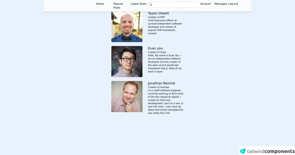
The preview of Responsive Fixed Navbar ui component.
To create a responsive fixed navbar with Tailwind CSS, we will use a combination of pre-defined classes and custom CSS. The navbar will have a logo on the left side, a menu on the right side, and a responsive design that adjusts its size and position based on the screen size.
Free download of the Responsive Fixed Navbar's source code
The source code of Responsive Fixed Navbar ui component.
To create a responsive fixed navbar with Tailwind CSS, we will use the following HTML and CSS code.
<div>
       <navbar class="fixed top-0 z-10 bg-gray-50 w-full">
       <div class="md:hidden py-4 px-8 flex justify-between">
            <div class="text-xl">Logo</div>
            <div>
              <svg xmlns="http://www.w3.org/2000/svg" width="16" height="16" fill="currentColor" class="bi bi-list" viewBox="0 0 16 16">
  <path fill-rule="evenodd" d="M2.5 12a.5.5 0 0 1 .5-.5h10a.5.5 0 0 1 0 1H3a.5.5 0 0 1-.5-.5zm0-4a.5.5 0 0 1 .5-.5h10a.5.5 0 0 1 0 1H3a.5.5 0 0 1-.5-.5zm0-4a.5.5 0 0 1 .5-.5h10a.5.5 0 0 1 0 1H3a.5.5 0 0 1-.5-.5z"/>
</svg>
            </div>
       </div>

     <div class="hidden md:grid grid-cols-4 gap-2 py-3 shadow-md">
         <div class="invisible"></div>
         <div>
           <!--Public links-->
           <ul class="inline-grid grid-cols-3 gap-x-2">
             <li>Home</li>
             <li>Popular Posts</li>
             <li>Latest Posts</li>
           </ul>
         </div>
         <div>
           <!--Search form-->
           <form>
             <div class="relative">
               <!--Search icon-->
              <span class="absolute p-2 insert-y-0">
                <svg xmlns="http://www.w3.org/2000/svg" width="16" height="16" fill="currentColor" class="bi bi-search" viewBox="0 0 16 16">
  <path d="M11.742 10.344a6.5 6.5 0 1 0-1.397 1.398h-.001c.03.04.062.078.098.115l3.85 3.85a1 1 0 0 0 1.415-1.414l-3.85-3.85a1.007 1.007 0 0 0-.115-.1zM12 6.5a5.5 5.5 0 1 1-11 0 5.5 5.5 0 0 1 11 0z"/>
</svg>
              </span>
              <input type="search" class="w-full px-8 py-1 border border-gray-300 focus:outline-none rounded-md">
             </div>
           </form>
         </div>
         <div>
           <!--Auth links-->
           <ul class="inline-grid grid-cols-3 gap-x-2">
             <li>Account</li>
             <li>Messages</li>
             <li>Log out</li>
           </ul>
         </div>
     </div>

  </navbar>
   <!--Responsive Search form-->
           <form class="md:hidden px-4 mt-16 mb-4">
             <div class="relative">
               <!--Search icon-->
              <span class="absolute p-2 insert-y-0">
                <svg xmlns="http://www.w3.org/2000/svg" width="16" height="16" fill="currentColor" class="bi bi-search" viewBox="0 0 16 16">
  <path d="M11.742 10.344a6.5 6.5 0 1 0-1.397 1.398h-.001c.03.04.062.078.098.115l3.85 3.85a1 1 0 0 0 1.415-1.414l-3.85-3.85a1.007 1.007 0 0 0-.115-.1zM12 6.5a5.5 5.5 0 1 1-11 0 5.5 5.5 0 0 1 11 0z"/>
</svg>
              </span>
              <input type="search" class="w-full px-8 py-1 border border-gray-300 focus:outline-none rounded-md">
             </div>
           </form>
     <!--Dummy Posts-->
    <div>
       <div class=" text-center text-gray-900 font-semibold text-2xl">The Nerds</div>
        <div class="flex flex-col items-center my-6 ">

          <!--First post-->
          <div class="grid grid-cols-1 md:grid-cols-2 gap-1 my-3 max-w-md">
            <div><img class="rounded-md w-screen md:w-48 h-48 object-contain" src="https://avatars.githubusercontent.com/u/463230?v=4" alt="Sarah dayan"></div>
            <div class="p-4 md:p-0">
              <div class="text-xl font-gray-900">Taylor Otwell</div>
              <div class="text-sm italic">Creator of PHP</div>
              <div class="text-sm">
                Chief Executive Officer at Laravel,independent software developer and creator of popular PHP Framework, Laravel
              </div>
            </div>
          </div>
          <!--Second post-->
            <div class="grid grid-cols-1 md:grid-cols-2 gap-1 my-3 max-w-md">
            <div><img class="rounded-md w-screen md:w-48 h-48 object-contain" src="https://avatars.githubusercontent.com/u/499550?v=4" alt="Evan you"></div>
            <div class="p-4 md:p-0">
              <div class="text-xl font-gray-900">Evan you</div>
              <div class="text-sm italic">Creator of Vuejs</div>
              <div class="text-sm">
                Hello. My name is Evan You. I am an independent software developer and the creator of the open source JavaScript framework Vue.js. Most of my work is open .
              </div>
            </div>
          </div>
          <!--Third post-->
            <div class="grid grid-cols-1 md:grid-cols-2 gap-1 my-3 max-w-md">
            <div><img class="rounded-md w-screen  md:w-48 h-48 object-contain" src="https://inertiajs.com/img/jonathan.png" alt="Sarah dayan"></div>
            <div class="p-4 md:p-0">
              <div class="text-xl font-gray-900">Jonathan Reinink</div>
              <div class="text-sm italic">Creator of inertiajs</div>
              <div class="text-sm">
                I'm a Staff Software Engineer currently working as Tech Lead of the Doc Squad at Algolia. I mostly do front-end development, and I'm a Vue. js and CSS nerd. I can't shut up about test-driven development and utility-first CSS.
              </div>
            </div>
          </div>
        </div>
    </div>

   </div>
How to create a Responsive Fixed Navbar with Tailwind CSS?
Step 1: Set up the HTML structure
The first step is to set up the HTML structure of the navbar. We will use a nav element with a fixed class to make it fixed at the top of the page. Inside the nav element, we will have a div element with a container class to center the content.
<nav class="fixed w-full bg-gray-800">
  <div class="container flex items-center justify-between px-6 py-4 mx-auto">
    <!-- Logo -->
    <a class="text-xl font-bold text-white" href="#">Logo</a>

    <!-- Menu -->
    <div class="flex items-center">
      <a class="text-gray-300 hover:text-white px-3 py-2 rounded-md" href="#">Home</a>
      <a class="text-gray-300 hover:text-white px-3 py-2 rounded-md" href="#">About</a>
      <a class="text-gray-300 hover:text-white px-3 py-2 rounded-md" href="#">Contact</a>
    </div>
  </div>
</nav>
Step 2: Style the navbar with Tailwind CSS
The next step is to style the navbar with Tailwind CSS. We will use a combination of pre-defined classes and custom CSS to create a responsive design that adjusts its size and position based on the screen size.
/* Navbar container */
.container {
  max-width: 1280px;
}

/* Logo */
a {
  transition: all 0.3s ease-in-out;
}

a:hover {
  transform: scale(1.1);
}

/* Menu */
a {
  transition: all 0.3s ease-in-out;
}

a:hover {
  color: #fff;
}

/* Responsive design */
@media (max-width: 768px) {
  .container {
    flex-direction: column;
    justify-content: center;
    align-items: center;
  }

  .flex {
    flex-direction: column;
  }

  .items-center {
    text-align: center;
  }

  .py-4 {
    padding-top: 2rem;
    padding-bottom: 2rem;
  }

  .px-6 {
    padding-left: 1rem;
    padding-right: 1rem;
  }
}
Step 3: Test the responsive design
The final step is to test the responsive design of the navbar. You can test it by resizing the browser window or using the Chrome DevTools to simulate different screen sizes.
Conclusion
In this article, we have learned how to create a responsive fixed navbar with Tailwind CSS. We have used a combination of pre-defined classes and custom CSS to create a responsive design that adjusts its size and position based on the screen size. With Tailwind CSS, you can create complex UI components with minimal effort and improve the user experience of your website.