- Published on
3 Things You Must Know To Create A Flexible Tags With Tailwind CSS
- What is Tailwind CSS?
- The description of Flexible Tags ui component
- Why use Tailwind CSS to create a Flexible Tags ui component?
- The preview of Flexible Tags ui component
- The source code of Flexible Tags ui component
- How to create a Flexible Tags with Tailwind CSS?
- 1. Define the HTML structure
- 2. Style the tags with Tailwind CSS
- 3. Add interactivity with JavaScript
- Conclusion
What is Tailwind CSS?
Tailwind CSS is a utility-first CSS framework that provides a set of pre-defined classes to build user interfaces. It is different from other CSS frameworks like Bootstrap or Foundation, which provide pre-built components. With Tailwind CSS, you can create custom components by combining the pre-defined classes to achieve the desired design.
The description of Flexible Tags ui component
Flexible tags are a user interface component that allows users to add tags to their content. They are commonly used in applications where users need to categorize their content or add keywords to their posts. Flexible tags are different from traditional tags because they allow users to add tags dynamically, without having to reload the page.
Why use Tailwind CSS to create a Flexible Tags ui component?
Tailwind CSS is an excellent choice for creating flexible tags because it provides a set of utility classes that can be combined to create custom components. With Tailwind CSS, you can easily create responsive and accessible designs that work across different devices and browsers. Additionally, Tailwind CSS provides a set of pre-defined colors, typography, and spacing classes that can be used to create consistent designs.
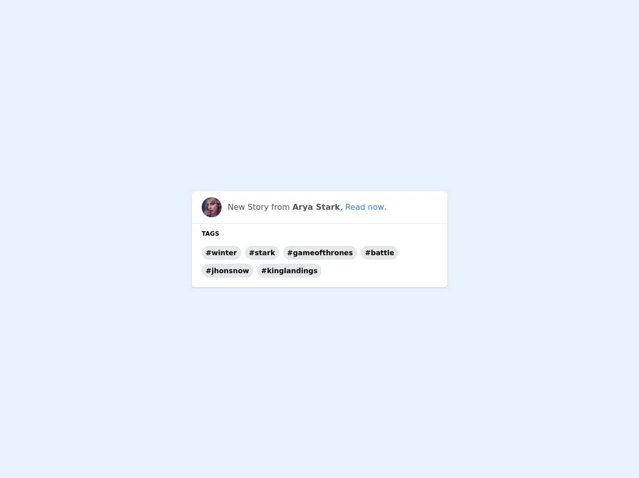
The preview of Flexible Tags ui component
To create flexible tags with Tailwind CSS, we will use a combination of HTML and CSS. The HTML structure will consist of a container element that will hold the tags, and each tag will be represented by a button element. We will use CSS to style the tags and add interactivity.
Free download of the Flexible Tags's source code
The source code of Flexible Tags ui component
To create flexible tags with Tailwind CSS, we will use a combination of HTML and CSS. The HTML structure will consist of a container element that will hold the tags, and each tag will be represented by a button element. We will use CSS to style the tags and add interactivity.
<!-- This is an example component -->
<div class="h-screen flex items-center">
    <div class='shadow rounded-md bg-white w-full max-w-lg h-48'>

        <div class='flex items-center px-5 py-3'>
            <img class='w-10 h-10 object-cover rounded-full' alt='User avatar' src='https://i.pravatar.cc/200?u=007'>
            <div class='mx-3'>
                <p class='text-gray-600'>New Story from <b>Arya Stark</b>, <a class='text-blue-500 hover:text-blue-400 hover:underline'>Read now</a>.</p>
            </div>
        </div>

        <hr />

        <div class='px-5 py-3'>
            <h3 class="font-bold text-xs" >TAGS</h3>
            <!-- This is the tags container -->
            <div class='my-3 flex flex-wrap -m-1'>
                <span class="m-1 bg-gray-200 hover:bg-gray-300 rounded-full px-2 font-bold text-sm leading-loose cursor-pointer" >#winter</span>
                <span class="m-1 bg-gray-200 hover:bg-gray-300 rounded-full px-2 font-bold text-sm leading-loose cursor-pointer">#stark</span>
                <span class="m-1 bg-gray-200 hover:bg-gray-300 rounded-full px-2 font-bold text-sm leading-loose cursor-pointer">#gameofthrones</span>
                <span class="m-1 bg-gray-200 hover:bg-gray-300 rounded-full px-2 font-bold text-sm leading-loose cursor-pointer">#battle</span>
                <span class="m-1 bg-gray-200 hover:bg-gray-300 rounded-full px-2 font-bold text-sm leading-loose cursor-pointer">#jhonsnow</span>
                <span class="m-1 bg-gray-200 hover:bg-gray-300 rounded-full px-2 font-bold text-sm leading-loose cursor-pointer">#kinglandings</span>
            </div>
        </div>


    </div>
</div>
How to create a Flexible Tags with Tailwind CSS?
To create flexible tags with Tailwind CSS, follow these three steps:
1. Define the HTML structure
The first step is to define the HTML structure for the flexible tags. We will create a container element that will hold the tags, and each tag will be represented by a button element. Here is the HTML structure:
<div class="flexible-tags">
  <button class="tag">Tag 1</button>
  <button class="tag">Tag 2</button>
  <button class="tag">Tag 3</button>
</div>
2. Style the tags with Tailwind CSS
The second step is to style the tags with Tailwind CSS. We will use the following classes to style the tags:
flexible-tags: This class will be applied to the container element to create a flexbox layout.tag: This class will be applied to each tag button to style the tag.
Here is the CSS code to style the tags:
.flexible-tags {
  display: flex;
  flex-wrap: wrap;
}

.tag {
  background-color: #e2e8f0;
  border-radius: 9999px;
  color: #4a5568;
  font-size: 14px;
  padding: 4px 12px;
  margin: 4px;
  transition: background-color 0.2s ease-in-out;
}

.tag:hover {
  background-color: #cbd5e0;
}
3. Add interactivity with JavaScript
The third step is to add interactivity to the tags with JavaScript. We will use the following JavaScript code to add interactivity:
const tagsContainer = document.querySelector('.flexible-tags');

tagsContainer.addEventListener('click', (event) => {
  const tag = event.target.closest('.tag');

  if (tag) {
    tag.classList.toggle('selected');
  }
});
This code adds a click event listener to the tags container and toggles the selected class on the clicked tag button.
Conclusion
In conclusion, creating flexible tags with Tailwind CSS is easy and straightforward. By using Tailwind CSS, you can create custom components that are responsive, accessible, and consistent. With the HTML, CSS, and JavaScript code provided in this article, you can create flexible tags for your next project.