- Published on
Advanced Guide: Build A Feedback/Review Section With Tailwind CSS
- What is Tailwind CSS?
- The description of Feedback/Review Section ui component
- Why use Tailwind CSS to create a Feedback/Review Section ui component?
- The preview of Feedback/Review Section ui component.
- The source code of Feedback/Review Section ui component.
- How to create a Feedback/Review Section with Tailwind CSS?
- Step 1: Create the HTML structure
- Step 2: Add Tailwind CSS classes
- Step 3: Customize your Feedback/Review section
- Conclusion
As a FrontEnd developer, you know that feedback and reviews are essential for any website or application. They help you improve your product and provide valuable insights to your users. In this article, we will show you how to create a Feedback/Review section with Tailwind CSS, a popular utility-first CSS framework.
What is Tailwind CSS?
Tailwind CSS is a utility-first CSS framework that allows you to create custom designs without writing any CSS. It provides a set of pre-defined classes that you can use to style your HTML elements. With Tailwind CSS, you can create responsive designs, customize colors, fonts, and spacing, and much more.
The description of Feedback/Review Section ui component
A Feedback/Review section is a UI component that allows users to provide feedback or leave a review about a product, service, or website. It usually consists of a form with input fields for the user's name, email, rating, and comments. The section may also include a list of reviews or testimonials from other users.
Why use Tailwind CSS to create a Feedback/Review Section ui component?
Tailwind CSS is an excellent choice for creating a Feedback/Review section because it provides a set of pre-defined classes that you can use to style your form and input fields. It also allows you to create responsive designs and customize the look and feel of your section. With Tailwind CSS, you can create a professional-looking Feedback/Review section in no time.
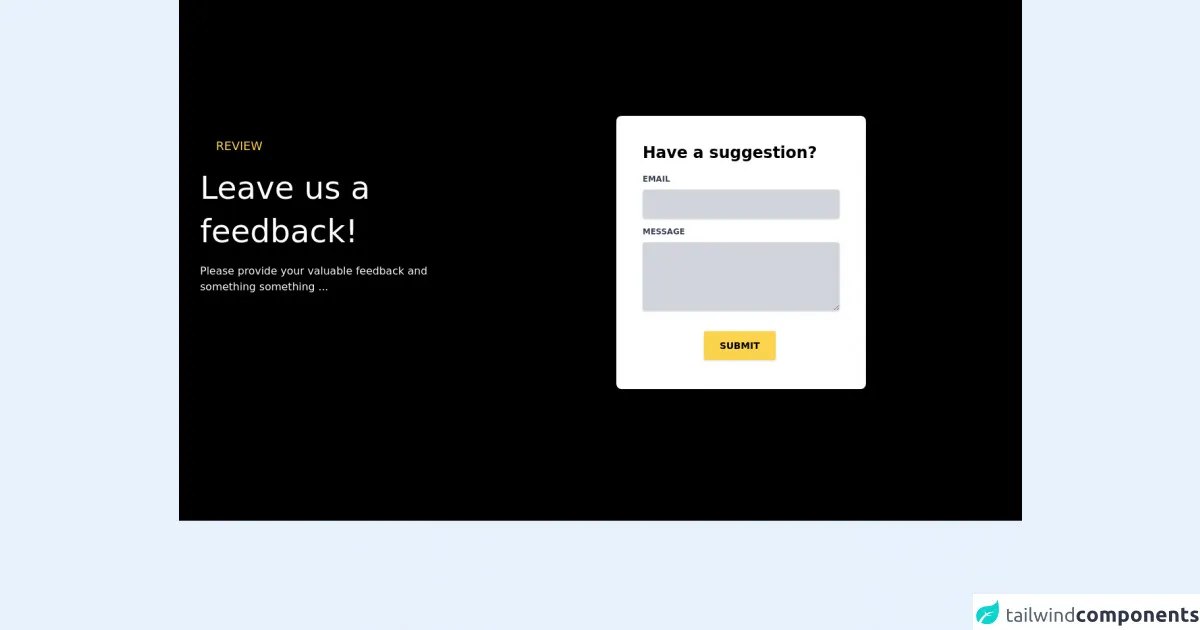
The preview of Feedback/Review Section ui component.
To create a Feedback/Review section, we will use Tailwind CSS classes to style our form and input fields. Here's a preview of what our Feedback/Review section will look like:
Free download of the Feedback/Review Section's source code
The source code of Feedback/Review Section ui component.
To create our Feedback/Review section, we will use HTML and Tailwind CSS classes. Here's the source code:
<section>
	<div class="bg-black text-white py-20">
		<div class="container mx-auto flex flex-col md:flex-row my-6 md:my-24">
			<div class="flex flex-col w-full lg:w-1/3 p-8">
				<p class="ml-6 text-yellow-300 text-lg uppercase tracking-loose">REVIEW</p>
				<p class="text-3xl md:text-5xl my-4 leading-relaxed md:leading-snug">Leave us a feedback!</p>
				<p class="text-sm md:text-base leading-snug text-gray-50 text-opacity-100">
					Please provide your valuable feedback and something something ...
				</p>
			</div>
			<div class="flex flex-col w-full lg:w-2/3 justify-center">
				<div class="container w-full px-4">
					<div class="flex flex-wrap justify-center">
						<div class="w-full lg:w-6/12 px-4">
							<div
								class="relative flex flex-col min-w-0 break-words w-full mb-6 shadow-lg rounded-lg bg-white">
								<div class="flex-auto p-5 lg:p-10">
									<h4 class="text-2xl mb-4 text-black font-semibold">Have a suggestion?</h4>
									<form id="feedbackForm" action="" method="">
										<div class="relative w-full mb-3">
											<label class="block uppercase text-gray-700 text-xs font-bold mb-2"
                        for="email">Email</label><input type="email" name="email" id="email" class="border-0 px-3 py-3 rounded text-sm shadow w-full
                    bg-gray-300 placeholder-black text-gray-800 outline-none focus:bg-gray-400" placeholder=" "
                        style="transition: all 0.15s ease 0s;" required />
                    </div>
											<div class="relative w-full mb-3">
												<label class="block uppercase text-gray-700 text-xs font-bold mb-2"
                        for="message">Message</label><textarea maxlength="300" name="feedback" id="feedback" rows="4"
                        cols="80"
                        class="border-0 px-3 py-3 bg-gray-300 placeholder-black text-gray-800 rounded text-sm shadow focus:outline-none w-full"
                        placeholder="" required></textarea>
											</div>
											<div class="text-center mt-6">
												<button id="feedbackBtn"
                        class="bg-yellow-300 text-black text-center mx-auto active:bg-yellow-400 text-sm font-bold uppercase px-6 py-3 rounded shadow hover:shadow-lg outline-none focus:outline-none mr-1 mb-1"
                        type="submit" style="transition: all 0.15s ease 0s;">Submit
                      </button>
											</div>
									</form>
								</div>
							</div>
						</div>
					</div>
				</div>
			</div>
		</div>
	</div>
</section>
How to create a Feedback/Review Section with Tailwind CSS?
To create a Feedback/Review section with Tailwind CSS, follow these steps:
Step 1: Create the HTML structure
First, create the HTML structure for your Feedback/Review section. You can use a form element to collect user feedback and input fields for the user's name, email, rating, and comments. You can also include a list of reviews or testimonials from other users.
<div class="container mx-auto py-8">
  <h2 class="text-3xl font-bold mb-4">Leave a Review</h2>
  <form class="w-full max-w-lg">
    <div class="flex flex-wrap -mx-3 mb-6">
      <div class="w-full md:w-1/2 px-3 mb-6 md:mb-0">
        <label class="block uppercase tracking-wide text-gray-700 text-xs font-bold mb-2" for="grid-first-name">
          Name
        </label>
        <input class="appearance-none block w-full bg-gray-200 text-gray-700 border border-gray-200 rounded py-3 px-4 mb-3 leading-tight focus:outline-none focus:bg-white" id="grid-first-name" type="text" placeholder="John Doe">
      </div>
      <div class="w-full md:w-1/2 px-3">
        <label class="block uppercase tracking-wide text-gray-700 text-xs font-bold mb-2" for="grid-last-name">
          Email
        </label>
        <input class="appearance-none block w-full bg-gray-200 text-gray-700 border border-gray-200 rounded py-3 px-4 leading-tight focus:outline-none focus:bg-white focus:border-gray-500" id="grid-last-name" type="email" placeholder="[email protected]">
      </div>
    </div>
    <div class="flex flex-wrap -mx-3 mb-6">
      <div class="w-full px-3">
        <label class="block uppercase tracking-wide text-gray-700 text-xs font-bold mb-2" for="grid-password">
          Rating
        </label>
        <div class="flex items-center">
          <input class="form-radio h-4 w-4 text-gray-700" type="radio" name="rating" value="1">
          <input class="form-radio h-4 w-4 text-gray-700" type="radio" name="rating" value="2">
          <input class="form-radio h-4 w-4 text-gray-700" type="radio" name="rating" value="3">
          <input class="form-radio h-4 w-4 text-gray-700" type="radio" name="rating" value="4">
          <input class="form-radio h-4 w-4 text-gray-700" type="radio" name="rating" value="5">
        </div>
      </div>
    </div>
    <div class="flex flex-wrap -mx-3 mb-6">
      <div class="w-full px-3">
        <label class="block uppercase tracking-wide text-gray-700 text-xs font-bold mb-2" for="grid-password">
          Comments
        </label>
        <textarea class="appearance-none block w-full bg-gray-200 text-gray-700 border border-gray-200 rounded py-3 px-4 mb-3 leading-tight focus:outline-none focus:bg-white focus:border-gray-500" id="grid-password" placeholder="Leave your comments here"></textarea>
      </div>
    </div>
    <div class="flex flex-wrap -mx-3 mb-6">
      <div class="w-full px-3">
        <button class="bg-blue-500 hover:bg-blue-700 text-white font-bold py-2 px-4 rounded focus:outline-none focus:shadow-outline" type="button">
          Submit
        </button>
      </div>
    </div>
  </form>
  <div class="mt-8">
    <h3 class="text-2xl font-bold mb-4">Reviews</h3>
    <div class="flex flex-wrap -mx-3">
      <div class="w-full md:w-1/2 px-3 mb-6">
        <div class="bg-white rounded-lg shadow-lg p-6">
          <p class="text-gray-700 text-base mb-4">Lorem ipsum dolor sit amet, consectetur adipiscing elit. Nullam ac ante mollis, lobortis elit in, bibendum purus. Sed vel lacinia nulla. Sed vel lacinia nulla.</p>
          <p class="text-gray-700 text-sm">John Doe</p>
          <p class="text-gray-700 text-sm">[email protected]</p>
          <p class="text-gray-700 text-sm">4/5</p>
        </div>
      </div>
      <div class="w-full md:w-1/2 px-3 mb-6">
        <div class="bg-white rounded-lg shadow-lg p-6">
          <p class="text-gray-700 text-base mb-4">Lorem ipsum dolor sit amet, consectetur adipiscing elit. Nullam ac ante mollis, lobortis elit in, bibendum purus. Sed vel lacinia nulla. Sed vel lacinia nulla.</p>
          <p class="text-gray-700 text-sm">Jane Doe</p>
          <p class="text-gray-700 text-sm">[email protected]</p>
          <p class="text-gray-700 text-sm">5/5</p>
        </div>
      </div>
    </div>
  </div>
</div>
Step 2: Add Tailwind CSS classes
Next, add Tailwind CSS classes to style your form and input fields. You can use classes like container, mx-auto, py-8, text-3xl, font-bold, mb-4, w-full, max-w-lg, flex, flex-wrap, px-3, mb-6, md:mb-0, uppercase, tracking-wide, text-gray-700, text-xs, font-bold, block, appearance-none, bg-gray-200, border, rounded, py-3, px-4, leading-tight, focus:outline-none, focus:bg-white, focus:border-gray-500, form-radio, text-base, bg-white, shadow-lg, p-6, text-sm, bg-blue-500, hover:bg-blue-700, text-white, font-bold, focus:outline-none, and focus:shadow-outline.
<div class="container mx-auto py-8">
  <h2 class="text-3xl font-bold mb-4">Leave a Review</h2>
  <form class="w-full max-w-lg">
    <div class="flex flex-wrap -mx-3 mb-6">
      <div class="w-full md:w-1/2 px-3 mb-6 md:mb-0">
        <label class="block uppercase tracking-wide text-gray-700 text-xs font-bold mb-2" for="grid-first-name">
          Name
        </label>
        <input class="appearance-none block w-full bg-gray-200 text-gray-700 border border-gray-200 rounded py-3 px-4 mb-3 leading-tight focus:outline-none focus:bg-white" id="grid-first-name" type="text" placeholder="John Doe">
      </div>
      <div class="w-full md:w-1/2 px-3">
        <label class="block uppercase tracking-wide text-gray-700 text-xs font-bold mb-2" for="grid-last-name">
          Email
        </label>
        <input class="appearance-none block w-full bg-gray-200 text-gray-700 border border-gray-200 rounded py-3 px-4 leading-tight focus:outline-none focus:bg-white focus:border-gray-500" id="grid-last-name" type="email" placeholder="[email protected]">
      </div>
    </div>
    <div class="flex flex-wrap -mx-3 mb-6">
      <div class="w-full px-3">
        <label class="block uppercase tracking-wide text-gray-700 text-xs font-bold mb-2" for="grid-password">
          Rating
        </label>
        <div class="flex items-center">
          <input class="form-radio h-4 w-4 text-gray-700" type="radio" name="rating" value="1">
          <input class="form-radio h-4 w-4 text-gray-700" type="radio" name="rating" value="2">
          <input class="form-radio h-4 w-4 text-gray-700" type="radio" name="rating" value="3">
          <input class="form-radio h-4 w-4 text-gray-700" type="radio" name="rating" value="4">
          <input class="form-radio h-4 w-4 text-gray-700" type="radio" name="rating" value="5">
        </div>
      </div>
    </div>
    <div class="flex flex-wrap -mx-3 mb-6">
      <div class="w-full px-3">
        <label class="block uppercase tracking-wide text-gray-700 text-xs font-bold mb-2" for="grid-password">
          Comments
        </label>
        <textarea class="appearance-none block w-full bg-gray-200 text-gray-700 border border-gray-200 rounded py-3 px-4 mb-3 leading-tight focus:outline-none focus:bg-white focus:border-gray-500" id="grid-password" placeholder="Leave your comments here"></textarea>
      </div>
    </div>
    <div class="flex flex-wrap -mx-3 mb-6">
      <div class="w-full px-3">
        <button class="bg-blue-500 hover:bg-blue-700 text-white font-bold py-2 px-4 rounded focus:outline-none focus:shadow-outline" type="button">
          Submit
        </button>
      </div>
    </div>
  </form>
  <div class="mt-8">
    <h3 class="text-2xl font-bold mb-4">Reviews</h3>
    <div class="flex flex-wrap -mx-3">
      <div class="w-full md:w-1/2 px-3 mb-6">
        <div class="bg-white rounded-lg shadow-lg p-6">
          <p class="text-gray-700 text-base mb-4">Lorem ipsum dolor sit amet, consectetur adipiscing elit. Nullam ac ante mollis, lobortis elit in, bibendum purus. Sed vel lacinia nulla. Sed vel lacinia nulla.</p>
          <p class="text-gray-700 text-sm">John Doe</p>
          <p class="text-gray-700 text-sm">[email protected]</p>
          <p class="text-gray-700 text-sm">4/5</p>
        </div>
      </div>
      <div class="w-full md:w-1/2 px-3 mb-6">
        <div class="bg-white rounded-lg shadow-lg p-6">
          <p class="text-gray-700 text-base mb-4">Lorem ipsum dolor sit amet, consectetur adipiscing elit. Nullam ac ante mollis, lobortis elit in, bibendum purus. Sed vel lacinia nulla. Sed vel lacinia nulla.</p>
          <p class="text-gray-700 text-sm">Jane Doe</p>
          <p class="text-gray-700 text-sm">[email protected]</p>
          <p class="text-gray-700 text-sm">5/5</p>
        </div>
      </div>
    </div>
  </div>
</div>
Step 3: Customize your Feedback/Review section
Finally, customize your Feedback/Review section to match your website or application's design. You can change the colors, fonts, and spacing by modifying the Tailwind CSS classes. You can also add more input fields or change the layout of the section.
Conclusion
In this article, we showed you how to create a Feedback/Review section with Tailwind CSS. We discussed the benefits of using Tailwind CSS and provided a step-by-step guide to create your Feedback/Review section. With Tailwind CSS, you can create custom designs quickly and easily. We hope this article helps you improve your website or application's feedback and review process.