- Published on
Create A File Input With Tailwind CSS Like A Pro With The Help Of These 6 Tips
- What is Tailwind CSS?
- The description of File input ui component
- Why use Tailwind CSS to create a File input ui component?
- The preview of File input ui component.
- The source code of File input ui component.
- How to create a File input with Tailwind CSS?
- 1. Use a label element
- 2. Style the label element
- 3. Style the input element
- 4. Add a placeholder
- 5. Customize the appearance
- 6. Add validation
- Conclusion
As a FrontEnd developer, you know that creating a file input UI component can be a tedious task. However, with Tailwind CSS, you can create a file input component like a pro in no time. In this article, we'll explore the benefits of using Tailwind CSS to create a file input component and provide you with six tips to help you create a beautiful and functional file input component.
What is Tailwind CSS?
Tailwind CSS is a utility-first CSS framework that allows you to create complex designs by composing small, single-purpose classes. With Tailwind CSS, you can create responsive and customizable UI components quickly and efficiently.
The description of File input ui component
A file input UI component is a form element that allows users to upload files. It's commonly used in web applications that require users to upload files, such as images, videos, or documents.
Why use Tailwind CSS to create a File input ui component?
Tailwind CSS provides a set of pre-defined classes that you can use to create a file input UI component quickly. You don't need to write custom CSS, which saves you time and effort. Additionally, Tailwind CSS allows you to customize the component's appearance and behavior with ease.
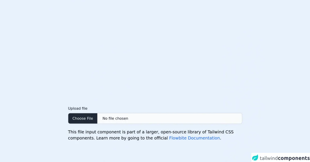
The preview of File input ui component.
To create a file input UI component with Tailwind CSS, you can use the following code:
<label class="block text-gray-700 font-bold mb-2" for="fileInput">
  Choose a file to upload:
</label>
<input class="border rounded-lg py-2 px-3 text-gray-700 leading-tight focus:outline-none focus:shadow-outline" id="fileInput" type="file">
Free download of the File input's source code
The source code of File input ui component.
To create a file input UI component with Tailwind CSS, you can use the following code:
<label class="block text-gray-700 font-bold mb-2" for="fileInput">
  Choose a file to upload:
</label>
<input class="border rounded-lg py-2 px-3 text-gray-700 leading-tight focus:outline-none focus:shadow-outline" id="fileInput" type="file">
<link rel="stylesheet" href="https://unpkg.com/[email protected]/dist/flowbite.min.css" />

<!-- This is an example component -->
<div class="max-w-2xl mx-auto">

	<label class="block mb-2 text-sm font-medium text-gray-900 dark:text-gray-300" for="file_input">Upload file</label>
<input class="block w-full text-sm text-gray-900 border border-gray-300 rounded-lg cursor-pointer bg-gray-50 dark:text-gray-400 focus:outline-none dark:bg-gray-700 dark:border-gray-600 dark:placeholder-gray-400" id="file_input" type="file">

	<p class="mt-5">This file input component is part of a larger, open-source library of Tailwind CSS components. Learn
		more
		by going to the official <a class="text-blue-600 hover:underline"
			href="https://flowbite.com/docs/getting-started/introduction/" target="_blank">Flowbite Documentation</a>.
	</p>
    <script src="https://unpkg.com/[email protected]/dist/flowbite.js"></script>
</div>
How to create a File input with Tailwind CSS?
Now that you've seen the basic code for creating a file input UI component with Tailwind CSS, let's dive into six tips to help you create a beautiful and functional file input component.
1. Use a label element
Using a label element with a for attribute that matches the input element's id attribute is a best practice for creating accessible forms. It also makes the form easier to use for users who have difficulty clicking small input elements.
<label class="block text-gray-700 font-bold mb-2" for="fileInput">
  Choose a file to upload:
</label>
<input class="border rounded-lg py-2 px-3 text-gray-700 leading-tight focus:outline-none focus:shadow-outline" id="fileInput" type="file">
2. Style the label element
Styling the label element can make the file input component more visually appealing and easier to use. You can use Tailwind CSS classes to style the label element, such as text-gray-700 and font-bold.
3. Style the input element
Styling the input element can make it more visually appealing and easier to use. You can use Tailwind CSS classes to style the input element, such as border, rounded-lg, py-2, px-3, text-gray-700, leading-tight, focus:outline-none, and focus:shadow-outline.
4. Add a placeholder
Adding a placeholder to the input element can help users understand what type of file they should upload. You can add a placeholder attribute to the input element and set its value to the desired text.
<input class="border rounded-lg py-2 px-3 text-gray-700 leading-tight focus:outline-none focus:shadow-outline" id="fileInput" type="file" placeholder="Select a file...">
5. Customize the appearance
You can customize the appearance of the file input component by using Tailwind CSS classes. For example, you can change the border color, background color, and text color.
<input class="border-red-500 bg-gray-200 text-gray-800 rounded-lg py-2 px-3 leading-tight focus:outline-none focus:shadow-outline" id="fileInput" type="file" placeholder="Select a file...">
6. Add validation
You can add validation to the file input component to ensure that users upload the correct file type or size. You can use JavaScript to validate the input element and display an error message if the user uploads an incorrect file.
<input class="border rounded-lg py-2 px-3 text-gray-700 leading-tight focus:outline-none focus:shadow-outline" id="fileInput" type="file" placeholder="Select a file..." onchange="validateFile()">
<div id="errorMessage" class="hidden text-red-500">Please upload a file with a .jpg, .png, or .gif extension.</div>
<script>
function validateFile() {
  var fileInput = document.getElementById('fileInput');
  var filePath = fileInput.value;
  var allowedExtensions = /(\.jpg|\.png|\.gif)$/i;
  if (!allowedExtensions.exec(filePath)) {
    document.getElementById('errorMessage').classList.remove('hidden');
    fileInput.value = '';
    return false;
  }
  else {
    document.getElementById('errorMessage').classList.add('hidden');
  }
}
</script>
Conclusion
Creating a file input UI component with Tailwind CSS is easy and efficient. By using the six tips we've provided, you can create a beautiful and functional file input component that meets your needs. Remember to use a label element, style the label and input elements, add a placeholder, customize the appearance, and add validation to ensure a great user experience.