- Published on
6 Easy Ways To Make A Emotion Dialog Card With Tailwind CSS
- What is Tailwind CSS?
- The description of Emotion Dialog Card ui component
- Why use Tailwind CSS to create a Emotion Dialog Card ui component?
- The preview of Emotion Dialog Card ui component
- The source code of Emotion Dialog Card ui component
- How to create a Emotion Dialog Card with Tailwind CSS?
- Conclusion
What is Tailwind CSS?
Tailwind CSS is a utility-first CSS framework that helps you quickly build custom user interfaces. It provides a set of pre-defined CSS classes that you can use to style your HTML elements. With Tailwind CSS, you can create complex layouts and designs with less code and more speed.
The description of Emotion Dialog Card ui component
An Emotion Dialog Card is a user interface component that displays a message or information in a dialog box. It is commonly used to show alerts, confirmations, or notifications to users. The Emotion Dialog Card usually contains a title, a message, and action buttons.
Why use Tailwind CSS to create a Emotion Dialog Card ui component?
Tailwind CSS provides a set of pre-defined CSS classes that you can use to create an Emotion Dialog Card quickly. With Tailwind CSS, you don't need to write custom CSS code, which saves you time and effort. Additionally, Tailwind CSS is highly customizable, so you can easily modify the styles of the Emotion Dialog Card to fit your design requirements.
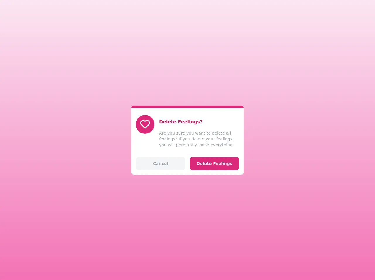
The preview of Emotion Dialog Card ui component
To create an Emotion Dialog Card with Tailwind CSS, you can use the following HTML structure:
Free download of the Emotion Dialog Card's source code
This HTML structure defines the basic structure of the Emotion Dialog Card. The bg-white class sets the background color of the dialog box to white. The rounded-lg class adds rounded corners to the dialog box. The shadow-md class adds a shadow effect to the dialog box.
The text-lg class sets the font size of the title to large. The font-semibold class sets the font weight of the title to bold. The text-gray-600 class sets the color of the message to gray.
The action buttons are defined using the bg-blue-500 and bg-gray-500 classes, which set the background color of the buttons to blue and gray, respectively. The hover:bg-blue-700 and hover:bg-gray-700 classes add a hover effect to the buttons. The text-white class sets the text color of the buttons to white. The font-bold class sets the font weight of the buttons to bold. The py-2 and px-4 classes set the padding of the buttons. The rounded class adds rounded corners to the buttons. The ml-2 class adds a margin to the second button.
The source code of Emotion Dialog Card ui component
To create an Emotion Dialog Card with Tailwind CSS, you can use the following HTML and CSS code:
<div class="min-h-screen bg-gradient-to-b from-pink-100 to-pink-400 flex justify-center items-center">
  <div class="bg-white rounded-lg">
    <div class="w-96 border-t-8 border-pink-600 rounded-lg flex">
      <div class="w-1/3 pt-6 flex justify-center">
        <svg xmlns="http://www.w3.org/2000/svg" class="w-16 h-16 bg-pink-600 text-white p-3 rounded-full" fill="none" viewBox="0 0 24 24" height="24" width="24" xmlns="http://www.w3.org/2000/svg">
          <path xmlns="http://www.w3.org/2000/svg" d="M12 4.52765C9.64418 2.41689 6.02125 2.49347 3.75736 4.75736C1.41421 7.1005 1.41421 10.8995 3.75736 13.2426L10.5858 20.0711C11.3668 20.8521 12.6332 20.8521 13.4142 20.0711L20.2426 13.2426C22.5858 10.8995 22.5858 7.1005 20.2426 4.75736C17.9787 2.49347 14.3558 2.41689 12 4.52765ZM10.8284 6.17157L11.2929 6.63604C11.6834 7.02656 12.3166 7.02656 12.7071 6.63604L13.1716 6.17157C14.7337 4.60948 17.2663 4.60948 18.8284 6.17157C20.3905 7.73367 20.3905 10.2663 18.8284 11.8284L12 18.6569L5.17157 11.8284C3.60948 10.2663 3.60948 7.73367 5.17157 6.17157C6.73367 4.60948 9.26633 4.60948 10.8284 6.17157Z" fill="currentcolor"></path>
        </svg>
      </div>
      <div class="w-full pt-9 pr-4">
        <h3 class="font-bold text-pink-700">Delete Feelings?</h3>
        <p class="py-4 text-sm text-gray-400">Are you sure you want to delete all feelings? If you delete your feelings, you will permantly loose everything.</p>
      </div>
    </div>

    <div class="p-4 flex space-x-4">
      <a href="#" class="w-1/2 px-4 py-3 text-center bg-gray-100 text-gray-400 hover:bg-gray-200 hover:text-black font-bold rounded-lg text-sm">Cancel</a>
      <a href="#" class="w-1/2 px-4 py-3 text-center text-pink-100 bg-pink-600 rounded-lg hover:bg-pink-700 hover:text-white font-bold text-sm">Delete Feelings</a>
    </div>
  </div>
</div>
This HTML and CSS code create an Emotion Dialog Card that displays a confirmation message and two action buttons.
How to create a Emotion Dialog Card with Tailwind CSS?
To create an Emotion Dialog Card with Tailwind CSS, you can follow these steps:
- Create a new HTML file and add the HTML structure for the Emotion Dialog Card.
- Add the required Tailwind CSS classes to the HTML elements to style the Emotion Dialog Card.
- Customize the styles of the Emotion Dialog Card by modifying the Tailwind CSS classes.
Here's an example of how to create an Emotion Dialog Card with Tailwind CSS:
<!DOCTYPE html>
<html>
  <head>
    <title>Emotion Dialog Card</title>
    <link rel="stylesheet" href="https://cdn.jsdelivr.net/npm/[email protected]/dist/tailwind.min.css">
  </head>
  <body>
    <div class="flex justify-center items-center h-screen">
      <div class="bg-white rounded-lg shadow-md p-6">
        <div class="text-lg font-semibold mb-2">Are you sure?</div>
        <div class="text-gray-600 mb-4">Deleting this item cannot be undone.</div>
        <div class="flex justify-end">
          <button class="bg-blue-500 hover:bg-blue-700 text-white font-bold py-2 px-4 rounded">Delete</button>
          <button class="bg-gray-500 hover:bg-gray-700 text-white font-bold py-2 px-4 rounded ml-2">Cancel</button>
        </div>
      </div>
    </div>
  </body>
</html>
In this example, we've added the required Tailwind CSS classes to the HTML elements to style the Emotion Dialog Card. We've also customized the styles of the Emotion Dialog Card by modifying the Tailwind CSS classes.
Conclusion
Creating an Emotion Dialog Card with Tailwind CSS is easy and straightforward. With Tailwind CSS, you can create custom user interfaces quickly and efficiently. By using the pre-defined CSS classes provided by Tailwind CSS, you can save time and effort in writing custom CSS code. Additionally, Tailwind CSS is highly customizable, so you can easily modify the styles of the Emotion Dialog Card to fit your design requirements.