- Published on
6 Critical Skills To Make A Digital Ocean - Tutorial Lists With Tailwind CSS Remarkably Well
- What is Tailwind CSS?
- The description of Digital Ocean - Tutorial Lists ui component
- Why use Tailwind CSS to create a Digital Ocean - Tutorial Lists ui component?
- The preview of Digital Ocean - Tutorial Lists ui component.
- The source code of Digital Ocean - Tutorial Lists ui component.
- How to create a Digital Ocean - Tutorial Lists with Tailwind CSS?
- Conclusion
As a FrontEnd technology blogger, you must have heard of Tailwind CSS, a utility-first CSS framework that helps to streamline your workflow and make your CSS code more maintainable. In this article, we will explore how to use Tailwind CSS to create a Digital Ocean - Tutorial Lists ui component, which can be used to display a list of tutorials on your website.
What is Tailwind CSS?
Tailwind CSS is a utility-first CSS framework that provides you with a set of pre-defined CSS classes to use in your HTML code. Instead of writing custom CSS code for each element, you can use these classes to style your elements quickly and efficiently. Tailwind CSS is highly customizable, so you can easily modify the default styles to match your website's design.
The description of Digital Ocean - Tutorial Lists ui component
The Digital Ocean - Tutorial Lists ui component is a simple and elegant way to display a list of tutorials on your website. It consists of a list of tutorial cards, each containing a thumbnail image, a title, a description, and a link to the tutorial page. The tutorial cards are arranged in a grid layout, with each row containing three cards.
Why use Tailwind CSS to create a Digital Ocean - Tutorial Lists ui component?
Tailwind CSS is an excellent choice for creating a Digital Ocean - Tutorial Lists ui component for several reasons:
Tailwind CSS provides a set of pre-defined CSS classes that can be used to style the tutorial cards quickly and efficiently.
Tailwind CSS is highly customizable, so you can easily modify the default styles to match your website's design.
Tailwind CSS is responsive by default, so your tutorial cards will look great on all devices.
Tailwind CSS is easy to learn and use, so you can create your Digital Ocean - Tutorial Lists ui component quickly and efficiently.
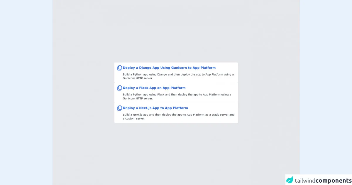
The preview of Digital Ocean - Tutorial Lists ui component.
The Digital Ocean - Tutorial Lists ui component consists of a grid of tutorial cards, each containing a thumbnail image, a title, a description, and a link to the tutorial page. The tutorial cards are arranged in a grid layout, with each row containing three cards.
Free download of the Digital Ocean - Tutorial Lists's source code
The source code of Digital Ocean - Tutorial Lists ui component.
The source code of the Digital Ocean - Tutorial Lists ui component is relatively simple and easy to understand. It consists of an HTML file and a CSS file. The HTML file contains the markup for the tutorial cards, while the CSS file contains the styles for the tutorial cards.
<div class="bg-gray-200 flex flex-col gap-4 h-screen items-center justify-center">

  <!-- Card 1 -->
  <a class="rounded-sm w-1/2 grid grid-cols-12 bg-white shadow p-3 gap-2 items-center hover:shadow-lg transition delay-150 duration-300 ease-in-out hover:scale-105 transform" href="#">

    <!-- Icon -->
    <div class="col-span-12 md:col-span-1">
      <svg xmlns="http://www.w3.org/2000/svg" class="h-8 w-8" fill="none" viewBox="0 0 24 24" stroke="#2563eb">
        <path stroke-linecap="round" stroke-linejoin="round" stroke-width="2" d="M8 7v8a2 2 0 002 2h6M8 7V5a2 2 0 012-2h4.586a1 1 0 01.707.293l4.414 4.414a1 1 0 01.293.707V15a2 2 0 01-2 2h-2M8 7H6a2 2 0 00-2 2v10a2 2 0 002 2h8a2 2 0 002-2v-2" />
      </svg>
    </div>

    <!-- Title -->
    <div class="col-span-11 xl:-ml-5">
      <p class="text-blue-600 font-semibold"> Deploy a Django App Using Gunicorn to App Platform </p>
    </div>

    <!-- Description -->
    <div class="md:col-start-2 col-span-11 xl:-ml-5">
      <p class="text-sm text-gray-800 font-light"> Build a Python app using Django and then deploy the app to App Platform using a Gunicorn HTTP server. </p>
    </div>

  </a>


  <!-- Card 2 -->
  <a class="rounded-sm w-1/2 grid grid-cols-12 bg-white shadow p-3 gap-2 items-center hover:shadow-lg transition delay-150 duration-300 ease-in-out hover:scale-105 transform" href="#">

    <!-- Icon -->
    <div class="col-span-12 md:col-span-1">
      <svg xmlns="http://www.w3.org/2000/svg" class="h-8 w-8" fill="none" viewBox="0 0 24 24" stroke="#2563eb">
        <path stroke-linecap="round" stroke-linejoin="round" stroke-width="2" d="M8 7v8a2 2 0 002 2h6M8 7V5a2 2 0 012-2h4.586a1 1 0 01.707.293l4.414 4.414a1 1 0 01.293.707V15a2 2 0 01-2 2h-2M8 7H6a2 2 0 00-2 2v10a2 2 0 002 2h8a2 2 0 002-2v-2" />
      </svg>
    </div>

    <!-- Title -->
    <div class="col-span-11 xl:-ml-5">
      <p class="text-blue-600 font-semibold"> Deploy a Flask App on App Platform </p>
    </div>

    <!-- Description -->
    <div class="md:col-start-2 col-span-11 xl:-ml-5">
      <p class="text-sm text-gray-800 font-light"> Build a Python app using Flask and then deploy the app to App Platform using a Gunicorn HTTP server. </p>
    </div>

  </a>


  <!-- Card 3 -->
  <a class="rounded-sm w-1/2 grid grid-cols-12 bg-white shadow p-3 gap-2 items-center hover:shadow-lg transition delay-150 duration-300 ease-in-out hover:scale-105 transform" href="#">

    <!-- Icon -->
    <div class="col-span-12 md:col-span-1">
      <svg xmlns="http://www.w3.org/2000/svg" class="h-8 w-8" fill="none" viewBox="0 0 24 24" stroke="#2563eb">
        <path stroke-linecap="round" stroke-linejoin="round" stroke-width="2" d="M8 7v8a2 2 0 002 2h6M8 7V5a2 2 0 012-2h4.586a1 1 0 01.707.293l4.414 4.414a1 1 0 01.293.707V15a2 2 0 01-2 2h-2M8 7H6a2 2 0 00-2 2v10a2 2 0 002 2h8a2 2 0 002-2v-2" />
      </svg>
    </div>

    <!-- Title -->
    <div class="col-span-11 xl:-ml-5">
      <p class="text-blue-600 font-semibold"> Deploy a Next.js App to App Platform </p>
    </div>

    <!-- Description -->
    <div class="md:col-start-2 col-span-11 xl:-ml-5">
      <p class="text-sm text-gray-800 font-light"> Build a Next.js app and then deploy the app to App Platform as a static server and a custom server. </p>
    </div>

  </a>

</div>
How to create a Digital Ocean - Tutorial Lists with Tailwind CSS?
To create a Digital Ocean - Tutorial Lists ui component with Tailwind CSS, you will need to have some knowledge of HTML and CSS. Here are the critical skills you will need:
HTML markup: You will need to know how to create the HTML markup for the tutorial cards, including the thumbnail image, title, description, and link to the tutorial page.
CSS styling: You will need to know how to style the tutorial cards using Tailwind CSS classes. You will need to know how to set the background color, font size, padding, and margin for the tutorial cards.
Responsive design: You will need to know how to make the tutorial cards responsive using Tailwind CSS classes. You will need to know how to set the width and height of the tutorial cards for different screen sizes.
Grid layout: You will need to know how to create a grid layout using Tailwind CSS classes. You will need to know how to set the number of columns and rows for the tutorial cards.
Hover effects: You will need to know how to create hover effects using Tailwind CSS classes. You will need to know how to change the background color and font color of the tutorial cards when the user hovers over them.
Link styling: You will need to know how to style the link to the tutorial page using Tailwind CSS classes. You will need to know how to set the font color, font size, and text decoration for the link.
Conclusion
In conclusion, Tailwind CSS is an excellent choice for creating a Digital Ocean - Tutorial Lists ui component. By using Tailwind CSS, you can create a responsive and customizable ui component quickly and efficiently. With the critical skills mentioned above, you can create your Digital Ocean - Tutorial Lists ui component in no time.