- Published on
Learn How To Build A Dashboard Layout With Dark & Light Mode With Tailwind CSS Like an Expert
- What is Tailwind CSS?
- The description of Dashboard Layout with dark & light mode ui component
- Why use Tailwind CSS to create a Dashboard Layout with dark & light mode ui component?
- The preview of Dashboard Layout with dark & light mode ui component
- The source code of Dashboard Layout with dark & light mode ui component
- How to create a Dashboard Layout with dark & light mode with Tailwind CSS?
- Step 1: Set up the project
- Step 2: Create the layout
- Step 3: Add dark mode support
- Step 4: Customize the color scheme
- Step 5: Add interactivity
- Conclusion
What is Tailwind CSS?
Tailwind CSS is a utility-first CSS framework that helps developers to create custom designs quickly and efficiently. It provides a set of pre-defined classes that can be used to style HTML elements without writing any CSS code. Tailwind CSS is highly customizable, and it allows developers to create unique designs that match their brand identity.
The description of Dashboard Layout with dark & light mode ui component
A dashboard layout is a user interface (UI) component that displays important information and metrics in a single view. It is commonly used in web applications to provide users with an overview of their data. A dashboard layout typically consists of multiple widgets or cards that display different types of information, such as charts, tables, and graphs.
A dark & light mode UI component is a design feature that allows users to switch between a dark and light color scheme. This feature is becoming increasingly popular as it provides users with a more comfortable viewing experience, especially in low-light conditions.
Why use Tailwind CSS to create a Dashboard Layout with dark & light mode ui component?
Tailwind CSS is an excellent choice for creating a dashboard layout with a dark & light mode UI component because it provides a wide range of utility classes that can be used to style different elements of the layout. It also allows developers to create custom color schemes that match their brand identity.
In addition, Tailwind CSS provides a built-in dark mode feature that makes it easy to create a dark mode version of the dashboard layout. This feature automatically applies the appropriate styles to elements based on the user's system preferences.
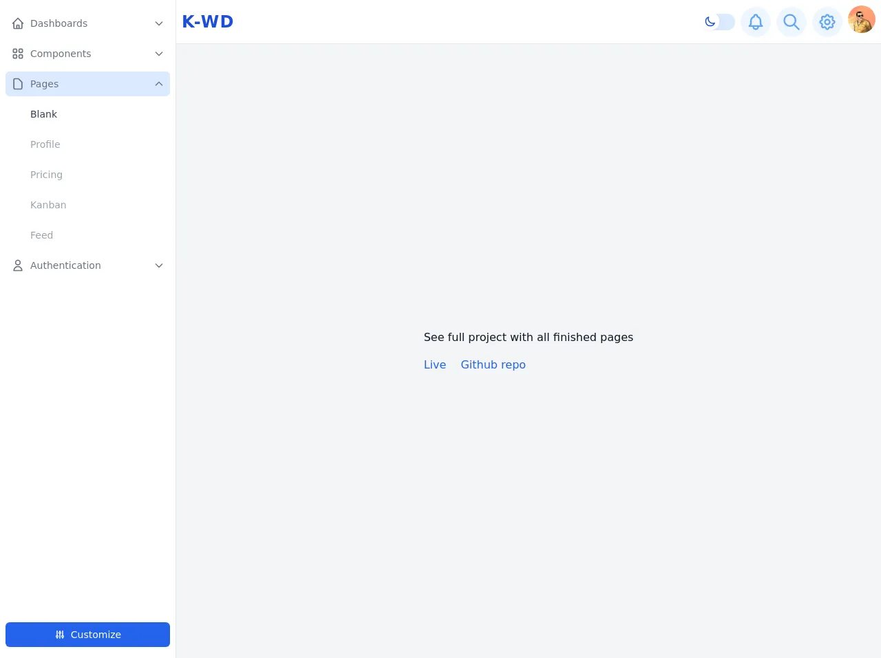
The preview of Dashboard Layout with dark & light mode ui component
In this article, we will be creating a dashboard layout with a dark & light mode UI component using Tailwind CSS. The final result will look something like this:
Free download of the Dashboard Layout with dark & light mode's source code
The source code of Dashboard Layout with dark & light mode ui component
The source code for the dashboard layout with a dark & light mode UI component can be found below:
<style>
/* This example part of kwd-dashboard see https://kamona-wd.github.io/kwd-dashboard/ */
/* So here we will write some classes to simulate dark mode and some of tailwind css config in our project */
:root {
--light: #edf2f9;
--dark: #152e4d;
--darker: #12263f;
--color-red: #dc2626;
--color-green: #16a34a;
--color-blue: #2563eb;
--color-cyan: #0891b2;
--color-teal: #0d9488;
--color-fuchsia: #c026d3;
--color-orange: #ea580c;
--color-yellow: #ca8a04;
--color-violet: #7c3aed;
}
[x-cloak] { display: none; }
.dark .dark\:text-light {
color: var(--light);
}
.dark .dark\:bg-dark {
background-color: var(--dark);
}
.dark .dark\:bg-darker {
background-color: var(--darker);
}
.dark .dark\:text-gray-300 {
color: #D1D5DB;
}
.dark .dark\:text-blue-500 {
color: #3B82F6;
}
.dark .dark\:text-blue-100 {
color: #DBEAFE;
}
.dark .dark\:hover\:text-light:hover {
color: var(--light);
}
.dark .dark\:border-blue-800 {
border-color: #1e40af;
}
.dark .dark\:border-blue-700 {
border-color: #1D4ED8;
}
.dark .dark\:bg-blue-600 {
background-color: #2563eb;
}
.dark .dark\:hover\:bg-blue-600:hover {
background-color: #2563eb;
}
.hover\:overflow-y-auto:hover {
overflow-y: auto;
}
</style>
<div x-data="setup()" x-init="$refs.loading.classList.add('hidden');" :class="{ 'dark': isDark}">
<!-- -->
<div class="flex h-screen antialiased text-gray-900 bg-gray-100 dark:bg-dark dark:text-light">
<!-- Loading screen -->
<div
x-ref="loading"
class="fixed inset-0 z-50 flex items-center justify-center text-2xl font-semibold text-white bg-opacity-90 bg-blue-800"
>
Loading.....
</div>
<!-- Sidebar -->
<aside class="flex-shrink-0 hidden w-64 bg-white border-r dark:border-blue-800 dark:bg-darker md:block">
<div class="flex flex-col h-full">
<!-- Sidebar links -->
<nav aria-label="Main" class="flex-1 px-2 py-4 space-y-2 overflow-y-hidden hover:overflow-y-auto">
<!-- Dashboards links -->
<div x-data="{ isActive: false, open: false}">
<!-- active & hover classes 'bg-blue-100 dark:bg-blue-600' -->
<a
href="#"
@click="$event.preventDefault(); open = !open"
class="flex items-center p-2 text-gray-500 transition-colors rounded-md dark:text-light hover:bg-blue-100 dark:hover:bg-blue-600"
:class="{'bg-blue-100 dark:bg-blue-600': isActive || open}"
role="button"
aria-haspopup="true"
:aria-expanded="(open || isActive) ? 'true' : 'false'"
>
<span aria-hidden="true">
<svg
class="w-5 h-5"
xmlns="http://www.w3.org/2000/svg"
fill="none"
viewBox="0 0 24 24"
stroke="currentColor"
>
<path
stroke-linecap="round"
stroke-linejoin="round"
stroke-width="2"
d="M3 12l2-2m0 0l7-7 7 7M5 10v10a1 1 0 001 1h3m10-11l2 2m-2-2v10a1 1 0 01-1 1h-3m-6 0a1 1 0 001-1v-4a1 1 0 011-1h2a1 1 0 011 1v4a1 1 0 001 1m-6 0h6"
/>
</svg>
</span>
<span class="ml-2 text-sm"> Dashboards </span>
<span class="ml-auto" aria-hidden="true">
<!-- active class 'rotate-180' -->
<svg
class="w-4 h-4 transition-transform transform"
:class="{ 'rotate-180': open }"
xmlns="http://www.w3.org/2000/svg"
fill="none"
viewBox="0 0 24 24"
stroke="currentColor"
>
<path stroke-linecap="round" stroke-linejoin="round" stroke-width="2" d="M19 9l-7 7-7-7" />
</svg>
</span>
</a>
<div role="menu" x-show="open" class="mt-2 space-y-2 px-7" aria-label="Dashboards">
<!-- active & hover classes 'text-gray-700 dark:text-light' -->
<!-- inActive classes 'text-gray-400 dark:text-gray-400' -->
<a
href="#"
role="menuitem"
class="block p-2 text-sm text-gray-400 transition-colors duration-200 rounded-md dark:text-gray-400 dark:hover:text-light hover:text-gray-700"
>
Default
</a>
<a
href="#"
role="menuitem"
class="block p-2 text-sm text-gray-400 transition-colors duration-200 rounded-md dark:hover:text-light hover:text-gray-700"
>
Project Mangement
</a>
<a
href="#"
role="menuitem"
class="block p-2 text-sm text-gray-400 transition-colors duration-200 rounded-md dark:hover:text-light hover:text-gray-700"
>
E-Commerce
</a>
</div>
</div>
<!-- Components links -->
<div x-data="{ isActive: false, open: false }">
<!-- active classes 'bg-blue-100 dark:bg-blue-600' -->
<a
href="#"
@click="$event.preventDefault(); open = !open"
class="flex items-center p-2 text-gray-500 transition-colors rounded-md dark:text-light hover:bg-blue-100 dark:hover:bg-blue-600"
:class="{ 'bg-blue-100 dark:bg-blue-600': isActive || open }"
role="button"
aria-haspopup="true"
:aria-expanded="(open || isActive) ? 'true' : 'false'"
>
<span aria-hidden="true">
<svg
class="w-5 h-5"
xmlns="http://www.w3.org/2000/svg"
fill="none"
viewBox="0 0 24 24"
stroke="currentColor"
>
<path
stroke-linecap="round"
stroke-linejoin="round"
stroke-width="2"
d="M4 6a2 2 0 012-2h2a2 2 0 012 2v2a2 2 0 01-2 2H6a2 2 0 01-2-2V6zM14 6a2 2 0 012-2h2a2 2 0 012 2v2a2 2 0 01-2 2h-2a2 2 0 01-2-2V6zM4 16a2 2 0 012-2h2a2 2 0 012 2v2a2 2 0 01-2 2H6a2 2 0 01-2-2v-2zM14 16a2 2 0 012-2h2a2 2 0 012 2v2a2 2 0 01-2 2h-2a2 2 0 01-2-2v-2z"
/>
</svg>
</span>
<span class="ml-2 text-sm"> Components </span>
<span aria-hidden="true" class="ml-auto">
<!-- active class 'rotate-180' -->
<svg
class="w-4 h-4 transition-transform transform"
:class="{ 'rotate-180': open }"
xmlns="http://www.w3.org/2000/svg"
fill="none"
viewBox="0 0 24 24"
stroke="currentColor"
>
<path stroke-linecap="round" stroke-linejoin="round" stroke-width="2" d="M19 9l-7 7-7-7" />
</svg>
</span>
</a>
<div x-show="open" class="mt-2 space-y-2 px-7" role="menu" arial-label="Components">
<!-- active & hover classes 'text-gray-700 dark:text-light' -->
<!-- inActive classes 'text-gray-400 dark:text-gray-400' -->
<a
href="#"
role="menuitem"
class="block p-2 text-sm text-gray-400 transition-colors duration-200 rounded-md dark:text-gray-400 dark:hover:text-light hover:text-gray-700"
>
Alerts
</a>
<a
href="#"
role="menuitem"
class="block p-2 text-sm text-gray-400 transition-colors duration-200 rounded-md dark:text-gray-400 dark:hover:text-light hover:text-gray-700"
>
Buttons
</a>
<a
href="#"
role="menuitem"
class="block p-2 text-sm text-gray-400 transition-colors duration-200 rounded-md dark:hover:text-light hover:text-gray-700"
>
Cards
</a>
<a
href="#"
role="menuitem"
class="block p-2 text-sm text-gray-400 transition-colors duration-200 rounded-md dark:hover:text-light hover:text-gray-700"
>
Dropdowns
</a>
<a
href="#"
role="menuitem"
class="block p-2 text-sm text-gray-400 transition-colors duration-200 rounded-md dark:hover:text-light hover:text-gray-700"
>
Forms
</a>
<a
href="#"
role="menuitem"
class="block p-2 text-sm text-gray-400 transition-colors duration-200 rounded-md dark:hover:text-light hover:text-gray-700"
>
Lists
</a>
<a
href="#"
role="menuitem"
class="block p-2 text-sm text-gray-400 transition-colors duration-200 rounded-md dark:hover:text-light hover:text-gray-700"
>
Modals
</a>
</div>
</div>
<!-- Pages links -->
<div x-data="{ isActive: true, open: open }">
<!-- active classes 'bg-blue-100 dark:bg-blue-600' -->
<a
href="#"
@click="$event.preventDefault(); open = !open"
class="flex items-center p-2 text-gray-500 transition-colors rounded-md dark:text-light hover:bg-blue-100 dark:hover:bg-blue-600"
:class="{ 'bg-blue-100 dark:bg-blue-600': isActive || open }"
role="button"
aria-haspopup="true"
:aria-expanded="(open || isActive) ? 'true' : 'false'"
>
<span aria-hidden="true">
<svg
class="w-5 h-5"
xmlns="http://www.w3.org/2000/svg"
fill="none"
viewBox="0 0 24 24"
stroke="currentColor"
>
<path
stroke-linecap="round"
stroke-linejoin="round"
stroke-width="2"
d="M7 21h10a2 2 0 002-2V9.414a1 1 0 00-.293-.707l-5.414-5.414A1 1 0 0012.586 3H7a2 2 0 00-2 2v14a2 2 0 002 2z"
/>
</svg>
</span>
<span class="ml-2 text-sm"> Pages </span>
<span aria-hidden="true" class="ml-auto">
<!-- active class 'rotate-180' -->
<svg
class="w-4 h-4 transition-transform transform"
:class="{ 'rotate-180': open }"
xmlns="http://www.w3.org/2000/svg"
fill="none"
viewBox="0 0 24 24"
stroke="currentColor"
>
<path stroke-linecap="round" stroke-linejoin="round" stroke-width="2" d="M19 9l-7 7-7-7" />
</svg>
</span>
</a>
<div x-show="open" class="mt-2 space-y-2 px-7" role="menu" arial-label="Pages">
<!-- active & hover classes 'text-gray-700 dark:text-light' -->
<!-- inActive classes 'text-gray-400 dark:text-gray-400' -->
<a
href="#"
role="menuitem"
class="block p-2 text-sm text-gray-700 transition-colors duration-200 rounded-md dark:text-light dark:hover:text-light hover:text-gray-700"
>
Blank
</a>
<a
href="#"
role="menuitem"
class="block p-2 text-sm text-gray-400 transition-colors duration-200 rounded-md dark:text-gray-400 dark:hover:text-light hover:text-gray-700"
>
Profile
</a>
<a
href="#"
role="menuitem"
class="block p-2 text-sm text-gray-400 transition-colors duration-200 rounded-md dark:hover:text-light hover:text-gray-700"
>
Pricing
</a>
<a
href="#"
role="menuitem"
class="block p-2 text-sm text-gray-400 transition-colors duration-200 rounded-md dark:hover:text-light hover:text-gray-700"
>
Kanban
</a>
<a
href="#"
role="menuitem"
class="block p-2 text-sm text-gray-400 transition-colors duration-200 rounded-md dark:hover:text-light hover:text-gray-700"
>
Feed
</a>
</div>
</div>
<!-- Authentication links -->
<div x-data="{ isActive: false, open: false}">
<!-- active & hover classes 'bg-blue-100 dark:bg-blue-600' -->
<a
href="#"
@click="$event.preventDefault(); open = !open"
class="flex items-center p-2 text-gray-500 transition-colors rounded-md dark:text-light hover:bg-blue-100 dark:hover:bg-blue-600"
:class="{'bg-blue-100 dark:bg-blue-600': isActive || open}"
role="button"
aria-haspopup="true"
:aria-expanded="(open || isActive) ? 'true' : 'false'"
>
<span aria-hidden="true">
<svg
class="w-5 h-5"
xmlns="http://www.w3.org/2000/svg"
fill="none"
viewBox="0 0 24 24"
stroke="currentColor"
>
<path
stroke-linecap="round"
stroke-linejoin="round"
stroke-width="2"
d="M16 7a4 4 0 11-8 0 4 4 0 018 0zM12 14a7 7 0 00-7 7h14a7 7 0 00-7-7z"
/>
</svg>
</span>
<span class="ml-2 text-sm"> Authentication </span>
<span aria-hidden="true" class="ml-auto">
<!-- active class 'rotate-180' -->
<svg
class="w-4 h-4 transition-transform transform"
:class="{ 'rotate-180': open }"
xmlns="http://www.w3.org/2000/svg"
fill="none"
viewBox="0 0 24 24"
stroke="currentColor"
>
<path stroke-linecap="round" stroke-linejoin="round" stroke-width="2" d="M19 9l-7 7-7-7" />
</svg>
</span>
</a>
<div x-show="open" class="mt-2 space-y-2 px-7" role="menu" aria-label="Authentication">
<!-- active & hover classes 'text-gray-700 dark:text-light' -->
<!-- inActive classes 'text-gray-400 dark:text-gray-400' -->
<a
href="#"
role="menuitem"
class="block p-2 text-sm text-gray-400 transition-colors duration-200 rounded-md dark:hover:text-light hover:text-gray-700"
>
Register
</a>
<a
href="#"
role="menuitem"
class="block p-2 text-sm text-gray-400 transition-colors duration-200 rounded-md dark:hover:text-light hover:text-gray-700"
>
Login
</a>
<a
href="#"
role="menuitem"
class="block p-2 text-sm text-gray-400 transition-colors duration-200 rounded-md dark:hover:text-light hover:text-gray-700"
>
Password Reset
</a>
</div>
</div>
</nav>
<!-- Sidebar footer -->
<div class="flex-shrink-0 px-2 py-4 space-y-2">
<button
@click="openSettingsPanel"
type="button"
class="flex items-center justify-center w-full px-4 py-2 text-sm text-white bg-blue-600 rounded-md hover:bg-blue-700 focus:outline-none focus:ring focus:ring-blue-700 focus:ring-offset-1 focus:ring-offset-white dark:focus:ring-offset-dark"
>
<span aria-hidden="true"">
<svg
class="w-4 h-4 mr-2"
xmlns="http://www.w3.org/2000/svg"
fill="none"
viewBox="0 0 24 24"
stroke="currentColor"
>
<path
stroke-linecap="round"
stroke-linejoin="round"
stroke-width="2"
d="M12 6V4m0 2a2 2 0 100 4m0-4a2 2 0 110 4m-6 8a2 2 0 100-4m0 4a2 2 0 110-4m0 4v2m0-6V4m6 6v10m6-2a2 2 0 100-4m0 4a2 2 0 110-4m0 4v2m0-6V4"
/>
</svg>
</span>
<span>Customize</span>
</button>
</div>
</div>
</aside>
<div class="flex flex-col flex-1 min-h-screen overflow-x-hidden overflow-y-auto">
<!-- Navbar -->
<header class="relative bg-white dark:bg-darker">
<div class="flex items-center justify-between p-2 border-b dark:border-blue-800">
<!-- Mobile menu button -->
<button
@click="isMobileMainMenuOpen = !isMobileMainMenuOpen"
class="p-1 text-blue-400 transition-colors duration-200 rounded-md bg-blue-50 hover:text-blue-600 hover:bg-blue-100 dark:hover:text-light dark:hover:bg-blue-700 dark:bg-dark md:hidden focus:outline-none focus:ring"
>
<span class="sr-only">Open main manu</span>
<span aria-hidden="true">
<svg
class="w-8 h-8"
xmlns="http://www.w3.org/2000/svg"
fill="none"
viewBox="0 0 24 24"
stroke="currentColor"
>
<path stroke-linecap="round" stroke-linejoin="round" stroke-width="2" d="M4 6h16M4 12h16M4 18h16" />
</svg>
</span>
</button>
<!-- Brand -->
<a
href="#"
class="inline-block text-2xl font-bold tracking-wider text-blue-700 uppercase dark:text-light"
>
K-WD
</a>
<!-- Mobile sub menu button -->
<button
@click="isMobileSubMenuOpen = !isMobileSubMenuOpen"
class="p-1 text-blue-400 transition-colors duration-200 rounded-md bg-blue-50 hover:text-blue-600 hover:bg-blue-100 dark:hover:text-light dark:hover:bg-blue-700 dark:bg-dark md:hidden focus:outline-none focus:ring"
>
<span class="sr-only">Open sub manu</span>
<span aria-hidden="true">
<svg
class="w-8 h-8"
xmlns="http://www.w3.org/2000/svg"
fill="none"
viewBox="0 0 24 24"
stroke="currentColor"
>
<path
stroke-linecap="round"
stroke-linejoin="round"
stroke-width="2"
d="M12 5v.01M12 12v.01M12 19v.01M12 6a1 1 0 110-2 1 1 0 010 2zm0 7a1 1 0 110-2 1 1 0 010 2zm0 7a1 1 0 110-2 1 1 0 010 2z"
/>
</svg>
</span>
</button>
<!-- Desktop Right buttons -->
<nav aria-label="Secondary" class="hidden space-x-2 md:flex md:items-center">
<!-- Toggle dark theme button -->
<button aria-hidden="true" class="relative focus:outline-none" x-cloak @click="toggleTheme">
<div
class="w-12 h-6 transition bg-blue-100 rounded-full outline-none dark:bg-blue-400"
></div>
<div
class="absolute top-0 left-0 inline-flex items-center justify-center w-6 h-6 transition-all duration-150 transform scale-110 rounded-full shadow-sm"
:class="{ 'translate-x-0 -translate-y-px bg-white text-blue-700': !isDark, 'translate-x-6 text-blue-100 bg-blue-800': isDark }"
>
<svg
x-show="!isDark"
class="w-4 h-4"
xmlns="http://www.w3.org/2000/svg"
fill="none"
viewBox="0 0 24 24"
stroke="currentColor"
>
<path
stroke-linecap="round"
stroke-linejoin="round"
stroke-width="2"
d="M20.354 15.354A9 9 0 018.646 3.646 9.003 9.003 0 0012 21a9.003 9.003 0 008.354-5.646z"
/>
</svg>
<svg
x-show="isDark"
class="w-4 h-4"
xmlns="http://www.w3.org/2000/svg"
fill="none"
viewBox="0 0 24 24"
stroke="currentColor"
>
<path
stroke-linecap="round"
stroke-linejoin="round"
stroke-width="2"
d="M11.049 2.927c.3-.921 1.603-.921 1.902 0l1.519 4.674a1 1 0 00.95.69h4.915c.969 0 1.371 1.24.588 1.81l-3.976 2.888a1 1 0 00-.363 1.118l1.518 4.674c.3.922-.755 1.688-1.538 1.118l-3.976-2.888a1 1 0 00-1.176 0l-3.976 2.888c-.783.57-1.838-.197-1.538-1.118l1.518-4.674a1 1 0 00-.363-1.118l-3.976-2.888c-.784-.57-.38-1.81.588-1.81h4.914a1 1 0 00.951-.69l1.519-4.674z"
/>
</svg>
</div>
</button>
<!-- Notification button -->
<button
@click="openNotificationsPanel"
class="p-2 text-blue-400 transition-colors duration-200 rounded-full bg-blue-50 hover:text-blue-600 hover:bg-blue-100 dark:hover:text-light dark:hover:bg-blue-700 dark:bg-dark focus:outline-none focus:bg-blue-100 dark:focus:bg-blue-700 focus:ring-blue-800"
>
<span class="sr-only">Open Notification panel</span>
<svg
class="w-7 h-7"
xmlns="http://www.w3.org/2000/svg"
fill="none"
viewBox="0 0 24 24"
stroke="currentColor"
aria-hidden="true"
>
<path
stroke-linecap="round"
stroke-linejoin="round"
stroke-width="2"
d="M15 17h5l-1.405-1.405A2.032 2.032 0 0118 14.158V11a6.002 6.002 0 00-4-5.659V5a2 2 0 10-4 0v.341C7.67 6.165 6 8.388 6 11v3.159c0 .538-.214 1.055-.595 1.436L4 17h5m6 0v1a3 3 0 11-6 0v-1m6 0H9"
/>
</svg>
</button>
<!-- Search button -->
<button
@click="openSearchPanel"
class="p-2 text-blue-400 transition-colors duration-200 rounded-full bg-blue-50 hover:text-blue-600 hover:bg-blue-100 dark:hover:text-light dark:hover:bg-blue-700 dark:bg-dark focus:outline-none focus:bg-blue-100 dark:focus:bg-blue-700 focus:ring-blue-800"
>
<span class="sr-only">Open search panel</span>
<svg
class="w-7 h-7"
xmlns="http://www.w3.org/2000/svg"
fill="none"
viewBox="0 0 24 24"
stroke="currentColor"
aria-hidden="true"
>
<path
stroke-linecap="round"
stroke-linejoin="round"
stroke-width="2"
d="M21 21l-6-6m2-5a7 7 0 11-14 0 7 7 0 0114 0z"
/>
</svg>
</button>
<!-- Settings button -->
<button
@click="openSettingsPanel"
class="p-2 text-blue-400 transition-colors duration-200 rounded-full bg-blue-50 hover:text-blue-600 hover:bg-blue-100 dark:hover:text-light dark:hover:bg-blue-700 dark:bg-dark focus:outline-none focus:bg-blue-100 dark:focus:bg-blue-700 focus:ring-blue-800"
>
<span class="sr-only">Open settings panel</span>
<svg
class="w-7 h-7"
xmlns="http://www.w3.org/2000/svg"
fill="none"
viewBox="0 0 24 24"
stroke="currentColor"
aria-hidden="true"
>
<path
stroke-linecap="round"
stroke-linejoin="round"
stroke-width="2"
d="M10.325 4.317c.426-1.756 2.924-1.756 3.35 0a1.724 1.724 0 002.573 1.066c1.543-.94 3.31.826 2.37 2.37a1.724 1.724 0 001.065 2.572c1.756.426 1.756 2.924 0 3.35a1.724 1.724 0 00-1.066 2.573c.94 1.543-.826 3.31-2.37 2.37a1.724 1.724 0 00-2.572 1.065c-.426 1.756-2.924 1.756-3.35 0a1.724 1.724 0 00-2.573-1.066c-1.543.94-3.31-.826-2.37-2.37a1.724 1.724 0 00-1.065-2.572c-1.756-.426-1.756-2.924 0-3.35a1.724 1.724 0 001.066-2.573c-.94-1.543.826-3.31 2.37-2.37.996.608 2.296.07 2.572-1.065z"
/>
<path
stroke-linecap="round"
stroke-linejoin="round"
stroke-width="2"
d="M15 12a3 3 0 11-6 0 3 3 0 016 0z"
/>
</svg>
</button>
<!-- User avatar button -->
<div class="relative" x-data="{ open: false }">
<button
@click="open = !open; $nextTick(() => { if(open){ $refs.userMenu.focus() } })"
type="button"
aria-haspopup="true"
:aria-expanded="open ? 'true' : 'false'"
class="transition-opacity duration-200 rounded-full dark:opacity-75 dark:hover:opacity-100 focus:outline-none focus:ring dark:focus:opacity-100"
>
<span class="sr-only">User menu</span>
<img class="w-10 h-10 rounded-full" src="https://avatars.githubusercontent.com/u/57622665?s=460&u=8f581f4c4acd4c18c33a87b3e6476112325e8b38&v=4" alt="Ahmed Kamel" />
</button>
<!-- User dropdown menu -->
<div
x-show="open"
x-ref="userMenu"
x-transition:enter="transition-all transform ease-out"
x-transition:enter-start="translate-y-1/2 opacity-0"
x-transition:enter-end="translate-y-0 opacity-100"
x-transition:leave="transition-all transform ease-in"
x-transition:leave-start="translate-y-0 opacity-100"
x-transition:leave-end="translate-y-1/2 opacity-0"
@click.away="open = false"
@keydown.escape="open = false"
class="absolute right-0 w-48 py-1 bg-white rounded-md shadow-lg top-12 ring-1 ring-black ring-opacity-5 dark:bg-dark focus:outline-none"
tabindex="-1"
role="menu"
aria-orientation="vertical"
aria-label="User menu"
>
<a
href="#"
role="menuitem"
class="block px-4 py-2 text-sm text-gray-700 transition-colors hover:bg-gray-100 dark:text-light dark:hover:bg-blue-600"
>
Your Profile
</a>
<a
href="#"
role="menuitem"
class="block px-4 py-2 text-sm text-gray-700 transition-colors hover:bg-gray-100 dark:text-light dark:hover:bg-blue-600"
>
Settings
</a>
<a
href="#"
role="menuitem"
class="block px-4 py-2 text-sm text-gray-700 transition-colors hover:bg-gray-100 dark:text-light dark:hover:bg-blue-600"
>
Logout
</a>
</div>
</div>
</nav>
<!-- Mobile sub menu -->
<nav
x-transition:enter="transition duration-200 ease-in-out transform sm:duration-500"
x-transition:enter-start="-translate-y-full opacity-0"
x-transition:enter-end="translate-y-0 opacity-100"
x-transition:leave="transition duration-300 ease-in-out transform sm:duration-500"
x-transition:leave-start="translate-y-0 opacity-100"
x-transition:leave-end="-translate-y-full opacity-0"
x-show="isMobileSubMenuOpen"
@click.away="isMobileSubMenuOpen = false"
class="absolute flex items-center p-4 bg-white rounded-md shadow-lg dark:bg-darker top-16 inset-x-4 md:hidden"
aria-label="Secondary"
>
<div class="space-x-2">
<!-- Toggle dark theme button -->
<button aria-hidden="true" class="relative focus:outline-none" x-cloak @click="toggleTheme">
<div
class="w-12 h-6 transition bg-blue-100 rounded-full outline-none dark:bg-blue-400"
></div>
<div
class="absolute top-0 left-0 inline-flex items-center justify-center w-6 h-6 transition-all duration-200 transform scale-110 rounded-full shadow-sm"
:class="{ 'translate-x-0 -translate-y-px bg-white text-blue-700': !isDark, 'translate-x-6 text-blue-100 bg-blue-800': isDark }"
>
<svg
x-show="!isDark"
class="w-4 h-4"
xmlns="http://www.w3.org/2000/svg"
fill="none"
viewBox="0 0 24 24"
stroke="currentColor"
>
<path
stroke-linecap="round"
stroke-linejoin="round"
stroke-width="2"
d="M20.354 15.354A9 9 0 018.646 3.646 9.003 9.003 0 0012 21a9.003 9.003 0 008.354-5.646z"
/>
</svg>
<svg
x-show="isDark"
class="w-4 h-4"
xmlns="http://www.w3.org/2000/svg"
fill="none"
viewBox="0 0 24 24"
stroke="currentColor"
>
<path
stroke-linecap="round"
stroke-linejoin="round"
stroke-width="2"
d="M11.049 2.927c.3-.921 1.603-.921 1.902 0l1.519 4.674a1 1 0 00.95.69h4.915c.969 0 1.371 1.24.588 1.81l-3.976 2.888a1 1 0 00-.363 1.118l1.518 4.674c.3.922-.755 1.688-1.538 1.118l-3.976-2.888a1 1 0 00-1.176 0l-3.976 2.888c-.783.57-1.838-.197-1.538-1.118l1.518-4.674a1 1 0 00-.363-1.118l-3.976-2.888c-.784-.57-.38-1.81.588-1.81h4.914a1 1 0 00.951-.69l1.519-4.674z"
/>
</svg>
</div>
</button>
<!-- Notification button -->
<button
@click="openNotificationsPanel(); $nextTick(() => { isMobileSubMenuOpen = false })"
class="p-2 text-blue-400 transition-colors duration-200 rounded-full bg-blue-50 hover:text-blue-600 hover:bg-blue-100 dark:hover:text-light dark:hover:bg-blue-700 dark:bg-dark focus:outline-none focus:bg-blue-100 dark:focus:bg-blue-700 focus:ring-blue-800"
>
<span class="sr-only">Open notifications panel</span>
<svg
class="w-7 h-7"
xmlns="http://www.w3.org/2000/svg"
fill="none"
viewBox="0 0 24 24"
stroke="currentColor"
aria-hidden="true"
>
<path
stroke-linecap="round"
stroke-linejoin="round"
stroke-width="2"
d="M15 17h5l-1.405-1.405A2.032 2.032 0 0118 14.158V11a6.002 6.002 0 00-4-5.659V5a2 2 0 10-4 0v.341C7.67 6.165 6 8.388 6 11v3.159c0 .538-.214 1.055-.595 1.436L4 17h5m6 0v1a3 3 0 11-6 0v-1m6 0H9"
/>
</svg>
</button>
<!-- Search button -->
<button
@click="openSearchPanel(); $nextTick(() => { $refs.searchInput.focus(); setTimeout(() => {isMobileSubMenuOpen= false}, 100) })"
class="p-2 text-blue-400 transition-colors duration-200 rounded-full bg-blue-50 hover:text-blue-600 hover:bg-blue-100 dark:hover:text-light dark:hover:bg-blue-700 dark:bg-dark focus:outline-none focus:bg-blue-100 dark:focus:bg-blue-700 focus:ring-blue-800"
>
<span class="sr-only">Open search panel</span>
<svg
class="w-7 h-7"
xmlns="http://www.w3.org/2000/svg"
fill="none"
viewBox="0 0 24 24"
stroke="currentColor"
aria-hidden="true"
>
<path
stroke-linecap="round"
stroke-linejoin="round"
stroke-width="2"
d="M21 21l-6-6m2-5a7 7 0 11-14 0 7 7 0 0114 0z"
/>
</svg>
</button>
<!-- Settings button -->
<button
@click="openSettingsPanel(); $nextTick(() => { isMobileSubMenuOpen = false })"
class="p-2 text-blue-400 transition-colors duration-200 rounded-full bg-blue-50 hover:text-blue-600 hover:bg-blue-100 dark:hover:text-light dark:hover:bg-blue-700 dark:bg-dark focus:outline-none focus:bg-blue-100 dark:focus:bg-blue-700 focus:ring-blue-800"
>
<span class="sr-only">Open settings panel</span>
<svg
class="w-7 h-7"
xmlns="http://www.w3.org/2000/svg"
fill="none"
viewBox="0 0 24 24"
stroke="currentColor"
>
<path
stroke-linecap="round"
stroke-linejoin="round"
stroke-width="2"
d="M10.325 4.317c.426-1.756 2.924-1.756 3.35 0a1.724 1.724 0 002.573 1.066c1.543-.94 3.31.826 2.37 2.37a1.724 1.724 0 001.065 2.572c1.756.426 1.756 2.924 0 3.35a1.724 1.724 0 00-1.066 2.573c.94 1.543-.826 3.31-2.37 2.37a1.724 1.724 0 00-2.572 1.065c-.426 1.756-2.924 1.756-3.35 0a1.724 1.724 0 00-2.573-1.066c-1.543.94-3.31-.826-2.37-2.37a1.724 1.724 0 00-1.065-2.572c-1.756-.426-1.756-2.924 0-3.35a1.724 1.724 0 001.066-2.573c-.94-1.543.826-3.31 2.37-2.37.996.608 2.296.07 2.572-1.065z"
/>
<path
stroke-linecap="round"
stroke-linejoin="round"
stroke-width="2"
d="M15 12a3 3 0 11-6 0 3 3 0 016 0z"
/>
</svg>
</button>
</div>
<!-- User avatar button -->
<div class="relative ml-auto" x-data="{ open: false }">
<button
@click="open = !open"
type="button"
aria-haspopup="true"
:aria-expanded="open ? 'true' : 'false'"
class="block transition-opacity duration-200 rounded-full dark:opacity-75 dark:hover:opacity-100 focus:outline-none focus:ring dark:focus:opacity-100"
>
<span class="sr-only">User menu</span>
<img class="w-10 h-10 rounded-full" src="https://avatars.githubusercontent.com/u/57622665?s=460&u=8f581f4c4acd4c18c33a87b3e6476112325e8b38&v=4" alt="Ahmed Kamel" />
</button>
<!-- User dropdown menu -->
<div
x-show="open"
x-transition:enter="transition-all transform ease-out"
x-transition:enter-start="translate-y-1/2 opacity-0"
x-transition:enter-end="translate-y-0 opacity-100"
x-transition:leave="transition-all transform ease-in"
x-transition:leave-start="translate-y-0 opacity-100"
x-transition:leave-end="translate-y-1/2 opacity-0"
@click.away="open = false"
class="absolute right-0 w-48 py-1 origin-top-right bg-white rounded-md shadow-lg top-12 ring-1 ring-black ring-opacity-5 dark:bg-dark"
role="menu"
aria-orientation="vertical"
aria-label="User menu"
>
<a
href="#"
role="menuitem"
class="block px-4 py-2 text-sm text-gray-700 transition-colors hover:bg-gray-100 dark:text-light dark:hover:bg-blue-600"
>
Your Profile
</a>
<a
href="#"
role="menuitem"
class="block px-4 py-2 text-sm text-gray-700 transition-colors hover:bg-gray-100 dark:text-light dark:hover:bg-blue-600"
>
Settings
</a>
<a
href="#"
role="menuitem"
class="block px-4 py-2 text-sm text-gray-700 transition-colors hover:bg-gray-100 dark:text-light dark:hover:bg-blue-600"
>
Logout
</a>
</div>
</div>
</nav>
</div>
<!-- Mobile main manu -->
<div
class="border-b md:hidden dark:border-blue-800"
x-show="isMobileMainMenuOpen"
@click.away="isMobileMainMenuOpen = false"
>
<nav aria-label="Main" class="px-2 py-4 space-y-2">
<!-- Dashboards links -->
<div x-data="{ isActive: false, open: false}">
<!-- active & hover classes 'bg-blue-100 dark:bg-blue-600' -->
<a
href="#"
@click="$event.preventDefault(); open = !open"
class="flex items-center p-2 text-gray-500 transition-colors rounded-md dark:text-light hover:bg-blue-100 dark:hover:bg-blue-600"
:class="{'bg-blue-100 dark:bg-blue-600': isActive || open}"
role="button"
aria-haspopup="true"
:aria-expanded="(open || isActive) ? 'true' : 'false'"
>
<span aria-hidden="true">
<svg
class="w-5 h-5"
xmlns="http://www.w3.org/2000/svg"
fill="none"
viewBox="0 0 24 24"
stroke="currentColor"
>
<path
stroke-linecap="round"
stroke-linejoin="round"
stroke-width="2"
d="M3 12l2-2m0 0l7-7 7 7M5 10v10a1 1 0 001 1h3m10-11l2 2m-2-2v10a1 1 0 01-1 1h-3m-6 0a1 1 0 001-1v-4a1 1 0 011-1h2a1 1 0 011 1v4a1 1 0 001 1m-6 0h6"
/>
</svg>
</span>
<span class="ml-2 text-sm"> Dashboards </span>
<span class="ml-auto" aria-hidden="true">
<!-- active class 'rotate-180' -->
<svg
class="w-4 h-4 transition-transform transform"
:class="{ 'rotate-180': open }"
xmlns="http://www.w3.org/2000/svg"
fill="none"
viewBox="0 0 24 24"
stroke="currentColor"
>
<path stroke-linecap="round" stroke-linejoin="round" stroke-width="2" d="M19 9l-7 7-7-7" />
</svg>
</span>
</a>
<div role="menu" x-show="open" class="mt-2 space-y-2 px-7" aria-label="Dashboards">
<!-- active & hover classes 'text-gray-700 dark:text-light' -->
<!-- inActive classes 'text-gray-400 dark:text-gray-400' -->
<a
href="#"
role="menuitem"
class="block p-2 text-sm text-gray-400 transition-colors duration-200 rounded-md dark:text-gray-400 dark:hover:text-light hover:text-gray-700"
>
Default
</a>
<a
href="#"
role="menuitem"
class="block p-2 text-sm text-gray-400 transition-colors duration-200 rounded-md dark:hover:text-light hover:text-gray-700"
>
Project Mangement
</a>
<a
href="#"
role="menuitem"
class="block p-2 text-sm text-gray-400 transition-colors duration-200 rounded-md dark:hover:text-light hover:text-gray-700"
>
E-Commerce
</a>
</div>
</div>
<!-- Components links -->
<div x-data="{ isActive: false, open: false }">
<!-- active classes 'bg-blue-100 dark:bg-blue-600' -->
<a
href="#"
@click="$event.preventDefault(); open = !open"
class="flex items-center p-2 text-gray-500 transition-colors rounded-md dark:text-light hover:bg-blue-100 dark:hover:bg-blue-600"
:class="{ 'bg-blue-100 dark:bg-blue-600': isActive || open }"
role="button"
aria-haspopup="true"
:aria-expanded="(open || isActive) ? 'true' : 'false'"
>
<span aria-hidden="true">
<svg
class="w-5 h-5"
xmlns="http://www.w3.org/2000/svg"
fill="none"
viewBox="0 0 24 24"
stroke="currentColor"
>
<path
stroke-linecap="round"
stroke-linejoin="round"
stroke-width="2"
d="M4 6a2 2 0 012-2h2a2 2 0 012 2v2a2 2 0 01-2 2H6a2 2 0 01-2-2V6zM14 6a2 2 0 012-2h2a2 2 0 012 2v2a2 2 0 01-2 2h-2a2 2 0 01-2-2V6zM4 16a2 2 0 012-2h2a2 2 0 012 2v2a2 2 0 01-2 2H6a2 2 0 01-2-2v-2zM14 16a2 2 0 012-2h2a2 2 0 012 2v2a2 2 0 01-2 2h-2a2 2 0 01-2-2v-2z"
/>
</svg>
</span>
<span class="ml-2 text-sm"> Components </span>
<span aria-hidden="true" class="ml-auto">
<!-- active class 'rotate-180' -->
<svg
class="w-4 h-4 transition-transform transform"
:class="{ 'rotate-180': open }"
xmlns="http://www.w3.org/2000/svg"
fill="none"
viewBox="0 0 24 24"
stroke="currentColor"
>
<path stroke-linecap="round" stroke-linejoin="round" stroke-width="2" d="M19 9l-7 7-7-7" />
</svg>
</span>
</a>
<div x-show="open" class="mt-2 space-y-2 px-7" role="menu" arial-label="Components">
<!-- active & hover classes 'text-gray-700 dark:text-light' -->
<!-- inActive classes 'text-gray-400 dark:text-gray-400' -->
<a
href="#"
role="menuitem"
class="block p-2 text-sm text-gray-400 transition-colors duration-200 rounded-md dark:text-gray-400 dark:hover:text-light hover:text-gray-700"
>
Alerts
</a>
<a
href="#"
role="menuitem"
class="block p-2 text-sm text-gray-400 transition-colors duration-200 rounded-md dark:text-gray-400 dark:hover:text-light hover:text-gray-700"
>
Buttons
</a>
<a
href="#"
role="menuitem"
class="block p-2 text-sm text-gray-400 transition-colors duration-200 rounded-md dark:hover:text-light hover:text-gray-700"
>
Cards
</a>
<a
href="#"
role="menuitem"
class="block p-2 text-sm text-gray-400 transition-colors duration-200 rounded-md dark:hover:text-light hover:text-gray-700"
>
Dropdowns
</a>
<a
href="#"
role="menuitem"
class="block p-2 text-sm text-gray-400 transition-colors duration-200 rounded-md dark:hover:text-light hover:text-gray-700"
>
Forms
</a>
<a
href="#"
role="menuitem"
class="block p-2 text-sm text-gray-400 transition-colors duration-200 rounded-md dark:hover:text-light hover:text-gray-700"
>
Lists
</a>
<a
href="#"
role="menuitem"
class="block p-2 text-sm text-gray-400 transition-colors duration-200 rounded-md dark:hover:text-light hover:text-gray-700"
>
Modals
</a>
</div>
</div>
<!-- Pages links -->
<div x-data="{ isActive: true, open: true }">
<!-- active classes 'bg-blue-100 dark:bg-blue-600' -->
<a
href="#"
@click="$event.preventDefault(); open = !open"
class="flex items-center p-2 text-gray-500 transition-colors rounded-md dark:text-light hover:bg-blue-100 dark:hover:bg-blue-600"
:class="{ 'bg-blue-100 dark:bg-blue-600': isActive || open }"
role="button"
aria-haspopup="true"
:aria-expanded="(open || isActive) ? 'true' : 'false'"
>
<span aria-hidden="true">
<svg
class="w-5 h-5"
xmlns="http://www.w3.org/2000/svg"
fill="none"
viewBox="0 0 24 24"
stroke="currentColor"
>
<path
stroke-linecap="round"
stroke-linejoin="round"
stroke-width="2"
d="M7 21h10a2 2 0 002-2V9.414a1 1 0 00-.293-.707l-5.414-5.414A1 1 0 0012.586 3H7a2 2 0 00-2 2v14a2 2 0 002 2z"
/>
</svg>
</span>
<span class="ml-2 text-sm"> Pages </span>
<span aria-hidden="true" class="ml-auto">
<!-- active class 'rotate-180' -->
<svg
class="w-4 h-4 transition-transform transform"
:class="{ 'rotate-180': open }"
xmlns="http://www.w3.org/2000/svg"
fill="none"
viewBox="0 0 24 24"
stroke="currentColor"
>
<path stroke-linecap="round" stroke-linejoin="round" stroke-width="2" d="M19 9l-7 7-7-7" />
</svg>
</span>
</a>
<div x-show="open" class="mt-2 space-y-2 px-7" role="menu" arial-label="Pages">
<!-- active & hover classes 'text-gray-700 dark:text-light' -->
<!-- inActive classes 'text-gray-400 dark:text-gray-400' -->
<a
href="#"
role="menuitem"
class="block p-2 text-sm text-gray-700 transition-colors duration-200 rounded-md dark:text-light dark:hover:text-light hover:text-gray-700"
>
Blank
</a>
<a
href="#"
role="menuitem"
class="block p-2 text-sm text-gray-400 transition-colors duration-200 rounded-md dark:text-gray-400 dark:hover:text-light hover:text-gray-700"
>
Profile
</a>
<a
href="#"
role="menuitem"
class="block p-2 text-sm text-gray-400 transition-colors duration-200 rounded-md dark:hover:text-light hover:text-gray-700"
>
Pricing
</a>
<a
href="#"
role="menuitem"
class="block p-2 text-sm text-gray-400 transition-colors duration-200 rounded-md dark:hover:text-light hover:text-gray-700"
>
Kanban
</a>
<a
href="#"
role="menuitem"
class="block p-2 text-sm text-gray-400 transition-colors duration-200 rounded-md dark:hover:text-light hover:text-gray-700"
>
Feed
</a>
</div>
</div>
<!-- Authentication links -->
<div x-data="{ isActive: false, open: false}">
<!-- active & hover classes 'bg-blue-100 dark:bg-blue-600' -->
<a
href="#"
@click="$event.preventDefault(); open = !open"
class="flex items-center p-2 text-gray-500 transition-colors rounded-md dark:text-light hover:bg-blue-100 dark:hover:bg-blue-600"
:class="{'bg-blue-100 dark:bg-blue-600': isActive || open}"
role="button"
aria-haspopup="true"
:aria-expanded="(open || isActive) ? 'true' : 'false'"
>
<span aria-hidden="true">
<svg
class="w-5 h-5"
xmlns="http://www.w3.org/2000/svg"
fill="none"
viewBox="0 0 24 24"
stroke="currentColor"
>
<path
stroke-linecap="round"
stroke-linejoin="round"
stroke-width="2"
d="M16 7a4 4 0 11-8 0 4 4 0 018 0zM12 14a7 7 0 00-7 7h14a7 7 0 00-7-7z"
/>
</svg>
</span>
<span class="ml-2 text-sm"> Authentication </span>
<span aria-hidden="true" class="ml-auto">
<!-- active class 'rotate-180' -->
<svg
class="w-4 h-4 transition-transform transform"
:class="{ 'rotate-180': open }"
xmlns="http://www.w3.org/2000/svg"
fill="none"
viewBox="0 0 24 24"
stroke="currentColor"
>
<path stroke-linecap="round" stroke-linejoin="round" stroke-width="2" d="M19 9l-7 7-7-7" />
</svg>
</span>
</a>
<div x-show="open" class="mt-2 space-y-2 px-7" role="menu" aria-label="Authentication">
<!-- active & hover classes 'text-gray-700 dark:text-light' -->
<!-- inActive classes 'text-gray-400 dark:text-gray-400' -->
<a
href="#"
role="menuitem"
class="block p-2 text-sm text-gray-400 transition-colors duration-200 rounded-md dark:hover:text-light hover:text-gray-700"
>
Register (soon)
</a>
<a
href="#"
role="menuitem"
class="block p-2 text-sm text-gray-400 transition-colors duration-200 rounded-md dark:hover:text-light hover:text-gray-700"
>
Login (soon)
</a>
<a
href="#"
role="menuitem"
class="block p-2 text-sm text-gray-400 transition-colors duration-200 rounded-md dark:hover:text-light hover:text-gray-700"
>
Password Reset (soon)
</a>
</div>
</div>
</nav>
</div>
</header>
<!-- Main content -->
<div class="flex items-center justify-center flex-1 h-full p-4">
<main class="space-y-4">
<p class="text-base font-medium">
See full project with all finished pages
</p>
<div class="space-x-4">
<a href="https://kamona-wd.github.io/kwd-dashboard/" target="_blank" class="inline-block text-blue-600 hover:underline">Live</a>
<a href="https://github.com/Kamona-WD/kwd-dashboard" target="_blank" class="inline-block text-blue-600 hover:underline">Github repo</a>
</div>
</main>
</div>
</div>
<!-- Panels -->
<!-- Settings Panel -->
<!-- Backdrop -->
<div
x-transition:enter="transition duration-300 ease-in-out"
x-transition:enter-start="opacity-0"
x-transition:enter-end="opacity-100"
x-transition:leave="transition duration-300 ease-in-out"
x-transition:leave-start="opacity-100"
x-transition:leave-end="opacity-0"
x-show="isSettingsPanelOpen"
@click="isSettingsPanelOpen = false"
class="fixed inset-0 z-10 bg-blue-800"
style="opacity: 0.5"
aria-hidden="true"
></div>
<!-- Panel -->
<section
x-transition:enter="transition duration-300 ease-in-out transform sm:duration-500"
x-transition:enter-start="translate-x-full"
x-transition:enter-end="translate-x-0"
x-transition:leave="transition duration-300 ease-in-out transform sm:duration-500"
x-transition:leave-start="translate-x-0"
x-transition:leave-end="translate-x-full"
x-ref="settingsPanel"
tabindex="-1"
x-show="isSettingsPanelOpen"
@keydown.escape="isSettingsPanelOpen = false"
class="fixed inset-y-0 right-0 z-20 w-full max-w-xs bg-white shadow-xl dark:bg-darker dark:text-light sm:max-w-md focus:outline-none"
aria-labelledby="settinsPanelLabel"
>
<div class="absolute left-0 p-2 transform -translate-x-full">
<!-- Close button -->
<button
@click="isSettingsPanelOpen = false"
class="p-2 text-white rounded-md focus:outline-none focus:ring"
>
<svg
class="w-5 h-5"
xmlns="http://www.w3.org/2000/svg"
fill="none"
viewBox="0 0 24 24"
stroke="currentColor"
>
<path stroke-linecap="round" stroke-linejoin="round" stroke-width="2" d="M6 18L18 6M6 6l12 12" />
</svg>
</button>
</div>
<!-- Panel content -->
<div class="flex flex-col h-screen">
<!-- Panel header -->
<div
class="flex flex-col items-center justify-center flex-shrink-0 px-4 py-8 space-y-4 border-b dark:border-blue-700"
>
<span aria-hidden="true" class="text-gray-500 dark:text-blue-600">
<svg
class="w-8 h-8"
xmlns="http://www.w3.org/2000/svg"
fill="none"
viewBox="0 0 24 24"
stroke="currentColor"
>
<path
stroke-linecap="round"
stroke-linejoin="round"
stroke-width="2"
d="M12 6V4m0 2a2 2 0 100 4m0-4a2 2 0 110 4m-6 8a2 2 0 100-4m0 4a2 2 0 110-4m0 4v2m0-6V4m6 6v10m6-2a2 2 0 100-4m0 4a2 2 0 110-4m0 4v2m0-6V4"
/>
</svg>
</span>
<h2 id="settinsPanelLabel" class="text-xl font-medium text-gray-500 dark:text-light">Settings</h2>
</div>
<!-- Content -->
<div class="flex-1 overflow-hidden hover:overflow-y-auto">
<!-- Theme -->
<div class="p-4 space-y-4 md:p-8">
<h6 class="text-lg font-medium text-gray-400 dark:text-light">Mode</h6>
<div class="flex items-center space-x-8">
<!-- Light button -->
<button
@click="setLightTheme"
class="flex items-center justify-center px-4 py-2 space-x-4 transition-colors border rounded-md hover:text-gray-900 hover:border-gray-900 dark:border-blue-700 dark:hover:text-blue-100 dark:hover:border-blue-500 focus:outline-none focus:ring focus:ring-blue-400 dark:focus:ring-indigo-700"
:class="{ 'border-gray-900 text-gray-900 dark:border-blue-500 dark:text-blue-100': !isDark, 'text-gray-500 dark:text-blue-500': isDark }"
>
<span>
<svg
class="w-6 h-6"
xmlns="http://www.w3.org/2000/svg"
fill="none"
viewBox="0 0 24 24"
stroke="currentColor"
>
<path
stroke-linecap="round"
stroke-linejoin="round"
stroke-width="2"
d="M11.049 2.927c.3-.921 1.603-.921 1.902 0l1.519 4.674a1 1 0 00.95.69h4.915c.969 0 1.371 1.24.588 1.81l-3.976 2.888a1 1 0 00-.363 1.118l1.518 4.674c.3.922-.755 1.688-1.538 1.118l-3.976-2.888a1 1 0 00-1.176 0l-3.976 2.888c-.783.57-1.838-.197-1.538-1.118l1.518-4.674a1 1 0 00-.363-1.118l-3.976-2.888c-.784-.57-.38-1.81.588-1.81h4.914a1 1 0 00.951-.69l1.519-4.674z"
/>
</svg>
</span>
<span>Light</span>
</button>
<!-- Dark button -->
<button
@click="setDarkTheme"
class="flex items-center justify-center px-4 py-2 space-x-4 transition-colors border rounded-md hover:text-gray-900 hover:border-gray-900 dark:border-blue-700 dark:hover:text-indigo-100 dark:hover:border-blue-500 focus:outline-none focus:ring focus:ring-blue-400 dark:focus:ring-blue-700"
:class="{ 'border-gray-900 text-gray-900 dark:border-blue-500 dark:text-blue-100': isDark, 'text-gray-500 dark:text-blue-500': !isDark }"
>
<span>
<svg
class="w-6 h-6"
xmlns="http://www.w3.org/2000/svg"
fill="none"
viewBox="0 0 24 24"
stroke="currentColor"
>
<path
stroke-linecap="round"
stroke-linejoin="round"
stroke-width="2"
d="M20.354 15.354A9 9 0 018.646 3.646 9.003 9.003 0 0012 21a9.003 9.003 0 008.354-5.646z"
/>
</svg>
</span>
<span>Dark</span>
</button>
</div>
</div>
</div>
</div>
</section>
<!-- Notification panel -->
<!-- Backdrop -->
<div
x-transition:enter="transition duration-300 ease-in-out"
x-transition:enter-start="opacity-0"
x-transition:enter-end="opacity-100"
x-transition:leave="transition duration-300 ease-in-out"
x-transition:leave-start="opacity-100"
x-transition:leave-end="opacity-0"
x-show="isNotificationsPanelOpen"
@click="isNotificationsPanelOpen = false"
class="fixed inset-0 z-10 bg-blue-800 bg-opacity-25"
style="opacity: .5;"
aria-hidden="true"
></div>
<!-- Panel -->
<section
x-cloak
x-transition:enter="transition duration-300 ease-in-out transform sm:duration-500"
x-transition:enter-start="-translate-x-full"
x-transition:enter-end="translate-x-0"
x-transition:leave="transition duration-300 ease-in-out transform sm:duration-500"
x-transition:leave-start="translate-x-0"
x-transition:leave-end="-translate-x-full"
x-rel="notificationsPanel"
x-show="isNotificationsPanelOpen"
@keydown.escape="isNotificationsPanelOpen = false"
tabindex="-1"
aria-labelledby="notificationPanelLabel"
class="fixed inset-y-0 z-20 w-full max-w-xs bg-white dark:bg-darker dark:text-light sm:max-w-md focus:outline-none"
>
<div class="absolute right-0 p-2 transform translate-x-full">
<!-- Close button -->
<button
@click="isNotificationsPanelOpen = false"
class="p-2 text-white rounded-md focus:outline-none focus:ring"
>
<svg
class="w-5 h-5"
xmlns="http://www.w3.org/2000/svg"
fill="none"
viewBox="0 0 24 24"
stroke="currentColor"
>
<path stroke-linecap="round" stroke-linejoin="round" stroke-width="2" d="M6 18L18 6M6 6l12 12" />
</svg>
</button>
</div>
<div class="flex flex-col h-screen" x-data="{ activeTabe: 'action' }">
<!-- Panel header -->
<div class="flex-shrink-0">
<div class="flex items-center justify-between px-4 pt-4 border-b dark:border-blue-800">
<h2 id="notificationPanelLabel" class="pb-4 font-semibold">Notifications</h2>
<div class="space-x-2">
<button
@click.prevent="activeTabe = 'action'"
class="px-px pb-4 transition-all duration-200 transform translate-y-px border-b focus:outline-none"
:class="{'border-blue-700 dark:border-blue-600': activeTabe == 'action', 'border-transparent': activeTabe != 'action'}"
>
Action
</button>
<button
@click.prevent="activeTabe = 'user'"
class="px-px pb-4 transition-all duration-200 transform translate-y-px border-b focus:outline-none"
:class="{'border-blue-700 dark:border-blue-600': activeTabe == 'user', 'border-transparent': activeTabe != 'user'}"
>
User
</button>
</div>
</div>
</div>
<!-- Panel content (tabs) -->
<div class="flex-1 pt-4 overflow-y-hidden hover:overflow-y-auto">
<!-- Action tab -->
<div class="space-y-4" x-show.transition.in="activeTabe == 'action'">
<a href="#" class="block">
<div class="flex px-4 space-x-4">
<div class="relative flex-shrink-0">
<span
class="z-10 inline-block p-2 overflow-visible text-blue-500 rounded-full bg-blue-50 dark:bg-blue-800"
>
<svg
class="w-7 h-7"
xmlns="http://www.w3.org/2000/svg"
fill="none"
viewBox="0 0 24 24"
stroke="currentColor"
>
<path
stroke-linecap="round"
stroke-linejoin="round"
stroke-width="2"
d="M15 17h5l-1.405-1.405A2.032 2.032 0 0118 14.158V11a6.002 6.002 0 00-4-5.659V5a2 2 0 10-4 0v.341C7.67 6.165 6 8.388 6 11v3.159c0 .538-.214 1.055-.595 1.436L4 17h5m6 0v1a3 3 0 11-6 0v-1m6 0H9"
/>
</svg>
</span>
<div class="absolute h-24 p-px -mt-3 -ml-px bg-blue-50 left-1/2 dark:bg-blue-800"></div>
</div>
<div class="flex-1 overflow-hidden">
<h5 class="text-sm font-semibold text-gray-600 dark:text-light">
New project "KWD Dashboard" created
</h5>
<p class="text-sm font-normal text-gray-400 truncate dark:text-blue-400">
Looks like there might be a new theme soon
</p>
<span class="text-sm font-normal text-gray-400 dark:text-blue-500"> 9h ago </span>
</div>
</div>
</a>
<a href="#" class="block">
<div class="flex px-4 space-x-4">
<div class="relative flex-shrink-0">
<span
class="inline-block p-2 overflow-visible text-blue-500 rounded-full bg-blue-50 dark:bg-blue-800"
>
<svg
class="w-7 h-7"
xmlns="http://www.w3.org/2000/svg"
fill="none"
viewBox="0 0 24 24"
stroke="currentColor"
>
<path
stroke-linecap="round"
stroke-linejoin="round"
stroke-width="2"
d="M15 17h5l-1.405-1.405A2.032 2.032 0 0118 14.158V11a6.002 6.002 0 00-4-5.659V5a2 2 0 10-4 0v.341C7.67 6.165 6 8.388 6 11v3.159c0 .538-.214 1.055-.595 1.436L4 17h5m6 0v1a3 3 0 11-6 0v-1m6 0H9"
/>
</svg>
</span>
<div class="absolute h-24 p-px -mt-3 -ml-px bg-blue-50 left-1/2 dark:bg-blue-800"></div>
</div>
<div class="flex-1 overflow-hidden">
<h5 class="text-sm font-semibold text-gray-600 dark:text-light">
KWD Dashboard v0.0.2 was released
</h5>
<p class="text-sm font-normal text-gray-400 truncate dark:text-blue-400">
Successful new version was released
</p>
<span class="text-sm font-normal text-gray-400 dark:text-blue-500"> 2d ago </span>
</div>
</div>
</a>
<template x-for="i in 20" x-key="i">
<a href="#" class="block">
<div class="flex px-4 space-x-4">
<div class="relative flex-shrink-0">
<span
class="inline-block p-2 overflow-visible text-blue-500 rounded-full bg-blue-50 dark:bg-blue-800"
>
<svg
class="w-7 h-7"
xmlns="http://www.w3.org/2000/svg"
fill="none"
viewBox="0 0 24 24"
stroke="currentColor"
>
<path
stroke-linecap="round"
stroke-linejoin="round"
stroke-width="2"
d="M15 17h5l-1.405-1.405A2.032 2.032 0 0118 14.158V11a6.002 6.002 0 00-4-5.659V5a2 2 0 10-4 0v.341C7.67 6.165 6 8.388 6 11v3.159c0 .538-.214 1.055-.595 1.436L4 17h5m6 0v1a3 3 0 11-6 0v-1m6 0H9"
/>
</svg>
</span>
<div
class="absolute h-24 p-px -mt-3 -ml-px bg-blue-50 left-1/2 dark:bg-blue-800"
></div>
</div>
<div class="flex-1 overflow-hidden">
<h5 class="text-sm font-semibold text-gray-600 dark:text-light">
New project "KWD Dashboard" created
</h5>
<p class="text-sm font-normal text-gray-400 truncate dark:text-blue-400">
Looks like there might be a new theme soon
</p>
<span class="text-sm font-normal text-gray-400 dark:text-blue-500"> 9h ago </span>
</div>
</div>
</a>
</template>
</div>
<!-- User tab -->
<div class="space-y-4" x-show.transition.in="activeTabe == 'user'">
<a href="#" class="block">
<div class="flex px-4 space-x-4">
<div class="relative flex-shrink-0">
<span class="relative z-10 inline-block overflow-visible rounded-ful">
<img
class="object-cover rounded-full w-9 h-9"
src="https://avatars.githubusercontent.com/u/57622665?s=460&u=8f581f4c4acd4c18c33a87b3e6476112325e8b38&v=4"
alt="Ahmed kamel"
/>
</span>
<div class="absolute h-24 p-px -mt-3 -ml-px bg-blue-50 left-1/2 dark:bg-blue-800"></div>
</div>
<div class="flex-1 overflow-hidden">
<h5 class="text-sm font-semibold text-gray-600 dark:text-light">Ahmed Kamel</h5>
<p class="text-sm font-normal text-gray-400 truncate dark:text-blue-400">
Shared new project "K-WD Dashboard"
</p>
<span class="text-sm font-normal text-gray-400 dark:text-blue-500"> 1d ago </span>
</div>
</div>
</a>
<a href="#" class="block">
<div class="flex px-4 space-x-4">
<div class="relative flex-shrink-0">
<span class="relative z-10 inline-block overflow-visible rounded-ful">
<img
class="object-cover rounded-full w-9 h-9"
src="https://avatars.githubusercontent.com/u/57622665?s=460&u=8f581f4c4acd4c18c33a87b3e6476112325e8b38&v=4"
alt="Ahmed kamel"
/>
</span>
<div class="absolute h-24 p-px -mt-3 -ml-px bg-blue-50 left-1/2 dark:bg-blue-800"></div>
</div>
<div class="flex-1 overflow-hidden">
<h5 class="text-sm font-semibold text-gray-600 dark:text-light">Ahmed Kamel</h5>
<p class="text-sm font-normal text-gray-400 truncate dark:text-blue-400">
Commit new changes to K-WD Dashboard project.
</p>
<span class="text-sm font-normal text-gray-400 dark:text-blue-500"> 10h ago </span>
</div>
</div>
</a>
<a href="#" class="block">
<div class="flex px-4 space-x-4">
<div class="relative flex-shrink-0">
<span class="relative z-10 inline-block overflow-visible rounded-ful">
<img
class="object-cover rounded-full w-9 h-9"
src="https://avatars.githubusercontent.com/u/57622665?s=460&u=8f581f4c4acd4c18c33a87b3e6476112325e8b38&v=4"
alt="Ahmed kamel"
/>
</span>
<div class="absolute h-24 p-px -mt-3 -ml-px bg-blue-50 left-1/2 dark:bg-blue-800"></div>
</div>
<div class="flex-1 overflow-hidden">
<h5 class="text-sm font-semibold text-gray-600 dark:text-light">Ahmed Kamel</h5>
<p class="text-sm font-normal text-gray-400 truncate dark:text-blue-400">
Release new version "K-WD Dashboard"
</p>
<span class="text-sm font-normal text-gray-400 dark:text-blue-500"> 20d ago </span>
</div>
</div>
</a>
<template x-for="i in 10" x-key="i">
<a href="#" class="block">
<div class="flex px-4 space-x-4">
<div class="relative flex-shrink-0">
<span class="relative z-10 inline-block overflow-visible rounded-ful">
<img
class="object-cover rounded-full w-9 h-9"
src="https://avatars.githubusercontent.com/u/57622665?s=460&u=8f581f4c4acd4c18c33a87b3e6476112325e8b38&v=4"
alt="Ahmed kamel"
/>
</span>
<div
class="absolute h-24 p-px -mt-3 -ml-px bg-blue-50 left-1/2 dark:bg-blue-800"
></div>
</div>
<div class="flex-1 overflow-hidden">
<h5 class="text-sm font-semibold text-gray-600 dark:text-light">Ahmed Kamel</h5>
<p class="text-sm font-normal text-gray-400 truncate dark:text-blue-400">
Release new version "K-WD Dashboard"
</p>
<span class="text-sm font-normal text-gray-400 dark:text-blue-500"> 20d ago </span>
</div>
</div>
</a>
</template>
</div>
</div>
</div>
</section>
<!-- Search panel -->
<!-- Backdrop -->
<div
x-transition:enter="transition duration-300 ease-in-out"
x-transition:enter-start="opacity-0"
x-transition:enter-end="opacity-100"
x-transition:leave="transition duration-300 ease-in-out"
x-transition:leave-start="opacity-100"
x-transition:leave-end="opacity-0"
x-show="isSearchPanelOpen"
@click="isSearchPanelOpen = false"
class="fixed inset-0 z-10 bg-blue-800 bg-opacity-25"
style="opacity: .5;"
aria-hidden="ture"
></div>
<!-- Panel -->
<section
x-cloak
x-transition:enter="transition duration-300 ease-in-out transform sm:duration-500"
x-transition:enter-start="-translate-x-full"
x-transition:enter-end="translate-x-0"
x-transition:leave="transition duration-300 ease-in-out transform sm:duration-500"
x-transition:leave-start="translate-x-0"
x-transition:leave-end="-translate-x-full"
x-show="isSearchPanelOpen"
@keydown.escape="isSearchPanelOpen = false"
class="fixed inset-y-0 z-20 w-full max-w-xs bg-white shadow-xl dark:bg-darker dark:text-light sm:max-w-md focus:outline-none"
>
<div class="absolute right-0 p-2 transform translate-x-full">
<!-- Close button -->
<button @click="isSearchPanelOpen = false" class="p-2 text-white rounded-md focus:outline-none focus:ring">
<svg
class="w-5 h-5"
xmlns="http://www.w3.org/2000/svg"
fill="none"
viewBox="0 0 24 24"
stroke="currentColor"
>
<path stroke-linecap="round" stroke-linejoin="round" stroke-width="2" d="M6 18L18 6M6 6l12 12" />
</svg>
</button>
</div>
<h2 class="sr-only">Search panel</h2>
<!-- Panel content -->
<div class="flex flex-col h-screen">
<!-- Panel header (Search input) -->
<div
class="relative flex-shrink-0 px-4 py-8 text-gray-400 border-b dark:border-blue-800 dark:focus-within:text-light focus-within:text-gray-700"
>
<span class="absolute inset-y-0 inline-flex items-center px-4">
<svg
class="w-5 h-5"
xmlns="http://www.w3.org/2000/svg"
fill="none"
viewBox="0 0 24 24"
stroke="currentColor"
>
<path
stroke-linecap="round"
stroke-linejoin="round"
stroke-width="2"
d="M21 21l-6-6m2-5a7 7 0 11-14 0 7 7 0 0114 0z"
/>
</svg>
</span>
<input
x-ref="searchInput"
type="text"
class="w-full py-2 pl-10 pr-4 border rounded-full dark:bg-dark dark:border-transparent dark:text-light focus:outline-none focus:ring"
placeholder="Search..."
/>
</div>
<!-- Panel content (Search result) -->
<div class="flex-1 px-4 pb-4 space-y-4 overflow-y-hidden font-sans h hover:overflow-y-auto">
<h3 class="py-2 text-sm font-semibold text-gray-600 dark:text-light">History</h3>
<a href="#" class="flex space-x-4">
<div class="flex-shrink-0">
<img class="w-10 h-10 rounded-lg" src="https://avatars.githubusercontent.com/u/57622665?s=460&u=8f581f4c4acd4c18c33a87b3e6476112325e8b38&v=4" alt="Post cover" />
</div>
<div class="flex-1 max-w-xs overflow-hidden">
<h4 class="text-sm font-semibold text-gray-600 dark:text-light">Header</h4>
<p class="text-sm font-normal text-gray-400 truncate dark:text-blue-400">
Lorem ipsum dolor, sit amet consectetur.
</p>
<span class="text-sm font-normal text-gray-400 dark:text-blue-500"> Post </span>
</div>
</a>
<a href="#" class="flex space-x-4">
<div class="flex-shrink-0">
<img class="w-10 h-10 rounded-lg" src="https://avatars.githubusercontent.com/u/57622665?s=460&u=8f581f4c4acd4c18c33a87b3e6476112325e8b38&v=4" alt="Ahmed Kamel" />
</div>
<div class="flex-1 max-w-xs overflow-hidden">
<h4 class="text-sm font-semibold text-gray-600 dark:text-light">Ahmed Kamel</h4>
<p class="text-sm font-normal text-gray-400 truncate dark:text-blue-400">
Last activity 3h ago.
</p>
<span class="text-sm font-normal text-gray-400 dark:text-blue-500"> Offline </span>
</div>
</a>
<a href="#" class="flex space-x-4">
<div class="flex-shrink-0">
<img class="w-10 h-10 rounded-lg" src="https://avatars.githubusercontent.com/u/57622665?s=460&u=8f581f4c4acd4c18c33a87b3e6476112325e8b38&v=4" alt="K-WD Dashboard" />
</div>
<div class="flex-1 max-w-xs overflow-hidden">
<h4 class="text-sm font-semibold text-gray-600 dark:text-light">K-WD Dashboard</h4>
<p class="text-sm font-normal text-gray-400 truncate dark:text-blue-400">
Lorem ipsum dolor, sit amet consectetur adipisicing elit.
</p>
<span class="text-sm font-normal text-gray-400 dark:text-blue-500"> Updated 3h ago. </span>
</div>
</a>
<template x-for="i in 10" x-key="i">
<a href="#" class="flex space-x-4">
<div class="flex-shrink-0">
<img class="w-10 h-10 rounded-lg" src="https://avatars.githubusercontent.com/u/57622665?s=460&u=8f581f4c4acd4c18c33a87b3e6476112325e8b38&v=4" alt="K-WD Dashboard" />
</div>
<div class="flex-1 max-w-xs overflow-hidden">
<h4 class="text-sm font-semibold text-gray-600 dark:text-light">K-WD Dashboard</h4>
<p class="text-sm font-normal text-gray-400 truncate dark:text-blue-400">
Lorem ipsum dolor, sit amet consectetur adipisicing elit.
</p>
<span class="text-sm font-normal text-gray-400 dark:text-blue-500"> Updated 3h ago. </span>
</div>
</a>
</template>
</div>
</div>
</section>
</div>
</div>
<script src="https://cdn.jsdelivr.net/gh/alpine-collective/[email protected]/dist/component.min.js"></script>
<script src="https://cdn.jsdelivr.net/gh/alpinejs/[email protected]/dist/alpine.min.js" defer></script>
<script>
const setup = () => {
const getTheme = () => {
if (window.localStorage.getItem('dark')) {
return JSON.parse(window.localStorage.getItem('dark'))
}
return !!window.matchMedia && window.matchMedia('(prefers-color-scheme: dark)').matches
}
const setTheme = (value) => {
window.localStorage.setItem('dark', value)
}
return {
loading: true,
isDark: getTheme(),
toggleTheme() {
this.isDark = !this.isDark
setTheme(this.isDark)
},
setLightTheme() {
this.isDark = false
setTheme(this.isDark)
},
setDarkTheme() {
this.isDark = true
setTheme(this.isDark)
},
isSettingsPanelOpen: false,
openSettingsPanel() {
this.isSettingsPanelOpen = true
this.$nextTick(() => {
this.$refs.settingsPanel.focus()
})
},
isNotificationsPanelOpen: false,
openNotificationsPanel() {
this.isNotificationsPanelOpen = true
this.$nextTick(() => {
this.$refs.notificationsPanel.focus()
})
},
isSearchPanelOpen: false,
openSearchPanel() {
this.isSearchPanelOpen = true
this.$nextTick(() => {
this.$refs.searchInput.focus()
})
},
isMobileSubMenuOpen: false,
openMobileSubMenu() {
this.isMobileSubMenuOpen = true
this.$nextTick(() => {
this.$refs.mobileSubMenu.focus()
})
},
isMobileMainMenuOpen: false,
openMobileMainMenu() {
this.isMobileMainMenuOpen = true
this.$nextTick(() => {
this.$refs.mobileMainMenu.focus()
})
},
}
}
</script>
How to create a Dashboard Layout with dark & light mode with Tailwind CSS?
To create a dashboard layout with a dark & light mode UI component using Tailwind CSS, follow these steps:
Step 1: Set up the project
Create a new HTML file and add the following code to it:
<!DOCTYPE html>
<html lang="en">
<head>
  <meta charset="UTF-8">
  <meta name="viewport" content="width=device-width, initial-scale=1.0">
  <title>Dashboard Layout</title>
  <link rel="stylesheet" href="https://cdn.jsdelivr.net/npm/[email protected]/dist/tailwind.min.css">
</head>
<body>

</body>
</html>
This code sets up a basic HTML file and includes the Tailwind CSS framework.
Step 2: Create the layout
Next, we will create the basic layout for the dashboard. Add the following code inside the <body> tag:
<div class="flex h-screen bg-gray-100 dark:bg-gray-800">
  <div class="flex flex-col flex-1">
    <div class="flex justify-between items-center py-4 px-6 bg-white dark:bg-gray-900 border-b-2 border-gray-200 dark:border-gray-700">
      <div class="flex items-center">
        <img class="h-8 w-auto" src="https://tailwindui.com/img/logos/workflow-mark-indigo-600.svg" alt="Workflow">
        <span class="ml-2 font-semibold text-gray-900 dark:text-white">Dashboard</span>
      </div>
      <div class="flex items-center">
        <button class="bg-gray-200 dark:bg-gray-700 rounded-full p-2">
          <svg class="h-6 w-6 text-gray-600 dark:text-gray-400" fill="none" stroke-linecap="round" stroke-linejoin="round" stroke-width="2" viewBox="0 0 24 24" stroke="currentColor">
            <path d="M4 6h16M4 12h16M4 18h16"></path>
          </svg>
        </button>
        <button class="ml-4 bg-gray-200 dark:bg-gray-700 rounded-full p-2">
          <svg class="h-6 w-6 text-gray-600 dark:text-gray-400" fill="none" stroke-linecap="round" stroke-linejoin="round" stroke-width="2" viewBox="0 0 24 24" stroke="currentColor">
            <path d="M6 18L18 6M6 6l12 12"></path>
          </svg>
        </button>
        <button class="ml-4 bg-gray-200 dark:bg-gray-700 rounded-full p-2">
          <svg class="h-6 w-6 text-gray-600 dark:text-gray-400" fill="none" stroke-linecap="round" stroke-linejoin="round" stroke-width="2" viewBox="0 0 24 24" stroke="currentColor">
            <path d="M12 6v6m0 0v6m0-6h6m-6 0H6"></path>
          </svg>
        </button>
      </div>
    </div>
    <div class="flex flex-col flex-1 overflow-y-auto">
      <div class="px-4 py-6">
        <h2 class="text-lg font-semibold text-gray-900 dark:text-white">Dashboard Overview</h2>
        <p class="mt-1 text-sm text-gray-600 dark:text-gray-400">A summary of your dashboard's performance.</p>
      </div>
      <div class="grid grid-cols-1 md:grid-cols-2 xl:grid-cols-3 gap-4 px-4">
        <div class="flex flex-col bg-white dark:bg-gray-900 shadow-lg rounded-lg overflow-hidden">
          <div class="flex-1 bg-indigo-500 text-white p-4">
            <div class="flex justify-between">
              <svg class="h-6 w-6" fill="none" stroke-linecap="round" stroke-linejoin="round" stroke-width="2" viewBox="0 0 24 24" stroke="currentColor">
                <path d="M12 14l9-5-9-5-9 5 9 5z"></path>
                <path d="M12 14l9-5-9-5-9 5 9 5z"></path>
                <path d="M12 14l9-5-9-5-9 5 9 5z"></path>
                <path d="M12 14l9-5-9-5-9 5 9 5z"></path>
              </svg>
              <div class="ml-2 text-xs uppercase font-semibold">Visitors</div>
            </div>
            <div class="mt-2 text-2xl font-bold">{{visitors}}</div>
          </div>
          <div class="flex items-center justify-between py-2 px-4 bg-gray-100 dark:bg-gray-800">
            <div class="text-xs uppercase font-semibold text-gray-500">New visitors</div>
            <div class="text-xs font-bold">{{newVisitors}}</div>
          </div>
        </div>
        <div class="flex flex-col bg-white dark:bg-gray-900 shadow-lg rounded-lg overflow-hidden">
          <div class="flex-1 bg-green-500 text-white p-4">
            <div class="flex justify-between">
              <svg class="h-6 w-6" fill="none" stroke-linecap="round" stroke-linejoin="round" stroke-width="2" viewBox="0 0 24 24" stroke="currentColor">
                <path d="M12 14l9-5-9-5-9 5 9 5z"></path>
                <path d="M12 14l9-5-9-5-9 5 9 5z"></path>
                <path d="M12 14l9-5-9-5-9 5 9 5z"></path>
                <path d="M12 14l9-5-9-5-9 5 9 5z"></path>
              </svg>
              <div class="ml-2 text-xs uppercase font-semibold">Sales</div>
            </div>
            <div class="mt-2 text-2xl font-bold">{{sales}}</div>
          </div>
          <div class="flex items-center justify-between py-2 px-4 bg-gray-100 dark:bg-gray-800">
            <div class="text-xs uppercase font-semibold text-gray-500">New sales</div>
            <div class="text-xs font-bold">{{newSales}}</div>
          </div>
        </div>
        <div class="flex flex-col bg-white dark:bg-gray-900 shadow-lg rounded-lg overflow-hidden">
          <div class="flex-1 bg-yellow-500 text-white p-4">
            <div class="flex justify-between">
              <svg class="h-6 w-6" fill="none" stroke-linecap="round" stroke-linejoin="round" stroke-width="2" viewBox="0 0 24 24" stroke="currentColor">
                <path d="M12 14l9-5-9-5-9 5 9 5z"></path>
                <path d="M12 14l9-5-9-5-9 5 9 5z"></path>
                <path d="M12 14l9-5-9-5-9 5 9 5z"></path>
                <path d="M12 14l9-5-9-5-9 5 9 5z"></path>
              </svg>
              <div class="ml-2 text-xs uppercase font-semibold">Orders</div>
            </div>
            <div class="mt-2 text-2xl font-bold">{{orders}}</div>
          </div>
          <div class="flex items-center justify-between py-2 px-4 bg-gray-100 dark:bg-gray-800">
            <div class="text-xs uppercase font-semibold text-gray-500">New orders</div>
            <div class="text-xs font-bold">{{newOrders}}</div>
          </div>
        </div>
      </div>
    </div>
  </div>
</div>
This code creates a basic dashboard layout with three cards that display different types of information. We have also added some styles to make the layout look more polished.
Step 3: Add dark mode support
To add dark mode support to the dashboard layout, we can use the dark variant provided by Tailwind CSS. This variant allows us to apply different styles to elements when the user has enabled dark mode on their device.
To use the dark variant, we need to add the dark class to the parent element. We also need to add the dark: prefix to any utility classes that we want to apply to elements when dark mode is enabled.
Here's an example of how to use the dark variant to change the background color of an element:
<div class="bg-white dark:bg-gray-900">...</div>
In this example, the background color of the element will be white when dark mode is disabled and gray-900 when dark mode is enabled.
Step 4: Customize the color scheme
Tailwind CSS provides a wide range of pre-defined colors that can be used to style different elements of the dashboard layout. We can also create custom colors by adding them to the colors section of the Tailwind configuration file.
To customize the color scheme of the dashboard layout, we can use the pre-defined colors or create custom colors that match our brand identity.
Here's an example of how to use a pre-defined color to style an element:
<div class="bg-indigo-500 text-white">...</div>
In this example, the background color of the element will be indigo-500, and the text color will be white.
Step 5: Add interactivity
To make the dashboard layout more interactive, we can add JavaScript code that updates the values of the cards based on real-time data. We can also add event listeners to the buttons to perform actions when they are clicked.
Here's an example of how to update the value of a card using JavaScript:
<div class="mt-2 text-2xl font-bold" id="visitors">...</div>

<script>
  const visitors = document.getElementById('visitors');
  visitors.textContent = 1000;
</script>
In this example, we have added an id attribute to the element that we want to update. We then use JavaScript to select the element and update its textContent property.
Conclusion
In this article, we have learned how to create a dashboard layout with a dark & light mode UI component using Tailwind CSS. We have also explored some of the features and benefits of using Tailwind CSS for front-end development.
By following the steps outlined in this article, you can create a custom dashboard layout that matches your brand identity and provides users with a comfortable viewing experience.