- Published on
The Ninja Guide To How To Build A Dashboard Info Card With Tailwind CSS Better
- What is Tailwind CSS?
- The description of Dashboard info card UI component
- Why use Tailwind CSS to create a Dashboard Info Card UI component?
- The preview of Dashboard info card UI component
- The source code of Dashboard info card UI component
- How to create a Dashboard Info Card with Tailwind CSS?
- Step 1: Set up your HTML structure
- Step 2: Style your Dashboard Info Card with Tailwind CSS
- Step 3: Customize your Dashboard Info Card
- Conclusion
As a FrontEnd technology blogger, you may have heard of Tailwind CSS, a utility-first CSS framework that allows you to build custom designs quickly. In this article, we will explore how to use Tailwind CSS to create a Dashboard Info Card UI component.
What is Tailwind CSS?
Tailwind CSS is a CSS framework that provides a set of pre-defined utility classes that can be used to style HTML elements. It is a utility-first framework, meaning that it focuses on providing low-level utility classes that can be combined to create custom designs quickly.
The description of Dashboard info card UI component
A Dashboard Info Card is a UI component that displays important information in a concise and visually appealing way. It is commonly used in dashboards and admin panels to provide users with a quick overview of key metrics.
A typical Dashboard Info Card consists of a header, a body, and a footer. The header usually contains a title or a label, while the body displays the actual information. The footer may contain additional details or actions.
Why use Tailwind CSS to create a Dashboard Info Card UI component?
Tailwind CSS provides a set of pre-defined utility classes that can be used to style HTML elements. This makes it easy to create custom designs without having to write custom CSS. Additionally, Tailwind CSS is highly customizable, allowing you to create unique designs that match your brand or style.
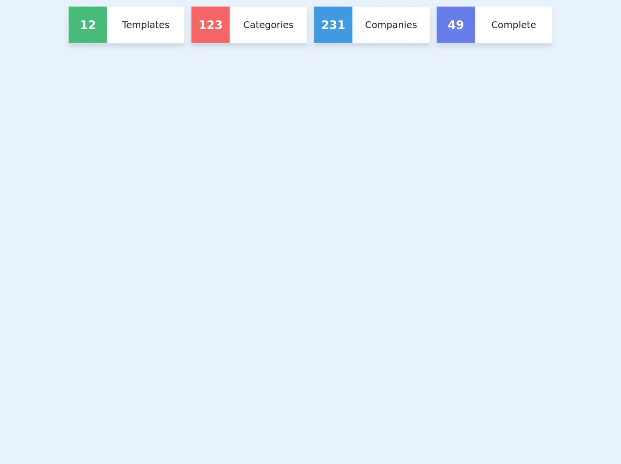
The preview of Dashboard info card UI component
To give you an idea of what a Dashboard Info Card UI component looks like, here is a preview:
Free download of the Dashboard info card's source code
The source code of Dashboard info card UI component
Here is the source code for a Dashboard Info Card UI component built with Tailwind CSS:
<div class="container">
<div class="px-4 py-4 mx-auto">
            <div class="grid sm:h-24 sm:grid-flow-row sm:gap-4 sm:grid-cols-3 grid-cols-1 md:grid-cols-4">
                <div class="shadow-lg flex flex-col justify-center bg-white border border-gray-300 rounded">
                    <div class="flex w-full h-full">
                        <div class="w-1/3 flex items-center justify-center bg-green-500">
                            <p class="text-3xl font-semibold text-center text-white">12</p>
                        </div>
                        <div class="w-2/3 flex items-center justify-center ">
                            <p class="text-2xl text-center text-gray-900">Templates</p>
                        </div>
                    </div>
                </div>

                <div class="shadow-lg flex flex-col justify-center bg-white border border-gray-300 rounded">
                    <div class="flex w-full h-full">
                        <div class="w-1/3 flex items-center justify-center bg-red-500">
                            <p class="text-3xl font-semibold text-center text-white">123</p>
                        </div>
                        <div class="w-2/3 flex items-center justify-center ">
                            <p class="text-2xl text-center text-gray-900">Categories</p>
                        </div>
                    </div>
                </div>

                <div class="shadow-lg flex flex-col justify-center bg-white border border-gray-300 rounded">
                    <div class="flex w-full h-full">
                        <div class="w-1/3 flex items-center justify-center bg-blue-500">
                            <p class="text-3xl font-semibold text-center text-white">231</p>
                        </div>
                        <div class="w-2/3 flex items-center justify-center ">
                            <p class="text-2xl text-center text-gray-900">Companies</p>
                        </div>
                    </div>
                </div>

                <div class="shadow-lg flex flex-col justify-center bg-white border border-gray-300 rounded">
                    <div class="flex w-full h-full">
                        <div class="w-1/3 flex items-center justify-center bg-indigo-500">
                            <p class="text-3xl font-semibold text-center text-white">49</p>
                        </div>
                        <div class="w-2/3 flex items-center justify-center ">
                            <p class="text-2xl text-center text-gray-900">Complete</p>
                        </div>
                    </div>
                </div>
            </div>
        </div>
</div>
How to create a Dashboard Info Card with Tailwind CSS?
To create a Dashboard Info Card with Tailwind CSS, follow these steps:
Step 1: Set up your HTML structure
The first step is to set up the HTML structure for your Dashboard Info Card. Here is an example:
<div class="bg-white rounded-lg shadow-lg">
  <div class="px-6 py-4">
    <div class="font-bold text-xl mb-2">Total Sales</div>
    <p class="text-gray-700 text-base">Lorem ipsum dolor sit amet, consectetur adipiscing elit. Sed non risus.</p>
  </div>
  <div class="px-6 py-4">
    <div class="flex items-center justify-between">
      <div class="text-sm font-semibold text-gray-600">Today</div>
      <div class="text-lg font-bold text-gray-800">$5,000</div>
    </div>
  </div>
</div>
In this example, we have a div element with a class of bg-white, rounded-lg, and shadow-lg. This creates a white background with rounded corners and a shadow effect. Inside this div, we have two div elements with classes of px-6 and py-4. These classes add padding to the left and right (px-6) and top and bottom (py-4) of the element.
The first div contains a div element with a class of font-bold and text-xl. This creates a bold and large title for our Dashboard Info Card. The second div contains a p element with a class of text-gray-700 and text-base. This creates a gray text with a base font size.
The third div contains two div elements with classes of flex, items-center, and justify-between. This creates a flexbox layout with the child elements centered vertically and spaced evenly. The first div contains a div element with a class of text-sm, font-semibold, and text-gray-600. This creates a small, semi-bold, gray text. The second div contains a div element with a class of text-lg, font-bold, and text-gray-800. This creates a large, bold, and dark gray text.
Step 2: Style your Dashboard Info Card with Tailwind CSS
Now that we have our HTML structure, we can start styling our Dashboard Info Card with Tailwind CSS. Here is an example:
<div class="bg-white rounded-lg shadow-lg">
  <div class="px-6 py-4">
    <div class="font-bold text-xl mb-2">Total Sales</div>
    <p class="text-gray-700 text-base">Lorem ipsum dolor sit amet, consectetur adipiscing elit. Sed non risus.</p>
  </div>
  <div class="px-6 py-4">
    <div class="flex items-center justify-between">
      <div class="text-sm font-semibold text-gray-600">Today</div>
      <div class="text-lg font-bold text-gray-800">$5,000</div>
    </div>
  </div>
</div>
In this example, we have added Tailwind CSS classes to our HTML elements. The bg-white class sets the background color to white. The rounded-lg class adds rounded corners to our element. The shadow-lg class adds a shadow effect.
The px-6 and py-4 classes add padding to our element. The font-bold and text-xl classes create a bold and large title. The text-gray-700 and text-base classes create a gray text with a base font size.
The flex, items-center, and justify-between classes create a flexbox layout with the child elements centered vertically and spaced evenly. The text-sm, font-semibold, and text-gray-600 classes create a small, semi-bold, gray text. The text-lg, font-bold, and text-gray-800 classes create a large, bold, and dark gray text.
Step 3: Customize your Dashboard Info Card
Tailwind CSS provides a set of pre-defined utility classes that can be customized to create unique designs. For example, you can change the background color of your Dashboard Info Card by adding a custom class:
<div class="bg-blue-500 rounded-lg shadow-lg">
  ...
</div>
In this example, we have added the bg-blue-500 class to our div element. This sets the background color to a shade of blue.
You can also customize the size, font, and spacing of your Dashboard Info Card by using Tailwind CSS classes. For example, you can change the font size of your title by adding a custom class:
<div class="bg-white rounded-lg shadow-lg">
  <div class="px-6 py-4">
    <div class="font-bold text-2xl mb-2">Total Sales</div>
    ...
  </div>
  ...
</div>
In this example, we have added the text-2xl class to our title element. This sets the font size to extra-large.
Conclusion
In this article, we have explored how to use Tailwind CSS to create a Dashboard Info Card UI component. We have discussed the benefits of using Tailwind CSS and provided a step-by-step guide on how to create a Dashboard Info Card with Tailwind CSS. With Tailwind CSS, you can create custom designs quickly and easily, making it a valuable tool for FrontEnd developers.