- Published on
Beginners Guide: Build A Dashboard Layout With Tailwind CSS
- What is Tailwind CSS?
- The description of Dashboard Layout ui component
- Why use Tailwind CSS to create a Dashboard Layout ui component?
- The preview of Dashboard Layout ui component
- The source code of Dashboard Layout ui component
- How to create a Dashboard Layout with Tailwind CSS?
- Step 1: Install Tailwind CSS
- Step 2: Create a new HTML file
- Step 3: Create the Dashboard Layout
- Step 4: Preview and customize the Dashboard Layout
- Conclusion
As a beginner in FrontEnd development, building a dashboard layout can be a daunting task. However, with the right tools and knowledge, it can be done with ease. In this article, we will explore how to build a dashboard layout using Tailwind CSS.
What is Tailwind CSS?
Tailwind CSS is a utility-first CSS framework that allows developers to rapidly build custom user interfaces. It provides a set of pre-defined CSS classes that can be used to style HTML elements. With Tailwind CSS, developers can create responsive and mobile-first designs without writing any custom CSS.
The description of Dashboard Layout ui component
A dashboard layout is a user interface component that displays data in a structured and organized way. It is commonly used in web applications to provide users with an overview of key metrics and data. A typical dashboard layout consists of multiple widgets or cards that display different types of data.
Why use Tailwind CSS to create a Dashboard Layout ui component?
Tailwind CSS provides a set of pre-defined CSS classes that can be used to style HTML elements. This means that developers can easily create a dashboard layout without writing any custom CSS. Tailwind CSS also provides responsive design classes, which makes it easy to create a mobile-first design.
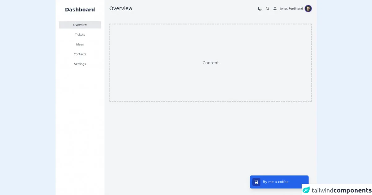
The preview of Dashboard Layout ui component
To give you an idea of what we will be building, here is a preview of the dashboard layout component we will create:
Free download of the Dashboard Layout's source code
The source code of Dashboard Layout ui component
Here is the source code for the dashboard layout component we will create:
<div>
    <script src="https://cdn.jsdelivr.net/gh/alpinejs/[email protected]/dist/alpine.min.js" defer></script>

    <div x-data="{ sidebarOpen: false, darkMode: false }" :class="{ 'dark': darkMode }">
        <div class="flex h-screen bg-gray-100 dark:bg-gray-800 font-roboto">
            <div :class="sidebarOpen ? 'block' : 'hidden'" @click="sidebarOpen = false"
                class="fixed z-20 inset-0 bg-black opacity-50 transition-opacity lg:hidden"></div>

            <div :class="sidebarOpen ? 'translate-x-0 ease-out' : '-translate-x-full ease-in'"
                class="fixed z-30 inset-y-0 left-0 w-60 transition duration-300 transform bg-white dark:bg-gray-900 overflow-y-auto lg:translate-x-0 lg:static lg:inset-0">
                <div class="flex items-center justify-center mt-8">
                    <div class="flex items-center">
                        <span class="text-gray-800 dark:text-white text-2xl font-semibold">Dashboard</span>
                    </div>
                </div>

                <nav class="flex flex-col mt-10 px-4 text-center">
                    <a href="#"
                        class="py-2 text-sm text-gray-700 dark:text-gray-100 bg-gray-200 dark:bg-gray-800 rounded">Overview</a>
                    <a href="#"
                        class="mt-3 py-2 text-sm text-gray-600 dark:text-gray-400 hover:text-gray-700 dark:hover:text-gray-100  hover:bg-gray-200 dark:hover:bg-gray-800 rounded">Tickets</a>
                    <a href="#"
                        class="mt-3 py-2 text-sm text-gray-600 dark:text-gray-400 hover:text-gray-700 dark:hover:text-gray-100 hover:bg-gray-200 dark:hover:bg-gray-800 rounded">Ideas</a>
                    <a href="#"
                        class="mt-3 py-2 text-sm text-gray-600 dark:text-gray-400 hover:text-gray-700 dark:hover:text-gray-100 hover:bg-gray-200 dark:hover:bg-gray-800 rounded">Contacts</a>
                    <a href="#"
                        class="mt-3 py-2 text-sm text-gray-600 dark:text-gray-400 hover:text-gray-700 dark:hover:text-gray-100 hover:bg-gray-200 dark:hover:bg-gray-800 rounded">Settings</a>
                </nav>
            </div>

            <div class="flex-1 flex flex-col overflow-hidden">
                <header class="flex justify-between items-center p-6">
                    <div class="flex items-center space-x-4 lg:space-x-0">
                        <button @click="sidebarOpen = true"
                            class="text-gray-500 dark:text-gray-300 focus:outline-none lg:hidden">
                            <svg class="h-6 w-6" viewBox="0 0 24 24" fill="none" xmlns="http://www.w3.org/2000/svg">
                                <path d="M4 6H20M4 12H20M4 18H11" stroke="currentColor" stroke-width="2"
                                    stroke-linecap="round" stroke-linejoin="round" />
                            </svg>
                        </button>

                        <div>
                            <h1 class="text-2xl font-medium text-gray-800 dark:text-white">Overview</h1>
                        </div>
                    </div>

                    <div class="flex items-center space-x-4">
                        <button @click="darkMode = !darkMode"
                            class="flex text-gray-600 dark:text-gray-300 focus:outline-none" aria-label="Color Mode">
                            <svg x-show="darkMode" class="h-6 w-6" viewBox="0 0 20 20" fill="currentColor">
                                <path fill-rule="evenodd"
                                    d="M10 2a1 1 0 011 1v1a1 1 0 11-2 0V3a1 1 0 011-1zm4 8a4 4 0 11-8 0 4 4 0 018 0zm-.464 4.95l.707.707a1 1 0 001.414-1.414l-.707-.707a1 1 0 00-1.414 1.414zm2.12-10.607a1 1 0 010 1.414l-.706.707a1 1 0 11-1.414-1.414l.707-.707a1 1 0 011.414 0zM17 11a1 1 0 100-2h-1a1 1 0 100 2h1zm-7 4a1 1 0 011 1v1a1 1 0 11-2 0v-1a1 1 0 011-1zM5.05 6.464A1 1 0 106.465 5.05l-.708-.707a1 1 0 00-1.414 1.414l.707.707zm1.414 8.486l-.707.707a1 1 0 01-1.414-1.414l.707-.707a1 1 0 011.414 1.414zM4 11a1 1 0 100-2H3a1 1 0 000 2h1z"
                                    clip-rule="evenodd" />
                            </svg>
                            <svg x-show="!darkMode" class="h-6 w-6" viewBox="0 0 20 20" fill="currentColor">
                                <path d="M17.293 13.293A8 8 0 016.707 2.707a8.001 8.001 0 1010.586 10.586z" />
                            </svg>
                        </button>
                        <button class="flex text-gray-600 dark:text-gray-300 focus:outline-none">
                            <svg class="h-5 w-5" viewBox="0 0 24 24" fill="none">
                                <path
                                    d="M21 21L15 15M17 10C17 13.866 13.866 17 10 17C6.13401 17 3 13.866 3 10C3 6.13401 6.13401 3 10 3C13.866 3 17 6.13401 17 10Z"
                                    stroke="currentColor" stroke-width="2" stroke-linecap="round" stroke-linejoin="round" />
                            </svg>
                        </button>

                        <button class="flex text-gray-600 dark:text-gray-300 focus:outline-none">
                            <svg class="h-5 w-5" viewBox="0 0 24 24" fill="none" xmlns="http://www.w3.org/2000/svg">
                                <path
                                    d="M15 17H20L18.5951 15.5951C18.2141 15.2141 18 14.6973 18 14.1585V11C18 8.38757 16.3304 6.16509 14 5.34142V5C14 3.89543 13.1046 3 12 3C10.8954 3 10 3.89543 10 5V5.34142C7.66962 6.16509 6 8.38757 6 11V14.1585C6 14.6973 5.78595 15.2141 5.40493 15.5951L4 17H9M15 17V18C15 19.6569 13.6569 21 12 21C10.3431 21 9 19.6569 9 18V17M15 17H9"
                                    stroke="currentColor" stroke-width="2" stroke-linecap="round" stroke-linejoin="round" />
                            </svg>
                        </button>

                        <div x-data="{ dropdownOpen: false }" class="relative">
                            <button @click="dropdownOpen = ! dropdownOpen"
                                class="flex items-center space-x-2 relative focus:outline-none">
                                <h2 class="text-gray-700 dark:text-gray-300 text-sm hidden sm:block">Jones Ferdinand</h2>
                                <img class="h-9 w-9 rounded-full border-2 border-purple-500 object-cover"
                                    src="https://images.unsplash.com/photo-1553267751-1c148a7280a1?ixid=MXwxMjA3fDB8MHxwaG90by1wYWdlfHx8fGVufDB8fHw%3D&ixlib=rb-1.2.1&auto=format&fit=crop&w=634&q=80"
                                    alt="Your avatar">
                            </button>

                            <div class="absolute right-0 mt-2 w-48 bg-white rounded-md overflow-hidden shadow-xl z-10"
                                x-show="dropdownOpen" x-transition:enter="transition ease-out duration-100 transform"
                                x-transition:enter-start="opacity-0 scale-95" x-transition:enter-end="opacity-100 scale-100"
                                x-transition:leave="transition ease-in duration-75 transform"
                                x-transition:leave-start="opacity-100 scale-100" x-transition:leave-end="opacity-0 scale-95"
                                @click.away="dropdownOpen = false">
                                <a href="#"
                                    class="block px-4 py-2 text-sm text-gray-700 hover:bg-purple-600 hover:text-white">Profile</a>
                                <a href="#"
                                    class="block px-4 py-2 text-sm text-gray-700 hover:bg-purple-600 hover:text-white">Tickets</a>
                                <a href="/login"
                                    class="block px-4 py-2 text-sm text-gray-700 hover:bg-purple-600 hover:text-white">Logout</a>
                            </div>
                        </div>
                    </div>
                </header>

                <main class="flex-1 overflow-x-hidden overflow-y-auto">
                    <div class="container mx-auto px-6 py-8">
                        <div
                            class="grid place-items-center h-96 text-gray-500 dark:text-gray-300 text-xl border-4 border-gray-300 border-dashed">
                            Content
                        </div>
                    </div>
                </main>
            </div>
        </div>
    </div>
</div>
How to create a Dashboard Layout with Tailwind CSS?
Now that we have an understanding of what a dashboard layout is and why we should use Tailwind CSS, let's dive into how to create a dashboard layout with Tailwind CSS.
Step 1: Install Tailwind CSS
The first step is to install Tailwind CSS. You can install Tailwind CSS using npm or yarn. Here is the command to install Tailwind CSS using npm:
npm install tailwindcss
Step 2: Create a new HTML file
Create a new HTML file and add the following code:
<!DOCTYPE html>
<html lang="en">
  <head>
    <meta charset="UTF-8" />
    <meta name="viewport" content="width=device-width, initial-scale=1.0" />
    <meta http-equiv="X-UA-Compatible" content="ie=edge" />
    <title>Dashboard Layout</title>

    <!-- Include Tailwind CSS -->
    <link
      rel="stylesheet"
      href="https://unpkg.com/tailwindcss@latest/dist/tailwind.min.css"
    />
  </head>
  <body>
    <!-- Add your dashboard layout code here -->
  </body>
</html>
Step 3: Create the Dashboard Layout
Now we can start creating the dashboard layout. We will use a combination of HTML and Tailwind CSS classes to create the layout.
Step 3.1: Create the header
The header will contain the logo and navigation links. Add the following code to create the header:
<header class="bg-white shadow">
  <div class="container mx-auto px-6 py-4">
    <div class="flex items-center justify-between">
      <div>
        <a
          class="text-gray-800 text-xl font-bold hover:text-gray-700"
          href="#"
        >
          Dashboard
        </a>
      </div>
      <div class="flex items-center">
        <div class="relative">
          <input
            type="text"
            class="bg-gray-100 h-10 px-5 pr-10 rounded-full text-sm focus:outline-none"
            placeholder="Search"
          />
          <button class="absolute right-0 top-0 mt-3 mr-4">
            <svg
              class="h-4 w-4 fill-current"
              xmlns="http://www.w3.org/2000/svg"
              viewBox="0 0 20 20"
            >
              <path
                d="M15.656 14.343l-3.98-3.98a5.5 5.5 0 111.414-1.414l3.98 3.98a1 1 0 01-1.414 1.414zM6.5 10.5a4 4 0 100-8 4 4 0 000 8z"
              />
            </svg>
          </button>
        </div>
        <div class="ml-4">
          <button
            class="bg-gray-600 text-white font-bold py-2 px-4 rounded-full"
          >
            Upgrade
          </button>
        </div>
      </div>
    </div>
  </div>
</header>
Step 3.2: Create the main content
The main content will contain the dashboard widgets or cards. Add the following code to create the main content:
<div class="container mx-auto my-5 px-6 md:px-12">
  <div class="flex flex-wrap -mx-6">
    <div class="w-full px-6 sm:w-1/2 xl:w-1/3">
      <!-- Widget code here -->
    </div>
    <div class="w-full px-6 sm:w-1/2 xl:w-1/3">
      <!-- Widget code here -->
    </div>
    <div class="w-full px-6 sm:w-1/2 xl:w-1/3">
      <!-- Widget code here -->
    </div>
    <div class="w-full px-6 sm:w-1/2 xl:w-1/3">
      <!-- Widget code here -->
    </div>
    <div class="w-full px-6 sm:w-1/2 xl:w-1/3">
      <!-- Widget code here -->
    </div>
    <div class="w-full px-6 sm:w-1/2 xl:w-1/3">
      <!-- Widget code here -->
    </div>
  </div>
</div>
Step 3.3: Create the widgets or cards
Finally, we will create the widgets or cards that will display the data. Add the following code to create a sample widget:
<div class="bg-white rounded-lg shadow-lg p-5">
  <div class="flex items-center">
    <div class="w-12 h-12 bg-blue-500 rounded-full flex justify-center items-center">
      <svg
        class="h-6 w-6 fill-current text-white"
        xmlns="http://www.w3.org/2000/svg"
        viewBox="0 0 20 20"
      >
        <path
          d="M10 12a2 2 0 100-4 2 2 0 000 4z"
        />
        <path
          fill-rule="evenodd"
          d="M10 18a8 8 0 100-16 8 8 0 000 16zm0-2a6 6 0 100-12 6 6 0 000 12z"
        />
      </svg>
    </div>
    <div class="ml-4">
      <p class="font-bold text-gray-700">Total Sales</p>
      <p class="text-gray-700">$50,000</p>
    </div>
  </div>
</div>
Step 4: Preview and customize the Dashboard Layout
Now that we have created the dashboard layout, we can preview it in the browser and customize it further. You can customize the layout by changing the colors, fonts, and sizes using Tailwind CSS classes.
Conclusion
In this article, we have explored how to build a dashboard layout using Tailwind CSS. We have seen how Tailwind CSS can be used to create a responsive and mobile-first design without writing any custom CSS. By following the steps outlined in this article, you can create your own dashboard layout with ease.