- Published on
Make A Dashboard Cards With Tailwind CSS Like A Pro With The Help Of These 6 Tips
- What is Tailwind CSS?
- The description of Dashboard Cards ui component
- Why use Tailwind CSS to create a Dashboard Cards ui component?
- The preview of Dashboard Cards ui component
- The source code of Dashboard Cards ui component
- How to create a Dashboard Cards with Tailwind CSS?
- Step 1: Set up your project
- Step 2: Define the structure of your Dashboard Cards
- Step 3: Style your Dashboard Cards
- Step 4: Add content to your Dashboard Cards
- Conclusion
As a FrontEnd technology blogger, it's important to stay up-to-date with the latest tools and techniques to help you create stunning user interfaces. One such tool is Tailwind CSS, a utility-first CSS framework that makes it easy to create beautiful designs quickly. In this article, we'll show you how to use Tailwind CSS to create a Dashboard Cards ui component like a pro with the help of these 6 tips.
What is Tailwind CSS?
Tailwind CSS is a utility-first CSS framework that provides a set of pre-defined classes that you can use to style your HTML elements. Unlike traditional CSS frameworks like Bootstrap or Foundation, Tailwind CSS doesn't come with pre-built components. Instead, it provides a set of low-level utility classes that you can use to build your own custom components quickly and easily.
The description of Dashboard Cards ui component
Dashboard Cards are a common UI component used in many web applications. They are used to display information in a visually appealing way and provide an at-a-glance view of important data. Dashboard Cards typically consist of a header, body, and footer section, with each section containing different types of content.
Why use Tailwind CSS to create a Dashboard Cards ui component?
Tailwind CSS is an excellent choice for creating Dashboard Cards because it provides a set of pre-defined classes that you can use to quickly style your components. Additionally, Tailwind CSS makes it easy to customize your styles by providing a range of configuration options that you can use to tweak the default styles.
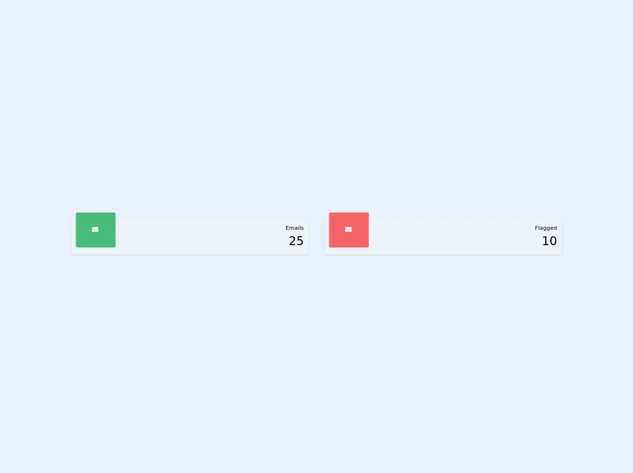
The preview of Dashboard Cards ui component
To create a Dashboard Cards ui component with Tailwind CSS, we'll use a combination of flexbox, grid, and utility classes to create a responsive layout that looks great on any device. Here's a preview of what our Dashboard Cards ui component will look like:
Free download of the Dashboard Cards's source code
The source code of Dashboard Cards ui component
To create our Dashboard Cards ui component, we'll use HTML and Tailwind CSS classes to define the structure and style of our component. Here's an example of what our HTML and CSS code will look like:
<link href="https://cdnjs.cloudflare.com/ajax/libs/font-awesome/5.11.2/css/all.min.css" rel="stylesheet">

<div class="flex w-full">
  <div class="flex-1 m-5 relative rounded bg-gray-200 shadow">
      <div class="bg-green-500 pl-10 pr-10 pt-8 pb-8 ml-3 absolute top-0 -mt-4 -mr-4 rounded text-white fill-current shadow">
          <i class="fas fa-envelope inline-block w-5"></i>
      </div>

      <div class="float-right top-0 right-0 m-3">
          <div class="text-right text-sm">Emails</div>
          <div class="text-right text-3xl">25</div>
      </div>
  </div>

  <div class="flex-1 m-5 relative rounded bg-gray-200 shadow">
      <div class="bg-red-500 pl-10 pr-10 pt-8 pb-8 ml-3 absolute top-0 -mt-4 -mr-4 rounded text-white fill-current shadow">
          <i class="fas fa-envelope inline-block w-5"></i>
      </div>

      <div class="float-right top-0 right-0 m-3">
          <div class="text-right text-sm">Flagged</div>
          <div class="text-right text-3xl">10</div>
      </div>
  </div>
</div>
How to create a Dashboard Cards with Tailwind CSS?
Now that we've covered the basics of Tailwind CSS and Dashboard Cards, let's dive into the steps you need to follow to create your own Dashboard Cards ui component with Tailwind CSS.
Step 1: Set up your project
The first step is to set up your project and install Tailwind CSS. You can do this by following the official Tailwind CSS documentation. Once you've installed Tailwind CSS, you can start building your Dashboard Cards ui component.
Step 2: Define the structure of your Dashboard Cards
The next step is to define the structure of your Dashboard Cards. To do this, you'll need to create a container element that will hold your Dashboard Cards. Inside this container, you'll create individual cards using the HTML structure we described earlier.
Step 3: Style your Dashboard Cards
Once you've defined the structure of your Dashboard Cards, it's time to style them using Tailwind CSS classes. You can use a combination of flexbox, grid, and utility classes to create a responsive layout that looks great on any device.
Step 4: Add content to your Dashboard Cards
The final step is to add content to your Dashboard Cards. You can do this by adding text, images, and other HTML elements to the header, body, and footer sections of your cards. You can also use Tailwind CSS classes to style your content and make it look great.
Conclusion
In this article, we've shown you how to use Tailwind CSS to create a Dashboard Cards ui component like a pro with the help of these 6 tips. By following these steps, you can create stunning user interfaces quickly and easily using Tailwind CSS. So why not give it a try and see what you can create?