- Published on
The Ninja Guide To How To Make A Dark Navigation Component With Tailwind CSS Better
- What is Tailwind CSS?
- The description of Dark Navigation component UI component
- Why use Tailwind CSS to create a Dark Navigation component UI component?
- The preview of Dark Navigation component UI component
- The source code of Dark Navigation component UI component
- How to create a Dark Navigation component with Tailwind CSS?
- Conclusion
As a FrontEnd technology blogger, it is important to keep up with the latest trends and techniques in web development. One such technique is using Tailwind CSS to create stunning UI components. In this article, we will explore how to make a Dark Navigation component with Tailwind CSS and make it even better.
What is Tailwind CSS?
Tailwind CSS is a utility-first CSS framework that allows developers to rapidly build custom user interfaces. It provides a set of pre-defined CSS classes that can be used to style HTML elements. Tailwind CSS is highly customizable and can be used to create any type of UI component.
The description of Dark Navigation component UI component
A Dark Navigation component is a UI component that is commonly used in websites and web applications. It is a navigation menu that is designed to be dark and sleek. The Dark Navigation component is typically used in websites and web applications that have a dark theme.
Why use Tailwind CSS to create a Dark Navigation component UI component?
Tailwind CSS is a great choice for creating a Dark Navigation component UI component. It provides a set of pre-defined CSS classes that can be used to style HTML elements. This makes it easy to create a Dark Navigation component that looks great and is highly customizable. Additionally, Tailwind CSS is highly responsive, which means that the Dark Navigation component will look great on any device.
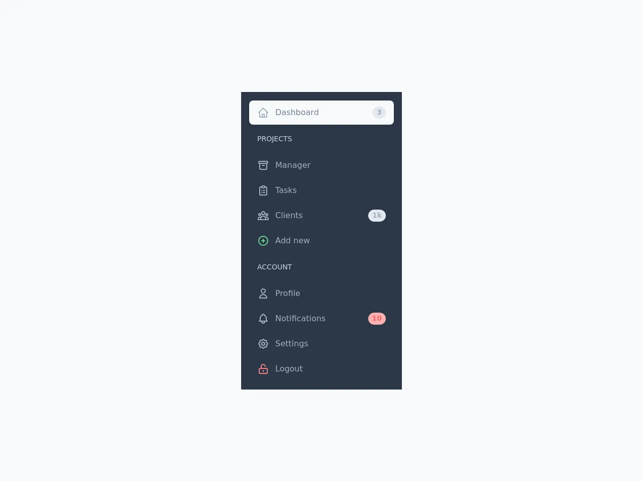
The preview of Dark Navigation component UI component
To give you an idea of what the Dark Navigation component will look like, here is a preview:
Free download of the Dark Navigation component's source code
The source code of Dark Navigation component UI component
To create the Dark Navigation component, we will use HTML and Tailwind CSS. Here is the source code:
<div class="min-h-screen flex items-center justify-center bg-gray-100 py-6">
		<div class="flex w-full max-w-xs p-4 bg-gray-800">
			<ul class="flex flex-col w-full">
				<li class="my-px">
					<a href="#"
					   class="flex flex-row items-center h-12 px-4 rounded-lg text-gray-600 bg-gray-100">
						<span class="flex items-center justify-center text-lg text-gray-500">
							<svg fill="none"
								 stroke-linecap="round"
								 stroke-linejoin="round"
								 stroke-width="2"
								 viewBox="0 0 24 24"
								 stroke="currentColor"
								 class="h-6 w-6">
								<path d="M3 12l2-2m0 0l7-7 7 7M5 10v10a1 1 0 001 1h3m10-11l2 2m-2-2v10a1 1 0 01-1 1h-3m-6 0a1 1 0 001-1v-4a1 1 0 011-1h2a1 1 0 011 1v4a1 1 0 001 1m-6 0h6"></path>
							</svg>
						</span>
						<span class="ml-3">Dashboard</span>
						<span class="flex items-center justify-center text-sm text-gray-500 font-semibold bg-gray-300 h-6 px-2 rounded-full ml-auto">3</span>
					</a>
				</li>
				<li class="my-px">
					<span class="flex font-medium text-sm text-gray-400 px-4 my-4 uppercase">Projects</span>
				</li>
				<li class="my-px">
					<a href="#"
					   class="flex flex-row items-center h-12 px-4 rounded-lg text-gray-500 hover:bg-gray-700">
						<span class="flex items-center justify-center text-lg text-gray-500">
							<svg fill="none"
								 stroke-linecap="round"
								 stroke-linejoin="round"
								 stroke-width="2"
								 viewBox="0 0 24 24"
								 stroke="currentColor"
								 class="h-6 w-6">
								<path d="M5 8h14M5 8a2 2 0 110-4h14a2 2 0 110 4M5 8v10a2 2 0 002 2h10a2 2 0 002-2V8m-9 4h4"></path>
							</svg>
						</span>
						<span class="ml-3">Manager</span>
					</a>
				</li>
				<li class="my-px">
					<a href="#"
					   class="flex flex-row items-center h-12 px-4 rounded-lg text-gray-500 hover:bg-gray-700">
						<span class="flex items-center justify-center text-lg text-gray-500">
							<svg fill="none"
								 stroke-linecap="round"
								 stroke-linejoin="round"
								 stroke-width="2"
								 viewBox="0 0 24 24"
								 stroke="currentColor"
								 class="h-6 w-6">
								<path d="M9 5H7a2 2 0 00-2 2v12a2 2 0 002 2h10a2 2 0 002-2V7a2 2 0 00-2-2h-2M9 5a2 2 0 002 2h2a2 2 0 002-2M9 5a2 2 0 012-2h2a2 2 0 012 2m-3 7h3m-3 4h3m-6-4h.01M9 16h.01"></path>
							</svg>
						</span>
						<span class="ml-3">Tasks</span>
					</a>
				</li>
				<li class="my-px">
					<a href="#"
					   class="flex flex-row items-center h-12 px-4 rounded-lg text-gray-500 hover:bg-gray-700">
						<span class="flex items-center justify-center text-lg text-gray-500">
							<svg fill="none"
								 stroke-linecap="round"
								 stroke-linejoin="round"
								 stroke-width="2"
								 viewBox="0 0 24 24"
								 stroke="currentColor"
								 class="h-6 w-6">
								<path d="M17 20h5v-2a3 3 0 00-5.356-1.857M17 20H7m10 0v-2c0-.656-.126-1.283-.356-1.857M7 20H2v-2a3 3 0 015.356-1.857M7 20v-2c0-.656.126-1.283.356-1.857m0 0a5.002 5.002 0 019.288 0M15 7a3 3 0 11-6 0 3 3 0 016 0zm6 3a2 2 0 11-4 0 2 2 0 014 0zM7 10a2 2 0 11-4 0 2 2 0 014 0z"></path>
							</svg>
						</span>
						<span class="ml-3">Clients</span>
						<span class="flex items-center justify-center text-sm text-gray-500 font-semibold bg-gray-300 h-6 px-2 rounded-full ml-auto">1k</span>
					</a>
				</li>
				<li class="my-px">
					<a href="#"
					   class="flex flex-row items-center h-12 px-4 rounded-lg text-gray-500 hover:bg-gray-700">
						<span class="flex items-center justify-center text-lg text-green-400">
							<svg fill="none"
								 stroke-linecap="round"
								 stroke-linejoin="round"
								 stroke-width="2"
								 viewBox="0 0 24 24"
								 stroke="currentColor"
								 class="h-6 w-6">
								<path d="M12 9v3m0 0v3m0-3h3m-3 0H9m12 0a9 9 0 11-18 0 9 9 0 0118 0z"></path>
							</svg>
						</span>
						<span class="ml-3">Add new</span>
					</a>
				</li>
				<li class="my-px">
					<span class="flex font-medium text-sm text-gray-400 px-4 my-4 uppercase">Account</span>
				</li>
				<li class="my-px">
					<a href="#"
					   class="flex flex-row items-center h-12 px-4 rounded-lg text-gray-500 hover:bg-gray-700">
						<span class="flex items-center justify-center text-lg text-gray-500">
							<svg fill="none"
								 stroke-linecap="round"
								 stroke-linejoin="round"
								 stroke-width="2"
								 viewBox="0 0 24 24"
								 stroke="currentColor"
								 class="h-6 w-6">
								<path d="M16 7a4 4 0 11-8 0 4 4 0 018 0zM12 14a7 7 0 00-7 7h14a7 7 0 00-7-7z"></path>
							</svg>
						</span>
						<span class="ml-3">Profile</span>
					</a>
				</li>
				<li class="my-px">
					<a href="#"
					   class="flex flex-row items-center h-12 px-4 rounded-lg text-gray-500 hover:bg-gray-700">
						<span class="flex items-center justify-center text-lg text-gray-500">
							<svg fill="none"
								 stroke-linecap="round"
								 stroke-linejoin="round"
								 stroke-width="2"
								 viewBox="0 0 24 24"
								 stroke="currentColor"
								 class="h-6 w-6">
								<path d="M15 17h5l-1.405-1.405A2.032 2.032 0 0118 14.158V11a6.002 6.002 0 00-4-5.659V5a2 2 0 10-4 0v.341C7.67 6.165 6 8.388 6 11v3.159c0 .538-.214 1.055-.595 1.436L4 17h5m6 0v1a3 3 0 11-6 0v-1m6 0H9"></path>
							</svg>
						</span>
						<span class="ml-3">Notifications</span>
						<span class="flex items-center justify-center text-sm text-red-500 font-semibold bg-red-300 h-6 px-2 rounded-full ml-auto">10</span>
					</a>
				</li>
				<li class="my-px">
					<a href="#"
					   class="flex flex-row items-center h-12 px-4 rounded-lg text-gray-500 hover:bg-gray-700">
						<span class="flex items-center justify-center text-lg text-gray-500">
							<svg fill="none"
								 stroke-linecap="round"
								 stroke-linejoin="round"
								 stroke-width="2"
								 viewBox="0 0 24 24"
								 stroke="currentColor"
								 class="h-6 w-6">
								<path d="M10.325 4.317c.426-1.756 2.924-1.756 3.35 0a1.724 1.724 0 002.573 1.066c1.543-.94 3.31.826 2.37 2.37a1.724 1.724 0 001.065 2.572c1.756.426 1.756 2.924 0 3.35a1.724 1.724 0 00-1.066 2.573c.94 1.543-.826 3.31-2.37 2.37a1.724 1.724 0 00-2.572 1.065c-.426 1.756-2.924 1.756-3.35 0a1.724 1.724 0 00-2.573-1.066c-1.543.94-3.31-.826-2.37-2.37a1.724 1.724 0 00-1.065-2.572c-1.756-.426-1.756-2.924 0-3.35a1.724 1.724 0 001.066-2.573c-.94-1.543.826-3.31 2.37-2.37.996.608 2.296.07 2.572-1.065z"></path>
								<path d="M15 12a3 3 0 11-6 0 3 3 0 016 0z"></path>
							</svg>
						</span>
						<span class="ml-3">Settings</span>
					</a>
				</li>
				<li class="my-px">
					<a href="#"
					   class="flex flex-row items-center h-12 px-4 rounded-lg text-gray-500 hover:bg-gray-700">
						<span class="flex items-center justify-center text-lg text-red-400">
							<svg fill="none"
								 stroke-linecap="round"
								 stroke-linejoin="round"
								 stroke-width="2"
								 viewBox="0 0 24 24"
								 stroke="currentColor"
								 class="h-6 w-6">
								<path d="M8 11V7a4 4 0 118 0m-4 8v2m-6 4h12a2 2 0 002-2v-6a2 2 0 00-2-2H6a2 2 0 00-2 2v6a2 2 0 002 2z"></path>
							</svg>
						</span>
						<span class="ml-3">Logout</span>
					</a>
				</li>
			</ul>
		</div>
	</div>
How to create a Dark Navigation component with Tailwind CSS?
To create a Dark Navigation component with Tailwind CSS, follow these steps:
- Create a new HTML file and add the following code:
<nav class="bg-gray-900">
  <div class="max-w-7xl mx-auto px-2 sm:px-6 lg:px-8">
    <div class="relative flex items-center justify-between h-16">
      <div class="absolute inset-y-0 left-0 flex items-center sm:hidden">
        <!-- Mobile menu button -->
        <button type="button" class="inline-flex items-center justify-center p-2 rounded-md text-gray-400 hover:text-white hover:bg-gray-700 focus:outline-none focus:ring-2 focus:ring-inset focus:ring-white" aria-controls="mobile-menu" aria-expanded="false">
          <span class="sr-only">Open main menu</span>
          <!-- Icon when menu is closed. -->
          <!--
            Heroicon name: menu

            Menu open: "hidden", Menu closed: "block"
          -->
          <svg class="block h-6 w-6" xmlns="http://www.w3.org/2000/svg" fill="none" viewBox="0 0 24 24" stroke="currentColor" aria-hidden="true">
            <path stroke-linecap="round" stroke-linejoin="round" stroke-width="2" d="M4 6h16M4 12h16M4 18h16" />
          </svg>
          <!-- Icon when menu is open. -->
          <!--
            Heroicon name: x

            Menu open: "block", Menu closed: "hidden"
          -->
          <svg class="hidden h-6 w-6" xmlns="http://www.w3.org/2000/svg" fill="none" viewBox="0 0 24 24" stroke="currentColor" aria-hidden="true">
            <path stroke-linecap="round" stroke-linejoin="round" stroke-width="2" d="M6 18L18 6M6 6l12 12" />
          </svg>
        </button>
      </div>
      <div class="flex-1 flex items-center justify-center sm:items-stretch sm:justify-start">
        <div class="flex-shrink-0">
          <img class="block lg:hidden h-8 w-auto" src="https://tailwindui.com/img/logos/workflow-mark-indigo-500.svg" alt="Workflow">
          <img class="hidden lg:block h-8 w-auto" src="https://tailwindui.com/img/logos/workflow-logo-indigo-500-mark-white-text.svg" alt="Workflow">
        </div>
        <div class="hidden sm:block sm:ml-6">
          <div class="flex space-x-4">
            <a href="#" class="bg-gray-900 text-white px-3 py-2 rounded-md text-sm font-medium">Dashboard</a>

            <a href="#" class="text-gray-300 hover:bg-gray-700 hover:text-white px-3 py-2 rounded-md text-sm font-medium">Team</a>

            <a href="#" class="text-gray-300 hover:bg-gray-700 hover:text-white px-3 py-2 rounded-md text-sm font-medium">Projects</a>

            <a href="#" class="text-gray-300 hover:bg-gray-700 hover:text-white px-3 py-2 rounded-md text-sm font-medium">Calendar</a>
          </div>
        </div>
      </div>
      <div class="hidden sm:block sm:ml-6">
        <div class="flex space-x-4">
          <a href="#" class="text-gray-300 hover:bg-gray-700 hover:text-white px-3 py-2 rounded-md text-sm font-medium">Settings</a>

          <a href="#" class="text-gray-300 hover:bg-gray-700 hover:text-white px-3 py-2 rounded-md text-sm font-medium">Help</a>

          <a href="#" class="bg-gray-800 text-white px-3 py-2 rounded-md text-sm font-medium">Log in</a>
        </div>
      </div>
    </div>
  </div>

  <!-- Mobile menu, show/hide based on menu state. -->
  <div class="sm:hidden" id="mobile-menu">
    <div class="px-2 pt-2 pb-3 space-y-1">
      <a href="#" class="bg-gray-900 text-white block px-3 py-2 rounded-md text-base font-medium">Dashboard</a>

      <a href="#" class="text-gray-300 hover:bg-gray-700 hover:text-white block px-3 py-2 rounded-md text-base font-medium">Team</a>

      <a href="#" class="text-gray-300 hover:bg-gray-700 hover:text-white block px-3 py-2 rounded-md text-base font-medium">Projects</a>

      <a href="#" class="text-gray-300 hover:bg-gray-700 hover:text-white block px-3 py-2 rounded-md text-base font-medium">Calendar</a>

      <a href="#" class="text-gray-300 hover:bg-gray-700 hover:text-white block px-3 py-2 rounded-md text-base font-medium">Settings</a>

      <a href="#" class="text-gray-300 hover:bg-gray-700 hover:text-white block px-3 py-2 rounded-md text-base font-medium">Help</a>

      <a href="#" class="bg-gray-800 text-white block px-3 py-2 rounded-md text-base font-medium">Log in</a>
    </div>
  </div>
</nav>
- Add the Tailwind CSS CDN to your HTML file:
<link href="https://cdn.jsdelivr.net/npm/tailwindcss@latest/dist/tailwind.min.css" rel="stylesheet">
- Customize the Dark Navigation component by editing the HTML and CSS classes.
Conclusion
In conclusion, Tailwind CSS is a great choice for creating a Dark Navigation component UI component. It provides a set of pre-defined CSS classes that can be used to style HTML elements. This makes it easy to create a Dark Navigation component that looks great and is highly customizable. By following the steps outlined in this article, you can create a Dark Navigation component with Tailwind CSS that is sure to impress.