- Published on
Build A Dark Mode Vs Light Mode Navigation With Tailwind CSS Like A Pro With The Help Of These 6 Tips
- What is Tailwind CSS?
- The description of Dark Mode vs Light Mode Navigation ui component
- Why use Tailwind CSS to create a Dark Mode vs Light Mode Navigation ui component?
- The preview of Dark Mode vs Light Mode Navigation ui component
- The source code of Dark Mode vs Light Mode Navigation ui component
- How to create a Dark Mode vs Light Mode Navigation with Tailwind CSS?
- Step 1: Set up your HTML file
- Step 2: Add Tailwind CSS classes to your HTML elements
- Step 3: Add JavaScript code to switch between dark and light modes
- Conclusion
If you're a FrontEnd developer, you're probably familiar with Tailwind CSS. It's a utility-first CSS framework that makes it easy to create responsive and customizable UI components. In this article, we'll show you how to build a Dark Mode vs Light Mode Navigation UI component with Tailwind CSS.
What is Tailwind CSS?
Tailwind CSS is a utility-first CSS framework that provides a set of pre-defined classes that you can use to style your HTML elements. It's designed to be highly customizable and easy to use, making it a popular choice for FrontEnd developers.
The description of Dark Mode vs Light Mode Navigation ui component
A Dark Mode vs Light Mode Navigation UI component is a navigation bar that allows users to switch between dark and light modes. It's a popular UI component that's used in many web applications and websites.
Why use Tailwind CSS to create a Dark Mode vs Light Mode Navigation ui component?
Tailwind CSS makes it easy to create responsive and customizable UI components. It provides a set of pre-defined classes that you can use to style your HTML elements, which saves you time and effort. Additionally, Tailwind CSS is highly customizable, which means you can easily customize the Dark Mode vs Light Mode Navigation UI component to fit your specific needs.
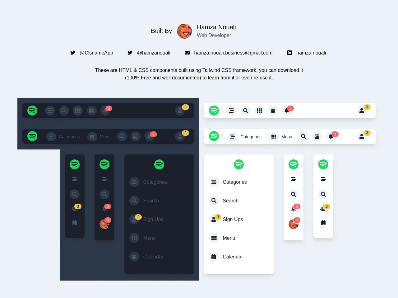
The preview of Dark Mode vs Light Mode Navigation ui component
To give you an idea of what the Dark Mode vs Light Mode Navigation UI component looks like, here's a preview:
Free download of the Dark Mode vs Light Mode Navigation's source code
The source code of Dark Mode vs Light Mode Navigation ui component
Here's the source code for the Dark Mode vs Light Mode Navigation UI component:
<link href="https://cdnjs.cloudflare.com/ajax/libs/font-awesome/5.11.2/css/all.min.css" rel="stylesheet">
<!-- This is an example component -->
<div class="bg-gray-200 p-10 flex flex-wrap sys-app-notCollapsed ">
  <!--this contains my photo, email and some information.-->
  <div class="p-4 w-full ">
    <div class="w-1/3 py-4 px-6 flex mx-auto ">
      <span class="px-2 mx-2 inline-block capitalize font-medium ">
        <span class="block text-xl mt-3">Built by</span>
      </span>
      <img
        src="https://lh3.googleusercontent.com/-U0lTbxzh0bE/AAAAAAAAAAI/AAAAAAAAAAA/ACHi3rdJubMZweMDYD49ddsxq1wXai_9Cg/s48-c/photo.jpg"
        alt="alt placeholder" class="w-12 h-12 mt-1 rounded-full inline-block">
      <span class="px-2 mx-2 inline-block capitalize font-medium">
        <span class="block text-xl">Hamza Nouali</span>
        <span class="block font-normal text-gray-700">Web Developer</span>
      </span>
    </div>
    <div class="p-4 text-center">
      <a href="https://twitter.com/AppClsname" target="_tab" class="p-2 mx-2 ">
        <i class="fab fa-twitter inline-block w-5">
        </i>
        <span class="mx-2 ">@ClsnameApp</span>
      </a>
      <a href="https://twitter.com/HamzaNouali3" target="_tab" class="p-2 mx-2 ">
        <i class="fab fa-twitter inline-block w-5">
        </i>
        <span class="mx-2 ">@hamzanouali</span>
      </a>
      <span class="p-2 mx-2 ">
        <i class="fas fa-envelope inline-block w-5">
        </i>
        <span class="mx-2 ">[email protected]</span>
      </span>
      <a href="https://www.linkedin.com/in/hamza-nouali-8786ab19a/" target="_tab" class="p-2 mx-2 ">
        <i class="fab fa-linkedin inline-block w-5">
        </i>
        <span class="mx-2 ">hamza nouali</span>
      </a>
    </div>
    <p class="p-4 text-center w-3/5 mx-auto">These are HTML & CSS components built using Tailwind CSS framework, you can
      download it (100% Free and well documented)
      to learn from it or even re-use it.</p>
  </div>
  <!--horizontal navigations-->
  <div class="p-4 pb-0 mx-auto flex flex-wrap ">
    <div class="p-4 w-full lg:w-1/2 bg-gray-800">
      <!--dark mode - without text - icons only-->
      <div class="p-2 text-gray-700 bg-gray-900 rounded-lg shadow-lg ">
        <span class="px-2 mr-2 border-r border-gray-800">
          <img src="https://www.freepnglogos.com/uploads/spotify-logo-png/file-spotify-logo-png-4.png"
            alt="alt placeholder" class="w-8 h-8 -mt-1 inline mx-auto">
        </span>
        <span class="px-1 hover:text-white cursor-pointer">
          <i class="fas fa-stream p-2 bg-gray-800 rounded-full">
          </i>
        </span>
        <span class="px-1 hover:text-white cursor-pointer">
          <i class="fas fa-search p-2 bg-gray-800 rounded-full">
          </i>
        </span>
        <span class="px-1 hover:text-white cursor-pointer">
          <i class="fas fa-th p-2 bg-gray-800 rounded-full">
          </i>
        </span>
        <span class="px-1 hover:text-white cursor-pointer">
          <i class="w-8 fas fa-calendar-alt p-2 bg-gray-800 rounded-full">
          </i>
        </span>
        <span class="px-1 hover:text-white cursor-pointer w-8 relative">
          <i class="fas fa-bell p-2 bg-gray-800 rounded-full">
          </i>
          <span
            class="absolute right-0 top-0 -mt-2 -mr-1 text-xs bg-red-500 text-white font-medium px-2 shadow-lg rounded-full">3</span>
        </span>
        <span class="hover:text-white cursor-pointer w-10 relative float-right mr-3">
          <i class="fas fa-user p-2 bg-gray-800 rounded-full">
          </i>
          <span
            class="absolute right-0 top-0 -mt-1 -mr-1 text-xs bg-yellow-500 text-black font-medium px-2 rounded-full">3</span>
        </span>
      </div>
    </div>
    <div class="p-4 w-full lg:w-1/2">
      <!--dark mode - without text - icons only-->
      <div class="p-2 text-gray-900 bg-white rounded-lg shadow-lg ">
        <span class="px-2 mr-2 border-r border-gray-800">
          <img src="https://www.freepnglogos.com/uploads/spotify-logo-png/file-spotify-logo-png-4.png"
            alt="alt placeholder" class="w-8 h-8 -mt-1 inline mx-auto">
        </span>
        <span class="px-1 cursor-pointer hover:text-gray-700">
          <i class="fas fa-stream p-2 bg-gray-200 rounded-full">
          </i>
        </span>
        <span class="px-1 cursor-pointer hover:text-gray-700">
          <i class="fas fa-search p-2 bg-gray-200 rounded-full">
          </i>
        </span>
        <span class="px-1 cursor-pointer hover:text-gray-700">
          <i class="fas fa-th p-2 bg-gray-200 rounded-full">
          </i>
        </span>
        <span class="px-1 cursor-pointer hover:text-gray-700">
          <i class="w-8 fas fa-calendar-alt p-2 bg-gray-200 rounded-full">
          </i>
        </span>
        <span class="px-1 w-8 relative cursor-pointer hover:text-gray-700">
          <i class="fas fa-bell p-2 bg-gray-200 rounded-full">
          </i>
          <span
            class="absolute right-0 top-0 -mt-2 -mr-1 text-xs bg-red-500 text-white font-medium px-2 shadow-lg rounded-full">3</span>
        </span>
        <span class="w-10 relative float-right mr-3 cursor-pointer hover:text-gray-700">
          <i class="fas fa-user p-2 bg-gray-200 rounded-full">
          </i>
          <span
            class="absolute right-0 top-0 -mt-1 -mr-1 text-xs bg-yellow-500 text-black font-medium px-2 rounded-full">3</span>
        </span>
      </div>
    </div>
    <div class="p-4 w-full lg:w-1/2 bg-gray-800">
      <!--dark mode - text and icons-->
      <div class="p-2 text-gray-700 bg-gray-900 rounded-lg shadow-lg font-medium capitalize">
        <span class="px-2 mr-2 border-r border-gray-800">
          <img src="https://www.freepnglogos.com/uploads/spotify-logo-png/file-spotify-logo-png-4.png"
            alt="alt placeholder" class="w-8 h-8 -mt-1 inline mx-auto">
        </span>
        <span class="px-2 py-1 cursor-pointer hover:bg-gray-800 hover:text-gray-300 text-sm rounded mb-5">
          <i class="w-8 fas fa-stream p-2 bg-gray-800 rounded-full">
          </i>
          <span class="mx-1">categories</span>
        </span>
        <span class="px-2 py-1 cursor-pointer hover:bg-gray-800 hover:text-gray-300 text-sm rounded mb-5">
          <i class="w-8 fas fa-th p-2 bg-gray-800 rounded-full">
          </i>
          <span class="mx-1">menu</span>
        </span>
        <span class="px-1 hover:text-white cursor-pointer">
          <i class="fas fa-search p-2 bg-gray-800 rounded-full">
          </i>
        </span>
        <span class="px-1 hover:text-white cursor-pointer">
          <i class="w-8 fas fa-calendar-alt p-2 bg-gray-800 rounded-full">
          </i>
        </span>
        <span class="px-1 hover:text-white cursor-pointer w-8 relative">
          <i class="w-8 fas fa-bell p-2 bg-gray-800 rounded-full">
          </i>
          <span
            class="absolute right-0 top-0 -mt-2 -mr-1 text-xs bg-red-500 text-white font-medium px-2 shadow-lg rounded-full">3</span>
        </span>
        <span class="hover:text-white cursor-pointer w-10 relative float-right mr-3">
          <i class="fas fa-user p-2 bg-gray-800 rounded-full">
          </i>
          <span
            class="absolute right-0 top-0 -mt-1 -mr-1 text-xs bg-yellow-500 text-black font-medium px-2 rounded-full">3</span>
        </span>
      </div>
    </div>
    <div class="p-4 w-full lg:w-1/2">
      <!--light mode - text and icons-->
      <div class="p-2 text-gray-900 bg-white rounded-lg shadow-lg font-medium capitalize">
        <span class="px-2 mr-2 border-r border-gray-800">
          <img src="https://www.freepnglogos.com/uploads/spotify-logo-png/file-spotify-logo-png-4.png"
            alt="alt placeholder" class="w-8 h-8 -mt-1 inline mx-auto">
        </span>
        <span class="px-2 py-1 cursor-pointer hover:bg-gray-200 hover:text-gray-700 text-sm rounded mb-5">
          <i class="w-8 fas fa-stream p-2 bg-gray-200 rounded-full">
          </i>
          <span class="mx-1">categories</span>
        </span>
        <span class="px-2 py-1 cursor-pointer hover:bg-gray-200 hover:text-gray-700 text-sm rounded mb-5">
          <i class="w-8 fas fa-th p-2 bg-gray-200 rounded-full">
          </i>
          <span class="mx-1">menu</span>
        </span>
        <span class="px-1 cursor-pointer hover:text-gray-700">
          <i class="fas fa-search p-2 bg-gray-200 rounded-full">
          </i>
        </span>
        <span class="px-1 cursor-pointer hover:text-gray-700">
          <i class="w-8 fas fa-calendar-alt p-2 bg-gray-200 rounded-full">
          </i>
        </span>
        <span class="px-1 w-8 relative cursor-pointer hover:text-gray-700">
          <i class="w-8 fas fa-bell p-2 bg-gray-200 rounded-full">
          </i>
          <span
            class="absolute right-0 top-0 -mt-2 -mr-1 text-xs bg-red-500 text-white font-medium px-2 shadow-lg rounded-full">3</span>
        </span>
        <span class="w-10 relative float-right mr-3 cursor-pointer hover:text-gray-700">
          <i class="w-8 fas fa-user p-2 bg-gray-200 rounded-full">
          </i>
          <span
            class="absolute right-0 top-0 -mt-1 -mr-1 text-xs bg-yellow-500 text-black font-medium px-2 rounded-full">3</span>
        </span>
      </div>
    </div>
  </div>
  <!--vertical navigations-->
  <div class="p-4 pt-0 mx-auto flex flex-wrap ">
    <!--dark mode - tight side navigation with yellow notification-->
    <div class="p-4 w-24 bg-gray-800">
      <div class="py-4 px-2 text-gray-700 bg-gray-900 rounded-lg text-center shadow-lg">
        <img src="https://www.freepnglogos.com/uploads/spotify-logo-png/file-spotify-logo-png-4.png"
          alt="alt placeholder" class="w-8 h-8 mx-auto mb-5">
        <span class="cursor-pointer hover:text-white px-2 block mb-5">
          <i class="fas fa-stream">
          </i>
        </span>
        <span class="cursor-pointer hover:text-white px-2 block mb-5">
          <i class="fas fa-search p-2 bg-gray-800 rounded-full">
          </i>
        </span>
        <span class="cursor-pointer hover:text-white px-2 block mb-5 relative">
          <i class="fas fa-users">
          </i>
          <span
            class="absolute right-0 top-0 -mt-2 text-xs bg-yellow-500 text-black font-medium px-2 shadow-lg rounded-full border-2 border-gray-900">3</span>
        </span>
        <span class="cursor-pointer hover:text-white px-2 block mb-5">
          <i class="fas fa-calendar-alt">
          </i>
        </span>
      </div>
    </div>
    <div class="p-4 w-24 bg-gray-800">
      <!--dark mode - tight side navigation with red notification-->
      <div class="py-4 px-2 text-gray-700 bg-gray-900 rounded text-center shadow-lg">
        <img src="https://www.freepnglogos.com/uploads/spotify-logo-png/file-spotify-logo-png-4.png"
          alt="alt placeholder" class="w-8 h-8 mx-auto mb-5">
        <span class="cursor-pointer hover:text-white px-2 block mb-5">
          <i class="fas fa-stream">
          </i>
        </span>
        <span class="cursor-pointer hover:text-white px-2 block mb-5">
          <i class="fas fa-search p-2 bg-gray-800 rounded-full">
          </i>
        </span>
        <span class="cursor-pointer hover:text-white px-2 block mb-5 relative">
          <i class="fas fa-bell">
          </i>
          <span
            class="absolute right-0 top-0 -mt-2 text-xs bg-red-500 text-white font-medium px-2 shadow-lg rounded-full border-2 border-gray-900">3</span>
        </span>
        <span class="cursor-pointer px-2 block mb-5 relative">
          <span
            class="absolute right-0 top-0 -mt-2 text-xs bg-red-500 text-white font-medium px-2 shadow-lg rounded-full border-2 border-gray-900">3</span>
          <img
            src="https://lh3.googleusercontent.com/-U0lTbxzh0bE/AAAAAAAAAAI/AAAAAAAAAAA/ACHi3rdJubMZweMDYD49ddsxq1wXai_9Cg/s48-c/photo.jpg"
            alt="alt placeholder" class="w-8 h-8 mx-auto mb-5 rounded-full">
        </span>
      </div>
    </div>
    <div class="p-4 w-64 bg-gray-800">
      <!--dark mode - wide side navigation-->
      <div class="w-full py-4 px-2 text-gray-700 bg-gray-900 rounded-lg text-left capitalize font-medium shadow-lg">
        <img src="https://www.freepnglogos.com/uploads/spotify-logo-png/file-spotify-logo-png-4.png"
          alt="alt placeholder" class="w-8 h-8 mx-auto mb-5 ">
        <span class="cursor-pointer px-2 py-1 hover:bg-gray-800 hover:text-gray-300 rounded block mb-5">
          <i class="w-8 fas fa-stream p-2 bg-gray-800 rounded-full">
          </i>
          <span class="mx-2">categories</span>
        </span>
        <span class="cursor-pointer px-2 py-1 hover:bg-gray-800 hover:text-gray-300 rounded block mb-5">
          <i class="w-8 fas fa-search p-2 bg-gray-800 rounded-full">
          </i>
          <span class="mx-2">search</span>
        </span>
        <span class="cursor-pointer px-2 py-1 hover:bg-gray-800 hover:text-gray-300 rounded block mb-5">
          <span class="w-8 mb-5 relative">
            <i class="w-8 fas fa-user p-2 bg-gray-800 rounded-full">
            </i>
            <span
              class="absolute right-0 top-0 -mt-2 -mr-1 text-xs bg-yellow-500 text-black font-medium px-2 rounded-full">3</span>
          </span>
          <span class="mx-2">sign ups</span>
        </span>
        <span class="cursor-pointer px-2 py-1 hover:bg-gray-800 hover:text-gray-300 rounded block mb-5">
          <i class="w-8 fas fa-th p-2 bg-gray-800 rounded-full">
          </i>
          <span class="mx-2">menu</span>
        </span>
        <span class="cursor-pointer px-2 py-1 hover:bg-gray-800 hover:text-gray-300 rounded block mb-5">
          <i class="w-8 fas fa-calendar-alt p-2 bg-gray-800 rounded-full">
          </i>
          <span class="mx-2">calendar</span>
        </span>
      </div>
    </div>
    <div class="p-4 w-64 ">
      <!--light mode - wide side navigation-->
      <div class="w-full py-4 px-2 text-gray-900 bg-white rounded-lg text-left capitalize font-medium shadow-lg">
        <img src="https://www.freepnglogos.com/uploads/spotify-logo-png/file-spotify-logo-png-4.png"
          alt="alt placeholder" class="w-8 h-8 mx-auto mb-5 ">
        <span class="cursor-pointer px-2 py-1 hover:bg-gray-200 hover:text-gray-700 rounded block mb-5">
          <i class="w-8 fas fa-stream p-2 bg-gray-200 rounded-full">
          </i>
          <span class="mx-2">categories</span>
        </span>
        <span class="cursor-pointer px-2 py-1 hover:bg-gray-200 hover:text-gray-700 rounded block mb-5">
          <i class="w-8 fas fa-search p-2 bg-gray-200 rounded-full">
          </i>
          <span class="mx-2">search</span>
        </span>
        <span class="cursor-pointer px-2 py-1 hover:bg-gray-200 hover:text-gray-700 rounded block mb-5">
          <span class="w-8 mb-5 relative">
            <i class="w-8 fas fa-user p-2 bg-gray-200 rounded-full">
            </i>
            <span
              class="absolute right-0 top-0 -mt-2 -mr-1 text-xs bg-yellow-500 text-black font-medium px-2 rounded-full">3</span>
          </span>
          <span class="mx-2">sign ups</span>
        </span>
        <span class="cursor-pointer px-2 py-1 hover:bg-gray-200 hover:text-gray-700 rounded block mb-5">
          <i class="w-8 fas fa-th p-2 bg-gray-200 rounded-full">
          </i>
          <span class="mx-2">menu</span>
        </span>
        <span class="cursor-pointer px-2 py-1 hover:bg-gray-200 hover:text-gray-700 rounded block mb-5">
          <i class="w-8 fas fa-calendar-alt p-2 bg-gray-200 rounded-full">
          </i>
          <span class="mx-2">calendar</span>
        </span>
      </div>
    </div>
    <div class="p-4 w-24 ">
      <!--light mode - tight side navigation with red notification-->
      <div class="py-4 px-2 text-gray-900 bg-white rounded text-center shadow-lg ">
        <img src="https://www.freepnglogos.com/uploads/spotify-logo-png/file-spotify-logo-png-4.png"
          alt="alt placeholder" class="w-8 h-8 mx-auto mb-5">
        <span class="cursor-pointer hover:text-gray-500 px-2 block mb-5">
          <i class="fas fa-stream">
          </i>
        </span>
        <span class="cursor-pointer hover:text-gray-500 px-2 block mb-5">
          <i class="fas fa-search p-2 bg-gray-200 rounded-full">
          </i>
        </span>
        <span class="cursor-pointer hover:text-gray-500 px-2 block mb-5 relative">
          <i class="fas fa-bell">
          </i>
          <span
            class="absolute right-0 top-0 -mt-2 text-xs bg-red-500 text-white font-medium px-2 shadow-lg rounded-full border-2 border-white">3</span>
        </span>
        <span class="cursor-pointer hover:text-gray-500 px-2 block mb-5 relative">
          <img
            src="https://lh3.googleusercontent.com/-U0lTbxzh0bE/AAAAAAAAAAI/AAAAAAAAAAA/ACHi3rdJubMZweMDYD49ddsxq1wXai_9Cg/s48-c/photo.jpg"
            alt="alt placeholder" class="w-8 h-8 mx-auto mb-5 rounded-full">
          <span
            class="absolute right-0 top-0 -mt-2 text-xs bg-red-500 text-white font-medium px-2 shadow-lg rounded-full border-2 border-white ">3</span>
        </span>
      </div>
    </div>
    <div class="p-4 w-24 ">
      <!--light mode - tight side navigation with yellow notification-->
      <div class="py-4 px-2 bg-white text-gray-900 rounded-lg text-center shadow-lg">
        <img src="https://www.freepnglogos.com/uploads/spotify-logo-png/file-spotify-logo-png-4.png"
          alt="alt placeholder" class="w-8 h-8 mx-auto mb-5">
        <span class="cursor-pointer hover:text-gray-500 px-2 block mb-5">
          <i class="fas fa-stream">
          </i>
        </span>
        <span class="cursor-pointer hover:text-gray-500 px-2 block mb-5">
          <i class="fas fa-search p-2 bg-gray-200 rounded-full">
          </i>
        </span>
        <span class="cursor-pointer hover:text-gray-500 px-2 block mb-5 relative">
          <i class="fas fa-users">
          </i>
          <span
            class="absolute right-0 top-0 -mt-2 text-xs bg-yellow-500 text-black font-medium px-2 shadow-lg rounded-full border-2 border-white">3</span>
        </span>
        <span class="cursor-pointer hover:text-gray-500 px-2 block mb-5">
          <i class="fas fa-calendar-alt">
          </i>
        </span>
      </div>
    </div>
  </div>
</div>
How to create a Dark Mode vs Light Mode Navigation with Tailwind CSS?
Now that you understand why Tailwind CSS is a great choice for creating a Dark Mode vs Light Mode Navigation UI component, let's dive into the steps you need to follow to create one.
Step 1: Set up your HTML file
The first step is to set up your HTML file. Here's an example HTML file that you can use:
<!DOCTYPE html>
<html lang="en">
  <head>
    <meta charset="UTF-8" />
    <meta name="viewport" content="width=device-width, initial-scale=1.0" />
    <title>Dark Mode vs Light Mode Navigation</title>
    <link rel="stylesheet" href="https://cdn.jsdelivr.net/npm/[email protected]/dist/tailwind.min.css" />
  </head>
  <body>
    <nav class="flex items-center justify-between flex-wrap bg-gray-800 p-6">
      <div class="flex items-center flex-shrink-0 text-white mr-6">
        <span class="font-semibold text-xl tracking-tight">Dark Mode vs Light Mode Navigation</span>
      </div>
      <div class="block lg:hidden">
        <button class="flex items-center px-3 py-2 border rounded text-gray-200 border-gray-400 hover:text-white hover:border-white">
          <svg class="fill-current h-3 w-3" viewBox="0 0 20 20" xmlns="http://www.w3.org/2000/svg">
            <title>Menu</title>
            <path d="M0 3h20v2H0V3zm0 6h20v2H0V9zm0 6h20v2H0v-2z" />
          </svg>
        </button>
      </div>
      <div class="w-full block flex-grow lg:flex lg:items-center lg:w-auto">
        <div class="text-sm lg:flex-grow">
          <a href="#responsive-header" class="block mt-4 lg:inline-block lg:mt-0 text-gray-200 hover:text-white mr-4">
            Docs
          </a>
          <a href="#responsive-header" class="block mt-4 lg:inline-block lg:mt-0 text-gray-200 hover:text-white mr-4">
            Examples
          </a>
          <a href="#responsive-header" class="block mt-4 lg:inline-block lg:mt-0 text-gray-200 hover:text-white">
            Blog
          </a>
        </div>
        <div>
          <button
            class="inline-block text-sm px-4 py-2 leading-none border rounded text-white border-white hover:border-transparent hover:text-gray-800 hover:bg-white mt-4 lg:mt-0"
          >
            Switch to Light Mode
          </button>
        </div>
      </div>
    </nav>
    <script src="./index.js"></script>
  </body>
</html>
Step 2: Add Tailwind CSS classes to your HTML elements
The next step is to add Tailwind CSS classes to your HTML elements. Here's a breakdown of the classes used in the example HTML file:
bg-gray-800: sets the background color of the navigation bar to gray-800p-6: adds padding to the navigation barflex: sets the display property of the navigation bar to flexitems-center: centers the items in the navigation bar verticallyjustify-between: evenly distributes the items in the navigation bar horizontallytext-white: sets the text color of the navigation bar to whitemr-6: adds margin to the right side of the logofont-semibold: sets the font weight of the logo to boldtext-xl: sets the font size of the logo to extra largetracking-tight: sets the letter spacing of the logo to tightblock: sets the display property of the button to blocklg:hidden: hides the button on screens larger than lgflex-shrink-0: prevents the logo from shrinkingtext-gray-200: sets the text color of the links to gray-200hover:text-white: changes the text color of the links to white on hovermr-4: adds margin to the right side of the linkstext-sm: sets the font size of the links to smalllg:flex-grow: allows the links to grow on screens larger than lginline-block: sets the display property of the button to inline-blockpx-4: adds horizontal padding to the buttonpy-2: adds vertical padding to the buttonleading-none: sets the line height of the button to noneborder: adds a border to the buttonrounded: rounds the corners of the buttonhover:border-transparent: removes the border on hoverhover:text-gray-800: changes the text color of the button to gray-800 on hoverhover:bg-white: changes the background color of the button to white on hovermt-4: adds margin to the top of the links and the buttonlg:mt-0: removes the margin on screens larger than lg
Step 3: Add JavaScript code to switch between dark and light modes
The final step is to add JavaScript code to switch between dark and light modes. Here's an example JavaScript file that you can use:
const button = document.querySelector("button");

button.addEventListener("click", () => {
  const body = document.querySelector("body");
  const nav = document.querySelector("nav");
  if (body.classList.contains("bg-white")) {
    body.classList.remove("bg-white");
    body.classList.add("bg-gray-800");
    nav.classList.remove("bg-white");
    nav.classList.add("bg-gray-800");
    button.textContent = "Switch to Light Mode";
  } else {
    body.classList.remove("bg-gray-800");
    body.classList.add("bg-white");
    nav.classList.remove("bg-gray-800");
    nav.classList.add("bg-white");
    button.textContent = "Switch to Dark Mode";
  }
});
This code adds a click event listener to the button and toggles the background color of the body and navigation bar between white and gray-800. It also changes the text content of the button to reflect the current mode.
Conclusion
In this article, we showed you how to build a Dark Mode vs Light Mode Navigation UI component with Tailwind CSS. We covered the benefits of using Tailwind CSS, provided a preview and source code for the UI component, and walked you through the steps to create one. With these tips, you can create a Dark Mode vs Light Mode Navigation UI component like a pro.