- Published on
Ultimate Guide: Build A Dark Stats Card With Tailwind CSS
- What is Tailwind CSS?
- The Description of Dark Stats Card UI Component
- Why Use Tailwind CSS to Create a Dark Stats Card UI Component?
- The Preview of Dark Stats Card UI Component
- The Source Code of Dark Stats Card UI Component
- How to Create a Dark Stats Card with Tailwind CSS?
- Step 1: Set Up Your Project
- Step 2: Create the Card
- Step 3: Customize the Card
- Conclusion
As a FrontEnd technology blogger, you may have heard of Tailwind CSS, a utility-first CSS framework that helps you quickly build custom designs. In this article, we will guide you on how to create a dark stats card UI component with Tailwind CSS.
What is Tailwind CSS?
Tailwind CSS is a utility-first CSS framework that provides a set of pre-defined CSS classes that you can use to style your HTML elements. It allows you to create custom designs quickly without writing any CSS code. With Tailwind CSS, you can easily create responsive designs, apply hover effects, and more.
The Description of Dark Stats Card UI Component
A dark stats card UI component is a card that displays statistics in a dark-themed design. It is commonly used in dashboards and analytics applications to show important metrics. The card usually contains a title, a value, and a chart or graph to visualize the data.
Why Use Tailwind CSS to Create a Dark Stats Card UI Component?
Tailwind CSS provides a set of pre-defined CSS classes that you can use to create a dark-themed design quickly. It also offers responsive design utilities that allow you to adjust the card's size and layout based on the device's screen size. Additionally, Tailwind CSS provides a wide range of color utilities that you can use to customize the card's color scheme.
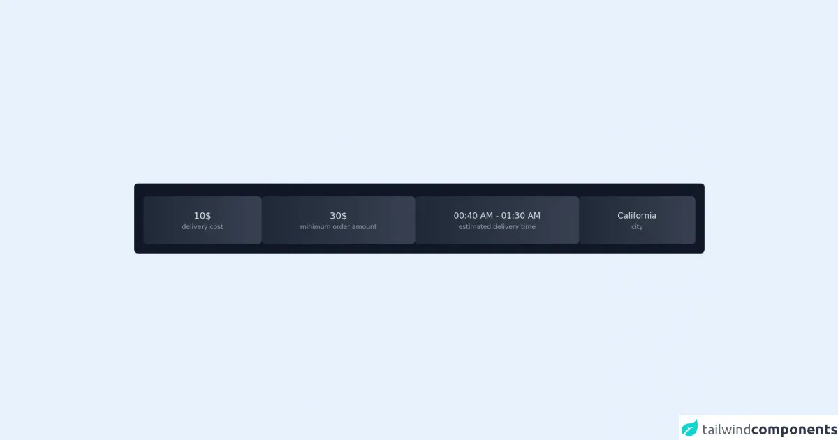
The Preview of Dark Stats Card UI Component
To create a dark stats card UI component, we will use Tailwind CSS to style the HTML elements. The card will contain a title, a value, and a chart to visualize the data. Here is a preview of what the final product will look like:
Free download of the dark stats card's source code
The Source Code of Dark Stats Card UI Component
To create the dark stats card UI component, we will use HTML and Tailwind CSS. Here is the source code for the card:
<div class="flex items-center h-screen justify-center mx-5">
<div class="w-full  mb-2 justify-center rounded-lg text-white bg-gray-900">
   <h3 class="text-white p-3 md:text-2xl lg:text-2xl text-lg"></h3>
   <div class="p-5 pt-1 flex-wrap  flex items-center gap-2 justify-center">
      <div class="bg-gradient-to-r flex-auto  w-42 h-42  from-gray-800 to-gray-700    shadow-lg    rounded-lg">
         <div class="md:p-7 p-4">
            <h2 class="text-xl text-center text-gray-200 capitalize">10$</h2>
            <h3 class="text-sm  text-gray-400  text-center">delivery cost</h3>
         </div>
      </div>
      <div class="bg-gradient-to-r flex-auto w-42 h-42  from-gray-800 to-gray-700    shadow-lg    rounded-lg">
         <div class="md:p-7 p-4">
            <h2 class="text-xl text-center text-gray-200 capitalize">30$</h2>
            <h3 class="text-sm  text-gray-400  text-center">minimum order amount</h3>
         </div>
      </div>
      <div class="bg-gradient-to-r flex-auto  w-42 h-42  from-gray-800 to-gray-700    shadow-lg    rounded-lg">
         <div class="md:p-7 p-4">
            <h2 class="text-lg text-center text-gray-200 capitalize">
                <span>00:40 AM</span>
                <span>-</span>
                <span>01:30 AM</span></h2>
            <h3 class="text-sm  text-gray-400  text-center">estimated delivery time</h3>
         </div>
      </div>
      <div class="bg-gradient-to-r flex-auto  w-42 h-42  from-gray-800 to-gray-700    shadow-lg    rounded-lg">
         <div class="md:p-7 p-4">
            <h2 class="text-lg text-center text-gray-200 capitalize" style="">california</h2>
            <h3 class="text-sm  text-gray-400  text-center">city</h3>
         </div>
      </div>
   </div>
</div>
</div>
How to Create a Dark Stats Card with Tailwind CSS?
To create a dark stats card with Tailwind CSS, follow the steps below:
Step 1: Set Up Your Project
Create a new HTML file and add the following code:
<!DOCTYPE html>
<html lang="en">
  <head>
    <meta charset="UTF-8" />
    <meta name="viewport" content="width=device-width, initial-scale=1.0" />
    <title>Dark Stats Card with Tailwind CSS</title>
    <link
      rel="stylesheet"
      href="https://cdn.jsdelivr.net/npm/[email protected]/dist/tailwind.min.css"
      integrity="sha384-lU2jxg7zJi6mDf7CgJ9R6RZuFw5b7Uf5cLZcBvJ4JG4r+7tX7e7Zjg2iWwq3J4p+"
      crossorigin="anonymous"
    />
  </head>
  <body>
    <!-- Your card goes here -->
  </body>
</html>
This code sets up a basic HTML file and includes the Tailwind CSS framework.
Step 2: Create the Card
Add the following code to create the card:
<div class="bg-gray-800 rounded-lg shadow-lg p-6">
  <div class="flex justify-between items-center">
    <div>
      <h2 class="text-lg font-medium text-white">Total Sales</h2>
      <p class="text-gray-400">Last 30 days</p>
    </div>
    <div class="bg-gray-700 rounded-full p-2">
      <svg
        xmlns="http://www.w3.org/2000/svg"
        class="h-6 w-6 text-white"
        fill="none"
        viewBox="0 0 24 24"
        stroke="currentColor"
      >
        <path
          stroke-linecap="round"
          stroke-linejoin="round"
          stroke-width="2"
          d="M9 5l7 7-7 7"
        />
      </svg>
    </div>
  </div>
  <div class="mt-6">
    <p class="text-3xl font-semibold text-white">$15,000</p>
    <p class="text-gray-400 mt-2">+10% from last month</p>
  </div>
  <div class="mt-6">
    <div class="text-gray-400 text-sm">Sales</div>
    <div class="relative pt-1">
      <div class="overflow-hidden h-2 mb-4 text-xs flex rounded bg-gray-700">
        <div
          style="width: 70%;"
          class="shadow-none flex flex-col text-center whitespace-nowrap text-white justify-center bg-green-500"
        ></div>
      </div>
    </div>
  </div>
</div>
This code creates the card using Tailwind CSS classes. The card has a dark background color, rounded corners, and a shadow effect. It also contains a title, a value, and a chart to visualize the data.
Step 3: Customize the Card
You can customize the card by changing the Tailwind CSS classes. For example, you can change the background color by replacing the bg-gray-800 class with another color utility class, such as bg-blue-800. You can also change the font size and color by using the text-* classes.
Conclusion
In this article, we have shown you how to create a dark stats card UI component with Tailwind CSS. We have explained why Tailwind CSS is a good choice for creating custom designs quickly and provided a step-by-step guide on how to create the card. With Tailwind CSS, you can easily create responsive designs, apply hover effects, and more. We hope this guide has been helpful to you in your FrontEnd technology journey.