- Published on
The 5 Really Obvious Ways To Build A Customers Table With Tailwind CSS Better That You Ever Did
- What is Tailwind CSS?
- The description of Customers Table ui component
- Why use Tailwind CSS to create a Customers Table ui component?
- The preview of Customers Table ui component
- The source code of Customers Table ui component
- How to create a Customers Table with Tailwind CSS?
- Step 1: Set up your development environment
- Step 2: Define the HTML structure
- Step 3: Style the table with Tailwind CSS
- Step 4: Add sorting and filtering functionality
- Conclusion
As a FrontEnd technology blogger, I am always on the lookout for new and innovative ways to create stunning user interfaces. One of the most popular CSS frameworks on the market today is Tailwind CSS. Tailwind CSS is a utility-first CSS framework that allows developers to rapidly create beautiful and responsive user interfaces. In this article, we will explore the 5 really obvious ways to build a customers table with Tailwind CSS better than you ever did.
What is Tailwind CSS?
Tailwind CSS is a utility-first CSS framework that provides a set of pre-defined CSS classes that can be used to style HTML elements. Unlike traditional CSS frameworks, Tailwind CSS does not provide pre-built components, but instead provides a set of low-level utility classes that can be combined to create custom components.
The description of Customers Table ui component
A customers table is a common UI component used in many web applications to display a list of customers. The table typically includes columns for customer name, email address, phone number, and other relevant information. The table may also include sorting and filtering functionality to help users find the information they need.
Why use Tailwind CSS to create a Customers Table ui component?
Tailwind CSS provides a number of benefits when creating a customers table UI component:
Rapid development: Tailwind CSS provides a set of pre-defined utility classes that can be used to rapidly create custom UI components.
Consistency: Tailwind CSS provides a consistent set of utility classes that can be used across multiple components, ensuring a consistent look and feel throughout the application.
Flexibility: Tailwind CSS provides a wide range of utility classes that can be combined to create custom UI components that meet the specific needs of the application.
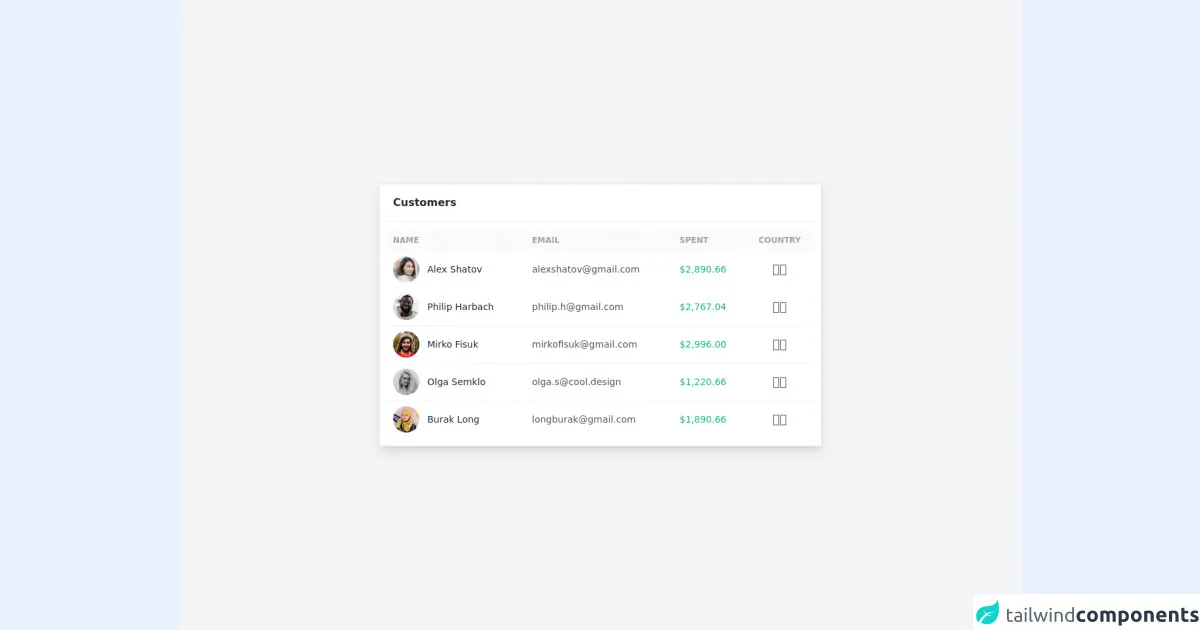
The preview of Customers Table ui component
To give you an idea of what a customers table UI component created with Tailwind CSS might look like, check out the following preview:
Free download of the Customers Table's source code
The source code of Customers Table ui component
Here is an example of the source code for a customers table UI component created with Tailwind CSS:
<section class="antialiased bg-gray-100 text-gray-600 h-screen px-4">
    <div class="flex flex-col justify-center h-full">
        <!-- Table -->
        <div class="w-full max-w-2xl mx-auto bg-white shadow-lg rounded-sm border border-gray-200">
            <header class="px-5 py-4 border-b border-gray-100">
                <h2 class="font-semibold text-gray-800">Customers</h2>
            </header>
            <div class="p-3">
                <div class="overflow-x-auto">
                    <table class="table-auto w-full">
                        <thead class="text-xs font-semibold uppercase text-gray-400 bg-gray-50">
                            <tr>
                                <th class="p-2 whitespace-nowrap">
                                    <div class="font-semibold text-left">Name</div>
                                </th>
                                <th class="p-2 whitespace-nowrap">
                                    <div class="font-semibold text-left">Email</div>
                                </th>
                                <th class="p-2 whitespace-nowrap">
                                    <div class="font-semibold text-left">Spent</div>
                                </th>
                                <th class="p-2 whitespace-nowrap">
                                    <div class="font-semibold text-center">Country</div>
                                </th>
                            </tr>
                        </thead>
                        <tbody class="text-sm divide-y divide-gray-100">
                            <tr>
                                <td class="p-2 whitespace-nowrap">
                                    <div class="flex items-center">
                                        <div class="w-10 h-10 flex-shrink-0 mr-2 sm:mr-3"><img class="rounded-full" src="https://raw.githubusercontent.com/cruip/vuejs-admin-dashboard-template/main/src/images/user-36-05.jpg" width="40" height="40" alt="Alex Shatov"></div>
                                        <div class="font-medium text-gray-800">Alex Shatov</div>
                                    </div>
                                </td>
                                <td class="p-2 whitespace-nowrap">
                                    <div class="text-left">[email protected]</div>
                                </td>
                                <td class="p-2 whitespace-nowrap">
                                    <div class="text-left font-medium text-green-500">$2,890.66</div>
                                </td>
                                <td class="p-2 whitespace-nowrap">
                                    <div class="text-lg text-center">🇺🇸</div>
                                </td>
                            </tr>
                            <tr>
                                <td class="p-2 whitespace-nowrap">
                                    <div class="flex items-center">
                                        <div class="w-10 h-10 flex-shrink-0 mr-2 sm:mr-3"><img class="rounded-full" src="https://raw.githubusercontent.com/cruip/vuejs-admin-dashboard-template/main/src/images/user-36-06.jpg" width="40" height="40" alt="Philip Harbach"></div>
                                        <div class="font-medium text-gray-800">Philip Harbach</div>
                                    </div>
                                </td>
                                <td class="p-2 whitespace-nowrap">
                                    <div class="text-left">[email protected]</div>
                                </td>
                                <td class="p-2 whitespace-nowrap">
                                    <div class="text-left font-medium text-green-500">$2,767.04</div>
                                </td>
                                <td class="p-2 whitespace-nowrap">
                                    <div class="text-lg text-center">🇩🇪</div>
                                </td>
                            </tr>
                            <tr>
                                <td class="p-2 whitespace-nowrap">
                                    <div class="flex items-center">
                                        <div class="w-10 h-10 flex-shrink-0 mr-2 sm:mr-3"><img class="rounded-full" src="https://raw.githubusercontent.com/cruip/vuejs-admin-dashboard-template/main/src/images/user-36-07.jpg" width="40" height="40" alt="Mirko Fisuk"></div>
                                        <div class="font-medium text-gray-800">Mirko Fisuk</div>
                                    </div>
                                </td>
                                <td class="p-2 whitespace-nowrap">
                                    <div class="text-left">[email protected]</div>
                                </td>
                                <td class="p-2 whitespace-nowrap">
                                    <div class="text-left font-medium text-green-500">$2,996.00</div>
                                </td>
                                <td class="p-2 whitespace-nowrap">
                                    <div class="text-lg text-center">🇫🇷</div>
                                </td>
                            </tr>
                            <tr>
                                <td class="p-2 whitespace-nowrap">
                                    <div class="flex items-center">
                                        <div class="w-10 h-10 flex-shrink-0 mr-2 sm:mr-3"><img class="rounded-full" src="https://raw.githubusercontent.com/cruip/vuejs-admin-dashboard-template/main/src/images/user-36-08.jpg" width="40" height="40" alt="Olga Semklo"></div>
                                        <div class="font-medium text-gray-800">Olga Semklo</div>
                                    </div>
                                </td>
                                <td class="p-2 whitespace-nowrap">
                                    <div class="text-left">[email protected]</div>
                                </td>
                                <td class="p-2 whitespace-nowrap">
                                    <div class="text-left font-medium text-green-500">$1,220.66</div>
                                </td>
                                <td class="p-2 whitespace-nowrap">
                                    <div class="text-lg text-center">🇮🇹</div>
                                </td>
                            </tr>
                            <tr>
                                <td class="p-2 whitespace-nowrap">
                                    <div class="flex items-center">
                                        <div class="w-10 h-10 flex-shrink-0 mr-2 sm:mr-3"><img class="rounded-full" src="https://raw.githubusercontent.com/cruip/vuejs-admin-dashboard-template/main/src/images/user-36-09.jpg" width="40" height="40" alt="Burak Long"></div>
                                        <div class="font-medium text-gray-800">Burak Long</div>
                                    </div>
                                </td>
                                <td class="p-2 whitespace-nowrap">
                                    <div class="text-left">[email protected]</div>
                                </td>
                                <td class="p-2 whitespace-nowrap">
                                    <div class="text-left font-medium text-green-500">$1,890.66</div>
                                </td>
                                <td class="p-2 whitespace-nowrap">
                                    <div class="text-lg text-center">🇬🇧</div>
                                </td>
                            </tr>
                        </tbody>
                    </table>
                </div>
            </div>
        </div>
    </div>
</section>
How to create a Customers Table with Tailwind CSS?
Now that we have covered the benefits of using Tailwind CSS to create a customers table UI component, let's take a look at the steps involved in creating one.
Step 1: Set up your development environment
To get started, you will need to set up your development environment. This will typically involve installing Node.js and using npm to install Tailwind CSS.
Step 2: Define the HTML structure
The first step in creating a customers table UI component is to define the HTML structure. This will typically involve creating a table element and defining the columns that will be displayed.
Step 3: Style the table with Tailwind CSS
Once you have defined the HTML structure, you can begin styling the table using Tailwind CSS. This will typically involve adding utility classes to the HTML elements to define the font size, color, padding, and other styling properties.
Step 4: Add sorting and filtering functionality
If your customers table UI component includes sorting and filtering functionality, you will need to add this functionality using JavaScript. This will typically involve adding event listeners to the table headers and using JavaScript to sort and filter the table data.
Conclusion
In conclusion, Tailwind CSS provides a powerful set of tools for creating beautiful and responsive user interfaces. By following the 5 really obvious ways outlined in this article, you can create a customers table UI component that is both functional and visually appealing. So why not give it a try and see what you can create with Tailwind CSS?