- Published on
A Complete Guide To Make A Custom Radio/Toggle Button With Tailwind CSS
- What is Tailwind CSS?
- The description of Custom Radio/Toggle Button ui component
- Why use Tailwind CSS to create a Custom Radio/Toggle Button ui component?
- The preview of Custom Radio/Toggle Button ui component.
- The source code of Custom Radio/Toggle Button ui component.
- How to create a Custom Radio/Toggle Button with Tailwind CSS?
- Conclusion
What is Tailwind CSS?
Tailwind CSS is a utility-first CSS framework that allows developers to create custom designs quickly and easily. It provides a set of pre-defined CSS classes that can be used to style HTML elements. With Tailwind CSS, developers can create responsive and mobile-first designs without writing any CSS code.
The description of Custom Radio/Toggle Button ui component
A custom radio/toggle button is a UI component that allows users to select an option from a list. It consists of a group of radio buttons or toggle switches that are styled to match the design of the website or application. Custom radio/toggle buttons are often used in forms, surveys, and other interactive elements.
Why use Tailwind CSS to create a Custom Radio/Toggle Button ui component?
Tailwind CSS provides a set of pre-defined CSS classes that can be used to create custom radio/toggle buttons quickly and easily. It also allows developers to customize the design of the buttons without writing any CSS code. This makes it an ideal choice for developers who want to create custom UI components without spending a lot of time on styling.
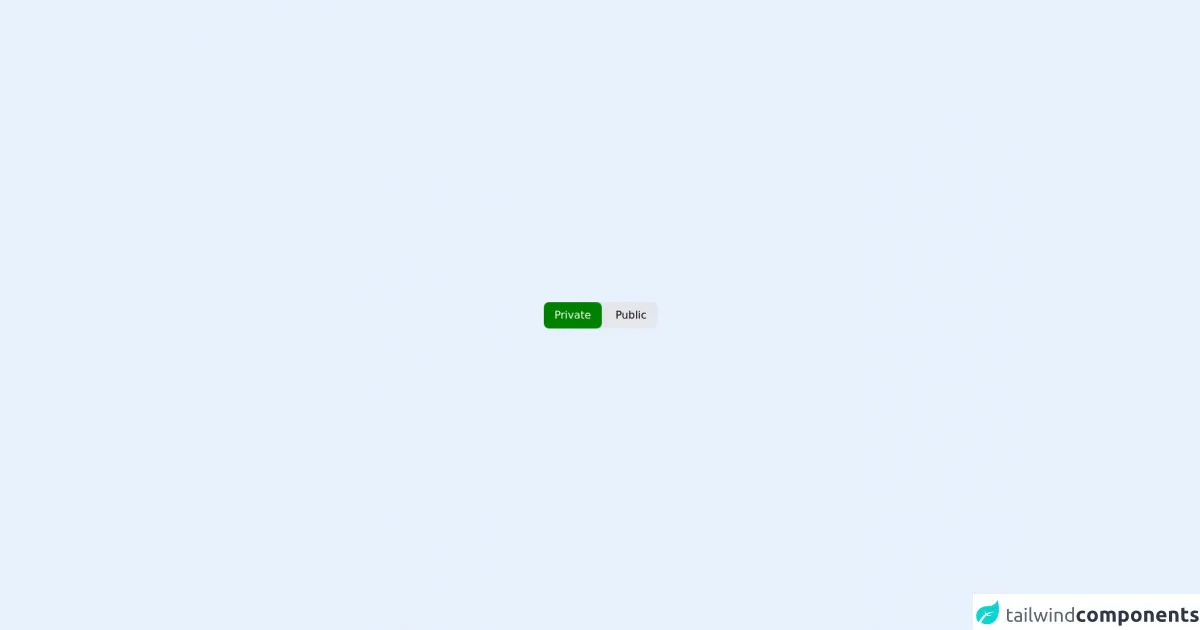
The preview of Custom Radio/Toggle Button ui component.
To create a custom radio/toggle button with Tailwind CSS, we will use a combination of HTML and CSS code. The final result will be a group of radio buttons or toggle switches that are styled to match the design of the website or application.
Free download of the Custom Radio/Toggle Button's source code
The source code of Custom Radio/Toggle Button ui component.
The source code for the custom radio/toggle button is relatively simple. It consists of a group of HTML elements that are styled using Tailwind CSS classes. The code can be easily customized to match the design of the website or application.
<!-- @author: Hackcharms -->
<style>
    input:checked ~ .radio {
  color:white;
  background-color: green;
}
</style>
<div class="flex justify-center items-center h-screen">
  <div class="bg-gray-200 rounded-lg">
<div class="inline-flex rounded-lg">
  <input type="radio" name="room_type" id="roomPrivate" checked hidden/>
  <label for="roomPrivate" class="radio text-center self-center py-2 px-4 rounded-lg cursor-pointer hover:opacity-75">Private</label>
</div>
<div class="inline-flex rounded-lg">
  <input type="radio" name="room_type" id="roomPublic" hidden/>
  <label for="roomPublic" class="radio text-center self-center py-2 px-4 rounded-lg cursor-pointer hover:opacity-75">Public</label>
</div>
</div>
</div>
</div>
How to create a Custom Radio/Toggle Button with Tailwind CSS?
To create a custom radio/toggle button with Tailwind CSS, follow these steps:
- Create an HTML element for the radio/toggle button group.
- Add a label element for each option in the group.
- Add a radio button or toggle switch input element for each option in the group.
- Style the radio/toggle button group using Tailwind CSS classes.
Here's an example of the HTML code for a custom radio button group:
<div class="flex items-center">
  <input type="radio" class="form-radio h-4 w-4 text-indigo-600 transition duration-150 ease-in-out" name="radio-button-group" id="radio-button-1" value="option1">
  <label for="radio-button-1" class="ml-3">
    <span class="block text-sm leading-5 font-medium text-gray-700">Option 1</span>
  </label>
</div>
<div class="flex items-center mt-2">
  <input type="radio" class="form-radio h-4 w-4 text-indigo-600 transition duration-150 ease-in-out" name="radio-button-group" id="radio-button-2" value="option2">
  <label for="radio-button-2" class="ml-3">
    <span class="block text-sm leading-5 font-medium text-gray-700">Option 2</span>
  </label>
</div>
In this example, we've used the form-radio class to style the radio buttons. We've also used the ml-3 class to add some margin to the left of the label element.
To create a toggle button group, we can use the form-checkbox class instead of the form-radio class. Here's an example of the HTML code for a custom toggle button group:
<div class="flex items-center">
  <input type="checkbox" class="form-checkbox h-4 w-4 text-indigo-600 transition duration-150 ease-in-out" name="toggle-button-group" id="toggle-button-1" value="option1">
  <label for="toggle-button-1" class="ml-3">
    <span class="block text-sm leading-5 font-medium text-gray-700">Option 1</span>
  </label>
</div>
<div class="flex items-center mt-2">
  <input type="checkbox" class="form-checkbox h-4 w-4 text-indigo-600 transition duration-150 ease-in-out" name="toggle-button-group" id="toggle-button-2" value="option2">
  <label for="toggle-button-2" class="ml-3">
    <span class="block text-sm leading-5 font-medium text-gray-700">Option 2</span>
  </label>
</div>
In this example, we've used the form-checkbox class to style the toggle buttons.
To customize the design of the radio/toggle button group, we can use Tailwind CSS classes. For example, we can use the text-indigo-600 class to change the color of the buttons, and the ml-3 class to add some margin to the left of the label element.
Conclusion
Creating custom radio/toggle buttons with Tailwind CSS is a quick and easy way to add custom UI components to your website or application. With Tailwind CSS, developers can create responsive and mobile-first designs without writing any CSS code. By following the steps outlined in this guide, you can create custom radio/toggle buttons that match the design of your website or application.