- Published on
6 Steps To Build A Checkbox With Tailwind CSS Like A Pro In Under An Hour
- What is Tailwind CSS?
- The description of Checkbox UI component
- Why use Tailwind CSS to create a Checkbox UI component?
- The preview of Checkbox UI component
- The source code of Checkbox UI component
- How to create a Checkbox with Tailwind CSS?
- Step 1: Create the HTML structure
- Step 2: Style the Checkbox
- Step 3: Style the Checkbox label
- Step 4: Add additional styles
- Step 5: Add more Checkbox options
- Step 6: Customize the Checkbox styles
- Conclusion
As a FrontEnd technology blogger, one of the most important things is to keep up with the latest trends and tools in the industry. One of the most popular tools in recent years is Tailwind CSS. It is a utility-first CSS framework that allows developers to quickly and easily create beautiful and responsive user interfaces. In this article, we will walk through the process of building a Checkbox UI component using Tailwind CSS.
What is Tailwind CSS?
Tailwind CSS is a utility-first CSS framework that provides a set of pre-defined CSS classes that can be used to quickly and easily style HTML elements. It is designed to be highly customizable and allows developers to create unique and beautiful user interfaces without writing custom CSS code.
The description of Checkbox UI component
A Checkbox is a UI component that allows users to select one or more options from a list of choices. It is commonly used in forms and surveys to collect data from users. A Checkbox consists of a small square box and a label that describes the option.
Why use Tailwind CSS to create a Checkbox UI component?
Tailwind CSS provides a set of pre-defined CSS classes that can be used to style a Checkbox UI component. This makes it easy to create a Checkbox that is both functional and visually appealing. Additionally, Tailwind CSS is highly customizable, which means that developers can easily modify the styles to match the design requirements of their project.
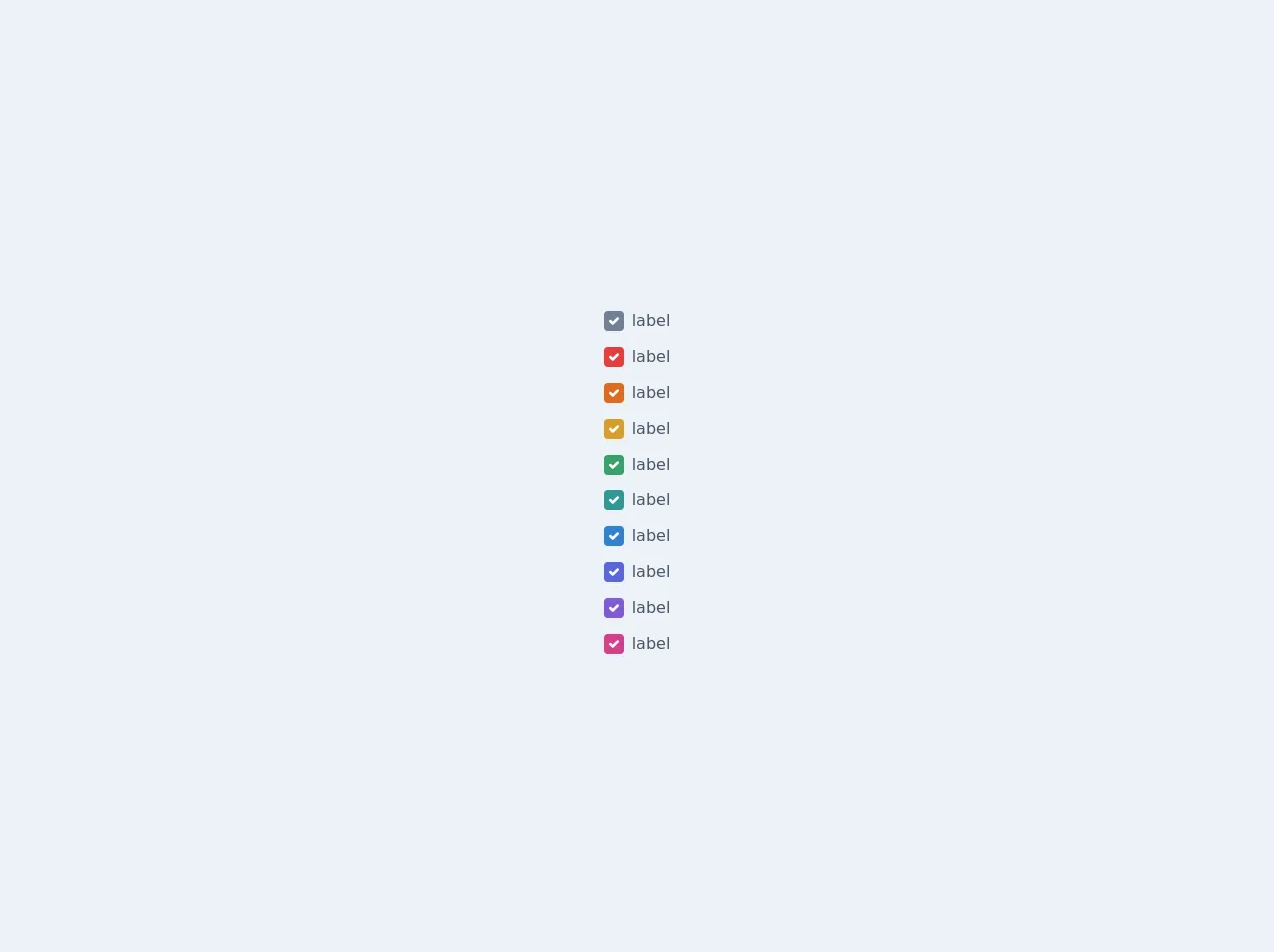
The preview of Checkbox UI component
To create a Checkbox UI component with Tailwind CSS, we will use a combination of CSS classes to style the Checkbox and its label. The result will be a Checkbox that is both functional and visually appealing.
Free download of the Checkbox's source code
The source code of Checkbox UI component
To create a Checkbox UI component with Tailwind CSS, we will use a combination of HTML and CSS code. The HTML code will define the structure of the Checkbox and its label, while the CSS code will style the Checkbox and its label.
<div class="bg-gray-200">
    <div class="flex flex-col items-center justify-center h-screen">
        <div class="flex flex-col">
            <label class="inline-flex items-center mt-3">
                <input type="checkbox" class="form-checkbox h-5 w-5 text-gray-600" checked><span class="ml-2 text-gray-700">label</span>
            </label>

            <label class="inline-flex items-center mt-3">
                <input type="checkbox" class="form-checkbox h-5 w-5 text-red-600" checked><span class="ml-2 text-gray-700">label</span>
            </label>

            <label class="inline-flex items-center mt-3">
                <input type="checkbox" class="form-checkbox h-5 w-5 text-orange-600" checked><span class="ml-2 text-gray-700">label</span>
            </label>

            <label class="inline-flex items-center mt-3">
                <input type="checkbox" class="form-checkbox h-5 w-5 text-yellow-600" checked><span class="ml-2 text-gray-700">label</span>
            </label>

            <label class="inline-flex items-center mt-3">
                <input type="checkbox" class="form-checkbox h-5 w-5 text-green-600" checked><span class="ml-2 text-gray-700">label</span>
            </label>

            <label class="inline-flex items-center mt-3">
                <input type="checkbox" class="form-checkbox h-5 w-5 text-teal-600" checked><span class="ml-2 text-gray-700">label</span>
            </label>

            <label class="inline-flex items-center mt-3">
                <input type="checkbox" class="form-checkbox h-5 w-5 text-blue-600" checked><span class="ml-2 text-gray-700">label</span>
            </label>

            <label class="inline-flex items-center mt-3">
                <input type="checkbox" class="form-checkbox h-5 w-5 text-indigo-600" checked><span class="ml-2 text-gray-700">label</span>
            </label>

            <label class="inline-flex items-center mt-3">
                <input type="checkbox" class="form-checkbox h-5 w-5 text-purple-600" checked><span class="ml-2 text-gray-700">label</span>
            </label>

            <label class="inline-flex items-center mt-3">
                <input type="checkbox" class="form-checkbox h-5 w-5 text-pink-600" checked><span class="ml-2 text-gray-700">label</span>
            </label>
        </div>
    </div>
</div>
How to create a Checkbox with Tailwind CSS?
Now that we have an understanding of what Tailwind CSS is and why it is useful for creating a Checkbox UI component, let's walk through the process of building a Checkbox with Tailwind CSS.
Step 1: Create the HTML structure
The first step in creating a Checkbox with Tailwind CSS is to create the HTML structure. The HTML structure consists of a label element and an input element with a type of "checkbox". The label element is used to describe the Checkbox option, while the input element is used to capture the user's selection.
<label class="flex items-center">
  <input type="checkbox" class="form-checkbox h-5 w-5 text-gray-600">
  <span class="ml-2 text-gray-700">Option 1</span>
</label>
Step 2: Style the Checkbox
The next step is to style the Checkbox using Tailwind CSS classes. We will use the "form-checkbox" class to style the Checkbox and the "text-gray-600" class to set the color of the Checkbox to gray.
<input type="checkbox" class="form-checkbox h-5 w-5 text-gray-600">
Step 3: Style the Checkbox label
The Checkbox label is styled using the "text-gray-700" class to set the color of the label to gray and the "ml-2" class to add some margin to the left of the label.
<span class="ml-2 text-gray-700">Option 1</span>
Step 4: Add additional styles
Tailwind CSS provides a wide range of additional classes that can be used to further customize the Checkbox. For example, we can use the "flex" and "items-center" classes to center the Checkbox and its label.
<label class="flex items-center">
  <input type="checkbox" class="form-checkbox h-5 w-5 text-gray-600">
  <span class="ml-2 text-gray-700">Option 1</span>
</label>
Step 5: Add more Checkbox options
To add more Checkbox options, simply duplicate the HTML code and update the label text.
<label class="flex items-center">
  <input type="checkbox" class="form-checkbox h-5 w-5 text-gray-600">
  <span class="ml-2 text-gray-700">Option 2</span>
</label>

<label class="flex items-center">
  <input type="checkbox" class="form-checkbox h-5 w-5 text-gray-600">
  <span class="ml-2 text-gray-700">Option 3</span>
</label>
Step 6: Customize the Checkbox styles
Tailwind CSS provides a wide range of customization options that can be used to modify the styles of the Checkbox. For example, we can use the "hover:text-blue-500" class to change the color of the label when the user hovers over the Checkbox.
<label class="flex items-center">
  <input type="checkbox" class="form-checkbox h-5 w-5 text-gray-600 hover:text-blue-500">
  <span class="ml-2 text-gray-700">Option 1</span>
</label>
Conclusion
In this article, we have walked through the process of building a Checkbox UI component using Tailwind CSS. We have learned about the benefits of using Tailwind CSS for UI development and have seen how easy it is to create a Checkbox with Tailwind CSS. By following the steps outlined in this article, you can create beautiful and functional UI components in no time.