- Published on
6 Tips To Make A Counter Buttons With An Input With Tailwind CSS
- What is Tailwind CSS?
- The description of Counter Buttons with an Input ui component
- Why use Tailwind CSS to create a Counter Buttons with an Input ui component?
- The preview of Counter Buttons with an Input ui component
- The source code of Counter Buttons with an Input ui component
- How to create a Counter Buttons with an Input with Tailwind CSS?
- Step 1: Create the HTML structure
- Step 2: Style the HTML elements with Tailwind CSS
- Step 3: Add JavaScript functionality
- Conclusion
As a FrontEnd technology blogger, I'm always on the lookout for new and exciting ways to create beautiful and functional UI components. One such component that has been gaining popularity recently is the Counter Buttons with an Input. In this article, I will show you how to create this UI component using Tailwind CSS.
What is Tailwind CSS?
Tailwind CSS is a utility-first CSS framework that allows you to quickly and easily create custom designs without having to write a lot of CSS code. It provides a set of pre-defined classes that you can use to style your HTML elements. With Tailwind CSS, you can create beautiful and functional UI components in a fraction of the time it would take you to write custom CSS from scratch.
The description of Counter Buttons with an Input ui component
The Counter Buttons with an Input is a UI component that consists of an input field and two buttons that allow the user to increment or decrement the value of the input field. This UI component is commonly used in e-commerce websites, where the user needs to select the quantity of a product they want to purchase.
Why use Tailwind CSS to create a Counter Buttons with an Input ui component?
Tailwind CSS provides a set of pre-defined classes that allow you to quickly and easily create the Counter Buttons with an Input UI component. With Tailwind CSS, you can create this UI component in a fraction of the time it would take you to write custom CSS from scratch.
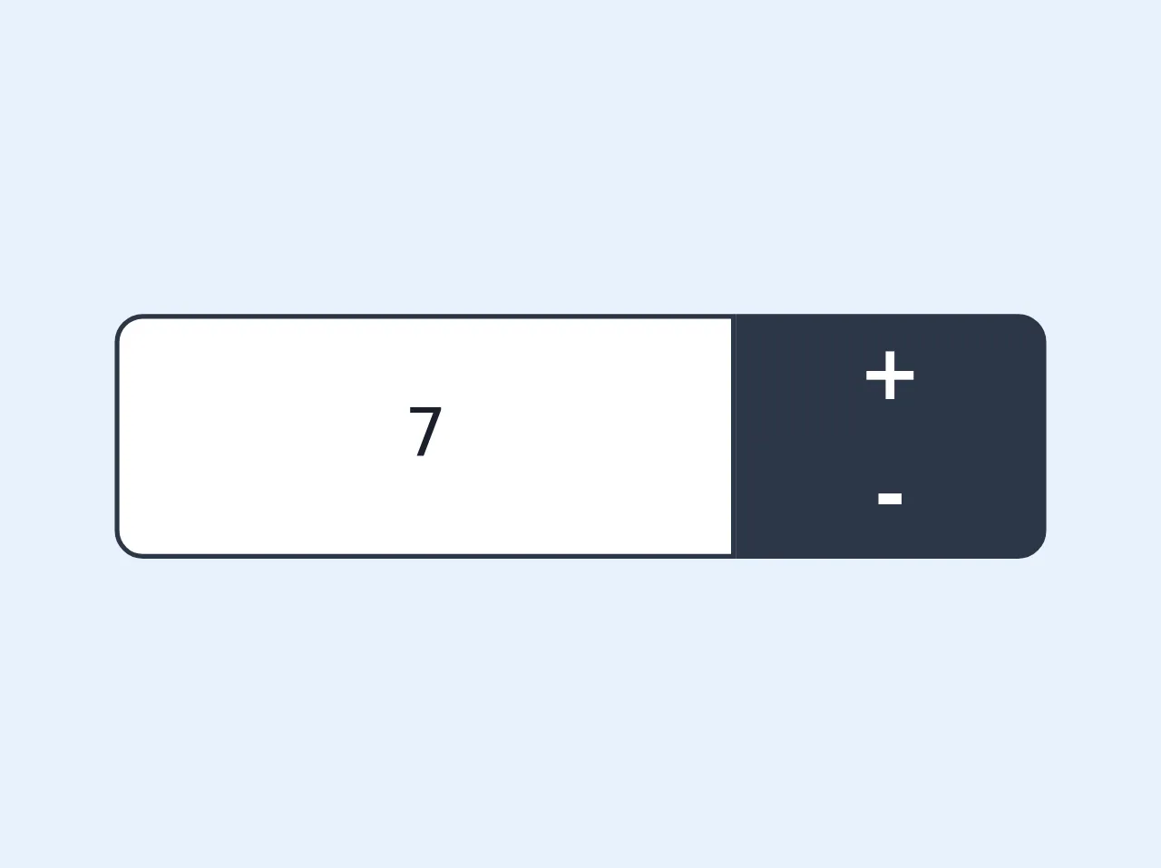
The preview of Counter Buttons with an Input ui component
To create the Counter Buttons with an Input UI component, we will use Tailwind CSS classes to style the HTML elements. The final result will look something like this:
Free download of the Counter Buttons with an Input's source code
The source code of Counter Buttons with an Input ui component
To create the Counter Buttons with an Input UI component, we will use HTML and Tailwind CSS. The source code will look something like this:
<div class="flex flex-wrap">
 <div class="flex w-8/12">
   <input type="text" value="7"
   class="bg-white text-sm text-gray-900 text-center focus:outline-none border border-gray-800 focus:border-gray-600 rounded-l-md w-full">
  </div>
<div class="flex flex-col w-4/12">
   <button
   class="text-white text-center text-md font-semibold rounded-tr-md px-1 bg-gray-800 focus:bg-gray-600 focus:outline-none border border-gray-800 focus:border-gray-600">
   +
   </button>
   <button
   class="text-white text-center text-md font-semibold rounded-br-md px-1 bg-gray-800 focus:bg-gray-600 focus:outline-none border border-gray-800 focus:border-gray-600">
   -
  </button>
 </div>
</div>
How to create a Counter Buttons with an Input with Tailwind CSS?
Now that we have seen the preview and source code of the Counter Buttons with an Input UI component, let's dive into the steps to create this UI component with Tailwind CSS.
Step 1: Create the HTML structure
The first step is to create the HTML structure for the Counter Buttons with an Input UI component. We will use a div element to wrap the input field and buttons. Here's the HTML code:
<div class="flex items-center justify-center">
  <button>-</button>
  <input type="text" value="1">
  <button>+</button>
</div>
Step 2: Style the HTML elements with Tailwind CSS
Next, we will use Tailwind CSS classes to style the HTML elements. We will add classes to the div, button, and input elements. Here's the updated HTML code:
<div class="flex items-center justify-center">
  <button class="bg-gray-300 hover:bg-gray-400 text-gray-800 font-bold py-2 px-4 rounded-l">
    -
  </button>
  <input class="appearance-none block w-16 text-center bg-gray-200 text-gray-700 font-bold py-2 px-4 rounded" type="text" value="1">
  <button class="bg-gray-300 hover:bg-gray-400 text-gray-800 font-bold py-2 px-4 rounded-r">
    +
  </button>
</div>
Step 3: Add JavaScript functionality
Finally, we will add JavaScript functionality to the buttons to increment or decrement the value of the input field. Here's the JavaScript code:
const decrementButton = document.querySelector('.decrement');
const incrementButton = document.querySelector('.increment');
const inputField = document.querySelector('input');

decrementButton.addEventListener('click', () => {
  let currentValue = parseInt(inputField.value);
  if (currentValue > 1) {
    inputField.value = currentValue - 1;
  }
});

incrementButton.addEventListener('click', () => {
  let currentValue = parseInt(inputField.value);
  inputField.value = currentValue + 1;
});
Conclusion
In this article, we have learned how to create a Counter Buttons with an Input UI component using Tailwind CSS. We have seen the preview and source code of this UI component, as well as the steps to create it. With Tailwind CSS, you can create beautiful and functional UI components in a fraction of the time it would take you to write custom CSS from scratch.