- Published on
Imagine You Make A Cool Text Inputs And Login With Tailwind CSS Like An Expert. Follow These 6 Steps To Get There
- What is Tailwind CSS?
- The description of Cool Text Inputs and Login UI component
- Why use Tailwind CSS to create a Cool Text Inputs and Login UI component?
- The preview of Cool Text Inputs and Login UI component.
- The source code of Cool Text Inputs and Login UI component.
- How to create a Cool Text Inputs and Login with Tailwind CSS?
- Step 1: Set up your project
- Step 2: Add Tailwind CSS to your project
- Step 3: Create the HTML for your component
- Step 4: Style your component with Tailwind CSS
- Step 5: Add interactivity to your component
- Step 6: Test your component
- Conclusion
Are you looking to create a cool text input and login UI component for your website or application? Look no further than Tailwind CSS. With its intuitive design and powerful features, Tailwind CSS is the perfect tool for creating stunning UI components that will impress your users.
In this article, we will walk you through the process of creating a cool text input and login UI component using Tailwind CSS. We will cover everything from the basics of Tailwind CSS to the step-by-step process of creating your component.
What is Tailwind CSS?
Tailwind CSS is a utility-first CSS framework that allows you to quickly and easily create custom user interfaces. With Tailwind CSS, you can create complex layouts and designs without writing a single line of custom CSS.
Tailwind CSS provides a set of pre-defined classes that you can use to style your UI components. These classes are designed to be easy to understand and use, making it easy for developers of all skill levels to create beautiful user interfaces.
The description of Cool Text Inputs and Login UI component
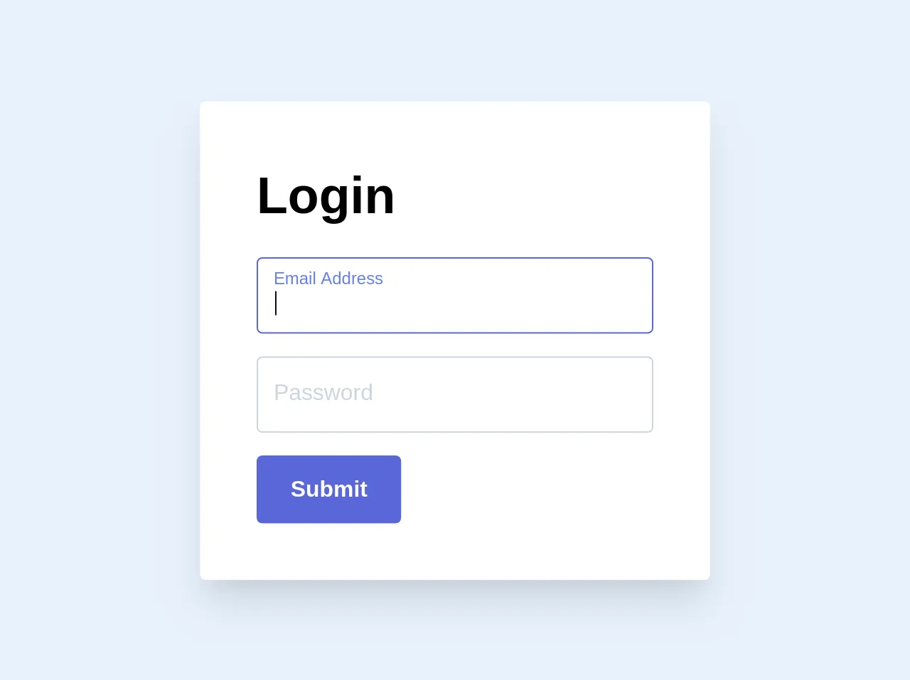
The cool text input and login UI component is a simple but stylish design that features a login form with two input fields for email and password. The form also includes a "Remember Me" checkbox, a "Forgot Password" link, and a "Login" button.
The text input fields have a unique design, with a border that changes color when the field is focused. The "Remember Me" checkbox and "Forgot Password" link are styled with a subtle hover effect, and the "Login" button has a gradient background that adds a touch of elegance to the design.
Why use Tailwind CSS to create a Cool Text Inputs and Login UI component?
Tailwind CSS is the perfect tool for creating a cool text input and login UI component. With its intuitive design and powerful features, Tailwind CSS makes it easy to create stunning UI components that will impress your users.
Tailwind CSS provides a set of pre-defined classes that you can use to style your UI components. These classes are designed to be easy to understand and use, making it easy for developers of all skill levels to create beautiful user interfaces.
The preview of Cool Text Inputs and Login UI component.
To see what the cool text input and login UI component looks like, check out the preview below:
Free download of the Cool Text Inputs and Login's source code
The source code of Cool Text Inputs and Login UI component.
To create the cool text input and login UI component, you will need to use HTML and CSS. Here is the source code for the component:
<style>
    .input {
        transition: border 0.2s ease-in-out;
        min-width: 280px
    }

    .input:focus+.label,
    .input:active+.label,
    .input.filled+.label {
        font-size: .75rem;
        transition: all 0.2s ease-out;
        top: -0.1rem;
        color: #667eea;
    }

    .label {
        transition: all 0.2s ease-out;
        top: 0.4rem;
      	left: 0;
    }
</style>
<div class="shadow-xl p-10 bg-white max-w-xl rounded">
    <h1 class="text-4xl font-black mb-4">Login</h1>
    <div class="mb-4 relative">
        <input class="input border border-gray-400 appearance-none rounded w-full px-3 py-3 pt-5 pb-2 focus focus:border-indigo-600 focus:outline-none active:outline-none active:border-indigo-600" id="email" type="text" autofocus>
        <label for="email" class="label absolute mb-0 -mt-2 pt-4 pl-3 leading-tighter text-gray-400 text-base mt-2 cursor-text">Email Address</label>
    </div>
    <div class="mb-4 relative">
        <input class="input border border-gray-400 appearance-none rounded w-full px-3 py-3 pt-5 pb-2 focus focus:border-indigo-600 focus:outline-none active:outline-none active:border-indigo-600" id="password" type="password" autofocus>
        <label for="password" class="label absolute mb-0 -mt-2 pt-4 pl-3 leading-tighter text-gray-400 text-base mt-2 cursor-text">Password</label>
    </div>
    <button class="bg-indigo-600 hover:bg-blue-dark text-white font-bold py-3 px-6 rounded">Submit</button>
</div>

<script>
    var toggleInputContainer = function (input) {
        if (input.value != "") {
            input.classList.add('filled');
        } else {
            input.classList.remove('filled');
        }
    }

    var labels = document.querySelectorAll('.label');
    for (var i = 0; i < labels.length; i++) {
        labels[i].addEventListener('click', function () {
            this.previousElementSibling.focus();
        });
    }

    window.addEventListener("load", function () {
        var inputs = document.getElementsByClassName("input");
        for (var i = 0; i < inputs.length; i++) {
            console.log('looped');
            inputs[i].addEventListener('keyup', function () {
                toggleInputContainer(this);
            });
            toggleInputContainer(inputs[i]);
        }
    });
</script>
How to create a Cool Text Inputs and Login with Tailwind CSS?
Now that you understand the basics of Tailwind CSS and the cool text input and login UI component, it's time to start creating your own component. Here are the six steps you need to follow to get started:
Step 1: Set up your project
Before you can start using Tailwind CSS, you need to set up your project. You can do this by downloading the Tailwind CSS files or by using a package manager like npm.
Step 2: Add Tailwind CSS to your project
Once you have set up your project, you need to add Tailwind CSS to your project. You can do this by importing the Tailwind CSS files into your project or by using a CDN.
Step 3: Create the HTML for your component
Next, you need to create the HTML for your component. This will include the form elements, such as the input fields, checkbox, and button.
Step 4: Style your component with Tailwind CSS
Once you have created the HTML for your component, you can start styling it with Tailwind CSS. You can use the pre-defined classes to style your component, or you can create your own custom classes.
Step 5: Add interactivity to your component
To make your component more interactive, you can add JavaScript to handle events like form submission and button clicks.
Step 6: Test your component
Finally, you need to test your component to make sure it works as expected. You can do this by submitting the form and verifying that the data is sent to the server.
Conclusion
Creating a cool text input and login UI component with Tailwind CSS is easy and fun. With its intuitive design and powerful features, Tailwind CSS makes it easy for developers of all skill levels to create stunning user interfaces.
By following the six steps outlined in this article, you can create your own cool text input and login UI component that will impress your users and make your website or application stand out. So what are you waiting for? Start creating your own UI components with Tailwind CSS today!