- Published on
6 Critical Skills To Make A Course Card With Tailwind CSS Remarkably Well

- What is Tailwind CSS?
- The description of Course Card UI component
- Why use Tailwind CSS to create a Course Card UI component?
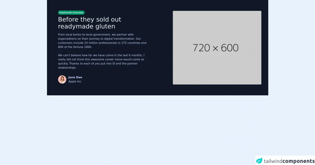
- The preview of Course Card UI component
- The source code of Course Card UI component
- How to create a Course Card with Tailwind CSS?
- Conclusion
As a FrontEnd technology blogger, you must have heard of Tailwind CSS, which is a utility-first CSS framework that allows you to create custom designs without writing any CSS. In this article, we will discuss how to create a Course Card UI component with Tailwind CSS.
What is Tailwind CSS?
Tailwind CSS is a CSS framework that provides a set of pre-defined CSS classes that you can use to style your HTML elements. It is a utility-first framework, which means that it focuses on providing small, single-purpose classes that can be combined to create complex designs.
The description of Course Card UI component
A Course Card is a UI component that is commonly used in online learning platforms to display information about a course. It usually includes a thumbnail image, the course title, a brief description, and a call-to-action button to enroll in the course.
Why use Tailwind CSS to create a Course Card UI component?
Tailwind CSS provides a set of pre-defined classes that can be used to create a Course Card UI component. It also allows you to customize the design of the component by adding your own classes. This makes it easy to create a Course Card that matches the design of your website or application.
The preview of Course Card UI component
To create a Course Card UI component with Tailwind CSS, you can use the following classes:
bg-white: Sets the background color of the card to white.shadow-md: Adds a shadow effect to the card.rounded-md: Rounds the corners of the card.overflow-hidden: Hides any content that overflows the card.w-full: Sets the width of the card to 100%.h-96: Sets the height of the card to 96px.bg-cover: Sets the background image of the card to cover the entire card.bg-center: Sets the background image to be centered.p-6: Adds padding to the card.flex flex-col justify-between: Sets the card to be a flexbox with a column layout and justify the content between the top and bottom of the card.text-gray-900 font-bold text-xl mb-2: Sets the font color to gray, the font weight to bold, the font size to extra large, and adds a margin bottom of 2 to the course title.text-gray-600 text-base: Sets the font color to gray and the font size to base for the course description.mt-4: Adds a margin top of 4 to the course description.flex items-center: Sets the card to be a flexbox with the items centered.justify-end: Justifies the content to the end of the card.text-purple-500: Sets the font color to purple.font-semibold: Sets the font weight to semi-bold.text-sm: Sets the font size to small.hover:text-purple-700: Changes the font color to purple when the card is hovered over.
Free download of the Course Card's source code
The source code of Course Card UI component
To create a Course Card UI component with Tailwind CSS, you can use the following HTML code:
<div class="bg-white shadow-md rounded-md overflow-hidden w-full h-96" style="background-image: url('course-thumbnail.jpg');">
  <div class="p-6 flex flex-col justify-between">
    <div>
      <div class="text-gray-900 font-bold text-xl mb-2">Course Title</div>
      <p class="text-gray-600 text-base">Course Description</p>
    </div>
    <div class="mt-4 flex items-center justify-end">
      <div class="text-purple-500 font-semibold text-sm hover:text-purple-700">Enroll Now</div>
    </div>
  </div>
</div>
<section class="text-indigo-200 body-font p-5 bg-gray-900">
      <Link to="coursedet">
        <div class="mx-auto flex px-5  md:flex-row flex-col items-center jobcard">
          <div class="lg:flex-grow md:w-1/2 lg:pr-24 md:pr-16 flex flex-col md:items-start md:text-left mb-16 md:mb-0 items-center">

            <figure class="visible">

                            <div class="">

                                <div class="pt-10 px-2 sm:px-6">
                                <span class="inline-block py-1 px-2 rounded-full bg-green-600 text-white  text-xs font-bold tracking-widest mb-2">Featured Courses</span>
                                <h1 class="title-font sm:text-4xl text-3xl mb-4 font-medium text-gray-100">Before they sold out
              <br class="hidden lg:inline-block" />readymade gluten
            </h1>
                                    <p class="text-indigo-200 text-base pb-6">From local banks to local government, we partner with organizations on their journey to digital transformation. Our customers include 15 million professionals in 175 countries and 800 of the fortune 1000.</p>
                                    <p class="text-indigo-200 text-base pb-8">We can't believe how far we have come in the last 6 months. I really did not think this awesome career move would come so quickly. Thanks to each of you put into SI and the partner relationships.</p>
                                    <div class="flex items-center justify-between">
                                        <div class="flex items-center pb-12">
                                            <div class="h-12 w-12">
                                                <img src="https://tuk-cdn.s3.amazonaws.com/assets/components/testimonials/t_1.png" alt class="h-full w-full object-cover overflow-hidden rounded-full" />
                                            </div>
                                            <p class="text-indigo-200 font-bold ml-3">
                                                Jane Doe <br />
                                                <span class="text-indigo-200 text-base font-light">Apple Inc</span>
                                            </p>
                                        </div>

                                    </div>
                                </div>
                            </div>
                        </figure>

          </div>
          <div class="lg:max-w-lg lg:w-full md:w-1/2 w-5/6 sm:block hidden">
            <img class="object-cover object-center rounded" alt="hero" src="https://dummyimage.com/720x600" />
          </div>
        </div>
        </Link>
      </section>
How to create a Course Card with Tailwind CSS?
To create a Course Card with Tailwind CSS, you need to follow these steps:
- Create a new HTML file and add the above HTML code.
- Replace the
course-thumbnail.jpgwith the URL of your course thumbnail image. - Customize the classes to match the design of your website or application.
Conclusion
In conclusion, Tailwind CSS is a powerful CSS framework that allows you to create custom designs without writing any CSS. By using the pre-defined classes provided by Tailwind CSS, you can easily create a Course Card UI component that matches the design of your website or application. With the skills mentioned in this article, you can create a Course Card with Tailwind CSS remarkably well.