- Published on
6 Ideas To Help You Build A Contact + Map With Tailwind CSS Like A Pro
- What is Tailwind CSS?
- The description of Contact + Map ui component
- Why use Tailwind CSS to create a Contact + Map ui component?
- The preview of Contact + Map ui component
- The source code of Contact + Map ui component
- How to create a Contact + Map with Tailwind CSS?
- 1. Use the grid system to layout the component
- 2. Style the map using custom CSS classes
- 3. Use utility classes to style the contact information
- 4. Use responsive classes to ensure the component looks good on all screen sizes
- 5. Add hover effects to the map markers
- 6. Use custom fonts and colors to match your branding
- Conclusion
What is Tailwind CSS?
Tailwind CSS is a utility-first CSS framework that provides a set of pre-defined CSS classes that can be used to style HTML elements. It is a popular choice for front-end developers who want to create responsive and customizable user interfaces quickly and efficiently.
The description of Contact + Map ui component
A Contact + Map UI component is a common feature on many websites that allows users to view the location of a business or organization and get in touch with them. It typically includes a map, contact information such as phone number and email address, and sometimes a contact form.
Why use Tailwind CSS to create a Contact + Map ui component?
Tailwind CSS provides a wide range of pre-defined CSS classes that can be used to style and customize UI components quickly and efficiently. This makes it an ideal choice for creating a Contact + Map UI component, where you need to style multiple elements and ensure that they are responsive across different screen sizes.
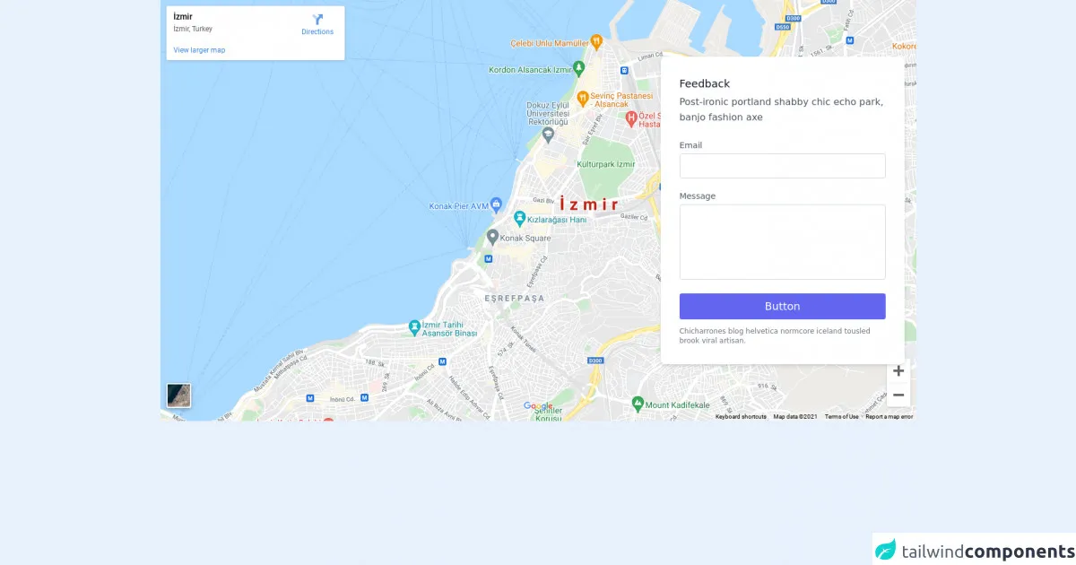
The preview of Contact + Map ui component
To create a Contact + Map UI component with Tailwind CSS, you can use a combination of HTML and CSS classes to style the different elements. Here's a preview of what the final component might look like:
Free download of the Contact + Map's source code
The source code of Contact + Map ui component
To create the Contact + Map UI component, you can use a combination of HTML and Tailwind CSS classes. Here's an example of what the source code might look like:
<section class="text-gray-600 body-font relative">
  <div class="absolute inset-0 bg-gray-300">
    <iframe width="100%" height="100%" frameborder="0" marginheight="0" marginwidth="0" title="map" scrolling="no" src="https://maps.google.com/maps?width=100%&height=600&hl=en&q=%C4%B0zmir+(My%20Business%20Name)&ie=UTF8&t=&z=14&iwloc=B&output=embed" style=""></iframe>
  </div>
  <div class="container px-5 py-24 mx-auto flex">
    <div class="lg:w-1/3 md:w-1/2 bg-white rounded-lg p-8 flex flex-col md:ml-auto w-full mt-10 md:mt-0 relative z-10 shadow-md">
      <h2 class="text-gray-900 text-lg mb-1 font-medium title-font">Feedback</h2>
      <p class="leading-relaxed mb-5 text-gray-600">Post-ironic portland shabby chic echo park, banjo fashion axe</p>
      <div class="relative mb-4">
        <label for="email" class="leading-7 text-sm text-gray-600">Email</label>
        <input type="email" id="email" name="email" class="w-full bg-white rounded border border-gray-300 focus:border-indigo-500 focus:ring-2 focus:ring-indigo-200 text-base outline-none text-gray-700 py-1 px-3 leading-8 transition-colors duration-200 ease-in-out">
      </div>
      <div class="relative mb-4">
        <label for="message" class="leading-7 text-sm text-gray-600">Message</label>
        <textarea id="message" name="message" class="w-full bg-white rounded border border-gray-300 focus:border-indigo-500 focus:ring-2 focus:ring-indigo-200 h-32 text-base outline-none text-gray-700 py-1 px-3 resize-none leading-6 transition-colors duration-200 ease-in-out"></textarea>
      </div>
      <button class="text-white bg-indigo-500 border-0 py-2 px-6 focus:outline-none hover:bg-indigo-600 rounded text-lg">Button</button>
      <p class="text-xs text-gray-500 mt-3">Chicharrones blog helvetica normcore iceland tousled brook viral artisan.</p>
    </div>
  </div>
</section>
How to create a Contact + Map with Tailwind CSS?
Here are six ideas to help you build a Contact + Map UI component with Tailwind CSS like a pro:
1. Use the grid system to layout the component
Tailwind CSS provides a powerful grid system that allows you to easily create responsive layouts for your UI components. You can use the grid system to create a two-column layout for the Contact + Map component, with the map on one side and the contact information on the other.
2. Style the map using custom CSS classes
To style the map, you can use custom CSS classes to customize the appearance of the map markers, zoom controls, and other elements. You can also use CSS to adjust the size and position of the map on the page.
3. Use utility classes to style the contact information
Tailwind CSS provides a wide range of utility classes that can be used to style text, buttons, and other UI elements. You can use these classes to style the contact information in the Contact + Map component, such as the phone number, email address, and contact form.
4. Use responsive classes to ensure the component looks good on all screen sizes
Tailwind CSS provides a range of responsive classes that allow you to adjust the appearance of UI components based on the screen size. You can use these classes to ensure that the Contact + Map component looks good on all devices, from desktops to mobile phones.
5. Add hover effects to the map markers
To make the Contact + Map component more interactive, you can add hover effects to the map markers. For example, you can change the color of the marker or display additional information when the user hovers over the marker.
6. Use custom fonts and colors to match your branding
Finally, you can use custom fonts and colors to match the Contact + Map component to your branding. Tailwind CSS allows you to easily customize the fonts and colors used in your UI components, so you can create a cohesive and branded user experience.
Conclusion
Creating a Contact + Map UI component with Tailwind CSS is a great way to add an important feature to your website quickly and efficiently. By using the tips and ideas outlined in this article, you can create a professional-looking Contact + Map component that is responsive, customizable, and matches your branding.