- Published on
Surprisingly Effective Ways To Create A Contact Page With Tailwind CSS
- What is Tailwind CSS?
- The description of Contact Page ui component
- Why use Tailwind CSS to create a Contact Page ui component?
- The preview of Contact Page ui component
- The source code of Contact Page ui component
- How to create a Contact Page with Tailwind CSS?
- Conclusion
As a FrontEnd technology blogger, you know how important it is to create a visually appealing and user-friendly contact page for your website. A well-designed contact page can help you build trust with your audience and encourage them to reach out to you. In this article, we will explore how you can create a contact page using Tailwind CSS, a popular utility-first CSS framework.
What is Tailwind CSS?
Tailwind CSS is a utility-first CSS framework that provides a set of pre-defined CSS classes that you can use to style your HTML elements. Unlike other CSS frameworks that provide pre-built components, Tailwind CSS allows you to create your own custom components by combining its utility classes.
The description of Contact Page ui component
A contact page is an essential part of any website that allows visitors to get in touch with the website owner. A typical contact page consists of a form that visitors can fill out to send a message to the website owner. The form usually includes fields for the visitor's name, email address, and message.
Why use Tailwind CSS to create a Contact Page ui component?
Tailwind CSS provides a set of pre-defined utility classes that you can use to style your contact page. Using Tailwind CSS can help you save time and effort in designing your contact page, as you don't have to write custom CSS code from scratch. Additionally, Tailwind CSS provides a consistent design language that can help you maintain a cohesive look and feel across your website.
The preview of Contact Page ui component
To create a contact page with Tailwind CSS, we will use a form component that includes fields for the visitor's name, email address, and message. The form will be styled using Tailwind CSS classes to create a visually appealing and user-friendly design.
Free download of the Contact Page's source code
The source code of Contact Page ui component
To create the contact page form, we will use HTML and Tailwind CSS classes. The HTML code will include form elements such as input fields, labels, and buttons, while the Tailwind CSS classes will be used to style these elements.
<div class="py-4 bg-black text-white">
<div class="container mx-auto flex flex-col md:flex-row my-12 md:my-36">
<div class="flex flex-col w-full lg:w-2/5 p-8">
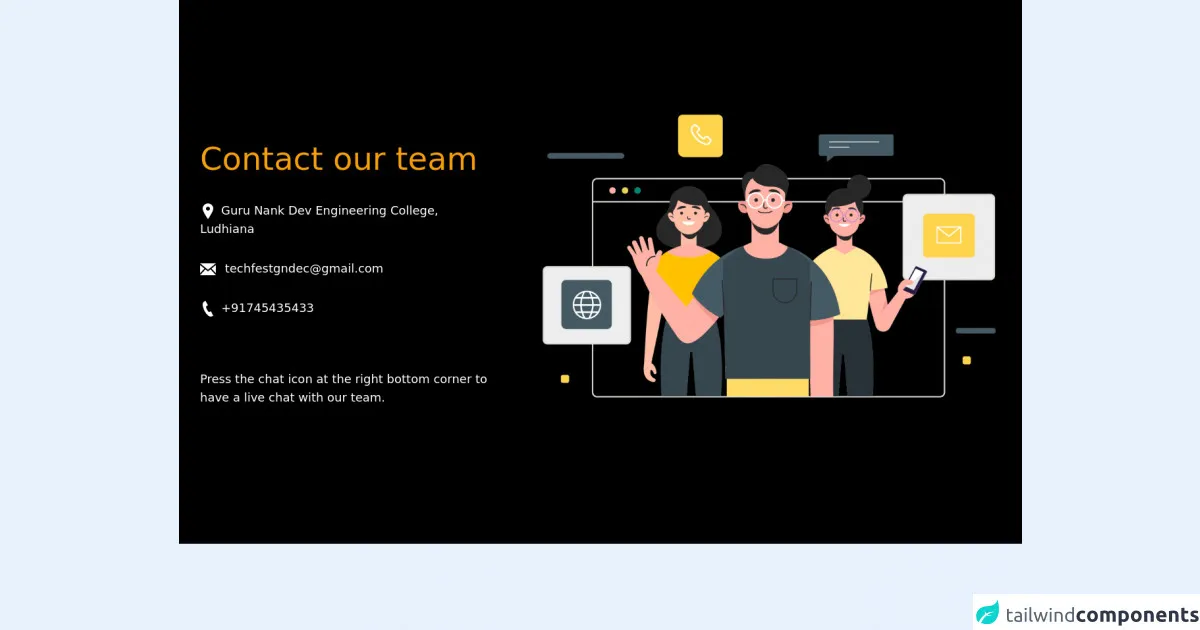
<p class="text-3xl md:text-5xl text-yellow-500 my-4 leading-relaxed md:leading-snug">Contact our team</p>
<p class="font-sans text-sm md:text-lg my-2 md:my-4"><svg class="inline-block fill-current mr-2"
xmlns="http://www.w3.org/2000/svg" width="24" height="24" viewBox="0 0 24 24">
<path
d="M12 0c-4.198 0-8 3.403-8 7.602 0 4.198 3.469 9.21 8 16.398 4.531-7.188 8-12.2 8-16.398 0-4.199-3.801-7.602-8-7.602zm0 11c-1.657 0-3-1.343-3-3s1.343-3 3-3 3 1.343 3 3-1.343 3-3 3z" />
</svg>Guru Nank Dev Engineering College, Ludhiana</p>
<p class="font-sans text-sm md:text-lg my-2 md:my-4"><svg class="inline-block fill-current mr-2"
xmlns="http://www.w3.org/2000/svg" width="24" height="24" viewBox="0 0 24 24">
<path
d="M12 12.713l-11.985-9.713h23.971l-11.986 9.713zm-5.425-1.822l-6.575-5.329v12.501l6.575-7.172zm10.85 0l6.575 7.172v-12.501l-6.575 5.329zm-1.557 1.261l-3.868 3.135-3.868-3.135-8.11 8.848h23.956l-8.11-8.848z" />
</svg> [email protected]</p>
<p class="font-sans text-sm md:text-lg my-2 md:my-4"><svg class="inline-block fill-current mr-2"
xmlns="http://www.w3.org/2000/svg" width="24" height="24" viewBox="0 0 24 24">
<path
d="M20 22.621l-3.521-6.795c-.008.004-1.974.97-2.064 1.011-2.24 1.086-6.799-7.82-4.609-8.994l2.083-1.026-3.493-6.817-2.106 1.039c-7.202 3.755 4.233 25.982 11.6 22.615.121-.055 2.102-1.029 2.11-1.033z" />
</svg>+91745435433</p> <br> <br>
<p class="font-sans text-sm md:text-lg my-2 md:my-4">Press the chat icon at the right bottom corner to have a
live chat with our team.
</p>
</div>
<div class=" flex flex-col lg:w-3/5 justify-center w-full lg:-mt-12">
<div class="container">
<div class="relative flex flex-col min-w-0 break-words w-full">
<div class="flex-auto p-5 lg:p-10">
<img src="https://user-images.githubusercontent.com/54521023/152731049-cc744a56-1d6f-4945-9566-0fa3b7ad1d24.png" alt="contact image">
</div>
</div>
</div>
</div>
</div>
</div>
How to create a Contact Page with Tailwind CSS?
To create a contact page with Tailwind CSS, follow these steps:
- Create a new HTML file and add a form element to it.
- Add input fields for the visitor's name, email address, and message.
- Add labels for each input field to provide context for the visitor.
- Add a submit button to the form.
- Add Tailwind CSS classes to the HTML elements to style them.
Here is an example of what the HTML code for the contact page form might look like:
<form class="max-w-lg mx-auto mt-10">
  <div class="mb-6">
    <label class="block text-gray-700 font-bold mb-2" for="name">
      Name
    </label>
    <input
      class="shadow appearance-none border rounded w-full py-2 px-3 text-gray-700 leading-tight focus:outline-none focus:shadow-outline"
      id="name"
      type="text"
      placeholder="John Doe"
    />
  </div>
  <div class="mb-6">
    <label class="block text-gray-700 font-bold mb-2" for="email">
      Email
    </label>
    <input
      class="shadow appearance-none border rounded w-full py-2 px-3 text-gray-700 leading-tight focus:outline-none focus:shadow-outline"
      id="email"
      type="email"
      placeholder="[email protected]"
    />
  </div>
  <div class="mb-6">
    <label class="block text-gray-700 font-bold mb-2" for="message">
      Message
    </label>
    <textarea
      class="shadow appearance-none border rounded w-full py-2 px-3 text-gray-700 leading-tight focus:outline-none focus:shadow-outline"
      id="message"
      rows="5"
      placeholder="Enter your message here"
    ></textarea>
  </div>
  <div class="flex items-center justify-between">
    <button
      class="bg-blue-500 hover:bg-blue-700 text-white font-bold py-2 px-4 rounded focus:outline-none focus:shadow-outline"
      type="button"
    >
      Send
    </button>
  </div>
</form>
In this example, we have used Tailwind CSS classes to style the form elements. For example, we have used the max-w-lg class to set the maximum width of the form to lg (large) size, and the mx-auto class to center the form horizontally. We have also used classes such as mb-6 to add margin-bottom to the form elements, and shadow to add a subtle drop shadow effect to the input fields.
Conclusion
Creating a contact page with Tailwind CSS is a simple and effective way to design a visually appealing and user-friendly form for your website. By using Tailwind CSS classes, you can save time and effort in designing your contact page, and maintain a consistent design language across your website. With these tips and tricks, you can create a contact page that will help you build trust with your audience and encourage them to reach out to you.