- Published on
Surprisingly Effective Ways To Build A Form Sidebar With Tailwind CSS
- What is Tailwind CSS?
- The description of Form Sidebar UI component
- Why use Tailwind CSS to create a Form Sidebar UI component?
- The preview of Form Sidebar UI component
- The source code of Form Sidebar UI component
- How to create a Form Sidebar with Tailwind CSS?
- Step 1: Create the HTML structure
- Step 2: Style the Form Sidebar using Tailwind CSS
- Step 3: Add JavaScript to handle the Form Sidebar behavior
- Conclusion
As a FrontEnd technology blogger, you must have heard of Tailwind CSS, a utility-first CSS framework that helps you quickly build custom designs. In this article, we will explore how to use Tailwind CSS to create a Form Sidebar UI component that is both functional and visually appealing.
What is Tailwind CSS?
Tailwind CSS is a utility-first CSS framework that provides a set of pre-defined CSS classes that you can use to style your HTML elements. Unlike other CSS frameworks, Tailwind CSS does not come with pre-designed components. Instead, it provides you with a set of building blocks that you can use to create your own custom designs.
The description of Form Sidebar UI component
A Form Sidebar is a UI component that is commonly used in web applications to display form fields and controls. The Form Sidebar is typically positioned on the left or right side of the screen and slides in and out of view when triggered.
The Form Sidebar UI component is composed of several parts, including a header, a body, and a footer. The header contains a title and a close button, the body contains the form fields and controls, and the footer contains the action buttons.
Why use Tailwind CSS to create a Form Sidebar UI component?
Tailwind CSS provides a set of pre-defined CSS classes that you can use to style your HTML elements. This makes it easy to create custom designs without having to write CSS from scratch. Additionally, Tailwind CSS is highly customizable, allowing you to create designs that match your brand's style guide.
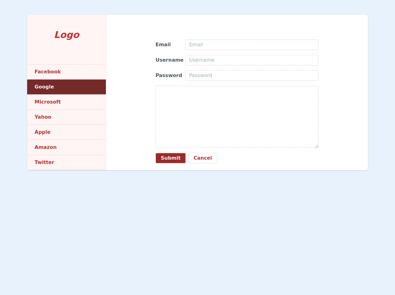
The preview of Form Sidebar UI component
To give you an idea of what the Form Sidebar UI component looks like, here is a preview:
Free download of the Form Sidebar's source code
The source code of Form Sidebar UI component
To create the Form Sidebar UI component, we will be using HTML and Tailwind CSS. Here is the source code:
<div class="w-full max-w-6xl min-w-0 mx-auto px-6">
			<div class="flex mt-12 bg-white rounded-md shadow">
				<div class="w-64 bg-red-100 rounded-l-md border-r border-dashed border-red-200">
					<div class="flex justify-center items-center h-32 text-red-700 text-center font-semibold text-3xl italic">
						Logo
					</div>
					<div class="mt-8 border-t border-red-200">
						<a href="#" class="block py-3 px-6 text-red-700 font-semibold border-b border-red-200">
							Facebook
						</a>
						<a href="#" class="block py-3 px-6 bg-red-900 text-red-100 font-semibold border-b border-red-200">
							Google
						</a>
						<a href="#" class="block py-3 px-6 text-red-700 font-semibold border-b border-red-200">
							Microsoft
						</a>
						<a href="#" class="block py-3 px-6 text-red-700 font-semibold border-b border-red-200">
							Yahoo
						</a>
						<a href="#" class="block py-3 px-6 text-red-700 font-semibold border-b border-red-200">
							Apple
						</a>
						<a href="#" class="block py-3 px-6 text-red-700 font-semibold border-b border-red-200">
							Amazon
						</a>
						<a href="#" class="block py-3 px-6 text-red-700 font-semibold border-b border-red-200">
							Twitter
						</a>
					</div>
				</div>
				<div class="flex-grow">
					<div class="flex flex-col mx-40 mt-20">
						<div class="flex items-center mb-4">
							<label for="email" class="w-24 font-semibold text-gray-700">Email</label>
							<input type="email" class="flex-grow border border-red-200 rounded py-1 px-3" placeholder="Email" />
						</div>
						<div class="flex items-center mb-4">
							<label for="username" class="w-24 font-semibold text-gray-700">Username</label>
							<input type="text" class="flex-grow border border-red-200 rounded py-1 px-3" placeholder="Username" />
						</div>
						<div class="flex items-center mb-4">
							<label for="password" class="w-24 font-semibold text-gray-700">Password</label>
							<input type="password" class="flex-grow border border-red-200 rounded py-1 px-3" placeholder="Password" />
						</div>
						<div class="flex items-center mb-4">
							<textarea name="description" class="flex-grow border border-red-200 rounded py-1 px-3" id="description" rows="8"></textarea>
						</div>
						<div class="flex items-center mb-4">
							<button class="py-1 px-4 bg-red-800 text-red-100 font-semibold hover:bg-red-900 hover:shadow border border-red-200 rounded mr-2">Submit</button>
							<button class="py-1 px-4 bg-white text-red-700 font-semibold hover:shadow border border-red-200 rounded">Cancel</button>
						</div>
					</div>
				</div>
			</div>
		</div>
How to create a Form Sidebar with Tailwind CSS?
Now that we have a basic understanding of what the Form Sidebar UI component is and why we should use Tailwind CSS to create it, let's dive into the steps to create it.
Step 1: Create the HTML structure
The first step is to create the HTML structure for the Form Sidebar UI component. We will start by creating a container div that will hold the entire Form Sidebar. Inside the container div, we will create three divs: one for the header, one for the body, and one for the footer.
<div class="fixed inset-0 overflow-hidden">
  <div class="absolute inset-0 overflow-hidden">
    <div class="absolute inset-y-0 right-0 pl-10 max-w-full flex sm:pl-16">
      <div class="w-screen max-w-md">
        <div class="h-full divide-y divide-gray-200 flex flex-col bg-white shadow-xl">
          <!-- Header -->
          <div class="px-4 py-6 sm:px-6">
            <div class="flex items-start justify-between">
              <h2 class="text-lg font-medium text-gray-900">Form Sidebar</h2>
              <div class="ml-3 h-7 flex items-center">
                <button
                  type="button"
                  class="bg-white rounded-md text-gray-400 hover:text-gray-500 focus:outline-none focus:ring-2 focus:ring-offset-2 focus:ring-indigo-500"
                >
                  <span class="sr-only">Close panel</span>
                  <!-- Heroicon name: x -->
                  <svg
                    class="h-6 w-6"
                    xmlns="http://www.w3.org/2000/svg"
                    fill="none"
                    viewBox="0 0 24 24"
                    stroke="currentColor"
                    aria-hidden="true"
                  >
                    <path
                      stroke-linecap="round"
                      stroke-linejoin="round"
                      stroke-width="2"
                      d="M6 18L18 6M6 6l12 12"
                    />
                  </svg>
                </button>
              </div>
            </div>
          </div>
          <!-- Body -->
          <div class="flex-1 h-0 overflow-y-auto">
            <div class="py-6 px-4 sm:px-6">
              <div class="mb-6">
                <label for="name" class="block text-sm font-medium text-gray-700">Name</label>
                <div class="mt-1">
                  <input
                    type="text"
                    name="name"
                    id="name"
                    class="shadow-sm focus:ring-indigo-500 focus:border-indigo-500 block w-full sm:text-sm border-gray-300 rounded-md"
                  />
                </div>
              </div>
              <div class="mb-6">
                <label for="email" class="block text-sm font-medium text-gray-700">Email</label>
                <div class="mt-1">
                  <input
                    type="email"
                    name="email"
                    id="email"
                    class="shadow-sm focus:ring-indigo-500 focus:border-indigo-500 block w-full sm:text-sm border-gray-300 rounded-md"
                  />
                </div>
              </div>
              <div class="mb-6">
                <label for="password" class="block text-sm font-medium text-gray-700">Password</label>
                <div class="mt-1">
                  <input
                    type="password"
                    name="password"
                    id="password"
                    class="shadow-sm focus:ring-indigo-500 focus:border-indigo-500 block w-full sm:text-sm border-gray-300 rounded-md"
                  />
                </div>
              </div>
            </div>
          </div>
          <!-- Footer -->
          <div class="flex-shrink-0 px-4 py-4 flex justify-end">
            <button
              type="button"
              class="ml-3 inline-flex justify-center py-2 px-4 border border-transparent shadow-sm text-sm font-medium rounded-md text-white bg-indigo-600 hover:bg-indigo-700 focus:outline-none focus:ring-2 focus:ring-offset-2 focus:ring-indigo-500"
            >
              Save
            </button>
            <button
              type="button"
              class="ml-3 inline-flex justify-center py-2 px-4 border border-gray-300 shadow-sm text-sm font-medium rounded-md text-gray-700 bg-white hover:bg-gray-50 focus:outline-none focus:ring-2 focus:ring-offset-2 focus:ring-indigo-500"
            >
              Cancel
            </button>
          </div>
        </div>
      </div>
    </div>
  </div>
</div>
Step 2: Style the Form Sidebar using Tailwind CSS
The next step is to style the Form Sidebar UI component using Tailwind CSS. We will use a combination of pre-defined CSS classes and custom styles to achieve the desired look and feel.
/* Container */
.fixed {
  z-index: 9999;
  background-color: rgba(0, 0, 0, 0.5);
}

/* Header */
.px-4 {
  padding-left: 1rem;
  padding-right: 1rem;
}

.py-6 {
  padding-top: 1.5rem;
  padding-bottom: 1.5rem;
}

.text-lg {
  font-size: 1.125rem;
  line-height: 1.75rem;
}

.font-medium {
  font-weight: 500;
}

.text-gray-900 {
  --tw-text-opacity: 1;
  color: rgba(17, 24, 39, var(--tw-text-opacity));
}

.ml-3 {
  margin-left: 0.75rem;
}

.h-7 {
  height: 1.75rem;
}

/* Body */
.py-6 {
  padding-top: 1.5rem;
  padding-bottom: 1.5rem;
}

.mb-6 {
  margin-bottom: 1.5rem;
}

.block {
  display: block;
}

.text-sm {
  font-size: 0.875rem;
  line-height: 1.25rem;
}

.font-medium {
  font-weight: 500;
}

.text-gray-700 {
  --tw-text-opacity: 1;
  color: rgba(113, 128, 150, var(--tw-text-opacity));
}

.mt-1 {
  margin-top: 0.25rem;
}

.shadow-sm {
  box-shadow: 0 1px 2px 0 rgba(0, 0, 0, 0.05);
}

.focus\:ring-indigo-500:focus {
  outline: 2px solid transparent;
  outline-offset: 2px;
  box-shadow: 0 0 0 3px rgba(66, 153, 225, 0.5);
}

.focus\:border-indigo-500:focus {
  --tw-border-opacity: 1;
  border-color: rgba(66, 153, 225, var(--tw-border-opacity));
}

.border-gray-300 {
  --tw-border-opacity: 1;
  border-color: rgba(209, 213, 219, var(--tw-border-opacity));
}

.rounded-md {
  border-radius: 0.375rem;
}

/* Footer */
.px-4 {
  padding-left: 1rem;
  padding-right: 1rem;
}

.py-4 {
  padding-top: 1rem;
  padding-bottom: 1rem;
}

.flex {
  display: flex;
}

.justify-end {
  justify-content: flex-end;
}

.ml-3 {
  margin-left: 0.75rem;
}

.inline-flex {
  display: inline-flex;
}

.py-2 {
  padding-top: 0.5rem;
  padding-bottom: 0.5rem;
}

.px-4 {
  padding-left: 1rem;
  padding-right: 1rem;
}

.border {
  border-width: 1px;
}

.border-transparent {
  border-color: transparent;
}

.shadow-sm {
  box-shadow: 0 1px 2px 0 rgba(0, 0, 0, 0.05);
}

.text-sm {
  font-size: 0.875rem;
  line-height: 1.25rem;
}

.font-medium {
  font-weight: 500;
}

.rounded-md {
  border-radius: 0.375rem;
}

.text-white {
  --tw-text-opacity: 1;
  color: rgba(255, 255, 255, var(--tw-text-opacity));
}

.bg-indigo-600 {
  --tw-bg-opacity: 1;
  background-color: rgba(79, 70, 229, var(--tw-bg-opacity));
}

.hover\:bg-indigo-700:hover {
  --tw-bg-opacity: 1;
  background-color: rgba(67, 56, 202, var(--tw-bg-opacity));
}

.text-gray-700 {
  --tw-text-opacity: 1;
  color: rgba(113, 128, 150, var(--tw-text-opacity));
}

.bg-white {
  --tw-bg-opacity: 1;
  background-color: rgba(255, 255, 255, var(--tw-bg-opacity));
}

.hover\:bg-gray-50:hover {
  --tw-bg-opacity: 1;
  background-color: rgba(249, 250, 251, var(--tw-bg-opacity));
}

.border-gray-300 {
  --tw-border-opacity: 1;
  border-color: rgba(209, 213, 219, var(--tw-border-opacity));
}
Step 3: Add JavaScript to handle the Form Sidebar behavior
The final step is to add JavaScript to handle the Form Sidebar behavior. We will use JavaScript to toggle the visibility of the Form Sidebar when the close button is clicked.
const formSidebar = document.querySelector('.fixed');
const closeButton = document.querySelector('.fixed button');

closeButton.addEventListener('click', () => {
  formSidebar.classList.add('hidden');
});

formSidebar.addEventListener('click', (event) => {
  if (event.target === formSidebar) {
    formSidebar.classList.add('hidden');
  }
});
Conclusion
In this article, we explored how to use Tailwind CSS to create a Form Sidebar UI component. We started by describing what a Form Sidebar is and why we should use Tailwind CSS to create it. We then provided a preview of the Form Sidebar UI component and shared the source code for creating it. Finally, we walked through the steps to create the Form Sidebar using HTML, Tailwind CSS, and JavaScript.
By following the steps outlined in this article, you can easily create a Form Sidebar UI component that is both functional and visually appealing. Tailwind CSS provides a powerful set of tools that make it easy to create custom designs without having to write CSS from scratch.