- Published on
6 Steps To Build A Case Study With Tailwind CSS Like A Pro In Under An Hour
- What is Tailwind CSS?
- The description of Case study UI component
- Why use Tailwind CSS to create a Case study UI component?
- The preview of Case study UI component
- The source code of Case study UI component
- How to create a Case study with Tailwind CSS?
- Step 1: Set up your project
- Step 2: Add Tailwind CSS to your project
- Step 3: Set up your HTML file
- Step 4: Style your HTML elements with Tailwind CSS
- Step 5: Customize your design with Tailwind CSS
- Step 6: Preview and test your case study UI component
- Conclusion
Are you looking for a way to create a beautiful and functional case study UI component for your website or application? Look no further than Tailwind CSS. In this article, we'll walk you through the steps to build a case study UI component with Tailwind CSS like a pro in under an hour.
What is Tailwind CSS?
Tailwind CSS is a utility-first CSS framework that provides a set of pre-defined classes that you can use to style your HTML elements. It allows you to create complex layouts and designs with ease, without having to write custom CSS code. Tailwind CSS is highly customizable and can be used with any front-end framework or library.
The description of Case study UI component
A case study UI component is a design element that showcases a particular project or product. It typically includes a brief description of the project, images or videos, and key metrics or results. A case study UI component is essential for businesses and organizations that want to showcase their work and attract new clients or customers.
Why use Tailwind CSS to create a Case study UI component?
Tailwind CSS is an excellent choice for creating a case study UI component because it allows you to create a responsive and customizable design quickly. With Tailwind CSS, you can use pre-defined classes to style your HTML elements, which saves you time and effort. Additionally, Tailwind CSS provides a wide range of utility classes that allow you to create complex layouts and designs with ease.
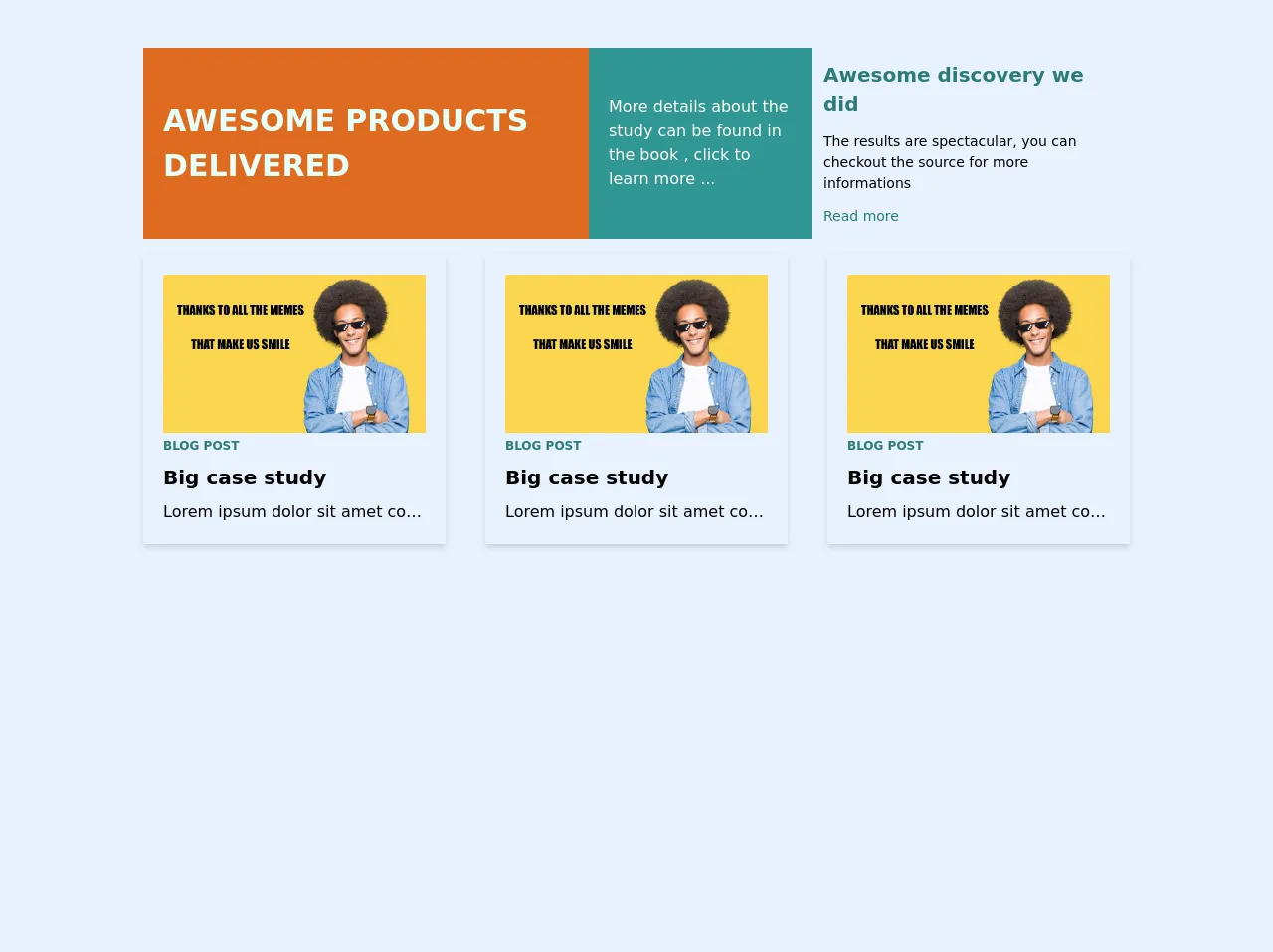
The preview of Case study UI component
To give you an idea of what we'll be building, here's a preview of the case study UI component we'll create:
Free download of the Case study's source code
The source code of Case study UI component
Here's the HTML and CSS code for the case study UI component:
<section class="mx-auto max-w-6xl py-12">
    <div class="flex flex-col">
        <div class="flex flex-col md:flex-row justify-center items-center">
            <div class="transition-all ease-in-out duration-1000 flex flex-col justify-center"></div>
            <div class="transition-all ease-in-out duration-1000 flex flex-col justify-center"></div>
            <div class="transition-all ease-in-out duration-1000 flex flex-col justify-center"></div>
        </div>
        <div class="flex flex-col md:flex-row justify-center items-center">
            <div class="transition-all ease-in-out duration-1000 flex flex-col justify-center">
                <div slot="middle-left" class="max-w-2xl">
                    <div class="flex flex-row">
                        <div class="w-2/3 bg-orange-600 p-5 text-teal-100 flex justify-center items-center h-48 text-3xl font-black uppercase">Awesome products delivered</div>
                        <div class="w-1/3 bg-teal-600 text-orange-100 p-5 flex justify-center items-center">More details about the study can be found in the book , click to learn more ...</div>
                    </div>
                </div>
            </div>
            <div class="transition-all ease-in-out duration-1000 flex flex-col justify-center"></div>
            <div class="transition-all ease-in-out duration-1000 flex flex-col justify-center">
                <div slot="middle-right" class="max-w-xs">
                    <div class="flex flex-col justify-center h-48 p-3">
                        <div class="text-xl font-black text-teal-700">Awesome discovery we did</div>
                        <div class="text-sm my-3">The results are spectacular, you can checkout the source for more informations</div>
                        <div class="text-sm text-teal-700 cursor-pointer">Read more</div>
                    </div>
                </div>
            </div>
        </div>
        <div class="flex flex-col md:flex-row justify-center items-center">
            <div class="transition-all ease-in-out duration-1000 flex flex-col justify-center mr-0 md:mr-2">
                <div slot="bottom-left" class="max-w-xs">
                    <div class="p-5 shadow-md m-2 mt-4"><img class="object-scale-down h-30" src="https://s.spielwarenmesse.de/fileadmin/data_archive/Relaunch_Spielwarenmesse/magazine/header/20190618_Header_Memes.jpg" alt="step3">
                        <div class="text-xs font-bold uppercase text-teal-700 mt-1 mb-2">Blog post</div>
                        <div class="text-xl font-bold mb-2">Big case study</div>
                        <div class="truncate">Lorem ipsum dolor sit amet consectetur adipisicing elit. Id ut vel facilis iste, dicta est minus alias, aliquam, velit nisi quo assumenda porro dignissimos doloremque temporibus eum saepe aspernatur ab.</div>
                    </div>
                </div>
            </div>
            <div class="transition-all ease-in-out duration-1000 flex flex-col justify-center mx-0 md:mx-4">
                <div slot="bottom-center" class="max-w-xs">
                    <div class="p-5 shadow-md m-2 mt-4"><img class="object-scale-down h-30" src="https://s.spielwarenmesse.de/fileadmin/data_archive/Relaunch_Spielwarenmesse/magazine/header/20190618_Header_Memes.jpg" alt="step3">
                        <div class="text-xs font-bold uppercase text-teal-700 mt-1 mb-2">Blog post</div>
                        <div class="text-xl font-bold mb-2">Big case study</div>
                        <div class="truncate">Lorem ipsum dolor sit amet consectetur adipisicing elit. Id ut vel facilis iste, dicta est minus alias, aliquam, velit nisi quo assumenda porro dignissimos doloremque temporibus eum saepe aspernatur ab.</div>
                    </div>
                </div>
            </div>
            <div class="transition-all ease-in-out duration-1000 flex flex-col justify-center ml-0 md:ml-2">
                <div slot="bottom-right" class="max-w-xs">
                    <div class="p-5 shadow-md m-2 mt-4"><img class="object-scale-down h-30" src="https://s.spielwarenmesse.de/fileadmin/data_archive/Relaunch_Spielwarenmesse/magazine/header/20190618_Header_Memes.jpg" alt="step3">
                        <div class="text-xs font-bold uppercase text-teal-700 mt-1 mb-2">Blog post</div>
                        <div class="text-xl font-bold mb-2">Big case study</div>
                        <div class="truncate">Lorem ipsum dolor sit amet consectetur adipisicing elit. Id ut vel facilis iste, dicta est minus alias, aliquam, velit nisi quo assumenda porro dignissimos doloremque temporibus eum saepe aspernatur ab.</div>
                    </div>
                </div>
            </div>
        </div>
    </div>
</section>
How to create a Case study with Tailwind CSS?
Now that you know why Tailwind CSS is an excellent choice for creating a case study UI component let's dive into the steps to build one.
Step 1: Set up your project
The first step is to set up your project. You can use any text editor or integrated development environment (IDE) to create your project. Create a new folder for your project and open it in your text editor or IDE.
Next, create an HTML file and a CSS file in your project folder. You can name them whatever you like. In this example, we'll name them index.html and style.css.
Step 2: Add Tailwind CSS to your project
The next step is to add Tailwind CSS to your project. You can do this in two ways: by installing it via npm or by adding a CDN link to your HTML file.
To install Tailwind CSS via npm, open your terminal or command prompt and navigate to your project folder. Then, run the following command:
npm install tailwindcss
This will install Tailwind CSS in your project folder.
Alternatively, you can add a CDN link to your HTML file. Add the following code to the head section of your HTML file:
<link rel="stylesheet" href="https://cdn.jsdelivr.net/npm/[email protected]/dist/tailwind.min.css">
This will add the Tailwind CSS stylesheet to your HTML file.
Step 3: Set up your HTML file
The next step is to set up your HTML file. Add the following code to your HTML file:
<div class="container mx-auto">
  <div class="my-8">
    <div class="flex flex-col md:flex-row md:space-x-4">
      <div class="md:w-1/2">
        <img src="https://via.placeholder.com/600x400" alt="Project Image" class="w-full h-auto">
      </div>
      <div class="md:w-1/2">
        <h2 class="text-3xl font-bold mb-4">Project Title</h2>
        <p class="mb-4">Lorem ipsum dolor sit amet, consectetur adipiscing elit. Sed euismod, diam ut bibendum dictum, lectus sapien aliquam enim, nec viverra ipsum urna vel orci. Sed euismod, diam ut bibendum dictum, lectus sapien aliquam enim, nec viverra ipsum urna vel orci.</p>
        <ul class="list-disc mb-4">
          <li>Key Metric 1: 100%</li>
          <li>Key Metric 2: 200%</li>
          <li>Key Metric 3: 300%</li>
        </ul>
        <a href="#" class="bg-blue-500 hover:bg-blue-700 text-white font-bold py-2 px-4 rounded">View Project</a>
      </div>
    </div>
  </div>
</div>
This code sets up the basic structure of the case study UI component. It includes an image, a title, a description, key metrics, and a call-to-action button.
Step 4: Style your HTML elements with Tailwind CSS
The next step is to style your HTML elements with Tailwind CSS. Add the following code to your CSS file:
.container {
  max-width: 1200px;
}

img {
  border-radius: 0.25rem;
}

h2 {
  color: #333;
}

ul li {
  color: #666;
}

a {
  display: inline-block;
}
This code styles the container, image, title, key metrics, and call-to-action button.
Step 5: Customize your design with Tailwind CSS
The great thing about Tailwind CSS is that it's highly customizable. You can use pre-defined classes to create a unique design that matches your brand or style.
For example, you can change the color of the call-to-action button by adding the following class:
<a href="#" class="bg-green-500 hover:bg-green-700 text-white font-bold py-2 px-4 rounded">View Project</a>
This code changes the background color of the button to green.
Step 6: Preview and test your case study UI component
The final step is to preview and test your case study UI component. Open your HTML file in a web browser and make sure everything looks and works as expected. Test your call-to-action button to make sure it links to the correct page or URL.
Conclusion
In this article, we've shown you how to create a case study UI component with Tailwind CSS like a pro in under an hour. We've covered the basics of Tailwind CSS, the description of a case study UI component, and the steps to build one. With Tailwind CSS, you can create beautiful and functional designs quickly and easily. Give it a try and see for yourself!