- Published on
6 Easy Ways To Build A Top Cards With Tailwind CSS
- What is Tailwind CSS?
- The description of Top Cards ui component
- Why use Tailwind CSS to create a Top Cards ui component?
- The preview of Top Cards ui component
- The source code of Top Cards ui component
- How to create a Top Cards with Tailwind CSS?
- Step 1: Set up the HTML structure
- Step 2: Style the card element
- Step 3: Style the image element
- Step 4: Style the card-content element
- Step 5: Style the card-title element
- Step 6: Style the card-description element
- Conclusion
What is Tailwind CSS?
Tailwind CSS is a utility-first CSS framework that enables developers to create custom designs quickly. It provides a set of pre-defined classes that can be used to style HTML elements. Tailwind CSS is gaining popularity among developers because of its flexibility and ease of use.
The description of Top Cards ui component
Top Cards is a UI component that displays information in a card format. It is commonly used to showcase products, services, or team members. Top Cards usually consist of an image, a title, a description, and a call-to-action button.
Why use Tailwind CSS to create a Top Cards ui component?
Tailwind CSS provides a straightforward way to create Top Cards UI components. It offers a set of pre-defined classes that can be used to style each element of the card. This makes it easy to create custom designs without writing any CSS code.
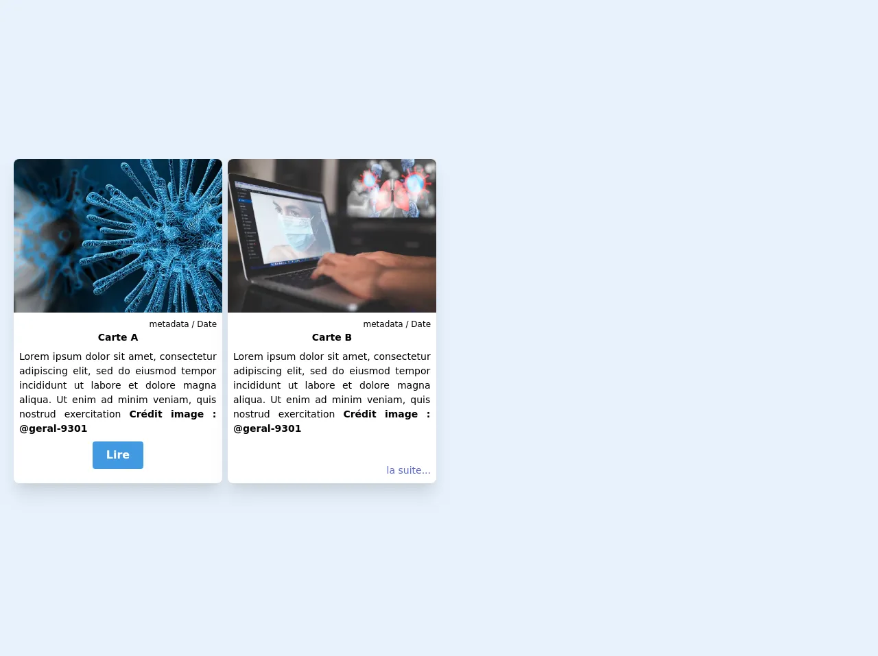
The preview of Top Cards ui component
To create a Top Cards UI component, we will use Tailwind CSS classes to style each element of the card. Here is a preview of what the final product will look like:
Free download of the Top Cards's source code
The source code of Top Cards ui component
To create a Top Cards UI component, we will use HTML and Tailwind CSS classes. Here is the source code for the Top Cards UI component:
<head>  <script src="https://kit.fontawesome.com/479346cc73.js" crossorigin="anonymous"></script>
</head>

<body class=" bg-blue-800 h-250">
    <div class="  grid md:grid-cols-2 sm:grid-cols-1 lg:grid-cols-3 xl:grid-cols-4 gap-2 m-5 mb-10">

        <div class="bg-white shadow-xl rounded-lg overflow-hidden">
            <div class="bg-cover bg-center h-56 p-4"
                style="background-image: url(https://cdn.pixabay.com/photo/2020/02/04/07/16/coronavirus-4817450__340.jpg)">

            </div>
            <div class="m-2 text-justify text-sm">
                <div class="flex flex-wrap items-center -mt-8 pb-3 ">
                    <img class="block h-8 w-8 rounded-full bg-white mt-1 mr-2 ml-3 border-2 border-white "
                        src="https://encrypted-tbn0.gstatic.com/images?q=tbn%3AANd9GcTEwsFRa_ZMCm8Jwm9oXFyV_irtl1kOq9QGg01TsL1YXpkP8oUu"
                        alt="Perfil">
                    <span class="block text-lg font-bold text-white">Author</span>

                </div>
                <p class=" text-right  text-xs">metadata / Date </p>
                <h2 class=" font-bold h-2 mb-5 text-center"> Carte A </h2>
                <p class=" text-xs p-3"> Lorem ipsum dolor sit amet, consectetur adipiscing elit, sed do eiusmod tempor
                    incididunt ut labore Author portrait ; https://karina-balzer.fr/portfolio/glamour/
                    et dolore magna aliqua. Ut enim ad minim veniam, quis nostrud exercitation

                    <strong> Crédit image : <a href="https://pixabay.com/fr/users/geralt-9301/">@geral-9301</a></strong>
                </p>

            </div>
            <div class="w-full text-center  "><button class=" text-gray-400 text-lg mb-2"><i
                        class="fas fa-plus-circle"></i></button>
            </div>
        </div>

        <div class="bg-white shadow-xl rounded-lg overflow-hidden">
            <div class="bg-cover bg-center h-56 p-4"
                style="background-image: url(https://cdn.pixabay.com/photo/2020/03/05/13/07/coronavirus-4904410_960_720.jpg)">
            </div>
            <div class="m-2 text-justify text-sm">
                <div class="flex flex-wrap items-center -mt-8 pb-3 ">
                    <img class="block h-8 w-8 bg-white rounded-full mt-1 mr-2 ml-3 border-2 border-white "
                        src="https://cdn.icon-icons.com/icons2/2126/PNG/512/yoda_star_wars_icon_131348.png"
                        alt="Perfil">
                    <span class="block text-lg font-bold text-white">Author</span>

                </div>
                <p class=" text-right  text-xs">metadata / Date </p>
                <h2 class=" font-bold h-2 mb-5 text-center"> Carte B </h2>
                <p class=""> Lorem ipsum dolor sit amet, consectetur adipiscing elit, sed do eiusmod tempor
                    incididunt ut labore
                    et dolore magna aliqua. Ut enim ad minim veniam, quis nostrud exercitation

                    <strong> Crédit image : <a href="https://pixabay.com/fr/users/geralt-9301/">@geral-9301</a></strong>
                </p>
                <p class="text-indigo-600 text-right mt-10"> <a class="" href="#">la suite...</a></p>
            </div>
        </div>
How to create a Top Cards with Tailwind CSS?
Here are six easy steps to create a Top Cards UI component with Tailwind CSS:
Step 1: Set up the HTML structure
The first step is to set up the HTML structure for the Top Cards UI component. We will use a div element with a class of "card" to wrap the entire card. Inside the card div, we will add an image element, a div element with a class of "card-content", and a button element.
<div class="card">
  <img src="image.jpg" alt="Card Image">
  <div class="card-content">
    <h3 class="card-title">Card Title</h3>
    <p class="card-description">Card Description</p>
    <button class="card-button">Learn More</button>
  </div>
</div>
Step 2: Style the card element
Next, we will use Tailwind CSS classes to style the card element. We will set the width, height, and border radius of the card element.
.card {
  width: 300px;
  height: 400px;
  border-radius: 10px;
}
Step 3: Style the image element
We will use Tailwind CSS classes to style the image element. We will set the width, height, and border radius of the image element.
.card img {
  width: 100%;
  height: 200px;
  border-top-left-radius: 10px;
  border-top-right-radius: 10px;
}
Step 4: Style the card-content element
Next, we will use Tailwind CSS classes to style the card-content element. We will set the padding and background color of the card-content element.
.card-content {
  padding: 20px;
  background-color: #fff;
}
Step 5: Style the card-title element
We will use Tailwind CSS classes to style the card-title element. We will set the font size, font weight, and margin of the card-title element.
.card-title {
  font-size: 24px;
  font-weight: bold;
  margin: 0;
}
Step 6: Style the card-description element
Finally, we will use Tailwind CSS classes to style the card-description element. We will set the font size, margin, and line height of the card-description element.
.card-description {
  font-size: 16px;
  margin: 10px 0;
  line-height: 1.5;
}
Conclusion
In this article, we have discussed how to create a Top Cards UI component with Tailwind CSS. We have outlined the benefits of using Tailwind CSS and provided a step-by-step guide to creating a Top Cards UI component. With Tailwind CSS, developers can create custom designs quickly and easily.